On Twitter, the other day, Noah Smith (@Noahpinion) argued the mere fact my model shows the income elasticity of health expenditure is greater than one implies these higher-income regimes are “starving themselves to death” to pay for healthcare.

Noah does not seem to appreciate that (1) my independent variable, income, is measured in real terms and (2) the relative price of expenditures changes systematically with incomes. Real income levels are overwhelmingly determined by productivity. As incomes rise, it generally takes less input to obtain the same quality-adjusted quantity. It is quite possible to allocate less input (especially human resources) to a given expenditure category and, simultaneously, to consume a larger quantity of that category per capita. The rise in productivity leaves room to increase real consumption.

Above and beyond the real income growth (i.e., the decline in average prices relative to nominal income levels), prices move relative to each other. Relative prices are systematically related to real income levels (spatially and temporally). Some prices rise relative to other prices due in large part to inherent differences in potential productivity growth and their exposure to the domestic labor costs.
Relative prices are clearly very much related to income growth, but relative prices are nonetheless an important partial conceptual explanation for the changing consumption share. Broad price indices are useful statistical tools, however, they hide significant systematic differences in underlying prices that are necessary to understand differences in material living conditions over time and between countries.
Food shares have collapsed….
It is amusing that Noah argued starvation because one of the most well-known examples of changing consumption shares is Engel’s Law: the share of income spent on food declines rapidly as incomes rise. If one simply assumes away corresponding productivity growth and extrapolates the trend out far in the future it implies we won’t spend “enough” on food.
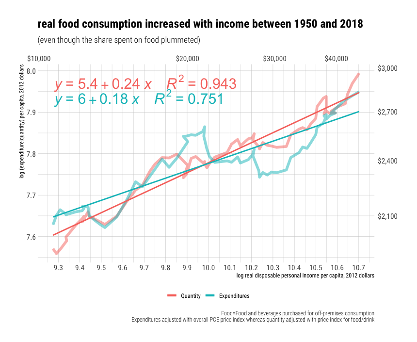
We can see the declining food share over the past several decades in the United States (a particularly rich country).

Food and beverages went from ~43% of consumption expenditures in 1900, to ~25% in 1950, to ~6% in 2018. Though this is a massive change in percentage terms, no one can seriously believe we are consuming lower quantities of food than previous generations.1 Likewise, in international cross-section (ICP 2011).

Given the low-income elasticity of demand for food (quantities) and the substantial increases in agricultural productivity, some decline should be expected. It wasn’t that many generations ago when the vast majority of people worked in food production (agriculture).

Food productivity has improved quite rapidly in the United States and other high-income countries. It takes substantially fewer man-hours to obtain the same amount of food than it did even a few decades ago. So far as I’m aware, there is not much reason to believe this productivity growth is apt to slow down appreciably.

Real food consumption obviously continues to increase!
Real food consumption per capita has clearly increased significantly within our lifetimes. To put this in terms of income elasticities, a 1% increase in disposable income predicts a ~.24% increase in real food consumption2. Perhaps Noah would have preferred us to have trebled real food consumption per person since the 1950s to better align with real income growth, but a ~50% increase hardly seems unreasonably low under the circumstances.

We observe very similar patterns cross-sectionally! For example, even amongst relatively high-income countries (OECD), we find the consumption share spent on food falls quite rapidly.
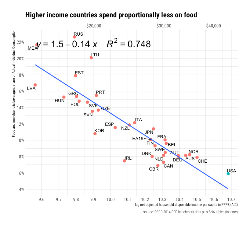
I guess Noah believes we are actually eating a lot less food than our counterparts in other countries because the share of income spent on food is obviously much lower. (Has he met Americans?) This, of course, would be to neglect the role of the denominator (income) and relative prices. Both have much to say when it comes to “predicting” what a given expenditure share means in real terms.
 A 1% increase in income may appear to predict a ~0.16% decline in food consumption cross-sectionally, i.e., when adjusted by PPPs for overall consumption (AIC), but the relative price of food falls even faster than the average price of our consumption basket (~0.45%), which means that actual implied quantities consumed per capita increase by ~.28%. This coefficient on implied quantity per capita is pretty damn close to what have observed in the US time series.
Goods versus Services
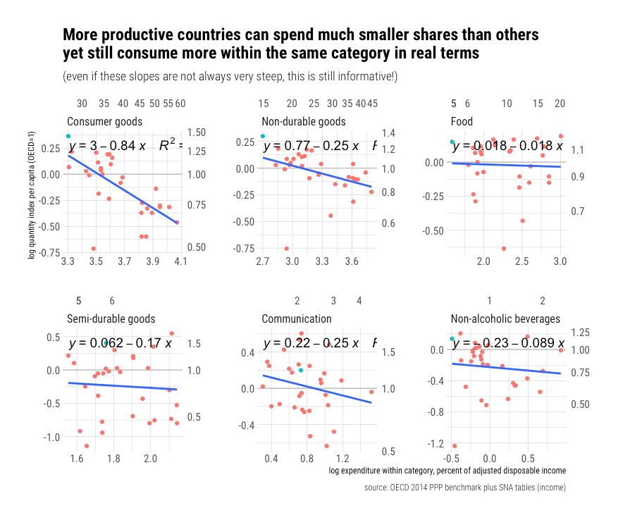
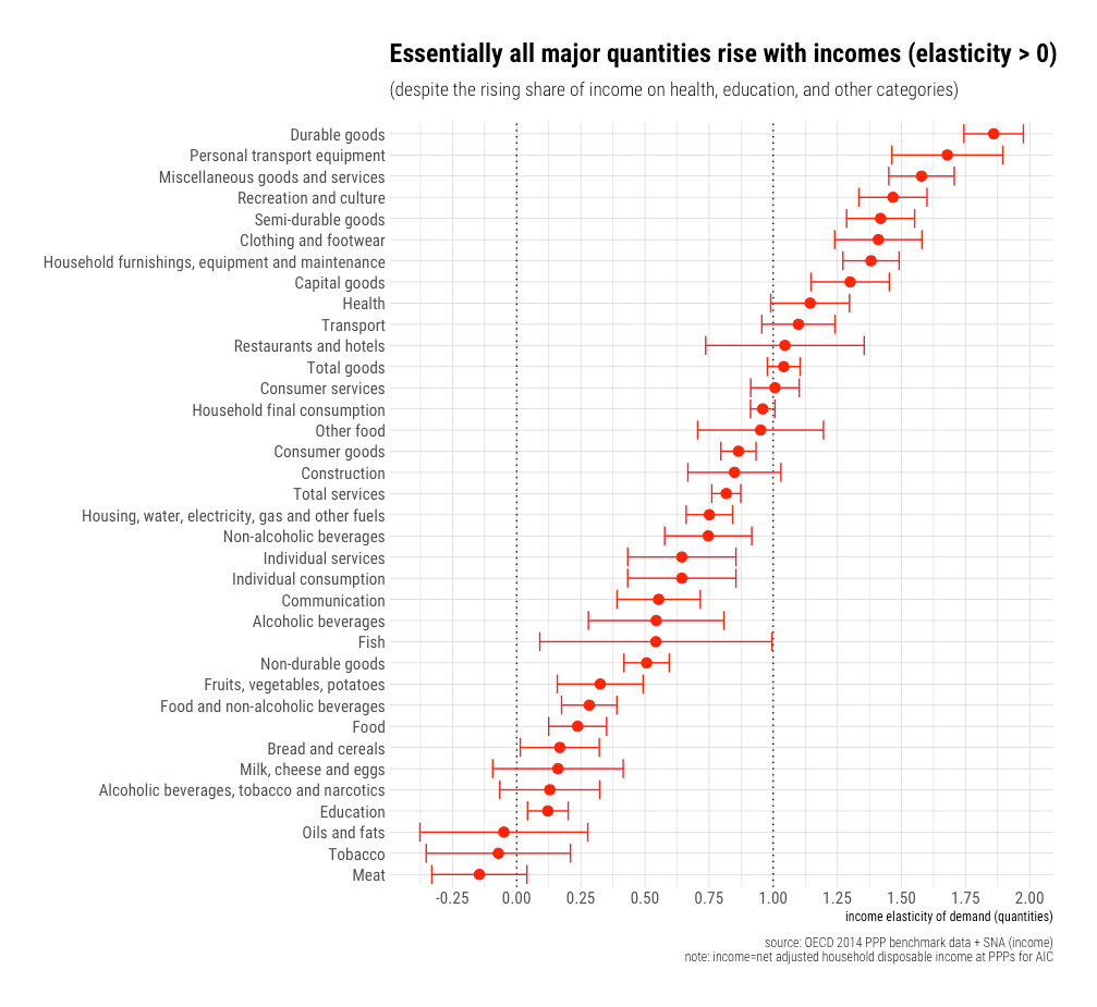
Similar patterns play out in other consumption categories. We can quickly if imperfectly, summarize these patterns by comparing the aggregates for total goods and total services.
 Note that while total services expenditures increase twice as fast as total goods in nominal terms (shares), the relative price of services rises while the relative price of goods falls so that the implied real consumption per capita in goods rises significantly faster than that for services. While these categories don’t perfectly map to individual consumption and don’t map perfectly to goods and services in practice (some “services” look a lot more like “goods” and vice versa as far as labor inputs are concerned), they are nonetheless reasonably indicative.
To put a finer point on this:
These cross-sectional results are generally consistent with what we observe in the US time series and with the theory of cost disease (Baumol’s effect). The belief in the existence of cost-disease is hardly some fringe opinion. A clear majority of experts (economists) agree.

It is important to note that all this really requires to be directionally accurate is for prevailing wages to rise in real terms (i.e., not just in the few highly productive sectors) and for productivity gains in services to substantially lag goods. Adding international trade into the mix makes these patterns even likelier because real wages are generally much lower in lower-income countries, and we can (and do) trade goods (computers, cars, agricultural products, etc) much more readily than services (health, education, childcare, restaurant service, etc).
Again, this cost disease bit is entirely about the relative movement of some prices (generally “goods”) relative to other prices (generally “services”). Although Noah still seems to be laboring under the misperception that health prices have risen faster than income and that this explains the rising health share, all of the reliable time series and cross-sectional price indices for broad health expenditures indicate that health prices have not kept up with income growth in the long run. The rising relative price of healthcare may imply our expenditures go a little less far (quantities) than adjustment for average price levels would suggest, but real health consumption (quantities) growth clearly exceeds real income growth in the long run.

Even if nursing wages had merely tracked with the national average3, it would still be the case that an hour of a nurses time can buy much real more goods today (cars, microprocessors, food, etc) than in the 1950s and that this rate of increase is faster than plausible productivity growth in nursing would allow her to provide additional units of care. The apparent opportunity cost to buy services domestically generally rises because compensation generally rises in real terms.
Rising health share correlates with higher real consumption of everything
Countries that spend a larger share of their incomes on healthcare also consume substantially more on all other categories even though the rising health share necessarily means the shares of the remaining expenditure categories must fall on aggregate. This is obvious if one so much as glances at the higher level aggregates in the OECD.

Likewise, in the available moderately granular categories.

Although this is not strictly necessary to explain how countries can spend larger shares on healthcare and still consume more of everything else, some of these categories are actually inversely associated with their own declining consumption shares.
Surely it can’t be that hard to understand how if a country is able to spend much less on food, consumer goods, and the like, yet still has more to show for it in real terms, this would free up resources to be spent on higher-order wants like subjectively better education and healthcare (How many more doodads do we really need?). This doesn’t necessarily work out for all individual items because some consumption categories actually increase as a share of income (superior goods) and because that there is some modest idiosyncratic component to prices4, but it doesn’t need to at the individual level. It works out on aggregate.
All that’s really necessary to explain this….
All that’s really necessary to understand how countries can spend proportionally more on health and still consume more of everything else in real terms is that the price on these many and varied categories of consumption decline in relation to income faster than health expenditures increase in relation to income. It’s really just that simple.
In the cross-sectional perspective, if the quantities potentially purchasable with nominal per capita income increases faster than the health share of income increases, this implies these implicitly higher-income countries can still purchase more within that particular category in real terms.

Alternatively, if we subtract health spending first to determine potential consumption and find a slope greater than zero, this implies potential real consumption with the remaining income can increase in these categories despite larger allocations to healthcare.

The results are much the same when we examine specific categories.
The only direct exceptions to this in OECD’s data are education and, sort of, health (insofar as it’s one of the few major categories with potential consumption not sloping sharply upwards).
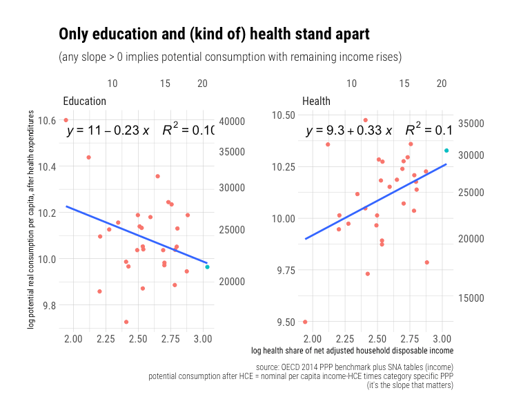
Of course, we’re not buying even more healthcare than we already are, but I included it for completeness. Education is a clear outlier, though both these collectively influence higher aggregates that are largely comprised of these expenditures.
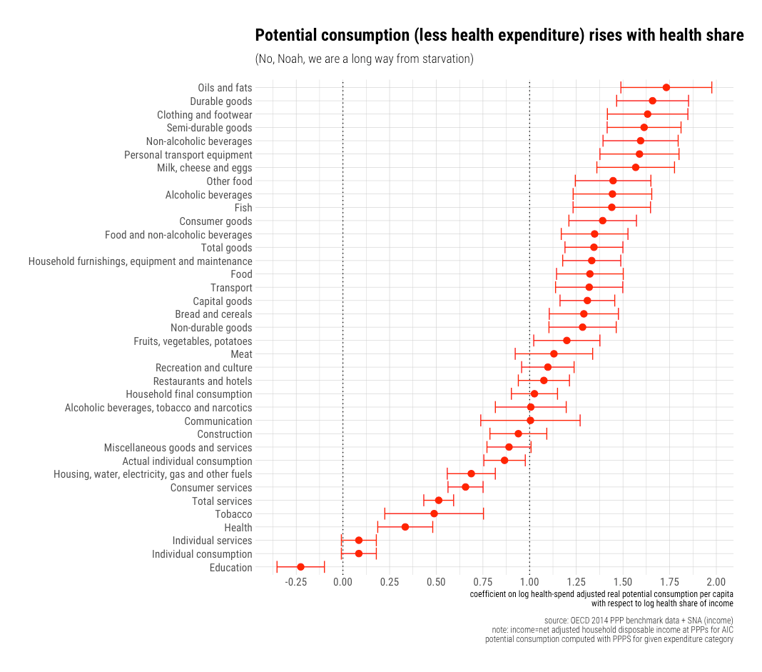
While I have serious doubts about the interpretation of the education PPPs5, this does not seriously threaten the interpretation that rising health shares and rising living conditions are very much compatible, both in principle and in practice. The income remaining for expenditure elsewhere simply goes much further than it did previously even as the remaining share declines. The same share of income on healthcare also goes further according to these international (PPPs) and domestic price indices (PCEPI, CMS, and others) than it once did (education surely stands apart here).
Obviously, I am not arguing that higher health spending causes higher real potential consumption (falling prices or rising productivity elsewhere). Other things equal, shifting more income to health implies other things must fall, but everything is clearly not equal. Health shares are strongly correlated with real income levels and real income levels are strongly correlated with a general increase in productivity (prices fall relative to nominal incomes) and strongly correlated with relative prices between these categories. Indeed, though some people will complain about identification, I think causation (i.e., higher income-> higher health share) is pretty obvious and that it’s just about the only factor worth mentioning (demographic factors and population health barely rises above the noise floor, if at all).
This pattern also holds up in domestic time series
Using BEA Personal Consumption Expenditure (PCE) price indexes, we can compute potential consumption after adjustment for health spending as a function of the health share of disposable personal income (the domestic analog to adjusted household disposable income in SNA).
 Far from trending towards “starvation“, we find that these are generally trending steadily upwards in the long run. Clearly, there is no necessary reason why rising health spending means we must starve. So long as the growth in the health share of income is lower than the rate at which prices are falling relative to nominal incomes on these other categories of expenditure, which is what we have actually observed historically and cross-sectionally, we can continue to consume more of these other things in real terms despite strong increases in the health share of income.
And, for what it’s worth, we find actual real consumption per capita (the consumption expenditures actually made adjusted by the category price level) has risen rapidly even as the health share of income has increased.

The static shares counterfactual is self-evidently ridiculous
Given massive increases in productivity in certain categories of consumption and finite demand, we should expect large changes in consumption shares across categories. We can obtain many of the basic necessities of life (and then some) because most of these prices have fallen rapidly relative to our income levels. Declining shares clearly does not mean falling real consumption in those categories; it’s more likely to mean relatively rapid declines in prices coupled with moderate demand elasticity.
I suspect many people understand this in the abstract, but for some reason seem to imagine we are at the end-stage of economic development wherein changes in income or differences between high-income countries are somehow inconsequential determinants of spending. In my opinion, this is very much consistent with the view that people, especially relatively affluent people, increasingly value other things more, so the fact that Americans consume substantially more across the board is downplayed. To a large degree, it reflects a lack of self-awareness (What is water, said the fish)
In a society where people shrug their shoulders at having more stuff and we can increasingly procure the same with less effort, is it really surprising we’d increasingly direct our resources to higher-order desires like better health, education, and so on, instead of allocating the same share to the same sort of expenditures as we did 25, 50, or 100 years prior? That house sizes, food consumption, or what have you does not track 1:1 with wealth (or more!) is precisely the point! We actually spend proportionally less on these things and still increase them moderately in real terms, leaving resources to be spent on other things that we value more.
Consider what the world would look like if countries did not re-allocate to reflect declining real prices (ultimately increasing productivity). Would we really expect rich countries like the United States to buy multiples more than countries of more moderate income levels across categories such as this?
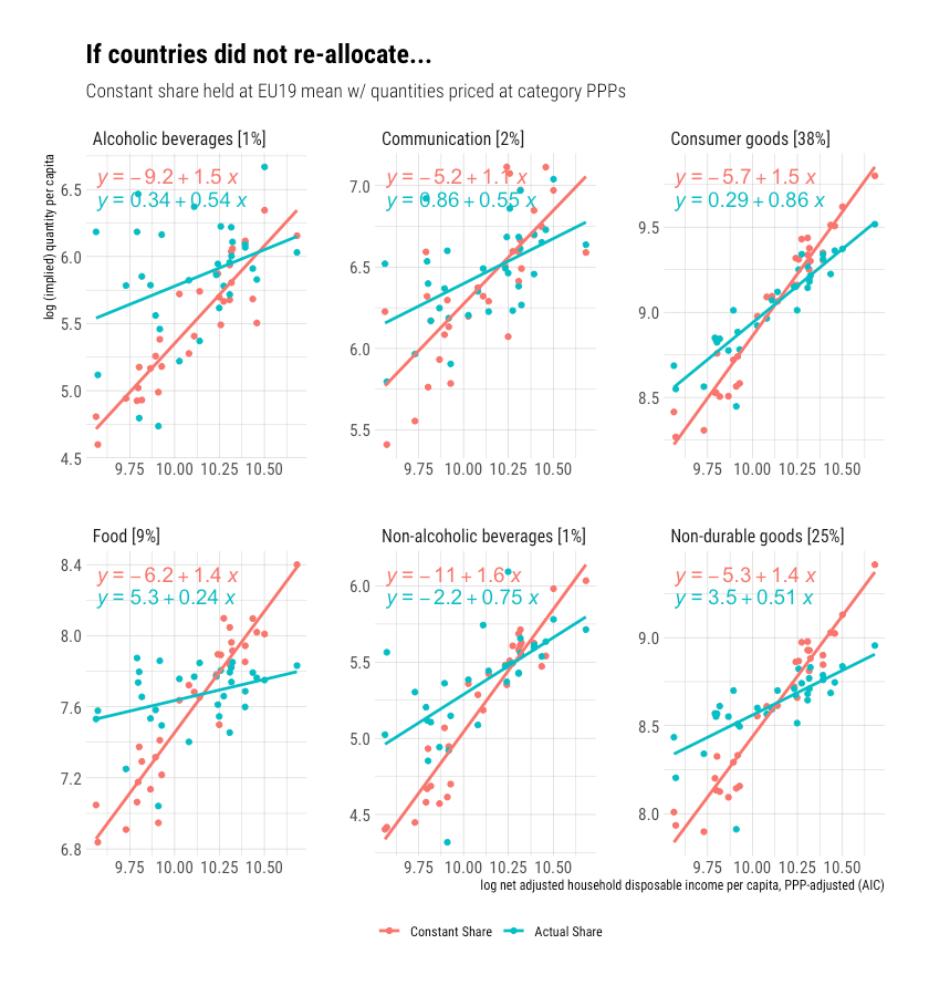 Alternatively, consider the domestic picture: how could we reasonably expect spending shares not to change in the face of such rapid decreases in prices in other consumption categories? Why should we expect households to allocate the same share to, say, household appliances as we did in the 1970s even though the same expenditure share goes ~800% further today?

Some specific categories might increase proportionally despite falling relative prices, but our default assumption should be that household consumption decisions tend to reflect both overall (average) purchasing power and relative prices within and between categories (i.e., real shares as opposed to nominal shares). Theoretical arguments aside, the empirical data are clear: consumption shares change and are strongly associated with real income levels.
All models are wrong, but some are useful.
If all estimated elasticities are presumed constant throughout the entire theoretical range, pretty much all estimates imply something impossible eventually or given some combination of arbitrary inputs. Obviously, this does not mean we cannot hope to meaningful describe relationships with estimates of this sort or that it is necessarily unreasonable to extrapolate models out even slightly beyond our observation set. This is simply a recognition of the fact that models don’t need to be perfect to be useful. More complicated models with more degrees of freedom are often even more unreasonable.
I am most emphatically not saying we’re likely to spend 100% of income on healthcare any time soon. I suspect the true relationship is non-linear and may resemble a sigmoid curve in the very long run. That is, the slope likely initially increases and then flattens out as health spending rises in the distant future.6

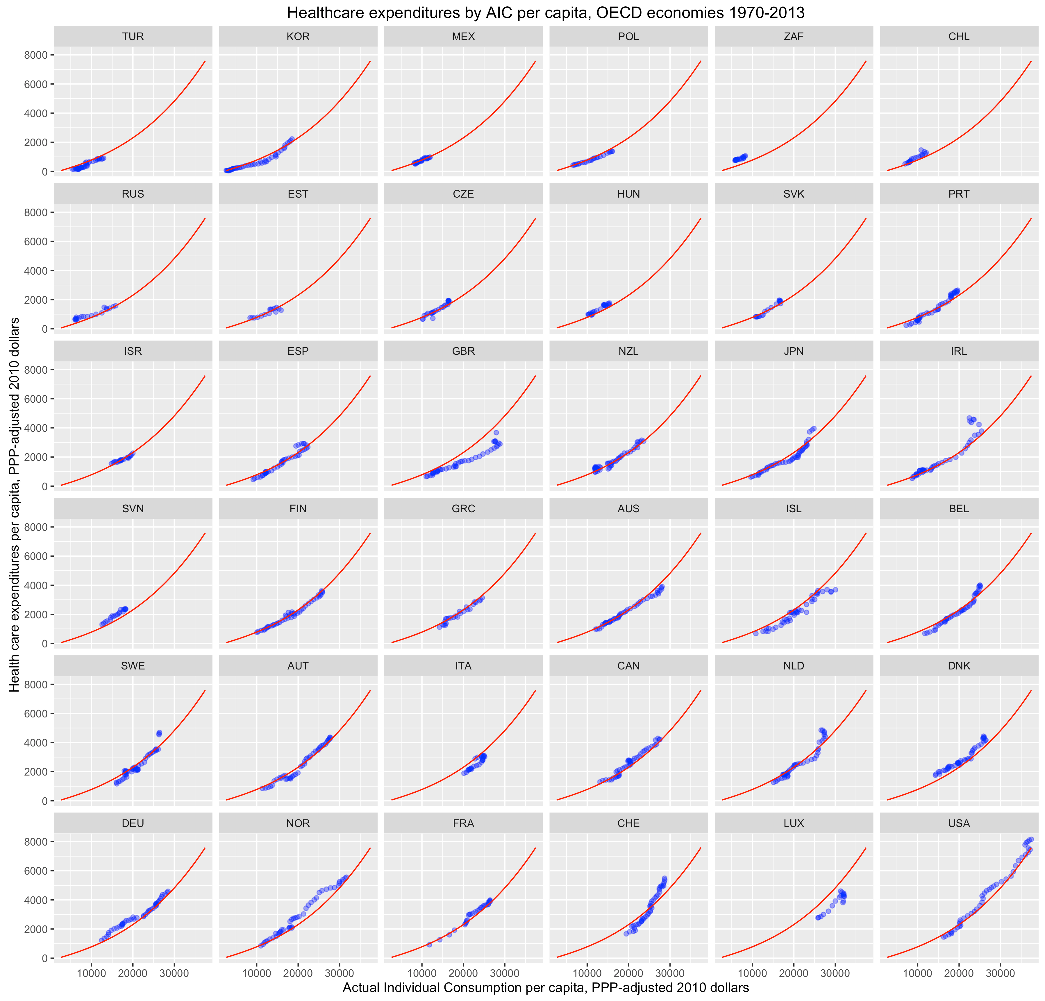
Noah seems to be under the impression that I need non-linearity to explain the United States, but I really don’t. The United States fits on a strong trend in current high-income country data. The need for such models only becomes readily apparent when the range is substantially larger7, as in, OECD panel data or cross-sectional data for the entire world, but then a lot of other high-income countries also tend to approach “outlier” status in direct proportion to their real income levels. The polynomial curve fit to these regions is potentially consistent with a sigmoid curve, we just lack the observations to fit the flattening part of the curve.
We are far from spending 100% on healthcare today.
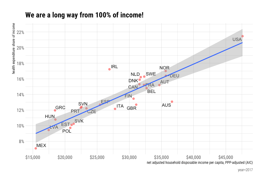
If we project the current slope out, it implies we’ll have a real per capita incomes north of $300,000 by the time this happens.
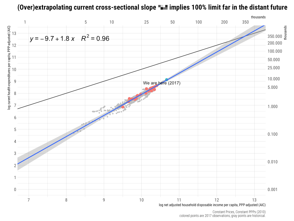
To be clear, I believe the health share can and will go much higher throughout the developed world before we start to see any sign of this slope appreciably leveling off. So long as these other categories of consumption are still significant and likely to see comparatively rapid productivity improvements, the relatively heavily demanded, relatively low productivity growth areas like health and education are apt to claim increasingly large shares of income.

Consider how much expenditures of this sort have already changed.

I don’t see why the food and beverage share cannot fall to less than 1% in principle, likewise for several other key categories. Such income-linked declines do not imply starvation any more than the declines we have already starved lived through in these areas resulted in “starvation” in the past. This simply implies we will be able to sate these wants in some distant future with effort equivalent to that which would be required to purchase the lint in my pocket today (and these fractional expenditures will likely still purchase lavish results by the standards of today).

No, I tend to think the reason why health might eventually flatten out significantly short of 100% is that health spending will ultimately be contending for incrementally larger shares of resources with other expenditure categories that won’t shrink because of some combination of relative prices (probably inherently lower productivity growth) and higher demand (income elasticity).
Even today, healthcare isn’t the only thing rising. Unless the productivity in these other categories skyrockets, with a corresponding decrease in expenditures to reflect lower prices, I wouldn’t expect these to substantially decline in the foreseeable future.
 [note: the quantities picture is appreciably right-shifted on the whole]8
That said, as these historically higher productivity growth areas shrink to vanishingly small proportions of consumption and lower productivity areas tend to be the ones rising in proportion (not necessarily exclusively so), I suspect the cross-sectional slope on income will tend to increase even as the rate of annual growth decreases with at least an apparent slowing down in measured real income growth (even with continued productivity gains their effect on income is likely to moderate as income shares converge on zero).
Despite the increasing attention paid to health spending, the rate of increase in health spending has actually declined significantly in the United States.
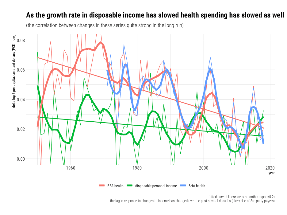
Likewise in most other high-income countries (usually in line with their income growth).
 If we reduce the entire economy to a two-sector model with high productivity growth (“goods”) and low productivity growth (“services”) where the high-productivity growth sector has combined demand elasticity significantly less than its rate of relative productivity growth (decline in relative prices), it shouldn’t be too difficult to understand how we can allocate ever-larger proportions of our income to these lower productivity growth areas while still expanding consumption at a fairly constant rate in the high productivity growth areas.
None of this requires the average price in the low productivity growth sector to rise faster than nominal incomes. Nor do we tend to find results consistent with this in wages, profits, and other proxies for (or presumed causes of) such issues in these sectors. On the contrary, the reliable statistics for healthcare (at least) shows prices have fallen relative to average nominal income and that most of the increase is therefore explained by rising real consumption (quantities per capita). These increases also parallel the growth in observable inputs in these sectors, such as the share of the workforce. Heroic assumptions must be made to explain such persistent patterns away.

Notes
(see below)
- On average! Some people may make poor choices (e.g., junk food) or consume less at home than prior generations, but the issues have little to do with affordability. On average, home cooks and grocery store shoppers are much better off than they were previously. Even though households spend much less on food as a proportion of their incomes, the expenditures they do make obviously go much further.
- This does not even include food purchased for consumption outside the home (e.g., restaurants, school meals, etc). Food outside the home has gone from ~0% a few generations ago to more than 50% of total food expenditures recently.
Although the service element to these meals implies a lower real amount of food per dollar spent, itself a strong indication of rising affluence, it nonetheless can be added to the total food conceptually.
It is also likely that Americans eat food outside the home much more often than our counterparts in most other OECD countries. One proxy for this is the falling amount of time spent cooking and cleaning up.
We can also see this in the PPP benchmark estimates for restaurants and hotels.

- Although this doesn’t explain much for healthcare writ large over the long run, it’s clearly true nursing wages increased faster than average wages in recent prior decades.
However, they started with low wages. This change is likely well explained by the changing skill mix in nursing (it’s more technically demanding than it once was) and the general increase in wages for women since the 50s and 60s as they entered the professional workforce.
Ultimately, more importantly, is that we have increased nursing and other healthcare worker density rapidly (and US density is much higher than most other high-income countries).
- Some countries may spend a bit more on a given component in conditional terms because of some idiosyncratic component to their relative prices or demand within that category.
- I believe the OECD PPPs are pretty sensible and reasonably reliable, but, I have doubts about education PPPs (similar issues exist for domestic price indices!). To a first approximation, they price education by the number of student-seat-hours and use test scores (PISA) as a quality adjustment. I actually agree that scores measure something very important, but test scores are substantially endogenous and the real inputs (e.g., smaller class sizes, more counselors, accommodations for the disabled, better amenities, etc) have at best negligible influences on them (not much does at the margins high-income countries are at today!). The high real inputs high-income countries allocate per pupil are near-impossible to justify based on their effects on test scores, and the cross-sectional PPPs they compute are consistent with this notion (no obvious correlation with quantity, probably less with adjustment for student density).
However, it’s also pretty clear that actual existing people value other things besides test scores. Like it or not, rich countries are to some extent buying more accommodating atmospheres and consumptive experiences for their students (especially in higher ed). That is clearly not being accounted for here. I question the utility of a price index that bears little resemblance to what parents, students, voters, and the like so obviously want.
I’m not necessarily saying I want our schools to spend more money than they already do (I don’t). I believe there are useful conversations that could be had around affordability and associated tradeoffs, but if we priced the consumptive aspects of education like we price, say, hotels or restaurants, I’d bet we’d see significant growth in the implied quantities with rising income levels. In other words, real incomes are likely rising somewhat faster than published estimates of the real rate because the education quantity index rises less than it probably should (my two cents).
- We can observe something broadly consistent with the initial upward sloping part of the S-curve, but flattening of the curve part we can only make speculate about, even if informed by theory (which may not be correct).
- This isn’t to say the latent slope isn’t continuously increasing over the range observed in recent high-income cross-sections, but when the true curvature is subtle over the range it takes a lot of more data points to reliably detect this!
-
Although some quantities don’t rise as fast as expenditures (services), no major category is actually falling in real terms.


thank you for your service
Wow, this is a remarkable (and polite) response to a pretty major (and glib) lack of comprehension. I’m glad that Twitter person misunderstood your point so completely, so I could benefit from this excellent layman’s explanation. Thank you.
Throwing a brick at the fly on the window is always a sound strategy, but choosing a brick of plutonium has undeniable élan — sometimes, you need to be sure.
RCA, thanks much for your posts and analysis. It takes a long time to write them, and an even longer time for me to completely internalise your points and conclusions.
However, if you see many of the posts or “rebuttals” to your claim it’s mostly cherry-picked cases (comparing individual treatment costs within, and outside US), or examples of subsections of population that are suffering from rising health care costs that are seemingly at odds with their income increases.
Most of your analysis that I can recall are to do with averages (sorry if I missed it), and not different subsections of the population, some of whom might not be able to afford world-class health care. The averages do tell an important story, but as an individual, it is far from a satisfactory explanation and it’s hard to relate to for many.
A case in point: if the rich see an exponential increase in income, and are willing to spend more on health care, then the averages might be skewed heavily towards the rich. I see this post (https://randomcriticalanalysis.com/2018/01/20/on-the-relevance-of-the-income-inequality-to-expected-health-expenditures/), and I am still reading through it, but most of the points seemed to be cross-country comparisons than within-country comparisons.
Could you point me to some of your analysis where you discuss a breakdown of healthcare expenditure as a function of their disposable income for some suitable subsections of population? Ethnicity wise, age wise, state wise, income-class wise, etc.? The other question is also whether there’s a feedback effect, that’s preventing (sections of) people from spending and, well, living in a poorer state of health. If such feedback effects exist, they may not show up in the data, would they? Some analysis on this front (or pointers to posts if you’ve already done them) would be quite useful.
Thank you.
In my opinion, the average is the best unit of analysis for this because that is the best indication of social capacity to pay. It’s also just about the only way to make direct comparisons between countries currently. When people talk about the cost of US healthcare, they’re invariably comparing averages (per capita or % of GDP).
One thing to keep in mind is that the costs are heavily socialized (dispersed) throughout the developed world, whether through taxes or insurance premiums (the expected benefits to be paid on behalf of specific covered individuals are rarely well reflected in the premiums paid on their behalf). Health spending is also obviously highly concentrated. A small fraction of the population (the sick) accounts for almost all health spending in any given year (they’re clearly not paying for more than a small fraction of their costs). Some people seem to think this is unique to the United States, but the best available evidence and (IMO) common sense suggests this a common feature of healthcare systems in the developed world.
https://journals.plos.org/plosone/article?id=10.1371/journal.pone.0217353
Likewise, the evidence suggests there is little to no relationship to individual income. On average, the rich don’t consume appreciably more than poor. Indeed, the evidence tends to suggest it’s somewhat the other way around, but the effects are fairly modest in the scheme of things in any event.
https://randomcriticalanalysis.com/2017/04/15/some-useful-data-on-the-dispersion-characteristics-of-us-health-expenditures/
I would agree with the overall statement, but not the premise that “the average is the best unit of analysis.” It’s often hard for an individual to empathise with the society at large, at the end of the day they each one has to meet their ends meet and pay for healthcare.
That’s a fair point about lack of data across countries to make more comparisons.
That’s interesting and partly answers the question I had earlier. The graph I had in mind (we could discuss whether it would be useful or not) is this: take the first plot in [1, under heading “Six”], and for each decile capture the healthcare expenses as a fraction of their household disposable income.
My hypothesis: The pain point here is that for lower income deciles, the net healthcare expenses (premiums + deductible + copay + out-of-pocket expenses) would be a much higher fraction of their total disposable income.
The hard question is the healthcare the poor are missing out (and hence might not show up in data) because they will be unable to pay for it. The point that advocates of universal healthcare might be making is this: people in every income decile (in the graph I referenced above) have access to the same healthcare at the same (free) cost. (But paid for proportionally through taxes.)
Whether the rich pay more to get better, faster service can be considered separately.
[1] https://randomcriticalanalysis.com/2018/01/20/on-the-relevance-of-the-income-inequality-to-expected-health-expenditures/#rcatoc-six
Hi @rcafdm,
It seems like a point in this post (https://randomcriticalanalysis.com/2020/02/13/its-still-not-the-health-care-prices-2017-edition/) and this article linked from the above post (https://onlinelibrary.wiley.com/doi/epdf/10.1111/1475-6773.13258) both confirm the hypothesis above. Would the interpretation be correct?
Another thing I’ll add is that US out of pocket costs are probably a little lower than the OECD average as a share of expenditures and that they broadly track with our (mean) income levels.
Also, higher income people pay for somewhat more of their healthcare out of pocket than lower income groups (likely explained mostly by the payer mix–higher % of public plans for lower income and, amongst those with private plans, likely skews towards somewhat lower deductibles, copays, etc)
https://twitter.com/RCAFDM/status/971057759050518528