A response to my least charitable critics on health care

Alex Tabarrok of Marginal Revolution linked to my primer and other research on health care recently.   This brought a lot of extra attention to my work.   Most of the response was positive, I think, but several people angrily lambasted my analysis.  The adverse reactions generally amounted to little more than name-calling, and much low-quality material was amplified by the usual suspects.

screenshot_5873.png

I will not respond to name-calling.  I will, however, reply to the few seemingly substantive critiques for the benefit of those that have trouble recognizing how weak these arguments are.   I will also use this opportunity to drive home the point that health spending growth has clearly been increasingly non-linearly as a function of income, with the slope increasing, increasingly, in global cross-section and OECD panel data analysis.  Indeed, I will show that the constant rate of relative increase implied by log-log regression specification, which triggered certain people, tends to underestimate the slope at higher income levels significantly.

Noah means Noah: the high income-elasticity of health expenditure does not mean we are all going to starve!

On Twitter, the other day, Noah Smith (@Noahpinion) argued the mere fact my model shows the income elasticity of health expenditure is greater than one implies these higher-income regimes are “starving themselves to death” to pay for healthcare.

screenshot_5428.png

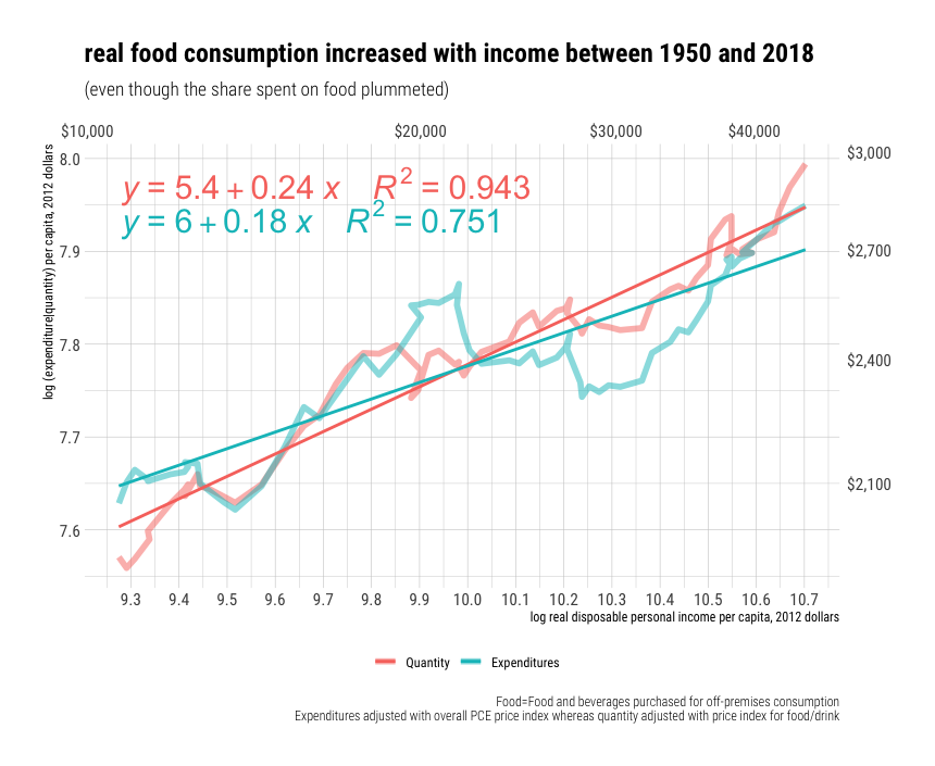
Noah does not seem to appreciate that (1) my independent variable, income, is measured in real terms and (2) the relative price of expenditures changes systematically with incomes.  Real income levels are overwhelmingly determined by productivity.  As incomes rise, it generally takes less input to obtain the same quality-adjusted quantity.   It is quite possible to allocate less input (especially human resources) to a given expenditure category and, simultaneously, to consume a larger quantity of that category per capita.  The rise in productivity leaves room to increase real consumption.

rcafdm_oecd_income_health_elasticity_2017.png

Above and beyond the real income growth (i.e., the decline in average prices relative to nominal income levels), prices move relative to each other.   Relative prices are systematically related to real income levels (spatially and temporally).  Some prices rise relative to other prices due in large part to inherent differences in potential productivity growth and their exposure to the domestic labor costs.

Relative prices are clearly very much related to income growth, but relative prices are nonetheless an important partial conceptual explanation for the changing consumption share.  Broad price indices are useful statistical tools, however, they hide significant systematic differences in underlying prices that are necessary to understand differences in material living conditions over time and between countries.

On school quality, test scores, and SES

I am going to share a little analysis I’ve done by combining Pennsylvania’s PSSA test scores, Census ACS data,  and Department of Education statistics to refute a few popular progressive notions about education, namely, that:

1: The SAT/ACT only “measures family income”:

SAT_scores_by_income

2: This is somehow being caused by more and better test prep efforts amongst the more affluent.

3: Higher income school districts are actually better because they spend more money.

Some visualizations of ancestry.com’s genetic data

As a quick follow up to my earlier post using ancestry.com’s “Genetic Census of America”, I thought I’d post some more heat maps using the data I aggregated by major continental group (“race”) and by the more granular “adjusted” European ethnicities (i.e., whereby I simply divide the ethnicity by the total european “ethnicities” in the state).

Note: You can click these images for an interactive view to see the actual numbers for each state if you care.

Adjusted European Ethnicities

Google Chrome (8)


National Healthcare Expenditure: United States versus Other Countries: The US is not really an outlier.

UPDATE (9/25/2016): I just created a new and (hopefully) much improved version of this argument here.  I suggest you start there instead.

Numerous people have asserted that the United States spends dramatically more on healthcare than other countries, presumably even more than countries of our level of wealth and affluence, and that this can only be explained by the fact that we do not have single-payer or some such.

Here are some examples graphs used to make this point

Above-expected-500x406 (1)

health-care-spending-in-the-united-states-selected-oecd-countries_chart02

These appear to be very convincing at first blush, but i never found these arguments particularly convincing due primarily to:

  1. Imperfect comparability between the selected countries
  2. Issues relating to comparing countries of the “same” GDP
  3. cherry-picking of countries

I knew the proponents of single-payer were, at best, making an incomplete argument and that it invited an exaggerated impression of what we should likely expect from a country like ours, but, up until now, I lacked the data and the time to present these argument comprehensively.  I recently got in an argument with someone over this subject and found a treasure trove of data all in one place (mostly) to thoroughly debunk this overly simplistic argument.

To make my points, vis-a-vis fundamental issues with naive treatment of GDP per capita and sensitivity to comparison countries, here is a quick chart showing National Healthcare Expenditure (NHE) as a percent of GDP by GDP per capita

NHE_as_Pct_GDP_by_GDP_per_capita