The OECD just published its PPP benchmark data for 2017, which contains the best and latest international estimates of price levels for health care. The OECD health PPPs and associated research are probably the only reliable international comparisons of health care prices. Although I have already presented data from several rounds of OECD’s analyses (as have they) and found consistent results, the latest data indicate these patterns have not changed appreciably. Clearly, these results are not flukes.
GDP basis
Like the US time series, health care prices are still increasing less quickly than income in cross-sectional analysis, and the United States is still far from an outlier.

The United States, for example, has real GDP per capita, approximately 41% greater than the EU28 average, while the weighted average price of health care is around 28% greater. Relative to income, this implies health care prices are more affordable.
Although the narrower hospital services category (mostly inpatient surgical procedures) is much more labor-intensive, and therefore likely to be most subject to Baumol’s effect, these prices still aren’t rising more rapidly than income as indicated by GDP, and the US still isn’t the outlier it is alleged to be. The best available evidence strongly suggests the belief that “it’s the prices” is gravely mistaken (these arguments were based on unreliable evidence).

Household basis
I led with GDP because that’s the conventional choice. I don’t need to break with convention to plainly show that prices are not the determinant of health spending that many imagine it to be, nor do I need to do that to show US health care prices are very much consistent with its income levels. However, GDP is not the best indicator of the household perspective (their material living conditions). The price level of GDP is also not a great indicator of spatial differences in opportunity costs faced by households for their comprehensive consumption expenditures.1 Indeed, these same OECD researchers use AIC to predict prices and plainly prefer it over GDP.2

Here, too, we find health care prices are not rising nearly as rapidly as household disposable income or consumption levels.

While US real consumption is ~54% higher than the EU28 average, its real price of health care is just ~32% higher. The patterns for hospital services are broadly similar, as we found with GDP.

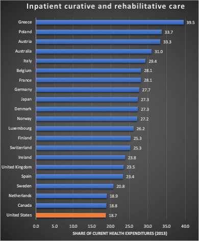
Though hospital services (primarily inpatient) are clearly significant, and clearly a source of some excess price inflation, it accounts for much less than 100% of spending. In the United States, inpatient care accounted for about 18% of spending in 2013 (a bit less than some high-income countries). It’s likely the rise of ambulatory care in HOPDs and ASCs, which the US probably does more than most, has helped keep price growth down as these methods tend to deliver care more efficiently (which ultimately means lower prices). On top of this, higher-income countries like the United States are also able to procure goods much more cheaply in general (e.g., generic drugs, devices, disposables, etc.), so overall health care can rise much less rapidly than inpatient hospital services.
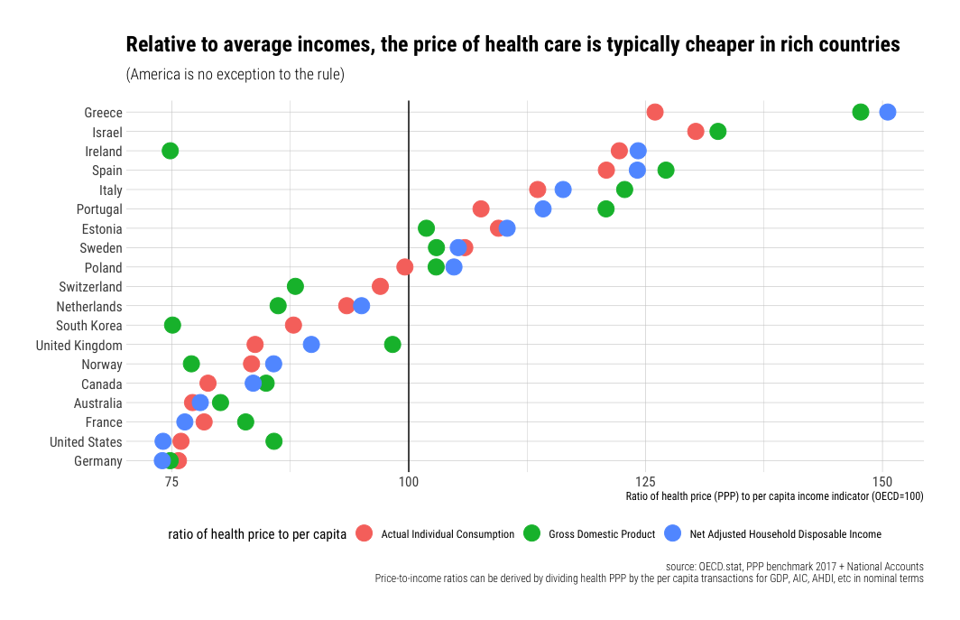
Price ratio-to-income ratios decline with income
As I have observed in the US time series, overall health prices tend to fall with incomes in cross-sectional analysis. This should be apparent from my charts above, but to make this abundantly clear, we can plot the ratios.

Directionally comparable results are obtained for hospital services. The real price of procedures may be lower in Spain and Greece, for example, but their incomes are lower still.

Since I know some of you will protest “but inequality…”, please realize that the costs of health care are almost entirely socialized in the developed world, and the ability to spend on health care is much better indicated by the mean than the median or some other arbitrary inequality-adjusted income measure. Indeed, lower-income households in the United States consume a disproportionate share of health care while higher-income pay for an even more disproportionate share.

Between countries, spending is almost entirely determined by the average income level, whereas within nations, spending is determined mainly by need and propensity to seek health care. Spending is highly concentrated throughout the developed world, but this doesn’t have much to do with individual income. Indeed, because lower-income, less educated individuals tend to be less healthy for a variety of reasons, they tend to consume more health care.
Rich countries consume much greater quantities of health care
The higher shares of income spent on health amongst rich countries are not explained by prices. Rich countries to spend a much larger proportion of their income on health care because they consume much more of it in real terms. Indeed, though the real price of health care and other services tends to be higher in higher-income countries, these prices rise less quickly than incomes. The same income share actually buys a significantly larger quantity of health care in the United States than in most lower-income countries.3
OECD provides actual quantity (“volume”) estimates of health per capita using National Accounts (SNA) for health expenditures. Their data implies that a 1% increase in household consumption (disposable income) predicts a 1.1% increase in the quantity of health care consumed per capita.

However, this is surely a significant underestimate of the health consumption of resident households. We can produce a better estimate using the more conventional current health expenditures derived from health accounts (SHA) along with the PPPs for health.4
 These large differences in quantities per capita are consistent with the inputs (e.g., labor) rich countries put into health care, the modest relative costs of these inputs, and their generally higher levels of productivity.
Modest price-to-income ratios and high costs are perfectly compatible
Health care costs clearly rise rapidly with income levels. As a long-run determinant of spending nationally, it’s probably the only variable worth talking about, and it’s probably almost entirely causal.
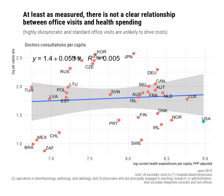
 Yet the reliable price evidence suggests prices are not rising faster than incomes. Indeed, price-to-income ratios have fallen in the United States, and they appear to decline with income in cross-sectional analysis. There is very little reason to believe income should be so tightly linked to higher needs. If we check probable correlates of need, such as age structure or rates of diabetes, we find very little to suggest a significant, let alone a robust relationship. Likewise, if we look a bit downstream at the number of encounters per capita, we find bupkis, not in ambulatory and not in inpatient settings. In short, things that seem to predict spending within countries are basically meaningless across countries in the long run. This is overwhelmingly a story of income as income level effects.
Rich countries consume much more cutting edge health care technology (innovations). For every 1% increase in real income, we find a 1-3% increase in organ transplant operations, a 1-2% increase in pacemaker and ICD implants, a 1-2% increase in the density of medical imaging/diagnostic technology, and likely similar patterns for all manner of other new technologies (e.g., insulin pumps, ADHD prescriptions, etc.). Obviously, these indicators are just the tip of the iceberg. Still, where data of this sort are available, they tend to be highly consistent with extreme income elasticity (particularly newer, more expensive forms of health care). In the main, costs rise because this technological change tends to requires a lot more people in hospitals and providers’ offices to deliver this increasingly complicated array of health care (surgical procedures, diagnostics, drugs, therapies, etc.).
If we examine the international data, we can calculate the average cost per encounter as others have done for the United States in time series. Although price-to-income ratios tend to decline with income, it’s evident the average cost per encounter rises more rapidly than incomes in hospital inpatient settings.

We find an even steeper slope for the implied cost per encounter for ambulatory care.
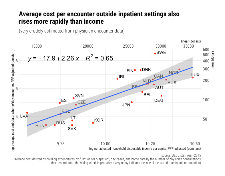
Expressed as income ratios, costs per encounters clearly rise rapidly despite no corresponding pattern in the income-ratios for price levels, wages5, and most other inputs. Indeed, these ratios generally trend downwards with income levels.
This is all very consistent with countries adopting increasingly cutting-edge health care as they grow wealthier. Although some of the residuals can no doubt be attributed to idiosyncratic variation in patient mix and use of inpatient-vs-ambulatory care, not to mention some measurement error, the underlying signal is still quite strong. Costs per encounter are clearly rising faster than incomes. I submit rich countries spend more almost entirely because they can, and that higher levels of expenditure are nearly altogether real. Still, the quantities of health consumption are driven mostly by intensity rather than utilization (which does not appear to be appreciably related to income or health spending). “Costs” rise relative to income even though prices do not.
The same sort of patient with the same kind of underlying conditions will get treated very differently in rich countries than in poor countries. For example, an otherwise similar 60-year-old man complaining of chest pain is much likely to get diagnosed with state-of-the-art equipment in higher income, higher spending countries and eventually receive treatment (newer pharmaceuticals, surgery, pacemakers, etc.) at inherently high cost than in poor countries which are much more likely to send the patient home once it’s been established that he doesn’t need urgent medical care (“take two aspirin and call me in the morning,” in other words). Other things equal, countries with a marginally higher objective need for health care (age, disease burden, etc.) are likely to balance their spending by using by slightly less technological innovations. Similar balancing relationships likely apply to variations in price-to-income ratios.
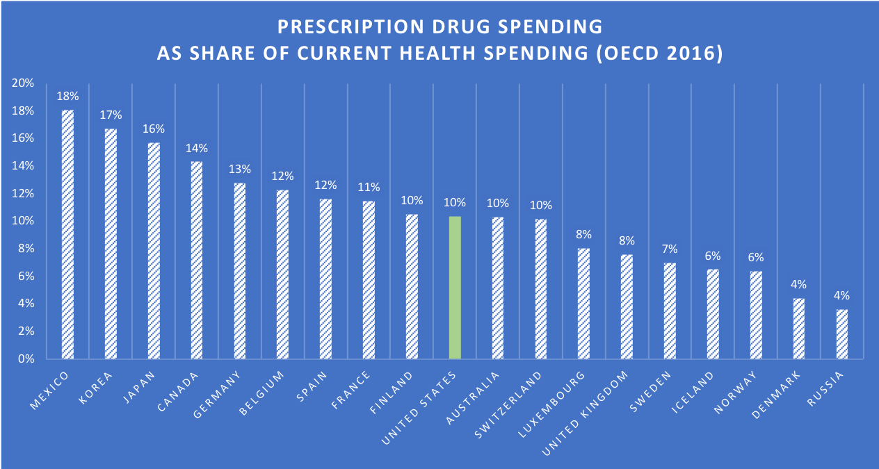
Even our famously high drug spending is better explained by technology than prices
Setting aside the fact that (1) pharmaceutical spending is very much factored into OECD’s health PPPs (2) prescription drug spending isn’t that much higher as a share of income and (3) it clearly isn’t all that important as a weight (~10% of spending), credible evidence suggests our drug high expenditures are driven by more use of new medicines than by prices.
If we view price indexes for a US market basket, we find most high-income countries are within 20-30 percentage points on an exchange rate basis.
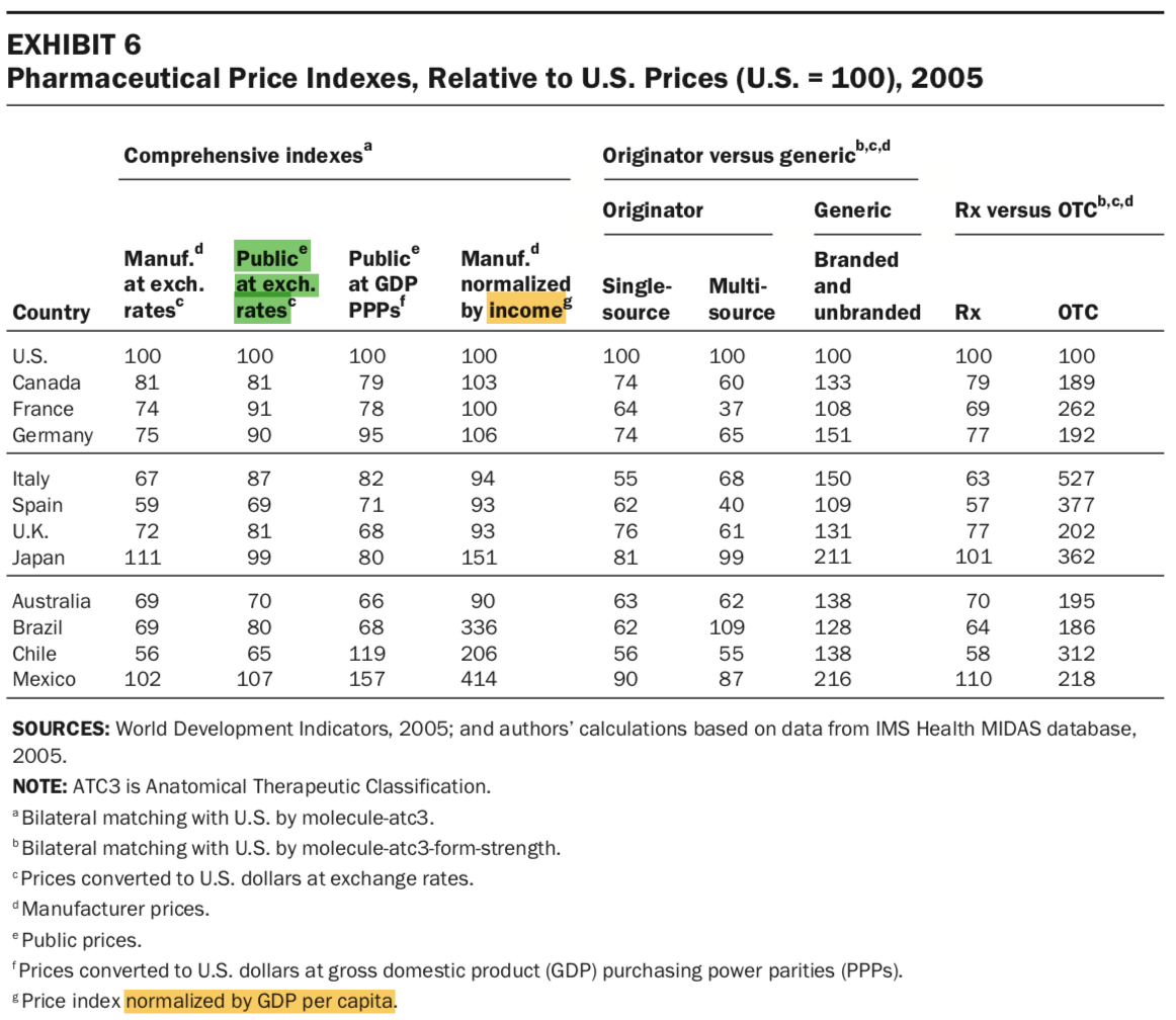
When normalized to income, these gaps shrink for the United States while they expand rapidly for developing countries (despite their discounts). You might also note that the average price paid for generics (branded and unbranded) outside the United States is substantially higher. Generics account for roughly 90% of prescriptions in the United States, so these differences are non-trivial. The US distribution chain and pharmacy retailers seem to be more competitive as they have smaller distribution margins.
cross-country price comparisons are only meaningful if the right prices are compared in each case….different studies may show different results, if prices across countries are not selected carefully. In this paper, we have demonstrated how significant price differences are when ex-factory prices are compared and how these differences narrow down significantly when public prices are compared across countries….it seems that price differences between the United States and Europe have been exaggerated….A very important aspect is that comparison of ex-factory price differences…. can be meaningless as they do not reflect what health insurers pay in the United States…..product age is an important determinant of drug price differences. Newer products or classes of products are on average higher priced than older (classes of) products across all settings after having controlled for other factors.…when conducting cross-national comparisons of prescription drug prices it is important to know what prices are compared and to ensure that such comparisons use the same denominator across countries. Misperceptions often occur about price levels across countries, particularly when list prices are confused with public prices. List prices coincide with public prices in European countries, but this is not the case in the United States.


This price index implies that if the cheapest countries were buying the same basket of drugs as they consume at home in the United States, they’d only pay around 25% more at market exchange rates (considerably less than in many). This is also presuming these estimates aren’t skewed high by manufacturer rebates, which are likely to be particularly significant in more recent US data.

While drug prices explain relatively little for the United States, it’s quite evident the United States adopts new drugs much sooner and much more intensely. These differences are particularly stark when we compare the United States to developing countries and the rare high-income countries known to exhibit high rationing efforts, such as the UK.
 Clearly, most other high-income countries don’t catch up with US usage until at least 11 years after launch and many considerably later than that. The sooner countries adopt drugs, the more they’re likely to cost since they’re still on patent, and there are likely fewer competing drugs (targets, mechanisms, etc.), but this likely relates primarily to income levels.
Incidentally, it’s likely nearly all the growth in drug spending in the United States over the past several years has come from specialty drugs. The exact definitions vary, but these tend to be inherently expensive drugs. This is precisely the sort of cutting-edge behavior that sets the United States apart from lower-income, lower-spending countries.


Effective cost containment hinges on curbing technological change
The few high-income country regimes that have had some measure of sustained success in their cost-containment measures (i.e., conditioning on the income levels that so clearly determine health spending), such as the UK/NHS, have pretty clearly done so by limiting access to high-intensity medicine. They curb growth by rationing. They ration by denying access categorically, and they ration by limiting the rate at which these technologies are employed by other mechanisms, such as long waitlists or eligibility criteria. In theory, these work, but these pressures don’t disappear simply because some technocrats are nominally responsible for making these decisions. Such methods ultimately prove unpopular with voters.6 The health regimes of high-income countries have been forced to retreat from aggressive rationing schemes as their incomes rise. As the distance between latent demand and the actual supply of these technological improvements rises, pressure surely mounts. These regimes show a strong tendency to cave to internal and external political pressures.

Notes
(see below)
- Just because the export of, say, machinery constitutes a disproportionate share of GDP, which is reflected in GDP expenditure weights and can be produced efficiently does not imply that similar efficiencies are observed by resident households for the goods and services they actually consume, not to mention the role of cross-border workforces (e.g., Luxembourg) and profit-shifting (e.g., Ireland) that are likely to further make GDP and its apparent price level all that much harder to interpret vis-a-vis real wage levels, profits, and domestic productivity.
- Curiously, they show prices using the price-level index (PLI). Although it indicates US health care prices are far below trend, PLIs are a strange choice for this application because it’s the ratio between the domestic price level and the market exchange rate.
Introducing an additional factor, exchange rates, is probably a mistake if we are interested in determining the price of health care relative to other goods and services in the same economy. It’s likely to be particularly misleading for the United States because it’s a reserve currency. Comparable patterns are found for GDP PLIs and others — the US prices are typically lower than that of other high-income countries. I think we’re much more interested in the price of healthcare as compared to a broad basket of consumption goods (e.g., AIC) than exchange rates, which will vary across the economy as a whole for a variety of reasons, so I’ve elected to show relative prices here, i.e., the ratio between (health|hospital) prices as a ratio of AIC and GDP prices. This tells us the opportunity cost in a way the PLIs cannot.
- This is despite the fact that adjusting for differences in the price of health care relative to a broader basket of goods (AIC or GDP) tends to marginally compress the spread of implied quantities. Higher-income countries are more productive at producing nearly everything, but their productivity advantages in goods production are systematically larger. Just because services tend to be relatively more expensive than goods in high-income countries and expensive for people in low-income countries do not imply they are expensive relative to the incomes earned within these same high-income countries. Baumol’s effect cuts both ways. Even people that aren’t directly involved in these highly productive industries tend to enjoy higher wages, largely by virtue of the country they reside in.
- OECD actually weights the health PPPs according to SHA, instead than SNA, so the health PPPs should even map better to SHA figures. Their reason for using SNA health rather than SHA to calculate volumes likely has to do with their overall mission to calculate PPPs for the entire economy (especially PPPs for AIC and GDP). SNA is largely concerned with production. They need to do things to reconcile final consumption in the domestic economy with the total consumption of households, such as adjusting domestic consumption expenditures in both directions by Net Purchases Abroad. The aims of SHA are different enough that they can’t just plug it into National Accounts without creating other headaches.
- Yes, I know physicians earn high relative wages. Still, their wages generally aren’t going up, and they account for a small fraction of the workforce. Physicians are not the explanation people believe it to be, and overall health care wages are not high in relative terms.
- Yes, I know the NHS is still notionally popular in the UK. That, however, does not mean that the things they do to contain costs are popular or ultimately sustainable.

USUALLY THE PROBLEM IS WHO WILL PAY EVEN IF PRICES INCREASE LESS THAN gdp THE LACK OF INSURANCE COVERAGE IS MORE THE REAL ISSUE