
Last week, Hubert Biscuit posted a response on Medium questioning the relevance per capita income to national health expenditures.
Here’s more on the debate about the source of high US health care spending. | “Are high US healthcare costs just an illusion?” by Hubert Biscuit https://t.co/bpcvo4gwoK
Note that nothing here argues for or against prices as the predominant factor.
— Austin Frakt (@afrakt) January 8, 2018
He believes that a distributionally-adjusted measure is a more relevant way of understanding health spending and that higher US income inequality implies much lower spending. Several others have also raised similar objections in response to my arguments on US health care over the past year or two.
I have several lines of response to these sorts of concerns.
One
There is little to suggest income inequality is a quantitively significant determinant of national health expenditures. High US health spending is primarily framed as being a consequence of uniquely American market failures, and reformers frequently imply the US could save one to two trillion dollars a year if only its health regime resembled pretty much any other OECD country. Causes matter. If it is true that health expenditures are almost entirely determined by average material living conditions, with little regard for its distribution, then the median or “inequality-adjusted” variants of these measures are not particularly relevant in estimating how much we would expect to save under a counterfactual health regime.
We might hope to cap spending at some arbitrary proportion of the median, but if the mean (conservatively) explains ninety percent of the variance in the long run and the multiple lines evidence indicate the distribution of income has little or no effect, it implies our above-average inequality does not fundamentally alter our expected health consumption. Ergo, it would also follow that US health spending is still well explained by the material living conditions of the average household, and there is still little reason to believe that replicating the sorts of health systems found in other OECD countries will result in substantial cost savings over the long run.
Let’s review some of the evidence.
WorldBank ICP data
I will start with the global cross-sectional data from the WorldBank’s 2011 ICP because it includes a much larger number of observations than OECD and because there is a much wider range of income inequality in this data.

And if we only include observations with Gini estimates available (2011 or nearest):

Gini is modestly inversely associated with AIC and NHE (colinearity is not likely to be a threat).

Subsetting the data to wholly exclude the US and only include those observations with values for AIC, NHE, and Gini so that we have identical data in all three models, we find the linear specification on AIC thoroughly mediates GINI in OLS.

Likewise in my preferred 3rd-degree polynomial specification.

If I fit a 3rd-degree polynomial model against the complete dataset (i.e., including those without Gini estimates), excluding the US, and then plot the residuals by Gini, for those countries with conventional estimates available, tI find nothing to indicate this model is likely to be significantly biased with respect to measured inequality [even though that particular model may slightly underpredict especially high-income countries]

That inequality would be leading us badly astray in the global data vis-a-vis the US seems even less likely given the US’s middling income inequality by global standards (which would be even less remarkable relative to potential inequality)

OECD data
I used OECD’s income distribution database (IDD) to obtain estimates for pre-tax/pre-transfer income (market income) and post-tax/post-transfer income (disposable income).
Here is a scatterplot matrix of the 2014 OECD data.

You might notice inequality is modestly inversely associated with both HCE and Net Adjusted Household Disposable Income (NAHDI); somewhat more for disposable income (TOT_GINI) than for market income (TOT_GINIB) in both cases. Countries with more inequality are statistically more likely to have lower average income and lower HCE per capita.
Because there are not enough observations for specifications with polynomials and other covariates without risk of serious overfitting, I’ll use the HCE share of disposable income as a dependent variable since it somewhat mitigates the need to account for the observed non-linearity and may also be a slightly more intuitive way to reasoning about this. To remind you, the share of disposable income consumed by health rises remarkably with mean disposable incomes.

In OLS, when we exclude the US in this data (2014), we find the distribution of market income is only modestly correlated (r=-.17) and appears to be entirely mediated by mean disposable income.

If we, again, exclude the US, but this time use the disposable income inequality, instead of market income inequality, we find something mildly suggestive.

This implies that a one standard deviation increase in disposable income inequality is associated with just 0.7 percentage points less HCE as a share of mean disposable income. However, before you get too excited, keep in mind that the slope on NAHDI is practically identical and the US is well within a standard deviation of much of the OECD by this measure (especially other Anglosphere countries).

I suspect this substantially over-estimates the real effect, but, even if it is correct, it suggests the US is likely to be much more distinguished by its exceptionally high average disposable income than by its elevated estimated (cash) disposable income inequality.
To illustrate, let’s compare actuals versus fitted for 2014 when the US is excluded from training data.

And if we include the US in the model:

Reasonably close in both cases, I think.
OECD’s IDD data, like most other survey-based estimates of the distribution of income (including substantially all estimated medians and related measures along the distribution), excludes health benefits and excludes essentially all taxes that are not income or payroll.

source
In other words, this doesn’t even necessarily tell us that countries with more equal distributions of adjusted disposable incomes, which would factor in the effects of all of these other taxes (e.g., taxes on benefits and consumption) and all significant social transfers in-kind (e.g., health, education, etc.), can be expected to spend even a little more.
That this flickers in and out, depending on the countries included and the year, suggests disposable income inequality isn’t likely to be particularly influential and that it may well be spurious.

Likewise, if I repeat model three for all years where we have a half-decent number of observations (n>=10):


And with the US:

And the effect of the distribution of market income hovers around zero.

Overall this evidence suggests that the mean is still the overriding determinant and that we need not pay particularly close attention to available estimates of the income distribution. This particularly appears to hold for market income inequality whereas disposable income inequality, though sometimes statistically significant, may be confounded by factors unrelated to the distribution of income itself.
Two
Some individuals have suggested alternatives to the mean. For instance, in his Medium post, Hubert adjusted NAHDI by income inequality estimates from the World Bank and plotted HCE.

I was able to approximate his results, though I don’t think it makes a lot of sense methodologically or analytically.

This correlates OK, but the correlation is nonetheless substantially better with the unmolested mean on the same set of observations.

To put this in perspective, I introduced a non-trivial amount of noise to NAHDI (via the jitter function with factor=1500) and still, I obtained a pretty decent correlation the first time around.

That it still correlates clearly does not tell us that this procedure has any value. Indeed, given that it definitionally introduced pseudorandom noise, we pretty well know that the only reason the resulting variable correlates is that it’s exploiting the underlying signal from the mean (NAHDI). And if I throw it in OLS (excluding the US), I find the real NAHDI mediates it in model three.
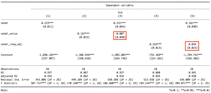
Much the same goes for the “inequality-adjusted” NAHDI in model five. The pattern we find with the inequality adjustment is consistent with adding noise.
Another person suggested using median income in the denominator in the same post. This strikes me as a sounder approach than the prior adjustment technique, so let’s run with this for awhile.

Again, we find the mean fits the data better.

And if I throw it in the OLS, it is substantially mediated by NAHDI (mean).

And entirely mediated if the US is included:

That the median might move the needle a bit does not necessarily tell us that this has anything to do with the distribution of income per se.
As I mentioned earlier, OECD IDD is (1) a survey-based measure and (2) only measures cash-income. This may have information that does not relate to the distribution of income as much as how much actually appears as cash (versus in-kind). The ability of some countries to capture more of the income on surveys may also signal something about a nation independent of the income distribution or the flow of national income (It may also be pure coincidence).
To this end, we see some similarity with the surveys’ estimated mean disposable income (same definition and methodology as used in the median).

Though it is somewhat more mediated by NAHDI than the median, it still nudges the NAHDI coefficient, and the survey-based coefficients (mean_di vs. median_di) cannot be distinguished statistically from one another.
Likewise, if I plot the survey estimated mean cash-disposable income the US appears to every bit as much the outlier as it was with its median counterpart (which indicates this has less to do with distribution than what is being measured).

Further, if I plot the IDD disposable income Gini by the ratio of mean disposable income (i.e., disposable cash income as estimated on surveys) to per capita NAHDI (i.e., comprehensive disposable income as estimated from national accounts), standardized for each year to remove potential time bias, I find that these variables are correlated.

This ratio is also correlated with health spending.

This suggests our interpretation of income distribution indicators (e.g., median, Gini, etc.) are likely to be at least partially confounded by one or more unobserved variables that are being reflected as a disagreement between the surveys and national accounts.

Lastly, on the same set of observations, the r-squared coefficients are higher in all but one year with the NAHDI than the survey-estimated median. The r-squared coefficients for the survey-based estimates of mean and median disposable income also look near identical to my eyes.

When we include the US, NAHDI leads in every year and to a more significant degree.

Keep in mind that those countries reporting survey-based disposable income statistics are much fewer in number than what we can obtain for per capita National Accounts statistics like AIC and NAHDI. Besides the limited and ambiguous utility of these distributional measures, we just have much more data to work with using per capita NA measures of this sort.
When we expand to include all available observations found in OECD’s data, the r-squared coefficients for AIC and NAHDI are quite stable and hover at a higher average (probably not just range restriction)

(The high r-squared values above are despite a broader range of income levels and significant curvature in the relationships. If a non-linear specification were used these would tighten up a good bit.)
These survey-based estimates of disposable income are likely to lead us astray in large part because they’re noisy, incomplete indicators of household income.
Three
Health expenditures are rising faster than incomes and consumption at the bottom of the income distribution throughout the developed world.
We can infer this pattern with a high degree of confidence because:
- NHE has increased much faster than mean incomes or consumption throughout the OECD.
- The correlation between individual income and individual health has long been less than or equal to zero (even in the US)
- Disposable income inequality has surely not decreased dramatically.

We can see that government health expenditures account for a large part of disposable incomes across the OECD.

source
We can also see that these expenditures are not being distributed more to the rich than the poor.

As average material living conditions have improved, the health share of consumption has increased along with it:

We can also see this cross-sectionally with respect to NAHDI (mean).

For comparison’s sake, even if we exclude the US (the presumed outlier), this relationship is ambiguous with median (cash) disposable income in the denominator.

Multiple lines of evidence suggest individual income is a terrible predictor of health expenditures. Mean health consumption in the first decile of income is approximately the same as the mean health consumption in the last decile (maybe actually slightly more in some countries, including the US). The relative lack of inequality in health consumption has implications.
If one were to plot per capita health expenditures by disposable income for each decile of per capita disposable income it is likely it would look roughly like this stylized plot.

Individuals in the bottom decile in Norway [point A] have markedly lower real incomes than individuals in the top decile in Poland [point B], but it is nonetheless the case that they consume many times what their more affluent counterparts in Poland consume on average. This obviously also means they consume a much more substantial proportion of their comprehensive disposable incomes as health despite lower individual disposable incomes.
This should hardly be surprising because humans treat health very differently than most other activities. We tolerate very little health inequality and engage in all kinds of interventions to eliminate or mitigate it. I would bet many of the people arguing most stridently that US health spending is excessive would be amongst those most concerned if it were to be discovered that the top of the income distribution was spending two-to-three times more than average on health and getting potentially better health care as a result (even with nary any evidence suggesting it moves the needle on outcomes).

source: GSS, year=2000
If we do not allow meaningful inequality in health, why should we expect the income distribution to be a particularly significant determinant of health spending? Why should we expect mean health expenditures to track with median income as opposed to the mean (particularly when the survey-based distribution estimates are likely to be much less reliable than the National Accounts-based mean)?
Four
US’s high health consumption in relation to (estimated) median disposable income might suggest to many that we should expect relatively less consumption in other areas.

However, it’s actually mirrored by high real consumption in virtually all other significant categories of expenditure, and many of them are well above the median income trend.

[Note: These are volume indices (adjusted by the price level for each individual category). They’re taken from OECD’s PPP benchmark survey — table 1.10]
Indeed, the better correlated the category is or the higher the elasticity, the more likely the US is to stand heads and shoulders above the rest.
The median is not a particularly good way to understand consumption patterns, especially not when combined with reliability and comparability issues introduced by those surveys, but I include to make a point.
We can see that most of these correlations tighten up with NAHDI and the US falls closer to trend.

This shouldn’t be surprising because both of these measures are derived from National Accounts, and NAHDI is little more than AIC plus household savings. Indeed, AIC and NAHDI are exceptionally well correlated in the OECD, which indicates that differences in housing savings rates aren’t particularly influential.

US consumption is neither particularly low or particularly high in relation to NAHDI.
The same necessarily applies to savings, but I’ve plotted this to make it clear.

US household wealth is surely not below average with respect to Net Disposable Income either (broader concept).
If one imagines that the top 1% explains US’s exceptionally high NAHDI, think again. US consumption is quite broad-based. It seems unlikely on its face that the ultra-rich are driving such high consumption, but let’s look at some other lines of evidence.
For example, we find that lower-income households in the US have larger houses with more rooms per person than their counterparts pretty much anywhere.

Lower-income Americans have larger houses than many people in relatively high-income groups in much of Europe.
And if we compare the amenities found in these homes as ownership rates, it’s quite clear this sort of consumption has long been a widespread phenomenon.

source
(this may be a bit dated, but it’s still instructive)
Americans also own far more cars per capita.

It is unlikely the “top one percent” would badly skew an actual quantity measure like this, and the US would jump far off trend if we were to plot this by the reported median disposable income.
Americans also eat out much more often than their counterparts in Europe (which tracks with the AIC and NAHDI). I don’t have the restaurant statistics handy, but we can proxy for this using time spent preparing food and cleaning up.

While there may be some idiosyncratic cultural component to this, these are surely not the habits of a materially impoverished people with too little real discretionary income.
Likewise, even surveys of households with school-aged children find US households compare favorably in household possessions in every round of study.

We find this in spite of differences in TFR, family structure, and changing demographics amongst the school-aged especially, i.e., this is likely to understate the current position of the broader population. Given the ceiling on the answers and the sorts of questions that were posed, these aren’t likely to be explained by the rich bringing the mean up. Obviously, if this were plotted as a function of the supposed median, the US would jump well off trend.
To this point, even after the authors adjusted for inequality in possessions the US still ranked number one.

The vast preponderance of the evidence indicates that the typical American consumes substantially more than his counterparts in Europe, including those in relatively high GDP countries, such as Norway, Switzerland, and Luxembourg. While health surely consumes a substantially larger than average share of his income (however measured), this tracks with the (better measured) mean and the elevated percentage apparently does not translate into less real consumption as compared to his counterparts in Europe (Nb, part of the problem is that the PPPs are weighted in such a way as to systematically underestimate the apparent purchasing power with the residual consumption).
Despite the rapid growth in health spending relative to median incomes and presumed lack of increase in middle incomes, it is nonetheless clear that real non-health consumption is much higher and much more broad-based than it was 10, 20, or 30 years prior (particularly in when adjusted for household size).


Of course, the high health share of disposable income has real opportunity costs for millions of Americans, and there are all sorts of arguments one can make for providing lower cost healthcare options. My point, however, is that much of the widely cited data presents an overly pessimistic view that severely understates the material position of the typical American household today.
Five
American inequality is likely substantially over-estimated as compared to the OECD. I mean this especially regarding the distribution of comprehensive disposable income (e.g., NAHDI) and comprehensive consumption (e.g., AIC).
We can see some evidence of this in in estimates produced by an OECD working group on the distribution of income and consumption in a National Accounts context.
We see this quite clearly in their consumption estimates.

With Actual Final Consumption, which is the micro-data analog to AIC, they find US consumption inequality is very average amongst countries for which they have data. Many of these nations are indicated as having substantially less income inequality in other, less comprehensive, albeit widely cited estimates.
I, for one, believe the consumption estimates are closer to the actual distribution of disposable income than available income estimates due to issues with the surveys (e.g., the scope, the accuracy of responses, etc.).
This same working group’s estimates of the distribution of adjusted disposable income suggest the US inequality is somewhat above average.

This estimate is nonetheless much lower than the inequality typically indicated by OECD’s IDD, Luxembourg Income Study (LIS), and other methodologically similar enterprises. These differences are mostly a result of more thorough accounting of income, including actually including social-transfers in-kind (those surveys tend to exclude most STiK)

Further, even this is likely to substantially under-estimate incomes in the bottom half of the household income distribution (especially at the very bottom!). Their combined estimates for consumption and disposable income requires one to accept that low-income households in the US are dissaving at improbably high rates.

These survey patterns are not one-off events, and they are not new. They have been found for many years in these sorts of surveys.

The steady disconnect between consumption and income is highly implausible, both at the bottom of the distribution and at upper-income levels (not at the levels we’re looking at here).
“The argument that income is missing at the bottom is reinforced by a pragmatic view of lower-income households. It is impossible to spend twice your income if you have no assets to draw down and no access to credit, which is the basic conclusion one takes away from wealth surveys…Thus, except for students, households with temporary business losses, and retirees drawing down assets, the high rates of implied dissaving by lower income households in the CE are already implausible, and proportional scaling up of spending would only increase these, already implausibly high, spending-to-income ratios….It is also unrealistic to think that families above $100,000, on average, save the fraction of their disposable income implied by Figure 4, using it for purchasing stocks, bonds, and other investments that are not captured by the CE. Such behavior would yield average wealth to income ratios for higher income households that are much different than what we observe in wealth surveys (e.g., PSID and SCF)”
source
The average incomes reported on these CEX surveys are actually higher than the average taxable incomes (AGI) when binned by neighborhood, so it’s not as if it’s likely these respondents are reporting much less income than they would typically indicate.

Indeed, their other plot indicates very similar responses in CPS (which is what most of the international income distribution estimates rely on)

The consumption-to-income ratios are unlikely to be well explained by income volatility either.
There is ample evidence that income is missing in CPS and other data sources these estimates actually rely upon.
For instance, researchers compared household survey responses (CPS) to matched administrative data for just three government assistance programs in New York State and found that this assistance was very much under-reported.

Including more programs would likely increase this even further.
Nor is this likely to be isolated to NY state (housing). Across all major surveys nationally and across a large number of quantitatively significant assistance programs there is an unquestionably great deal of missing transfer income (much of which is cash or near-cash).
This is not just some fringey conservative argument. Even Vox has acknowledged the reduction in poverty is likely to be substantially under-estimated due to these sorts of issues.

It seems plausible that at least some of these discrepancies are explained by social desirability bias. Whereas in the US many of these programs are statistically and popularly associated with lower socioeconomic status (SES), this is much less true in the welfare states of Europe, where the safety net is much more broadly utilized across the SES distribution, so there is likely to be much less stigma associated with reporting it.

(an illustrative example of the tax/transfer wedge for a single mother in Pennsylvania)
The welfare states also tend to have much better, more centralized administrative data and a much broader tax base, whereas in the US we have a much narrower tax base, a patchwork of partially overlapping systems, and various means-testing schemes. Overall we are apt to have a harder time designing surveys to capture the full range of economic income (weaker feedback loop) and are less likely to elicit accurate responses from the typical household. This is likely to be a much bigger problem for the US than it is for Scandinavia (the other end of the spectrum).
At least one researcher has looked into correcting the CPS data with micro-simulations of means-tested benefits to derive better, more comparable, income distribution estimates for Luxembourg Income Study and has found it is likely to make a significant difference in the income distribution (even with their more limited definition of “disposable income”).

Similar results are likely to be obtained for OECD IDD and others since they rely on the same primary data sources and use similar methods.
More generally, it needs to be understood that, as compared to most of Europe (especially most Scandinavian countries), the US tax code is appreciably more progressive. While the safety net is considerably smaller and leakier, it tends to be much more focused on the bottom half of the income distribution.

And this is not just due to the elderly either:

source
Indeed, the larger the safety net the less likely transfers are to be distributed progressively.
We can see this pattern in survey data (despite their flaws).

And we see similar patterns for taxes:

Closer examinations suggest US is likely to have amongst the most progressive taxes in the OECD (probably the most)

Particularly once consumption taxes (including VAT) is factored into the equation.

That US taxes are substantially more progressive in comparison to most of Europe is a widely held view amongst those that have seriously examined the evidence. Although our rich do not pay the highest tax rates, our lower-to-middle income groups face much lower tax burdens overall, so the resulting gap is substantially larger (even allowing for somewhat higher market income inequality).
Any serious argument for much lower disposable income inequality must ultimately rely on transfers to do almost all of the heavy lifting (not enough difference in market income inequality). That is, while the tax rates may be flat-to-regressive in many parts of Europe, if they raise enough tax revenue and actually transfer enough of it back to households, even if distributed roughly equally across the market-income distribution, it’s theoretically possible to move the needle on the distribution of disposable income this way.
While the transfer-centric argument is not implausible on its face and is supported by some evidence (namely, the aforementioned surveys), it does not hold up nearly as well as many seem to believe. One of the biggest problems with this argument is that the magnitude of the difference in social expenditures is much smaller than is supposed after other sorts of taxes are well accounted for at a macro-level.
 These other taxes include taxes on the benefits themselves (which are basically unheard of in the US) and consumption taxes (which are much lower in the US). None of these are factored into typical disposable income distribution estimates.
If we further add private alternatives to public social expenditures, the US moves towards the top of the heap.

Setting private SOCX aside (mostly health, retirement, and disability), even net public social expenditures are quite high in real per capita terms.

Public social expenditures are mostly health, old age, and related in the US, as in the rest of the OECD.

Long story short, further accounting for indirect taxes and the actual distribution of transfers is likely to be put the US distribution of disposable income considerably closer to the OECD mean in ways that are largely ignored by these survey-based estimates. I suspect much the same goes for the Anglosphere generally, the opposite for northern Europe and Scandinavia so that there is a substantial reduction in the variance of true disposable income inequality.
Some may argue that US time series data proves income inequality must be higher because income inequality has apparently increased so much. However, this is mostly attributable to changes in the tax code, changes in income composition, changes in household formation, and failure to account for income redistribution. Better evidence suggests the distribution of disposable income isn’t likely to have changed nearly as much as is commonly supposed. Briefly, since I’m already too far into weeds, I’ll cover some of the key highlights on this vein of inquiry.
Contrary to Piketty and Saez’s widely publicized 2003 paper on income inequality, Auten and Splinter find that after properly accounting for changes in the tax code (especially TRA86) and changes in the composition of income nationally, the distribution of disposable income has only changed modestly since the 60s.

To compare

Part of the problem here is that such a large and growing proportion of market incomes are either wholly excluded or deferred from taxation.

This is also supported by similar findings for changes in the distribution of consumption.

Even the CBO estimates, which took the earlier tax-based estimates as-is, without making any corrections, indicates there has been broad-based growth in real per capita disposable incomes since 1979.

Of course, the corrected data indicate even more substantial gains.

Some may point to the middling median wealth of American households as alternative evidence of income inequality, but this isn’t likely to be the indictment people think it is.
The estimates of wealth and disposable income inequality are poorly correlated.

Moreover, the median white (and surely Asian) family has about twice the wealth as the overall median amongst all families nationally (the differences between groups are not thought to be particularly well explained by income).

More generally, the bottom 40-50% of the wealth distribution has a pretty negligible share of the wealth in most high-income countries and what little wealth they do have is very much connected to the price of real estate (the relationship between the price of housing and price of financial assets drives much of difference).

Six
Even these more conventional household surveys, flawed as they may be, indicate Americans around the middle of the income distribution have much more disposable income than their counterparts in other most other high-income countries.
This is particularly evident before equivalisation for household size.

Even when household disposable income is equivalized, and the households are re-ordered accordingly, American disposable incomes compare quite favorably across the vast majority of the income distribution.

My point here is that even though it is likely the US has at least somewhat more inequality, even accounting for the many and varied issues with these surveys, high disposable incomes by OECD standards are not just the province of a small economic elite. If one conceptualizes the determinants of health spending as something more along the lines of the median voter theorem, instead of the combined influence of all households in the economy (especially in their role as consumers of health care), then it seems to me the broad middle is important (not just the 50th percentile individual) and the relative advantage probably outweighs the modest implied disadvantage at the bottom.
The American middle class (especially if defined more traditionally) are particularly well off as compared to their counterparts in the European welfare states

(Nb: Employer health benefits and Medicare/Medicaid are excluded from this income definition, i.e., this is the residual after these sorts of benefits have been paid for.)
Seven
Ultimately what I find most convincing, with respect to the importance of real per capita AIC (or NAHDI) as a determinant of national health expenditures and as a particularly robust measure of material living conditions, is that the disaggregated consumption statistics hold together exceptionally well, and that estimated income inequality is rarely, if ever, particularly significant once household income or consumption are well accounted for.
This is to say that if we take consumption expenditures from National Accounts, disaggregate it by function or category (e.g., COICOP) and run this data through dimension reduction algorithms like PCA or factor analysis, the first factor that falls out is nearly perfectly correlated with AIC (or NAHDI) and explains a great deal of the variance in multiple specifications. Similar results are obtained with various transformations (e.g., standardize each category or log-scale both) and/or on quantity/volume indices instead of PPP-adjusted expenditures.
More than that, if we regress these component or factor scores by AIC, we find the US very much on trend.

Even if we omit several key categories (e.g., health, education, transportation) from consideration, where many might suppose the US to be an outlier, we obtain reasonably comparable results.

What we do not see here is the US straying notably from the trend, despite the fact that these expenditure categories have markedly different loadings in relation to the component (or factor) scores [or different elasticities vis-a-vis income]. US consumption patterns are very much consistent with what we would expect to find for a country of its indicated AIC or NAHDI.
If the American rich indeed account for such an atypically high share of consumption we should probably expect to see some evidence of this at this level of analysis due to atypical allocations across categories and the different loadings associated with them. We just do not find this.
Nor do we find this if we examine the data somewhat more granularly.

That is, even comparing volumes (quantities) at a relatively granular level we find the US is usually about where we’d expect it to be, especially given the strength of the relationship (elasticity or correlation). Similar results hold for somewhat more granular data too.
I also obtained similar results in my constructed panel data (which are somewhat noisier than the provided cross-sectional data):

Even if one thinks it likely this may somehow be obscuring large variations in consumption inequality between countries, it is not clear why we should we expect health expenditures, one of the most elastic categories with respect to income nationally, to track differently at a national level than all of these other expenditures (especially in light of all the other evidence).

Eight
As in other countries, a significant fraction of the cost of healthcare in the US is borne by people other than the consumers themselves, especially amongst lower-income groups.

As of 2016, just 46% of HCE could be attributed to private health insurance or out-of-pocket payment. The rest of it, nearly 54%, was paid for by public health plans or other government programs.
The mean per beneficiary expenditure for private health plans are substantially less than per capita HCE might lead one to believe (especially those purchased on the individual market).

For reference, the 2016 OECD (SHA) estimate for US HCE was $9,892 per capita, about twice as much as employer-sponsored health insurance expenditures per beneficiary.
Of the out-of-pocket expenditure, upper-income groups tend to spend more per capita.
On average relatively little of the health expenditures of lower income groups are paid for out-of-pocket or by private health insurance schemes. Their healthcare is mostly paid for by taxpayers. This can be seen quite clearly in the Medical Expenditure Panel Survey (MEPS) data (table 1)

The out-of-pocket and private health insurance expenditures observed in HCE nationally are mostly paid for by or on behalf of middle-to-upper income groups.
Furthermore, conventional estimates of the incidence of employer-sponsored health insurance imply that the employees themselves bear somewhere in the ballpark of 56 and 85 percent of the incidence of these premiums, so the true burden for lower-income households is likely somewhat lower still on average. Also, health spending is subject to substantial tax subsidy, which is likely to further reduce the burden on the consumer and spur further health spending nationally.

source
When so much of the costs are not being borne by the households consuming the healthcare, the relevance of the income distribution weakens further, both as a theoretical determinant of spending and regarding the practical implications of average health expenditure levels (with its implications for premiums) for the typical household budget.
One can always argue these various healthcare transfers and subsidies have opportunity costs, that the lower-income households might otherwise enjoy a corresponding increase in cash assistance but for our increasingly intensive healthcare system, however, this argument also applies to other developed countries and, given the unique nature of healthcare, it is possible, perhaps even likely, that a large portion of these resources would not otherwise be redistributed.