
In the popular telling, there is a strong and reasonably constant relationship between health spending and life expectancy. We can presumably compare countries of “similar” development with eyeball regressions well enough to make strong inferences about the efficacy of a particular country’s health care system1. I have doubts.

In reality, healthcare is surely subject to rapidly diminishing returns and other factors shape outcomes largely independent of actual health inputs. Striking as such plots may be, the apparent slope for the United States can be readily predicted based on the relationship observed in other high-income countries with nothing more than time series for health expenditure and life expectancy. Truth be told, the average marginal effect of health expenditure for high-income countries in recent years is likely pretty close to zero (particularly as pertains macro-level indicators like life expectancy).
The US intercept, meanwhile, can be explained quite well by obesity. Obesity is likely to have very large negative effects on all manner of health outcomes. It is actually much more predictive of outcomes in the developed world than health spending. Indeed, the effects of obesity and related western diseases may be such that the apparent slope on health spending turns unambiguously negative in the developed world in the future (cross-sectionally, even if not in time series…).
Income is a double-edged sword. Income growth strongly predicts health spending growth, but income growth also predicts rising obesity, diabetes, prescription opioid use, illicit drugs, and likely several other “western” illnesses. While there probably are some idiosyncratic US factors not explained by current income levels (e.g., deep roots), many of these “American” issues are more widespread and more linked to income than most people appreciate. The equilibrium between the positive side (esp. healthcare) and the negative side (overeating, drugs, etc) is likely to seriously confound extrapolation from prior experience because of the non-linearities and tipping effects involved with these different processes.
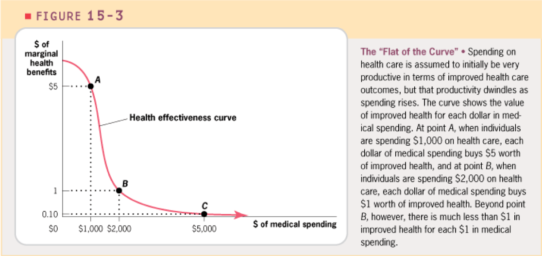
The shape of the curve
Diminishing returns are evident cross-sectionally (spatial)

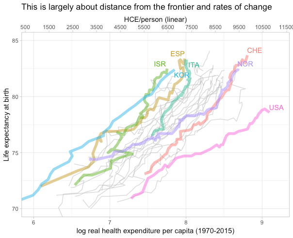
The likes of Spain and Italy spend half as much as the likes of Norway and Luxembourg and live at least as long. These countries also have significantly lower income levels, higher poverty rates, higher inequality, lower social expenditures, and several other factors that should presumably work against them in health outcomes.
Even with OWID’s more limited dataset on countries “with similar income per capita” we see strong indications of non-linear returns to spending.

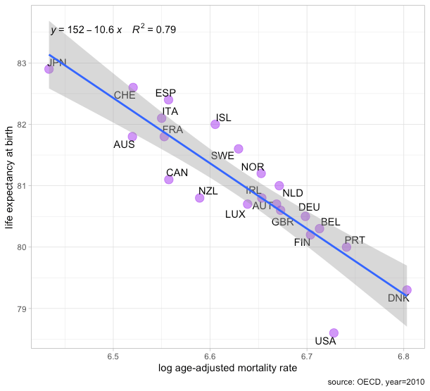
The rapidly diminishing returns to health spending found cross-sectionally implies the still higher level of expenditure observed in the United States does not predict higher life expectancy than the average high-income country. Expenditure much beyond the likes of Spain as of a few years ago is not associated with systematically better outcomes in broad measures such as life expectancy or age-adjusted (all-cause) mortality rates. Even if the signal from the true effects of ever-higher health spending on broad measures such as life expectancy was somehow being confounded (e.g., lifestyle factors offsetting gains) such patterns are themselves informative for what we might expect from even higher spending countries like the United States.
And they are evident over time (temporal)
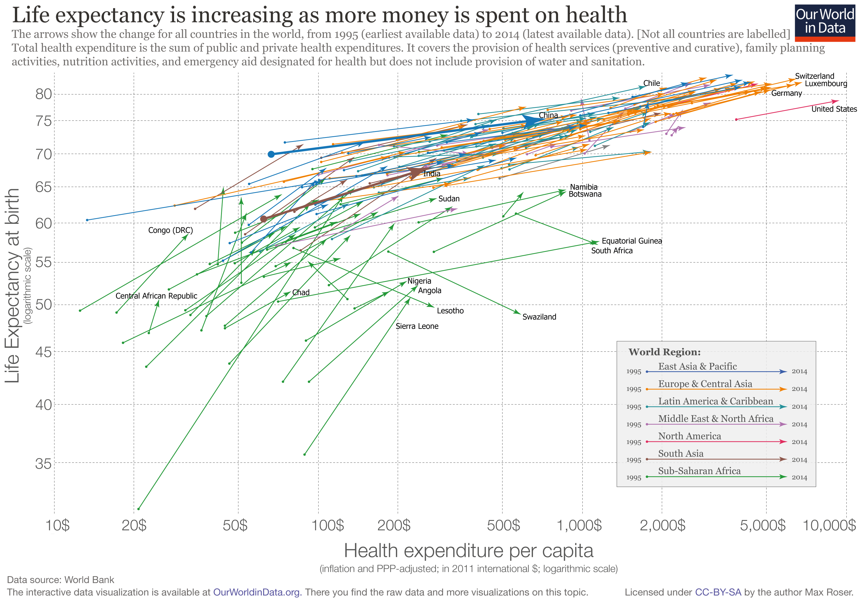
While there has been (with rare exception) little-to-no convergence in income levels, health spending, human capital, and related indicators2, there actually has been rapid convergence in health outcomes. Poor countries have seen much more rapid improvements in health outcomes than rich countries.

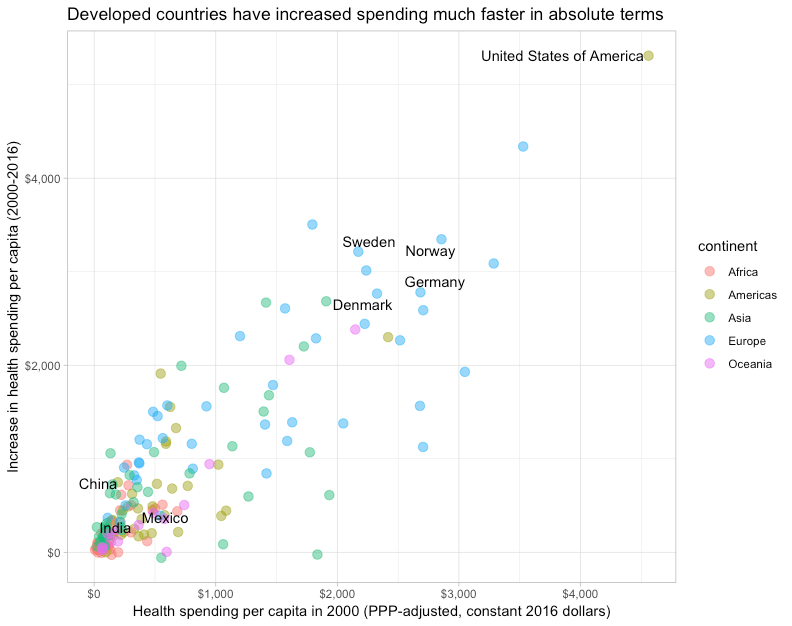
Neither income nor spending shares have appreciably converged, so it ‘s highly unlikely this explains much if anything. Indeed, already high spending countries have tended to increase spending faster.
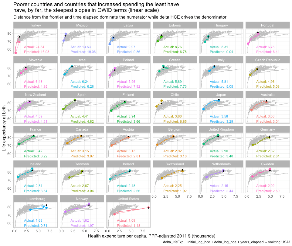
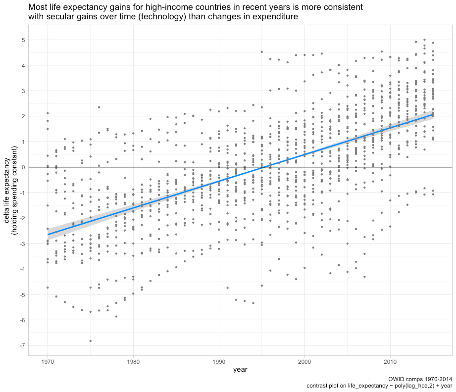
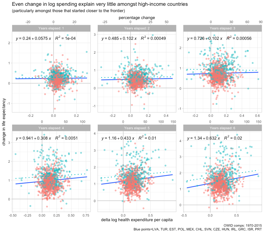
If we plot this on a linear scale, as OWID does for their “outlier” plot, there actually seems to be an inverse correlation between the change in health spending and the change in life expectancy. The countries which have increased spending infinitesimally by western standards have seen very large gains relative to the highest-income countries.

Even if we plot this by changes in log health spending (exponential increase!), which is the relationship implied by the Preston Curve3, we find no correlation despite large differences in the rate of increase.

This suggests two things. First, even the log-linear relationship is overly optimistic vis-a-vis diminishing returns. Second, the apparent effect of health spending implied by OWID’s misleading plot is apt to be heavily confounded by technological developments because there is a pronounced secular trend regardless of changes in expenditure. It is abundantly clear most of the gains observed over time are not explained by changes in expenditure.
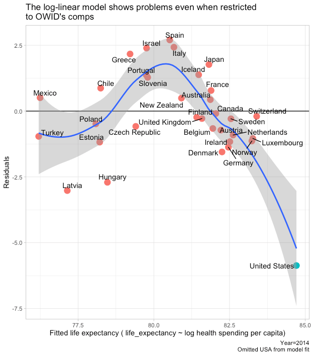
Going even slightly beyond OWID’s skin-deep coverage indicates reality is much more complex than they let on. Even in the more limited high-income context and in the longer-run, we can’t say there is any evidence for constant linear returns to health spending. The results, if anything, indicate an inverse relationship.

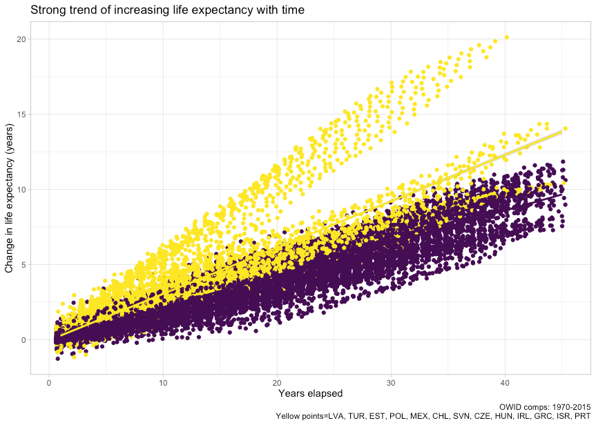
Likewise, in the shorter run (more observations).

This is the same data OWID used. The only real difference is we’re effectively accounting for the secular trend (technological change) by looking at changes over the same length of time while still plotting on the linear scale OWID curiously employed in their widely circulated plot.4 When OWID asserts “the population lives increasingly long lives as health expenditure increases” you might imagine countries that increased spending by more real dollars per capita saw larger gains, but that’s clearly not even the case for the high-income countries they chose to present.
If we instead plot their data on a log scale, we find some evidence of a positive relationship and one that surely more closely approximates the true relationship.

The log-linear relationship implied by this transformation, as in the Preston Curve, suggests that it takes exponential increases in spending to maintain constant annual growth in life expectancy. The US may have increased spending more than other high-income countries in absolute terms, but it clearly did not increase spending the most in proportional terms (exponential). Though still confounded by other major issues, an OWID-style plot on a log scale would at least present a model that bears some semblance to known reality and economic growth patterns.
However, even the changes approach is naive because we actually expect countries that started closer to the frontier to see smaller gains. There is much reason to expect this theoretically. It is also abundantly clear in bivariate and multiple regression5.
Because the time series for some countries start much later, we need to include a variable to account for time elapsed, as I’ve done here, or omit observations so that all countries span the same number of years.

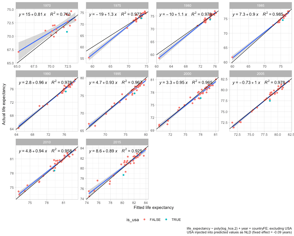
Initial health spending per capita is clearly significant and negative. Countries that entered the time series with higher real spending (~=incomes) enjoyed markedly lower growth in life expectancy. Accounting for time elapsed (clearly significant) and changes in health expenditure (not so much) gives pretty much the same coefficient on initial spending. These patterns are robust to alternative modeling strategies (matching time series, excluding the USA, different periods, etc).
If we plot the fitted values from model 9, the US clearly falls close to the trend in expected long-term life expectancy gains.

The slope is even more predictable
“The above-mentioned cross-sectional relationships cannot be interpreted causally because countries differs in a number of ways that simultaneously affect health outcomes and health expenditure. Income is one of them. But we can get a step closer by concentrating on countries with similar income per capita, and looking at changes across time for each country, which eliminates the potential confounding effect of country-specific time-invariant factors.”
Though OWID kind of makes a big deal of analysis of changes and tacitly acknowledges the potential for confounding between countries, the long-run slope observed for the US is very much explicable as a product of diminishing returns. The US slope is, ironically, the least mysterious aspect of the debate over US healthcare.6 Countries that start off with significantly lower spending can make larger gains because they have much low hanging fruit remaining whereas high-income countries like the US have already largely picked them and need to make almost all of their health-system gains at the frontier of medicine.7 The richest countries actually need to innovate and push the bleeding edge whereas poorer countries can make rapid gains by playing catch up on the cheap. Further, because secular trends (improving technology) are doing so much work in OWID’s plots8, countries that increase spending less will tend to have steeper slopes, particularly if they’re starting near the frontier.
If we merely plug in the results from model 9 in the earlier section into an OWID style plot, i.e., fitted life expectancy change + initial life expectancy, we get this result.

We can do a lot better than this if we try to directly predict the slope over matching time series!9 The US falls on the trend even when restricted to 1990 onwards.

OWID notes the US trajectory was markedly flatter than some other high-income countries following 1980. I don’t dispute that, insofar as that goes, but the same clearly goes for other high-income countries in direct proportion to their distance from the frontier and the amount by which they increased health spending. Sweden, for example, saw much smaller gains per dollar spent than Greece. The patterns are surely better explained by broader economic forces than idiosyncratic Greek excellence. Moreover, both of these variables, initial health spending (~=distance from the frontier) and the change in expenditure can themselves be predicted exceptionally well over the long run by material living conditions (initial+changes).
Better approximating the marginal effects
Although assuming a log-linear relationship can be useful for regression analysis, it usually generates at least modestly biased predictions the cross-sectional, time series, and panel data analysis. These models fail predictably in both the spatial and the temporal dimensions because we are trying to fit the wrong model to the curve. The true causal relationship is likely better modeled with something like a logistic function.

When the observations are particularly mixed vis-a-vis distance from the frontier, as OWID’s preferred data clearly are, the failings of the model become readily apparent.
This hump shape pattern is also evident in panel data even with year and country fixed effects included.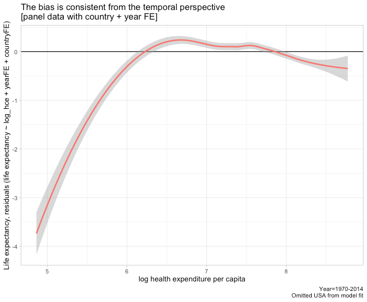
The point here is that while there is some uncertainty concerning the exact marginal effects of ever-higher spending, the statistical evidence nonetheless strongly suggests the incremental effects decline much faster than constant log-linear regression across worldwide data would imply and that the incremental spending of most high-income countries over most of the past decade or two is apt to have been spent at the “flat of the curve”.
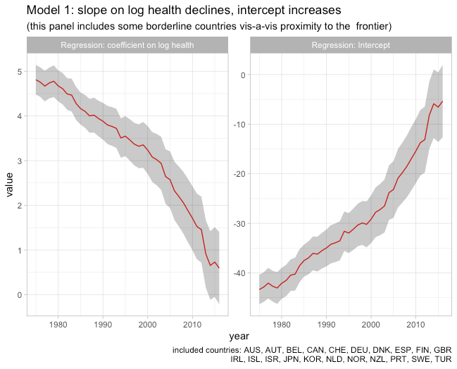
We can roughly approximate this relationship using a 2nd order polynomial on log health spending in panel data with year fixed effects (much of the trend is secular, i.e., technology changes the scope of what is possible even without changes in spending).

This implies the incremental effects of doubling health spending are much larger when starting from low levels of expenditure than at the levels seen today amongst high-income countries (close to zero). We can make this more explicit by plotting health expenditure on a linear scale along with fitted values from the model above for several years (shifts the intercept up).
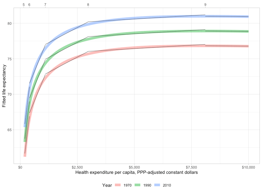
While it’s clear that most high-income countries have seen gains in life expectancy most years, the evidence is much more consistent with technological change (strong secular trend) than actual changes in expenditure.
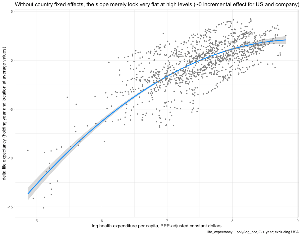
Incorporating country fixed effects into the equation only amplifies these patterns (returns to expenditure fall more rapidly, secular trends are larger still, and the slope even shifts negative).
The combination of secular gains due to a shifting of the technological frontier along with diminishing marginal returns to spending can explain much. It explains the trends for high-income countries and the convergence of the developing world. Although differences in spending are at least as large today as they were in earlier decades, both in absolute and percentage terms, the actual effect of these differences has declined as countries have converged on the frontier. Rich countries still dramatically outspend in real terms and still do a lot more cutting-edge medicine, but this stuff rarely has large effects on mortality rates on the margins today since it’s overwhelmingly near-flat of the curve and/or affects very small segments of the population (e.g., treatment of orphan diseases). The few technologies that really move the needle tend to spill over to the rest of the world in fairly short order as prices fall and processes are simplified.
This is generally consistent with findings from a UN Development Program paper on income-effects (scrutinizing the Preston Curve)
“We claim that the income elasticity in the standard Preston curve is likely to be overestimated due to the failure of controlling for countries’ distance to the health technology frontier, and that the income elasticity of life expectancy has substantially declined even in countries close to the health technology frontier….Finally, we provide evidence suggesting that even for the countries close to the health technology frontier the role of income for the determination of life expectancy has substantially weakened during the last two to three decades. Health conditions are thus becoming increasingly disconnected to per capita income in developed countries. Living a healthier life requires new insights about healthy behavior (smoking, obesity, stress, diet), their spread and adoption on a large scale. The individual’s behavior thus appears to gain importance for the prolongation of life in developed countries, too.”

This is also consistent with a simpler random-effects model on health spending amongst developed countries.
In short, the evidence suggests health system inputs are not a major source of differences in life expectancy between developed countries in recent years.
Obesity
The elephant in the room
Indicators that actually predict health outcomes at the margins high-income countries are at today are given short shrift. Though it is far from the only factor, obesity is the biggest, dare I say, fattest elephant in the room. We can catch a glimpse of this with crude bivariate regression at a national level despite considerable range-restriction and other confounds.

If we partially disaggregate, US states seem to attain comparable life expectancy at comparable obesity rates.

Regional disaggregation
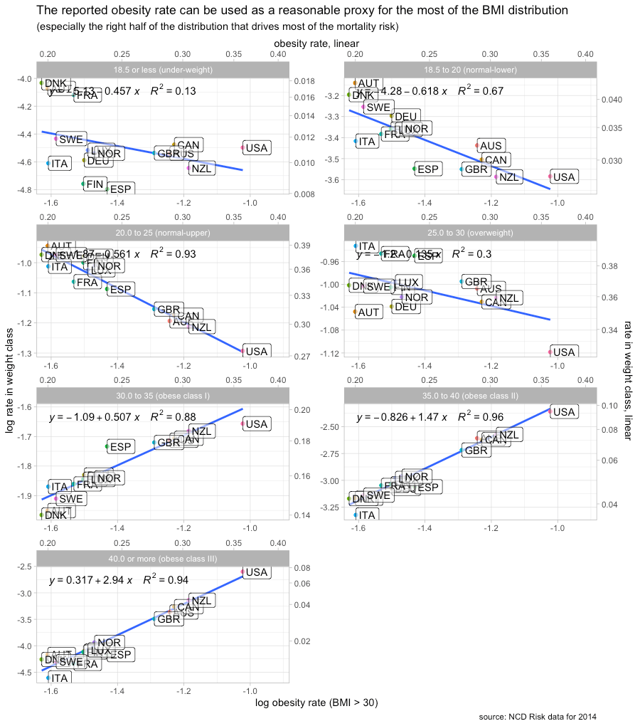
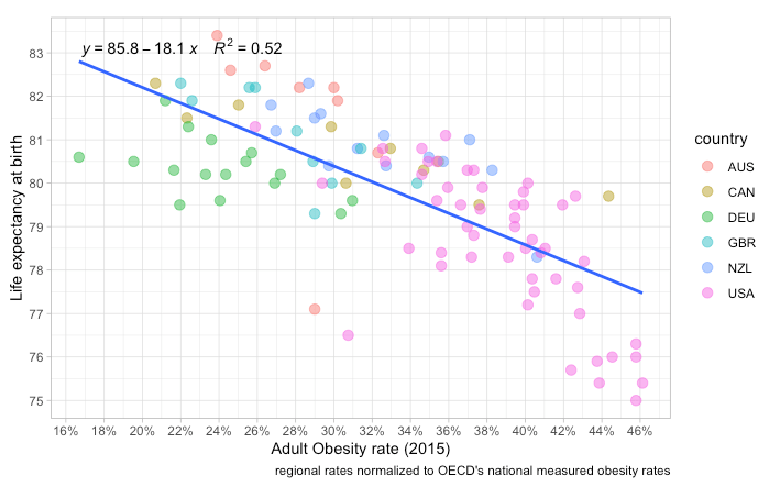
Better still, we can approach this at a regional level (OECD TL2) for OECD countries that publish reliable obesity statistics on a regional level. Currently, my data set just includes the UK, Germany, Canada, Australia, and New Zealand, but these are better comps for the US than most other OECD countries.10

Obesity rates seem to explain much within and between countries of broadly similar development and backgrounds. Those few US regions (states) with obesity rates comparable to regions in other reasonably comparable countries tend to have at least comparable life expectancy.
Much the same applies when the log age-adjusted mortality rate is used as the dependent variable.
The cross-sectional coefficient on the regional obesity rate here is somewhere between one and two, depending on the national obesity reference used (some age-adjust it to different population norms, some rely on surveys, etc). It’s probably higher for more reliable, better harmonized, estimates (as in, OECD and IHME), but all of these estimates imply substantial explanatory value for the US and even 1 is a very large effect. This implies the expected mortality rate for a region where 100% of the adult population has a BMI >= 30 kg/m2 is approximately 170% higher than one where 0% of the population crosses the same threshold. Such effect sizes can explain much for the United States relative to other high-income countries and they are actually causally plausible.
Obesity also seems to be a particularly strong predictor within the United States.
 Even allowing for significant confounding, a few percentage points in obesity rates can plausibly make a big difference in mortality rates.11
Individual-level data show large effects
Though such concerns are rarely raised for the effects of national health spending (a strange asymmetry), some may argue this is just ecological correlation. There are, however, many studies showing BMI has a large effect on mortality rates in individual-level data. If we find such large effects within developed countries, i.e., holding the quality of the national healthcare system and other ecological factors constant, this suggests we would be remiss to ignore this in cross-sectional comparisons of outcomes.
Such effects have been observed in US-centric data (even net of many controls).

The mortality effects of elevated American BMI were also calculated on a years-of-life-lost (YLL) basis several years ago.

And they have been found in better-powered studies using administrative (primary care) databases in the UK (n=3.6M).

Meta-analysis generally indicates the effects are larger:
- when smoking is accounted for12
- in men vs women
- in young vs old
- over longer surveillance periods.
- in higher-quality studies
These effects don’t seem to be much mediated by indicators of socioeconomic status. Indeed, the closer the individual-level analysis gets to the sort of differences we observe in cross-sectional or time series analysis, where obesogenic factors are more likely to move in relative isolation, the larger the effect sizes appear to be.
It’s also worth pointing out that BMI appears to be similarly predictive of mortality risk in the United States and Europe.

If people believe other high-income countries are doing a substantially better job of mitigating the consequences of obesity, say, in the progression of diabetes, it’s not being borne out in their mortality rates.
Mortality increases quickly much beyond optimal BMI
Mortality risks increase much faster than BMI past the region generally thought to be optimal (elasticity >> 1) and there is some evidence to suggest non-linear effects (increases increasingly)
(note the log-scale on the y-axis)


The smallest log-log coefficient in this analysis (never-smokers) implies an average increase of at least two past the optimal BMI range. In other words, a 1% increase in BMI predicts an average increase of at least 2%. The longer-run and more tightly bounded estimates imply even larger effects. Further, these trends likely continue at least linearly (log-log) out beyond the BMI range they provided estimates for. These estimates imply that those with BMIs of 50 or higher, probably at least 1% of American adults, face approximately 500% higher mortality rate than people with optimal BMIs (higher if non-linear).

Almost all adults in high-income countries are to the right of the mortality curve13, i.e., at least slightly beyond optimal. This goes doubly for the United States, which has been richer for longer, and likely had a particular historical advantage in food production.14
Though this may not have been true a few generations ago, particularly in some less affluent European countries, the average marginal effect of our increasingly obesogenic environments is clearly and profoundly negative. Said differently, the rightward shift in the BMI distribution implies large net increases in mortality risks for most countries of at least moderately high-incomes today, particularly given the increased variance and right skew that accompanies the general rightward trend.
Greatly elevated risks are found in most causes of death.
This isn’t just about people dropping dead from heart attacks. High BMIs are associated with large increases in mortality in most major causes of death.

Increased risks are also found in most specific causes of death (cancers, CVD, endocrine, etc).

High BMI is also associated with many other morbidities (comorbidities) which independently predict risk. Type II diabetes and related metabolic conditions, for example, are strongly linked to obesity.

These comorbidities are likely associated primarily because they share the same proximate cause, namely, excessive caloric intake. So it stands to reason that countries with high obesity are apt to suffer from higher mortality across a wide range of diseases.
Individual-level analyses likely downward biased
BMI is apt to be even more predictive of health risk between populations than estimates within populations would suggest.
- BMI is more likely to reflect actual body fat differences at the population level than at the individual level.15
- accidents and other weakly correlated causes of mortality get averaged out to some degree
- BMI measurement error and short term fluctuations tend to fall with larger n
The key point is that BMI presumably predicts risk chiefly because it predicts body fatness. Indeed, there is some evidence that higher BMI is actually good conditional on measured body fat percentage (more bone and muscle mass per unit of height). If a one-unit increase in observed BMI between populations is more likely to predict body fat than between individuals in the same population (higher SNR at the population level than individual level), which seems likely, the implied effects of population-level BMI risks are apt to be significantly larger (particularly when genetic differences in bone and muscle mass isn’t likely to be a major confound). Higher body fat itself may work as something of a bell-weather for the accumulated damage of excess caloric consumption, so the group differences indicated by such indicators may systematically under-estimate risk between groups when analyzed independently.
The obesity rate is just the tip of the iceberg
When comparing populations in the spatial or temporal dimension, the headline obesity rate is only the tip of the iceberg. Interpreted naively it might merely indicate some fraction of the population has a BMI greater than the 30 kg/m2 threshold. Though it’s theoretically possible that 40% of US adults have a BMI tightly clustered just past 30 kg/m2, it is facially implausible. We wouldn’t expect this sort of bunching even if the shape of the curve closely resembled a platonic normal distribution.
The entire distribution has to shifted to the right. Crucially, the variance and skew of the distribution have risen along with the general increase such that the right tail of the distribution has grown very long. There are many more people with extremely high BMIs than we’d otherwise predict. This has terrible implications for life expectancy and quality of life. The greater the variance and the larger the right-ward skew in BMI, the worse the health outcomes picture gets since this implies the fraction of the population past the obesity threshold ( 30 kg/m2 ) are more likely to suffer from extreme degrees of obesity where the risks are exceptionally high.
These patterns (right-ward shift, increasing variance, and increasing right skew) can be seen starting before the 20th century in America.

And they can clearly be seen over the past 2-3 generations with high-quality data from the CDC and related organizations.
Distribution of BMI over time, 1971-2014

The skewness and, to some degree, the increasing variance of the BMI distribution is an artifact of how BMI is constructed.16 Nonetheless, these high BMIs speak to large increases in mortality. Indeed, this implies high body fat is even riskier than it might appear at first blush.
Estimating the changing risk profile
American life expectancy has significantly improved as a result of advances in medicine and other gains from economic progress (safer jobs, housing, transportation, etc), but it’d likely have improved even more had BMIs not increased so much. We can use published mortality hazard curves from meta-analyses of individual-risk to roughly approximate how rising obesity has impacted mortality rates on a counterfactual basis since the evidence suggests the effects are quite stable across countries and over time (better medicine has not visibly reduced the relative impact of obesity on mortality).
 This implies rising BMI in the adult American population has increased mortality risk by around 40 percent since the mid-seventies!17

By my estimate, the implied mortality risk has risen a little more than twice as fast as mean BMI over the past couple of decades.

The true rise in obesity should be slightly smaller in age-adjusted terms, and accounting for the decline in smoking may partially (directly) offset the increase in obesity. Nonetheless, it’s clear we have a lot more people with severe body fat issues than we did just a few decades ago, and the decline in smoking can explain little of this.

Thanks to improvements in the technological frontier, there have been net declines in overall mortality rates. The heart disease death rate was reduced by more than 60%, but these declines would likely have been considerably larger and more comparable to the gains in other long-established high-income countries if the US wasn’t handicapped by its obesity rate.
Others have tried to quantify this a bit more precisely :
“We estimate that rising Max BMI during the period 1988–2011 has lowered the rate of decline in US age-standardized death rates by ∼0.5–0.6% [per year]. The estimate is robust to the inclusion of other major drivers of national mortality levels, including smoking, educational attainment, and racial composition. It is also robust to alternative ways of operationalizing BMI and identifying trends.
Is a difference in rates of mortality decline of 0.5–0.6%/y large or small? One useful metric is provided by mortality projections done by the US Social Security Administration…. At ages 65+, the difference between intermediate and low-cost projections is 0.42%, also below the estimated impact of rising BMI. So the rise in BMI appears to be a powerful factor in mortality relative to the amount of uncertainty embedded in Social Security projections.
A second metric is international. The SD of national rates of mortality decline shown in Fig. 1 is 0.30%. So rising BMI in the United States has generated an effect on mortality decline (0.50–0.60%) that is close to two international SD units. Relative to observed international variation in rates of mortality improvement, the effect of increasing body mass indices in the United States is large.
A third metric is the number of excess deaths. If death rates had declined since 1988 at the Max BMI-controlled rate of 2.35% rather than the uncontrolled rate of 1.81%, there would have been ∼88.3% as many deaths at ages 40–84 in 2011 as actually occurred that year. So in the age interval 40–84, we estimate that rising BMI is responsible for 11.7% of the 1,590,254 deaths, or a total of 186,000 excess deaths, in 2011 alone. The total number of deaths in 2011 at all ages combined was 2,515,458, so the excess deaths attributable to rising Max BMI at ages 40–84 represent 7.4% of the total deaths in the United States in 2011.”
Their estimated mortality effect seems to be broadly consistent with the secular trend found in my “back-of-the-napkin” approach.18
Obesity rates are predictive of spatial differences in risk factors
The relationship between obesity rates and the general BMI distributions within other countries is probably quite similar to what we observe in US time series19 Though more sophisticated methods are available, we can make reasonable inferences about the rest of the BMI distribution in other countries with little more than the obesity rate. The fact that a substantially larger fraction of the US population has a BMI greater than 30 predicts that we have proportionally more people with even higher BMIs and vice versa for those in the low-normal range.
This is not to suggest all countries have exactly the same mean, variance, and skew conditional on the obesity rate, but the underlying forces appear to be similar enough to make reasonably strong inferences about the general nature of the BMI distribution in lieu of extensive micro-data, particularly as it relates to those with BMIs much higher than optimal, which drives BMI-related mortality risk. Published, albeit discretized, estimates of the international BMI distribution largely support this assertion, particularly amongst developed countries 20


Many other high-income countries are where the US was decades earlier. We are clearly further along the obesity frontier.21

The measured obesity rate is a powerful and plausible explanatory variable for spatial differences in mortality because these twin tail effects are known to be so large. As the body fat percentage increases across the vast majority of the population (increasing variance in body fat plays some role), measured BMI increases very rapidly out on the right tail on the margins high-income countries are at today. All the same, despite the non-linear relationship between body fat and BMI, the evidence shows these BMIs are robustly associated with much higher mortality rates throughout the developed world, and there is plenty of reason to believe this to be causal.

These risks can evolve differently
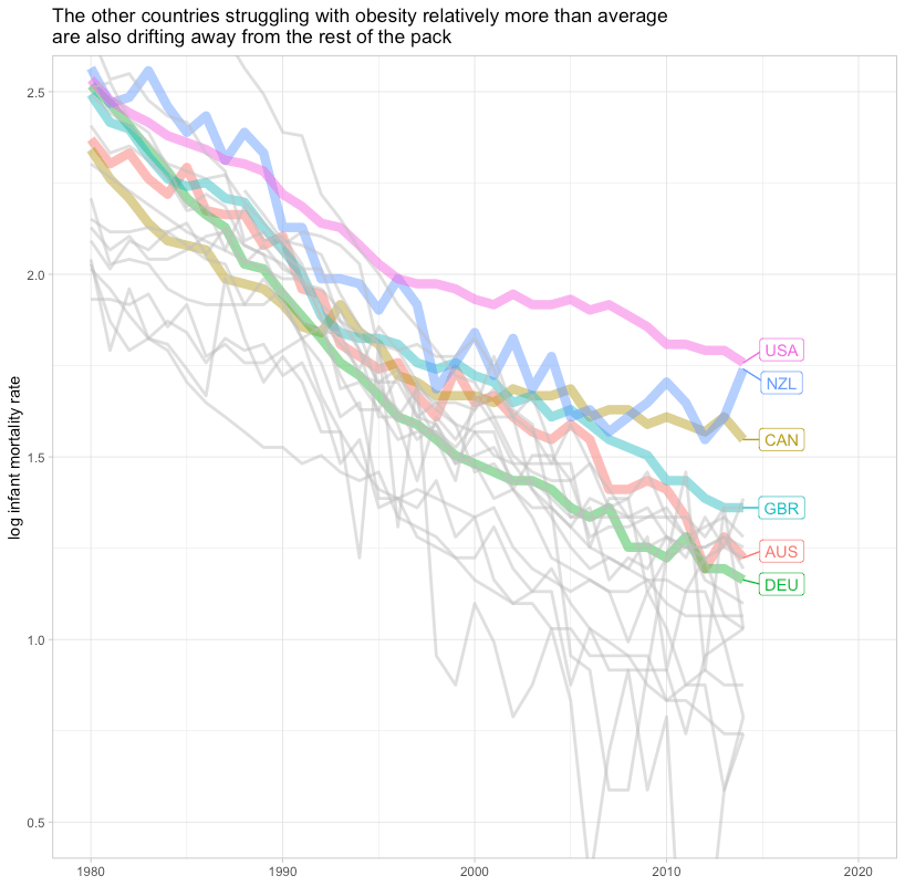
Contrary to what some seem to imply, changes in obesity are apt to exert significant influence on life expectancy trends within and between countries. Extreme obesity has evidently increased more quickly in some countries than in others. This is very likely to materially confound attempts to gauge the relative efficacy of the health care system by comparing changes in health outcomes.
Though virtually all rich countries face historically high and rising obesity rates, the US started with higher obesity and obesity has increased more quickly. The combination implies a more rapid rate of increase in mortality burdens from excess body fat for reasons unlikely to be substantially related to healthcare inputs.

We can model this a bit more explicitly using NCD RiSC’s binned BMI frequencies along with parameter estimates (approximately) corresponding to those bins.22


I am not claiming this is an exact representation of reality, but meaningfully significant divergence of this sort should be expected given reasonable BMI risk estimates and known changes in the BMI distribution.
Obesity explains much in national panel data
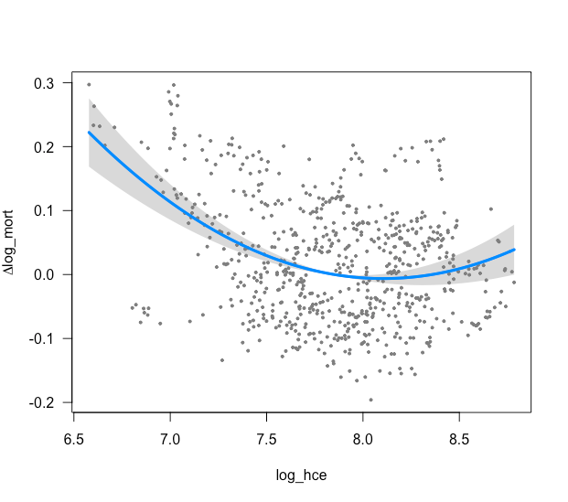
Conditional on health spending and year fixed effects, the US mortality rate is about 10% higher than comparable countries in OECD panel data.23. However, adding BMI to the equation fully mediates the USA dummy coefficient.

Though it appears to here, I wouldn’t necessarily expect obesity to fully mediate given other sources of elevated mortality, notably deaths resulting from homicide, car accidents, and drug abuse. More important, I think, is that BMI appears to be much more predictive than health spending (or income levels) amongst high-income countries. Further, the coefficient on BMI is very much within the range of plausible, probably causal, effects found in other forms of analysis. The model results are also effectively identical when inverted BMI is used to track obesity instead.24
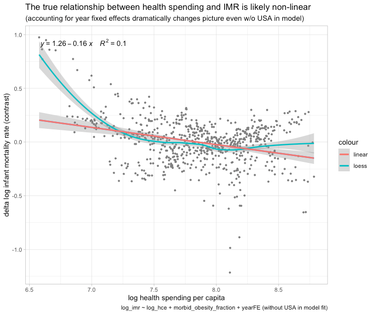
The mortality effects of health spending and closely linked income growth are clearly non-linear, so that approach is systematically biased against higher-income higher spending countries. In an alternative model with a non-linear specification on log health spending with year fixed effects, excluding the US from the model fit25, the US residual starts above average and trends higher.
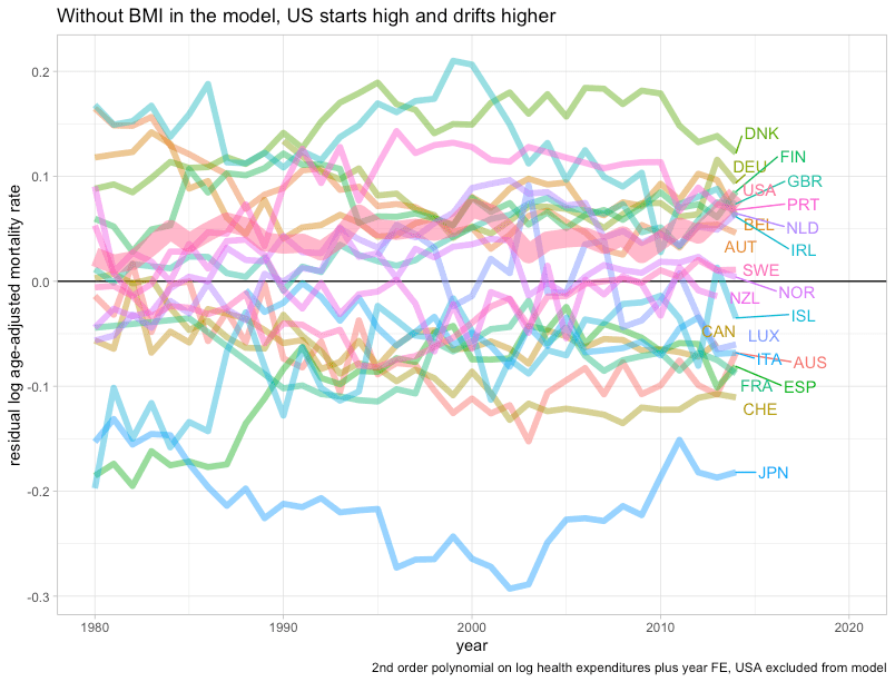
However, with BMI in the equation, the US actually drops below trend (lower than expected mortality rates).
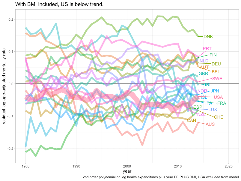
As in the prior model, BMI is more informative than health spending amongst higher-income countries in recent years.26 A similar pattern is obtained with a random-effects model wherein the effects of health spending are constant in log-log terms but the slope is allowed to vary each year.27 Multiple methods point to rapidly diminishing returns to higher health expenditure as upper-income countries converge on the frontier of medicine such that the apparent slope is flat to possibly even pointing towards worse health outcomes.28
The US does slightly worse in life expectancy than would be predicted based on age-adjusted mortality rates. For example, conditional on health spending in a similarly specified random-effects model, the US is about 2 years below trend over the past few decades.

However, when BMI is added to the equation the US moves to within about half a year (very close to Germany and the UK in conditional terms).

The difference between these two measures is likely explained by the fact that particularly premature causes of death, such as homicide, car accidents, drug abuse, have a much larger effect on life expectancy than they do on age-adjusted mortality rates.29
Cross-sectional regression on regional data shows likewise
The obesity rate is highly predictive of regional life expectancy. Including country fixed effects and regional disposable income in the equation does not obviously change these results. Indeed, obesity seems to mediate regional disposable income, so this is a fairly good indication that the within-country effects of regional income levels are mediated by lifestyle factors like obesity. In the developed world, income effects on health are apt to be mostly caused by differences in initial human capital and sorting.30

Obesity also seems to mediate with other covariates in the equation.

Although in the model with just obesity in the equation (#4), the US dummy is slightly negative (even if much smaller), it’s fully mediated with health spending and regional disposable income in the equation. When the age-adjusted mortality rate is used as the dependent variable instead it’s fully mediated (#4).

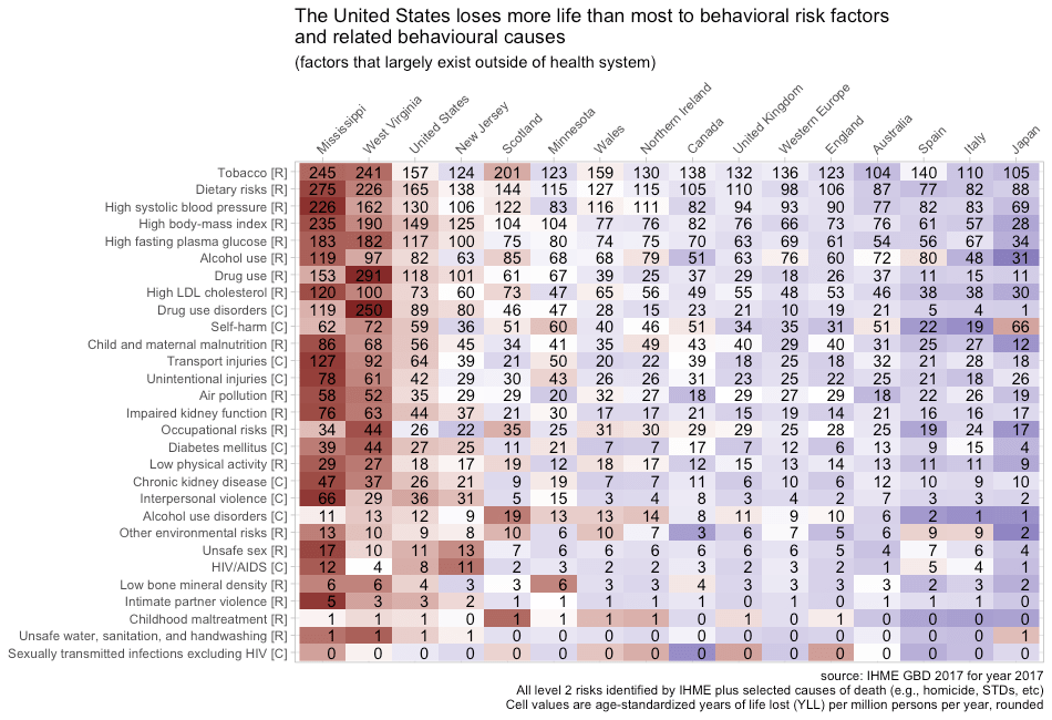
America does markedly worse in causes linked to obesity
Amongst mid-level causes of death thought to be reasonably tied to health care quality, there is a rather strong relationship between the cause-specific effects of obesity in cohort studies (within the UK in this case) and US performance relative to other high-income countries.

Controlling for health spending yields very similar results.
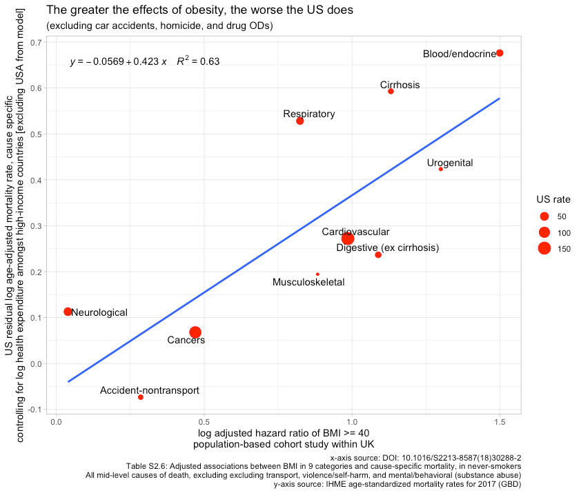
Including intermediate-level causes that are driven overwhelmingly by car accidents, homicide, and drug overdoses in the equation admittedly weakens the relationship31, but I suspect most people don’t imagine these causes of death to be substantially related to universal healthcare and related themes. The US’s performance in causes of death somewhat plausibly linked to healthcare provision is likely explained by higher obesity rates.
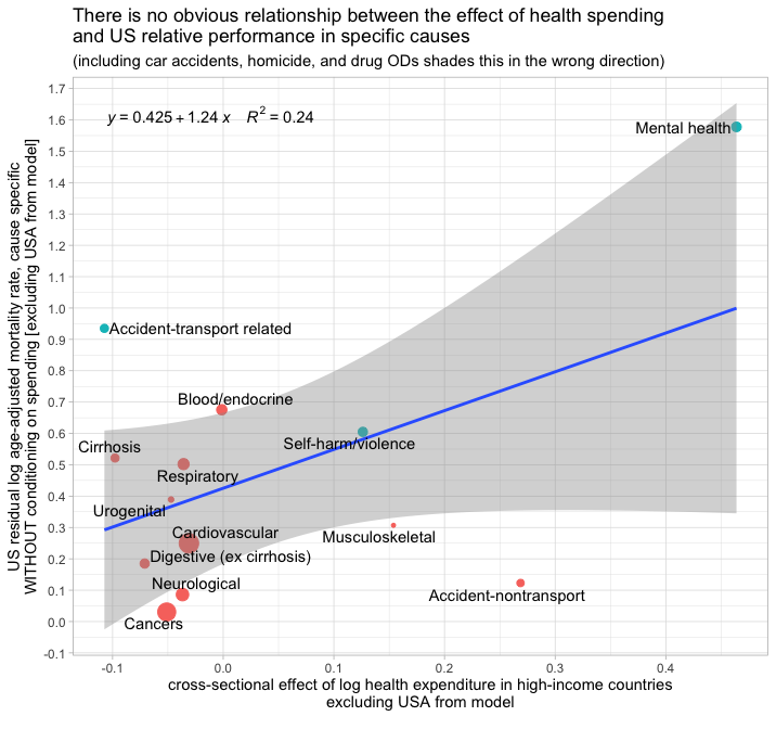
By contrast, there is no obvious relationship between the cause-specific effects of national health spending and the US residual for these same causes amongst high-income countries.

Indeed, if I broaden the scope to include car accidents, homicide, and drug ODs, the correlation is the opposite of what we’d presumably expect. If the quality of US healthcare inputs is generally worse and healthcare provision is a significant determinant of these outcomes amongst developed countries, we should probably expect to find the US doing relatively worse at those causes most linked to healthcare internationally. We don’t find this, although we do find these same causes are linked to obesity.
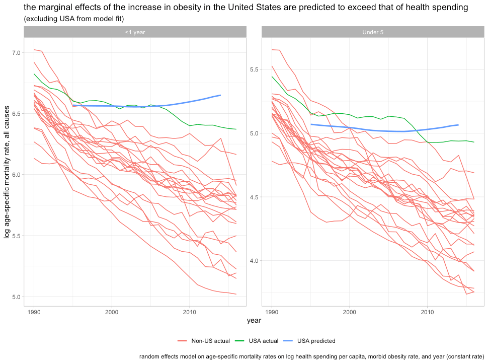
Obesity also explains much for infant, child, and maternal mortality
Maternal obesity is a major risk factor in meta-analysis.
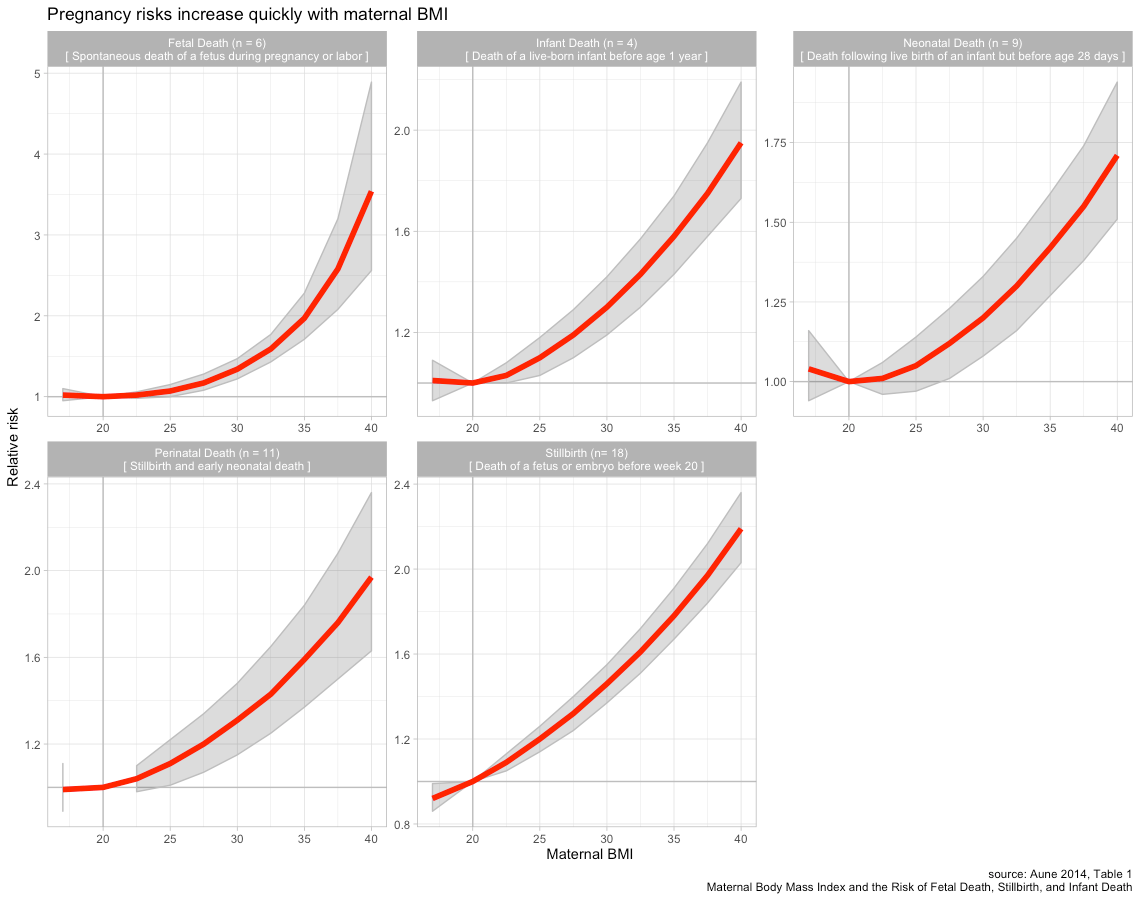
These patterns also appear to be quite similar in Europe.


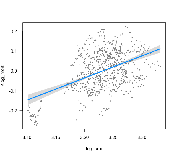
Unsurprisingly, BMI is a strong predictor of infant mortality in OECD panel data. Indeed, it’s actually a stronger predictor of IMR than health spending amongst high-income countries even though there is surely more measurement error in BMI than health spending.

Though mean BMI for both sexes does not seem to wholly mediate the US dummy, using a better indicator of maternal adiposity risk (women’s morbid obesity rate) does.

The results are much the same if I wholly omit the United States from the model and plot the residuals.
Obviously, the precise position of the US (dummy coefficient, residual, etc) is somewhat sensitive to the specification used, but in all cases, indicators of adiposity are clearly powerful and the evidence strongly suggests rapidly diminishing returns to health spending. The United States’ less than stellar infant mortality rate can hardly be surprising under the circumstances.32
It’s also likely obesity explains rates explain much for the United States in maternal mortality rates. Even in the US, we’re talking about something that happens in less than 0.02 percent of pregnancies, which makes it hard to produce precise point estimates for risk factors33. However, the observational data are generally consistent with very large effects.
Washington State, 2004-2013

Washington State compares somewhat favorably to much of the country, but morbidly obese women nonetheless seem to die at higher rates.


The data are a little patchy, but the pattern is quite clear. Obesity also predicts pregnancy complications, increased surgical inventions (e.g., obesity->c-section->surgical complications), and, obviously, much higher mortality rates generally, i.e., even without conditioning on pregnancy. We also know that many of these morbidities, which obesity is clearly associated with, are leading causes of pregnancy-related death. Even without direct evidence for the effects of obesity on pregnancy-related mortality ratios, there is much cause to believe it’s a major cause and that it explains most of the increase (~80% with coding change)

International comparisons seem to support this too. For instance, a simple bivariate comparison shows a rather strong link between maternal mortality ratios and morbid obesity rates amongst high-income countries.

Health spending seems to predict nothing at these margins.

In panel data, we find much the same.

Morbid obesity appears robust whereas health spending does not predict lower rates as some might expect. Morbid obesity mediates the USA dummy and the coefficient on obesity holds up well in multiple specifications (compare models 8,9, and 10). The cross-sectional effect observed in US state-level data also seems to be consistent with effects at least this large.34
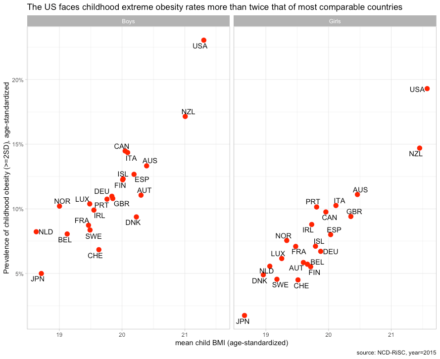
These issues are hardly independent, but since OWID mentioned it, it’s worth pointing out that much the same goes for child mortality rates35. Our children and our mothers suffer from obesity to a much greater degree than most comparable countries, so the elevated mortality in pregnancy, infancy, and early childhood is unfortunately to some extent predictable.
When combined with other known factors, there’s little left to explain
Combining the cumulative effects of differences in obesity, homicide, car accidents, and drug abuse can likely entirely explain US outcomes. Using disaggregations of age-standardized years-of-life lost (YLL) by risks and causes of death, we can estimate the effect of specific national differences in terms of life expectancy since YLLs take into account age at death. The Institute for Health Metrics and Evaluation (IHME) produces meta-analytic estimates of the effects of known risk factors from multiple published studies.
There is a small wrinkle insofar as this age-standardized measure is sensitive to age-structure with higher-income countries typically being older and less developed countries typically being much younger.
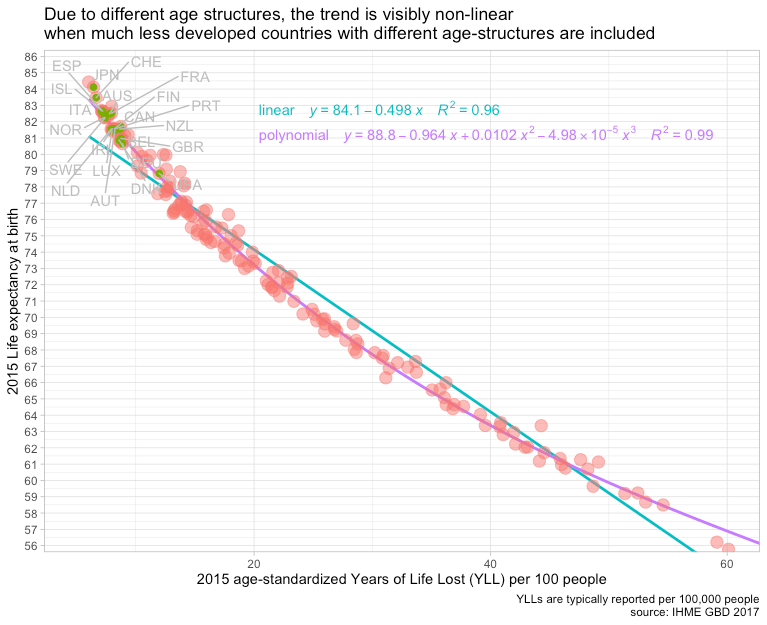
However, we can largely ignore this non-linearity by focusing on countries with broadly similar age structures.

For the sake of simplicity, we’ll examine specific risks and causes of death in terms of total YLLs.
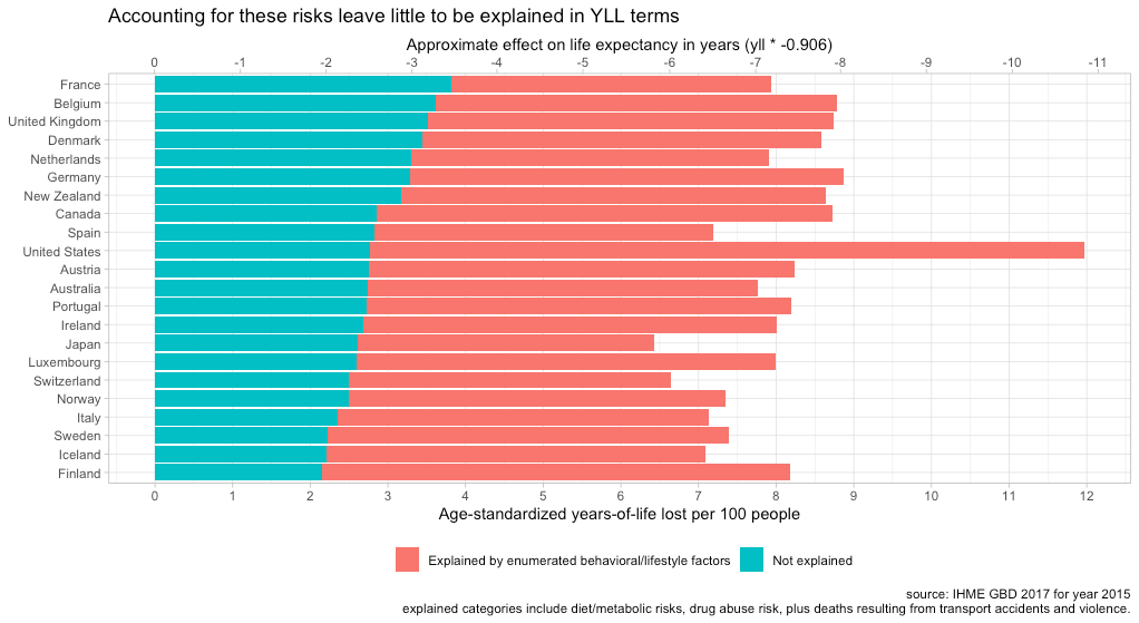
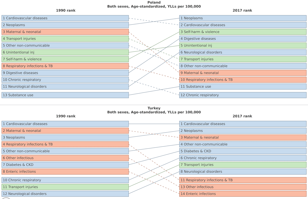
Age-standardized years-of-life-lost from All Causes

Right off the bat, we can see that drug abuse, car accidents, and homicide accounts for roughly half the US life expectancy gap (as discussed earlier, these modes of death have much larger effects on life expectancy than on mortality rates). This is reasonably consistent with the published analyses from some researchers affiliated with the CDC, though a bit larger due to the broader scope (drug risk as opposed to causes as might be reported death certificates, e.g., overdoses.).

Likewise, their estimates for dietary/metabolic risks imply that the US loses about a bit more than 1.5 years of life expectancy than most comparable countries.36

In sum, these two behavioral/lifestyle factor risk groups cost the US roughly 4-5 more years of life expectancy than the countries with which we are typically compared.

Put differently, accounting for these enumerated risk factors puts the US about mid-pack in terms of YLLs left to be explained, and better off than the United Kingdom and Germany after accounting for these behavioral lifestyle factors.
Likewise, if we regress the explained YLLs against overall (all-cause) YLLs.
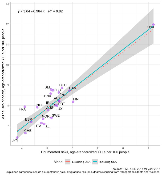
In terms of life expectancy and known risks, the US does a bit better than expected.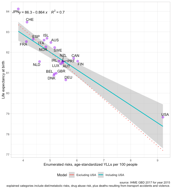
This also seems to explain much for states with abnormally low life expectancy.
Although there are many additional risk factors that could be included, these particular effects are very large, plausible, and they surely confound naive analysis of healthcare efficacy. Accounting for other risks would be overkill so far as I am concerned, and they’d likely imply the US healthcare is even more handicapped by behavioral/lifestyle factors than this collection of key risk factors suggests, particularly in states like West Virginia and Mississippi.

Synthesis
The rise in obesity is determined largely by rising incomes
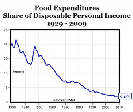
It’s reasonably certain the rise in obesity is driven largely by the rise in real incomes. Even though we spend a smaller share of our income on food than we once did and a smaller share than lower-income countries do today, our expenditures nonetheless buy considerably more food in real terms.

Food consumption rises considerably less than quickly than incomes do (income-elasticity < 1), but they still rise. These expenditures don’t merely buy a more diverse diet; they also translate into calories. (Indeed, some evidence suggests the diversity and availability of palatable foods is a significant component of obesity).
The strength of the relationship between incomes and calories is abundantly clear in the big picture. Although some people argue this “plateaus”, there is still a significant cross-sectional link between material living conditions and calories even when restricted to the OECD (relatively high-income).

Although this measure is clearly volatile, the time series for high-income countries is, if anything, more consistent with an increasing slope when taken on the whole.


Some people might find this a little confusing because poor and less educated people are more likely to be obese in the developed world.

However, the effects are fairly modest when compared to long-run changes and differences between countries. Further, they are likely to be substantially determined by factors other than intra-national income per se (e.g., genetics, education, culture, status, etc). Even if the within-country differences (slopes) are significantly caused by income, there can still be very large income effects at the national level operating on the intercept, i.e., everyone gets a little fatter even while the rich tend to be a little thinner than their fellow countrymen.
![]()

Obesity isn’t the only disease of affluence
One of the biggest unforced errors the United States made in recent years was allowing opioids to be prescribed casually as the first line of treatment for relatively minor pain problems. It has clearly cost many lives. Some industry players were clearly responsible for the reckless and unethical promotion of opioids, though there is much blame to go around (prescribers, regulators, medical boards, etc). However, while there may be some general philosophic differences, this particular mistake clearly extended well beyond US borders. It is evident that willingness to treat with opioids is, in large part, a function of income levels.
Health spending is clearly a strong predictor of opioid use.

And the same goes for indicators of material living conditions like AIC and AHDI.
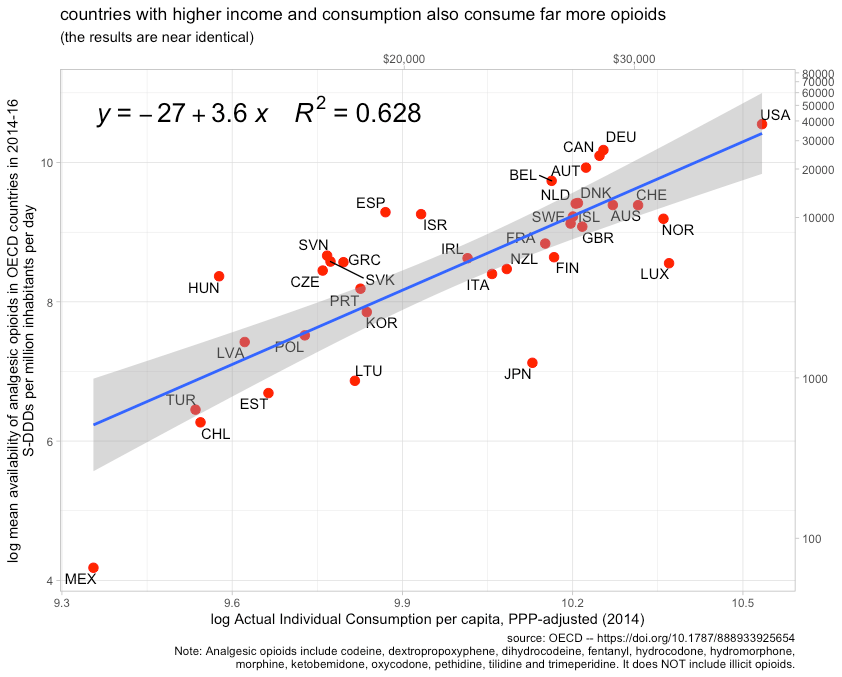
Indeed, if we restrict these to the same set of observations, health spending does not fit the data any better.37 However measured, affluence clearly predicts one of the major risk factors to emerge in the past decade or two. Lower-to-middle income countries are not consuming prescription opioids at nearly the same rate as high-income countries, so it can hardly be surprising their opioid death rates are much lower.

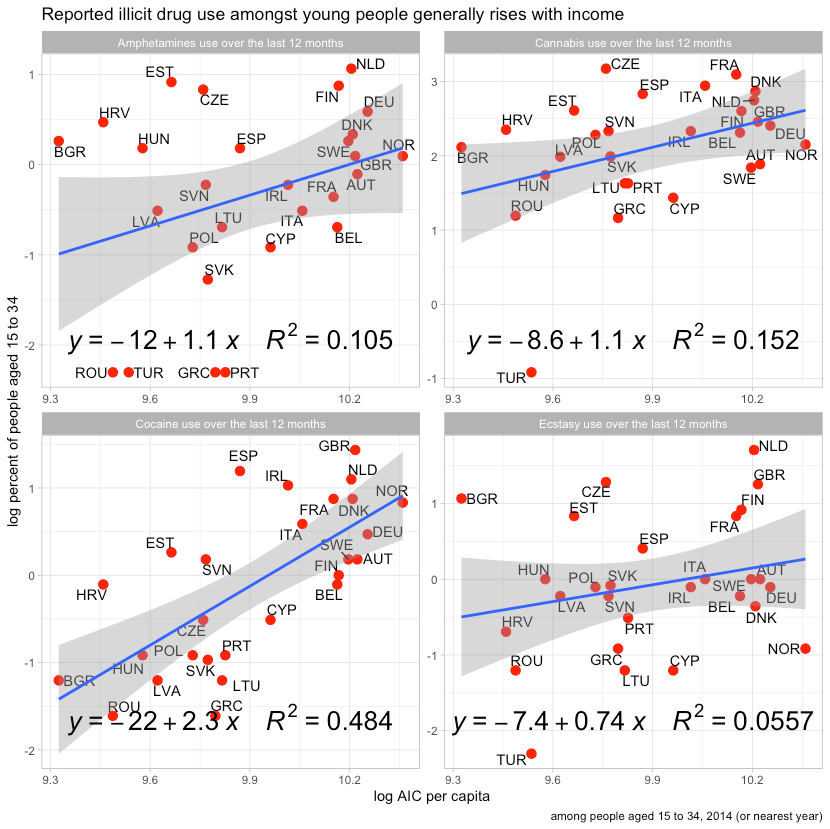
These issues also extend far beyond the careless consumption of prescription drugs. We also find increasing illicit drug use. Probably the most reliable indicator of this is the number of people that die from illicit drugs.

This pattern also existed in 1990, before the explosion of prescription opioids (a major gateway in recent years).

These deaths generally align with patterns observed in reported drug use.
Affluence also predicted significantly higher rates of smoking until fairly recently (before the risks were widely recognized by the general public)
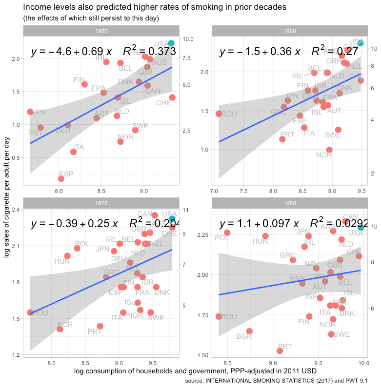
The United States’ exceptionally high material standard of living is probably the primary reason it had much higher than average smoking rates in earlier decades. The data suggest the US had the highest smoking rates of any developed countries for many years.

The peak risk associated with smoking is believed lag initiation and cessation by several decades, so it’s likely this is still dragging down high-income life expectancy (particularly the United States).


If A > H, the slopes on income and health spending are likely to flip
If the negative effects of affluence (A) exceed the positive effect of health spending (H) beyond some threshold, the relationship between income (or health spending) and life expectancy is likely to flip amongst upper-income countries. That is so to say that while life expectancy may continue to improve over time as health expenditure increases, the slope on income and the slope on health expenditures will increasingly turn negative amongst upper-income countries. There are all kinds of non-linearities and tipping effects involved here, so I am not going to try to model this formally. The basic intuition, however, is that income is an exceptionally strong proxy for health spending at the national level. As income rises, health spending rises along with a host of ill-effects of western lifestyles.

If the slope is assumed to be constant across the entire range, the implied relationship is still clearly positive. This implies that the positive effects of higher-income (especially health spending) exceed the negative effects of higher-income on average. However, there is good cause to believe health expenditures are subject to rapidly diminishing returns. The slope is not likely to be constant, not even in log-linear terms.

If healthcare is the primary driver of life expectancy gains between countries and health spending is largely determined by income, differences in income and health spending will cease to predict significant positive gains resulting from incremental health expenditures for countries at the frontier of medicine. The slopes for income and health expenditure should presumably converge on zero if healthcare was the only thing changing. However, the trend is for a lot of behavioral/lifestyle diseases associated with income to continue growing apace. The combination of the slowing efficacy of incremental health expenditures (flat of the curve spending) and the rising burden of western illnesses implies a potentially unambiguous negative relationship between income and life expectancy may arise amongst upper-income countries.

As it stands now, however, the slope is pretty flat to possibly negative depending on just how high the line for high-income is set and which countries happen to be included (some idiosyncratic differences). Unless the relationship between income and behavioral/lifestyle risks also dimish though, I would expect this to turn clearly negative in cross-sectional analysis. This is the result implied by random effect models for higher-income countries.
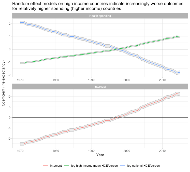
The models fit the patterns observed in the data wherein relatively lower-income countries converge and increasingly perform relatively better following their lower expenditure levels (which also happen to imply relatively lower burdens from things like obesity).

The residuals for each country are mostly constant. Countries which start significantly above-trend, stay above trend by a fairly similar amount and vice versa. In other words, this model does a reasonably good job of explaining why countries that experienced significant shifts relative to other high-income countries experienced the shifts that they did.

These patterns are also robust to the inclusion of country fixed effects and exclusion of the United States. It is sensitive to which countries are included, but this relates to income levels and that is to be expected. If countries of substantially lower development are included, like Turkey and Mexico, the results will be different because the log-linear model is a poor approximation of the cross-sectional relationship most years. The more heterogeneous the frame (annual grouping), the more non-linear models are required. When modeled with a polynomial approach, the curves also shift down and are consistent with the evolution of the slope indicated by the random effect models38
Life expectancy growth has slowed markedly in high-income countries (lines for each country are loess smoothed to aid visibility)
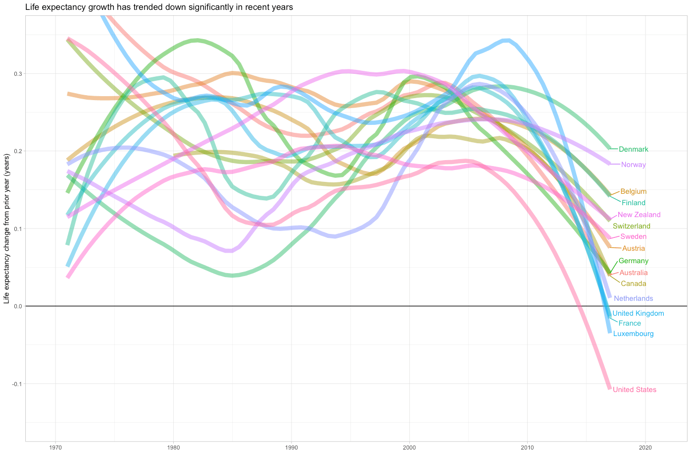
Several countries, such as the UK and Italy, have experienced actual declines in life expectancy (not just the United States), but the change in the trend is clearer and more widespread.

This aligns with the previously observed fact that mortality tends to decline during recessions and that income growth resumed around 2010. This is not to suggest life expectancy will necessarily decline or even stop growing in the near term, but I believe it is consistent with the view that the headwinds imposed by lifestyle factors (which are correlated with income) are swamping the incremental gains achieved by additional health inputs at the frontier. As the general gains from marginal health inputs decline and the effects of obesity and related issues continue to accumulate, the average increase is likely to slow significantly such that relatively short-lived, substantially reversible problems (e.g., opioid crisis) can result in negative life expectancy growth.
The gains achieved by basic public health measures and medicine have gone a long way to suppress the lifestyle signal. Fundamentally basic, relatively cheap things like sewers, clean drinking water, vaccines, and antibiotics have done much to save lives. People in high-income countries mostly aren’t dying from the same causes that take a non-trivial fraction of lives in less affluent countries.
It’s not just the poor countries that struggle with such problems. Poland and Turkey, for example, were still struggling with them in the early 90s and still do today to some extent. More peripheral developed countries still have the potential to make relatively rapid gains by addressing some of these residual problems (and they likely will) whereas more firmly ensconced rich countries face a different set of problems.

Though the slope is very steep initially, it gets much harder to save lives as countries get richer. Rich countries are almost exclusively battling non-communicable diseases (cardiovascular, cancer, etc.) whereas poor countries are mostly battling communicable diseases and related problems even to this day.

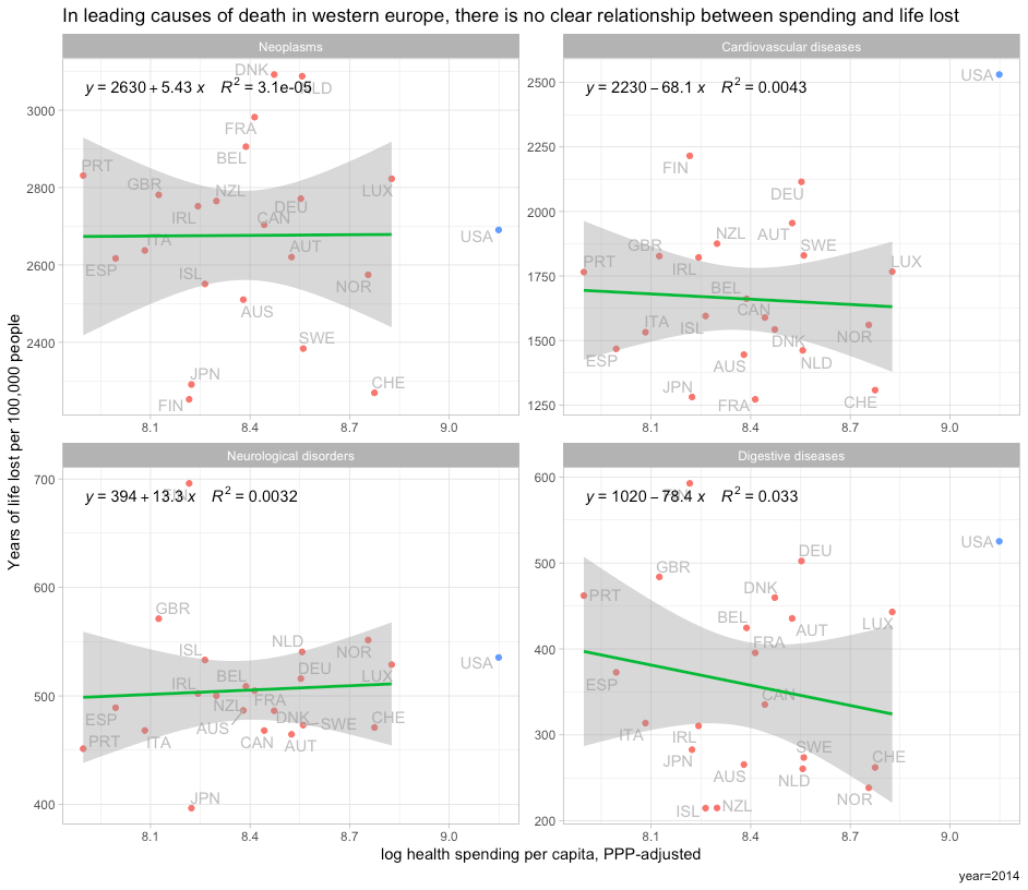
Though there clearly has been some progress in cardiovascular treatment and the like, the gains here are much less rapid and are largely shared by all countries near the frontier today. To wit, there is damn little to suggest a significant relationship between spending and outcomes amongst developed countries in Western Europe’s four leading causes of death.
It is silly to assume the same rate of progress when (1) the data don’t support it, (2) the issues are surely different, and (3) there are likely to be strong countervailing forces. It is unlikely the issues the United States faces are apt to be resolved by merely replicating the healthcare regimes found in other countries (different problems require different solutions) and it is a mistake to assume rising income and rising health expenditure must necessarily be perpetually associated with rising life expectancy.
Notes
(see below)
- This may come off as a little harsh. Although The Economist, NYTimes, and others have circulated variants of this plot with similar arguments vis-a-vis US healthcare, OWID is the most popular purveyor, so I largely focus on their analysis. The thing is, I actually like and respect OWID generally! (Data! Plots! Sharing data!) We could do with more of them in this world.
However, this particular widely shared analysis is sloppy and misleading. I expect better from them. It’s fine if they want to throw up a plot like this and say “life expectancy goes up with (health spending|income)” without getting into confounds, diminishing returns, and so on. Clearly, there is some causation here. But, when they obviously have at least an inkling about diminishing returns and effects of the technological frontier, they must know it’s inappropriate to draw naive inferences about the efficacy of a particular healthcare regime based on such plot (linear scale, unmatched time series, etc). Indeed, it should be fairly obvious to people with some background knowledge (e.g., OWID) that the slopes for the relatively poorer countries in the plot are much steeper. To then go further and say:
Two points are worth mentioning. Firstly, all countries in this graph have followed an upward trajectory (life expectancy increased as health expenditure increased), but the U.S. stands out as an exception following a much flatter trajectory; gains in life expectancy from additional health spending in the U.S. were much smaller than in the other high-income countries, particularly since the mid-1980s. And secondly, the gains for all countries (except for the U.S.) were not diminishing, as in the previous graph.
This is misleading, to say the least.
-
Although some OECD countries in Europe and Asia have converged closer to the United States over the past several decades, much less developed countries generally have not converged economically (save mostly for China).

Human capital and learning (cognitive skills) haven’t changed very much either, but health outcomes clearly have.
-
While we can better approximate the spatial and temporal relationship as log-linear (t still overpredicts at the high end), as in the Preston Curve, please keep in mind this implies it takes exponentially higher spending to attain the same increase.

An absolute difference of $2000 dollars per capita, approximately the gap between USA and Switzerland in 2016, translates into a log increase of about .23 relative to Switzerland whereas the same absolute increase for the median country in Subsaharan Africa would correspond to a log increase of around 3, i.e., the implied effect on life expectancy in SSA is around 13 times larger — more than an order of magnitude.
Moreover, these models seem to substantially overpredict the improvement amongst the more developed countries, and they don’t even correlate in recent years.

Despite substantial variation in fitted values (log health expenditure) the estimated slope is approximately zero and appears to be significantly lower than that estimated over the entire WHO dataset.
- I say curious because (1) they acknowledge diminishing returns to expenditure in other parts of their blog posts on healthcare (2) they have used a log-linear scale with life expectancy and related outcomes in the past (it clearly fits the data better) and (3) they usually offer the ability to toggle scales in their interactive plots (it’s often the default) — here’s it’s apparently disabled.
-
Countries that started with higher health spending see systematically smaller gains. We see this in a broad international context.

And we see this amongst high-income countries.

The true causal effects of health spending are likely diminishing even more rapidly than the log-linear function implies. We may even see some indication of an inverse relationship amongst the highest-income countries in recent years, but the latent causal relationship is nonetheless likely increasing monotonically. [ The average marginal causal effects of health spending are probably not actually negative, not even at the margins the United States spends at — if there is a negative slope– it’s probably because some other factor, like diabetes/obesity, happens to be rising with income and health spending and health spending effects aren’t large enough to offset it.]
At any moment in time, there is a technological frontier past which the returns to expenditure are effectively undetectable vis-a-vis mortality rates.

The noise floor (e.g., idiosyncratic national differences in obesity) swamps very small gains on large-scale measures like life expectancy and overall mortality rates (causal effects are more likely to be observed on finer-scale measures where high-income countries are more differentiated, like specific cancer survival rates). However, the technological frontier also shifts out slightly with time. The same level of real expenditure today can do much more than it could have a few decades ago.
Even countries that don’t increase spending at all still enjoy health gains because of technological developments (mostly spillovers from high-income countries). The inflection point probably gets pushed out slightly with time, but high-income countries are so far out in terms of health inputs (at or beyond the “flat of the curve”) that differences in expenditure cease to be predictive. Lower-to-middle income countries, meanwhile, are far enough from the frontier they can experience rapid gains from healthcare (not to mention sanitation/public health, transportation, and probably relatively less long-term exposure to the side effects of western lifestyles, namely, diet)
- It’s the intercept or country fixed effect that needs a little more investigation and explaining. While the changes in life expectancy and its slope in relation to spending changes are theoretically congruent and can be very well explained by simply looking at the relationship between spending and outcomes in panel data, we actually need to look at other factors (e.g., obesity rates) to explain why some countries have different intercepts. These other factors likely do have some modest impact on the slope, but initial expenditure and changes in expenditure are adequate explanations for the US slope and explain most of the variance amongst OECD countries.
- These patterns, incidentally, are virtually identical with indicators of material living conditions, like Actual Individual Consumption, Adjusted Household Disposable Income, or even Final Consumption. OWID could have produced a very similar plot with consumption and I’ve actually run these regressions but omitted them to save space.
-
The strength of the secular trend is quite obvious.

If we look at actual changes there is little to no correlation between percentage (log) changes in spending and changes in life expectancy.

While we have a hard time seeing any relationship by changes in spending in this dataset, even when extended over several years, life expectancy nonetheless increases at a fairly steady rate (countries further from the frontier increase faster).

-
We can predict the slope observed in OWID’s plot and explain the US using patterns for other high-income countries.

1970-2015

Likewise, if we apply this same procedure to more recent data with more countries.
1990-2015

Likewise, if we zoom out (~all countries), the US remains on-trend.
Worldwide 2000-2015

It’s generally evident that the richest countries have markedly flatter slopes. The United States is simply further along the continuum of diminishing returns because it started much closer to the frontier and because its health spending has grown quicker than other high-income countries.
- Beyond the obvious economic and cultural similarities, a large proportion of American settlers and migrants were from the United Kingdom and Germany. Much the same goes for other Anglosphere countries in this dataset. These origins may be important from the deep roots perspective (via culture, institutions, etc) and genetics may also play some non-trivial role in disease risk, particularly when even less related high-income countries are in the dataset (Southern & Eastern Europe, East Asia, etc). While I’d prefer to have all developed countries in the regional dataset, there is something to be said for analysis of closer comparisons if we are trying to isolate the effects of differences in healthcare systems.
-
The bivariate effect is much larger than necessary to explain the US relative to “comparable” countries.

This implies a hypothetical county reporting 100% obesity has an expected mortality rate roughly 51 times larger than one with zero. This is probably somewhat confounded as this effect is also much larger than would be implied by individual-level analyses. On the other hand, the effects observed in such studies probably non-trivially under-estimate the long-run causal effect of high body fat and thus the sort of effects that are apt to be found in population-level analyses. The truth is probably somewhere in-between.
Even with an extensive set of controls, obesity survives as a powerful predictor in ecological data of this sort. Here is a partial residual plot wherein first I’ve controlled for log median income, state fixed effects, race/ethnicity (% black, % hispanic, and % asian), income inequality, % elderly, education (% with some college or more), % rural, % adults uninsured, and % of children uninsured.

Though obesity may still arguably predict excess mortality for other reasons, this should do a reasonable job of accounting for bias from differences in health system access and socioeconomic disparities (and then some). Holding these covariates equal, this implies a county with an obesity rate one unit above the conditional average is predicted to have a mortality rate ~250% higher than would otherwise be expected. Obesity is likely a major source of mortality between groups, which we’re significantly controlling away here, and there is likely considerable measurement error in this obesity measure (survey-based with modest n in many counties), so I’d bet the real effect is probably considerably larger. Still, that’s not a small effect.
- Smoking causes weight loss and increased mortality, ergo smoking tends to reduce the apparent unconditional mortality effects of higher BMI.
- Those few that aren’t suffer from other problems, such as, anorexia or cancer, and such people aren’t likely to benefit from our increasingly obesogenic environment. The very few that aren’t otherwise probably aren’t so far to the left that they’re likely to benefit appreciably from body fat gain.
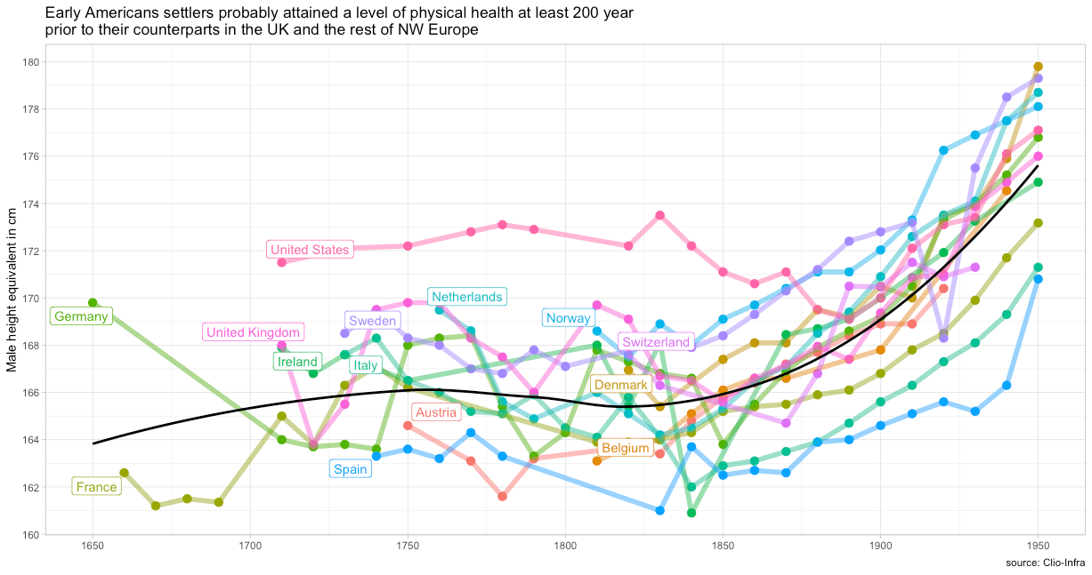
- The United States almost certainly escaped the Malthusian trap hundreds of years ago, well before the industrial revolution is thought to have taken hold in England.

This transition happened in America before essentially all of our European counterparts. It’s almost certainly explained by the fact that American settlers had vastly more agricultural land per capita. This may have shaped attitudes towards diet and eating in ways that are unlikely to be well reflected in income levels today (or even at the time)
- Some individuals have more bone and muscle mass conditional on height due to genetics, exercise, age, and related idiosyncratic characteristics that will tend to systematically confound inference about body fat. Such differences are possible between populations to some degree, but they are probably proportionally smaller. Put differently, there is probably much more variance within populations than between populations in these other dimensions.
-
BMI increases much faster than body fat past some threshold because the relationship is non-linear.
Although there is probably something to “preferential unmasking” and related notions, a large fraction of the increasing variance and almost all of the increasing skewness in the BMI distribution is an artifact of how BMI is constructed. The rise in BMI reflects very real increases in risk, but the obesity distribution and mortality risks are probably better modeled with another proxy for body fat, such as inverted BMI.
Inverted BMI seems to be a better proxy for body fatness (the presumed source of risk and the underlying phenomenon we’re trying to capture) and the distribution is clearly much more normal (which facilitates statistical analysis).

- I right-censored BMIs greater than 60 and left-censored BMIs less than 10 because of uncertainty about the effects so far from the rest of the distribution. The implied effects are larger but less stable without such treatment. The outliers on the right tail probably are an important part of national mortality rates and the risk profile likely keeps on going up, but I don’t want to lean on them given sampling issues and the like!
- Whereas they estimate 0.5 to 0.6 percent per year on age-standardized rates, my crude analysis suggests it’s about 0.8% (without accounting for changing age structure, etc). It’s roughly in the same ballpark.

- Particularly between countries of broadly similar social and economic development, as in, these comparable countries are: very far from the Malthusian trap (~high per capita incomes); have broadly similar income, age, and sex distributions; broadly similar ethnic/cultural characteristics; and the like. Though such methods surely aren’t completely useless in the developing world, there are likely to be significant systematic biases when comparing across times and places with wildly different social and economic development. Perhaps more importantly, the statistical reliability of such data from most individual countries in the developing world tends to be quite poor
- I don’t want to make too much of the particulars since the NCD RiSC estimates were modeled using microdata to impute missing data necessary to produce this dataset (surely some measurement error when it comes to using these estimates!). Nonetheless, it’s worth pointing out that more extensive analysis with more complex models supports my assertion that the obesity rate and general nature of the BMI distribution are quite well correlated and, most importantly, high obesity % predicts proportionally more people with extremely high BMIs. The data coverage, quality, and comparability (environmental factors) are likely adequate to get a reasonable picture of differences in the BMI risk profile amongst high-income OECD countries (probably less reliable for developing countries)
- I suspect this is best explained by many years of higher real income levels, which largely persists to this day, and differences in deep roots.
To put a little meat on the bones concerning deep roots, you might notice that the other Anglosphere countries are also significantly right-shifted in the BMI distribution, even if not quite at the level of the United States. Further, American ancestry drew much more heavily from the periphery of the UK (Scotland, N. Ireland, Wales) than the UK as a whole (particularly today) and these regions have higher rates of obesity and mortality. Likewise, those regions of the US with larger proportions of this population, particularly the deep south, Appalachia, and the lower midwest, suffer in both of these dimensions.

- The exact values or cut-points used shouldn’t much affect the pattern of divergence between countries, which is primarily what I’m interested in showing here. However, for the sake of transparency, I used hazard ratios for “Never Smokes, All Studies” Table I of the supplement of Aune 2016 to approximate this.

The binned approach is likely to underestimate the risk at the tails (overwhelmingly on the right side) since as the percent in the top bin (>=40) rises those with even more extreme BMIs rises along with it, i.e., the approximate value for the top bin will increasingly tend to underestimate the average risk in the category. This crude approach will still suffice for illustrative purposes though.
- Included AUS, AUT, BEL, CAN, CHE, DEU, DNK, ESP, FIN, FRA, GBR, IRL, ISL, ITA, JPN, LUX, NLD, NOR, NZL, PRT, SWE, and the USA.
-
I include this because of the non-linearity between body fat and BMI, and potential concerns about these effects spilling over into the US due to its particularly high BMI (i.e., higher than the linear trend on body fat might suggest). However, this has no effect on the model, save for the expected difference in the sign on the BMI measure.
-

-
This is easier to understand visually. Keep in mind that this was fit without the United States in the model and the points in these contrast plots also exclude the USA.


-


-
Yes, there is clearly a secular trend of declining mortality, just as the reverse is true for life expectancy (they’re strongly correlated). However, the cross-sectional patterns between already developed countries suggest differences explain basically nothing (in the expected direction). Indeed, the coefficient implies worse outcomes for higher spending countries in recent years even though the US, the presumed outlier, is excluded from the model. I suspect this isn’t caused by the adverse effect of health spending (overall). Rather, health spending is probably operating as a proxy for higher incomes which predict worse health outcomes on these margins as a result of behavioral/lifestyle factors (e.g., obesity/diabetes, drug abuse, etc).

-
Log age-adjusted mortality is strongly correlated with life expectancy, but not quite perfectly so.

Deaths early in life have a much larger effect on life expectancy than age-adjusting mortality rates corrects for. Although there are differences in mortality rates throughout most of the age distribution, which excess caloric intake (obesity, diabetes, etc) surely contributes to, the residual for the US, i.e,. life expectancy conditional on the age-adjusted mortality rate is likely to be well explained by other causes of premature death, particularly homicide, car accidents, and drug overdose deaths, which directly explain a large fraction of the life expectancy gap relative to “comparable” high-income countries.

The hump in the ratio between, say, 15 and 49 years of age is particularly conspicuous. Without these additional premature causes of death, the ratio would likely decline fairly linearly with age, i.e., the lifestyle factors vis-a-vis dietary/metabolic risk (obesity, diabetes, etc) would still have a large impact on life expectancy and the impacts would be most felt earlier in life.


- One visible indication of this is that income only seems to predict within countries.

It holds up poorly between countries. At the very least, these effects are swamped by idiosyncratic national effects that shift the intercept dramatically relative to the predictive power of income. Richer regions tend to be less obese and likely have other behavioral/lifestyle factors working in their favor.

Very much unlike income levels, obesity seems to predict both within and between countries.
-

-
Accounting for year fixed effects almost entirely mediate health spending effects amongst reasonably high-income countries over the past few decades (1980-2014) and this effect is likely non-linear (big effects for countries distant from the frontier but near-zero marginal effects for everyone else). Better accounting for the non-linearities will tend to make the US look better in conditional terms (linear specification over-predicts gains).

By contrast, the secular trend is strong and quite consistent.

Likewise, morbid obesity is a strong predictor even without the USA in the model.

In case you’re curious, these other relatively high obesity countries are primarily New Zealand, Canada, United Kingdom, and Germany. They’re also increasingly trailing other high-income countries and doing so in a way that is quite consistent with their estimated obesity rates.

- Keep in mind that maternal mortality accounts for about 700 lives each year. As tragic as that is, it’s relatively rare in population-wide terms. For perspective, most people imagine HIV/AIDS deaths are pretty rare these days, but it takes about an order of magnitude more lives each year (though declining).
-
Using maternal mortality ratios and the fraction of pregnancies to obese women for the available states, we find a rather steep slope.

The correlation isn’t super-strong, but there’s not perfect consistency in reporting and there are other risk factors that likely contribute (adds noise). Using a similar measure of obesity for national data (BMI >= 30), the slope seems to be in the ballpark. The slope appears larger within the US, but that may be due to their age-standardization function.

-
There is practically no relationship with spending amongst developed countries.

And obesity is a rather strong predictor of childhood mortality.

And, again, we find obesity remains a strong predictor in panel data and mediates the USA dummy.

- Although they disaggregate the data somewhat differently, their metabolic risks map to strongly to obesity and its comorbidities.
Metabolic risk factor disaggregation

Dietary risk factor disaggregation

-

-
A basic polynomial model in bog-standard linear regression (not random effects) on OWID’s “high income” dataset generates this slope when country fixed effects are included.


The fitted growth paths for individual countries generally seem to hold up pretty well. Some countries do a little better and others do a little worse than the model suggests, but the errors don’t seem to align with income/health expenditure levels despite a significant negative slope at high values.
Without country fixed effects, the slope appears to be flat at high levels.

However, the predictions are biased when disaggregated by country and by year, indicating that the results aren’t very useful for these purposes.


Nothing useful to add, just want to say thanks a lot for writing these incredibly in-depth posts! It’s so refreshing to see important public policy questions tackled with a clearly argued data-driven argument.
I have this idea that Heath Insurance is not Good for Everyone.
And the people it is not good for are unwise males.
I can’t wait to read much more of this analysis when time allows. One comment (that may or may not be fair as admittedly I have only scratched the surface) is that while you focus a lot on what’s behind the mortality, and rightly so, there is another story to be told on the spending side.
It comes down to the incentives inside the healthcare industry, and how they make money. It seems to me, from the outside looking in, that the healthcare industry isn’t selling ‘health’. Because of the 3rd party payer model, and the various industry protections and regulatory relationships, the industry is selling ‘care’ or ‘treatment’, and those may or may not have a positive impact on mortality. This folds into the marginal benefit of increased spending because it serves to increase the profitability of the industry without always having a measurable positive impact on the health outcomes and sometimes even a negative one (see Dope Sick).
If you touch on this deeper in the article, then great, can’t wait to read it! Thank you, great work!!
“In sum, these two behavioral/lifestyle factor risk groups cost the US roughly 4-5 more years of life expectancy than the countries with which we are typically compared.”
Eyeballing the graph, shouldn’t this say 3-4 years?