I created a primer on fundamental misconceptions about health care

I created a new page on my website (randomcriticalanalysis.com) to summarize my research on health care.   It’s not exactly short, but it covers a lot of ground that I’ve previously spread across several blog posts, activity on Twitter, and elsewhere.  Some of the content may be new to regular readers, but mostly I’m aiming to cover major misconceptions in just enough depth to drive home the point(s) without putting people with less interest or attention to sleep.  🙂

I created the primer as a page instead of a blog post in WordPress because it’s something of a work-in-progress, and I may extensively edit it later. In contrast, with blog posts, even my epically long ones, I typically only edit them for glaring typos and grammatical errors shortly after I’ve published them.  Nonetheless, it’s a good idea to idea to link to this so that it can be discovered from the blog and RSS feed.

A response to my least charitable critics on health care

Alex Tabarrok of Marginal Revolution linked to my primer and other research on health care recently.   This brought a lot of extra attention to my work.   Most of the response was positive, I think, but several people angrily lambasted my analysis.  The adverse reactions generally amounted to little more than name-calling, and much low-quality material was amplified by the usual suspects.

screenshot_5873.png

I will not respond to name-calling.  I will, however, reply to the few seemingly substantive critiques for the benefit of those that have trouble recognizing how weak these arguments are.   I will also use this opportunity to drive home the point that health spending growth has clearly been increasingly non-linearly as a function of income, with the slope increasing, increasingly, in global cross-section and OECD panel data analysis.  Indeed, I will show that the constant rate of relative increase implied by log-log regression specification, which triggered certain people, tends to underestimate the slope at higher income levels significantly.

It’s still not the health care prices (2017 edition)

The OECD just published its PPP benchmark data for 2017, which contains the best and latest international estimates of price levels for health care.   The OECD health PPPs and associated research are probably the only reliable international comparisons of health care prices.   Although I have already presented data from several rounds of OECD’s analyses (as have they) and found consistent results, the latest data indicate these patterns have not changed appreciably.   Clearly, these results are not flukes.

Noah means Noah: the high income-elasticity of health expenditure does not mean we are all going to starve!

On Twitter, the other day, Noah Smith (@Noahpinion) argued the mere fact my model shows the income elasticity of health expenditure is greater than one implies these higher-income regimes are “starving themselves to death” to pay for healthcare.

screenshot_5428.png

Noah does not seem to appreciate that (1) my independent variable, income, is measured in real terms and (2) the relative price of expenditures changes systematically with incomes.  Real income levels are overwhelmingly determined by productivity.  As incomes rise, it generally takes less input to obtain the same quality-adjusted quantity.   It is quite possible to allocate less input (especially human resources) to a given expenditure category and, simultaneously, to consume a larger quantity of that category per capita.  The rise in productivity leaves room to increase real consumption.

rcafdm_oecd_income_health_elasticity_2017.png

Above and beyond the real income growth (i.e., the decline in average prices relative to nominal income levels), prices move relative to each other.   Relative prices are systematically related to real income levels (spatially and temporally).  Some prices rise relative to other prices due in large part to inherent differences in potential productivity growth and their exposure to the domestic labor costs.

Relative prices are clearly very much related to income growth, but relative prices are nonetheless an important partial conceptual explanation for the changing consumption share.  Broad price indices are useful statistical tools, however, they hide significant systematic differences in underlying prices that are necessary to understand differences in material living conditions over time and between countries.

A tale of two covariates: Why OWID and company are wrong about US healthcare

In the popular telling, there is a strong and reasonably constant relationship between health spending and life expectancy.  We can presumably compare countries of “similar” development with eyeball regressions well enough to make strong inferences about the efficacy of a particular country’s health care system1.  I have doubts.

screenshot_5347.pngsource

In reality, healthcare is surely subject to rapidly diminishing returns and other factors shape outcomes largely independent of actual health inputs.   Striking as such plots may be, the apparent slope for the United States can be readily predicted based on the relationship observed in other high-income countries with nothing more than time series for health expenditure and life expectancy.   Truth be told, the average marginal effect of health expenditure for high-income countries in recent years is likely pretty close to zero (particularly as pertains macro-level indicators like life expectancy).

The US intercept, meanwhile, can be explained quite well by obesity.  Obesity is likely to have very large negative effects on all manner of health outcomes.  It is actually much more predictive of outcomes in the developed world than health spending.  Indeed, the effects of obesity and related western diseases may be such that the apparent slope on health spending turns unambiguously negative in the developed world in the future (cross-sectionally, even if not in time series…).

Income is a double-edged sword.   Income growth strongly predicts health spending growth, but income growth also predicts rising obesity, diabetes, prescription opioid use, illicit drugs, and likely several other “western” illnesses.  While there probably are some idiosyncratic US factors not explained by current income levels (e.g., deep roots), many of these “American” issues are more widespread and more linked to income than most people appreciate.   The equilibrium between the positive side (esp. healthcare) and the negative side (overeating, drugs, etc) is likely to seriously confound extrapolation from prior experience because of the non-linearities and tipping effects involved with these different processes.

Why everything you have said about the determinants of health expenditure is wrong in one million charts: a response to Noah Smith.


Disclaimer: The title of this post is somewhat tongue-in-cheek and I fell slightly short of one million charts.   Also, Noah probably isn’t wrong about everything he’s ever said on this topic, just the central points under contention, and he has tons of company.  


Noah Smith (Noahpinion) recently published a column in Bloomberg with the title “Health-Care Costs Are Still Eating the U.S. Economy.”  This came to my attention because he was kind enough to link to my blog when he alluded to my arguments on health spending.  Though there are obvious areas of agreement (e.g., that health spending has risen faster than income; that the so-called “cost curve” hasn’t been bent; that rising health spending puts a very real crimp on take-home paychecks amongst the working class), I strongly disagree with the central arguments he advanced and feel that he did not quite accurately characterize my views.

Noah wrote:

“In sum, health care is still eating the economy, and that’s still cause for alarm….Why is this happening? Some argue that the U.S. is just very rich, and that prosperous countries choose to spend more on health care, which drives up prices.  They note, for example, that although U.S. health-care spending is unusually high as a percent of gross domestic product, it’s not th at high as a percent of individual consumption. But this isn’t very convincing, because consumption is a result of high health-care prices as well as an effect — high health care prices force Americans to use more of their income than people in other rich countries.”

He seems to misunderstand the argument and appears to be insufficiently aware of the evidence against his assertions.   Since he is surely not alone in these thoughts, I am going to put some time into weaving together statistical evidence, supporting data, and thoughts I have strewn over a good number of blog posts, tweets, etc. over the years.   My goal in this post is to parsimoniously explain the evidence at multiple levels, clear up misperceptions, and address probable objections for the benefit of those that have invested considerably less time into assessing the evidence for themselves.

(warning: this is going to be even longer than usual).

On the relevance of the income inequality to expected health expenditures.

Last week, Hubert Biscuit posted a response on Medium questioning the relevance per capita income to national health expenditures.

He believes that a distributionally-adjusted measure is a more relevant way of understanding health spending and that higher US income inequality implies much lower spending.  Several others have also raised similar objections in response to my arguments on US health care over the past year or two.

I have several lines of response to these sorts of concerns.

It’s not the prices, stupid. A response to Austin Frakt’s and Aaron Carroll’s NYTimes article

Austin Frakt and Aaron Carroll recently wrote a piece for the New York Times re-hashing Uwe Reinhardt’s fifteen-year-old argument (“It’s The Prices, Stupid”) that high prices explain why US healthcare spends so much more than other countries.

Reinhardt’s argument was never well founded, and FC did not substantively advance it.

Health care prices do not play the role most believe

As I mentioned in two (long) posts on how comprehensive measures of household consumption or disposable income explain high US national health expenditures (NHE) rather well, I believe US health expenditures are overwhelming accounted for by higher volume of health consumption (the quantities of goods and services consumed in the health care sector).  I reject the popular notion that idiosyncratically high prices are what causes the US to spend so much more than other OECD countries and I reject the notion that rising health prices explain why US health expenditures have grown so much faster than income over the past few decades (at least).

This does not mean that prices play no role whatsoever in international comparisons of NHE.  It does not mean, for instance, that if we could somehow force U.S. physicians, nurses, and various other workers in the health care sector to work for the real remuneration paid to their counterparts in, say, Brazil with equal productivity that the price of medical care, especially more labor intensive categories, would not plummet (presumably real NHE could decrease if volume were hold constant…. not a very safe assumption imo).  It means that the reason health expenditures have accounted for an increasing share of our consumption (or income) over time has little to do with prices increasing relative to income and a great deal to do with the volume of health goods & services consumed rising at a faster rate than overall consumption (or income) per capita.

animated_nhe_consumption_share_by_country

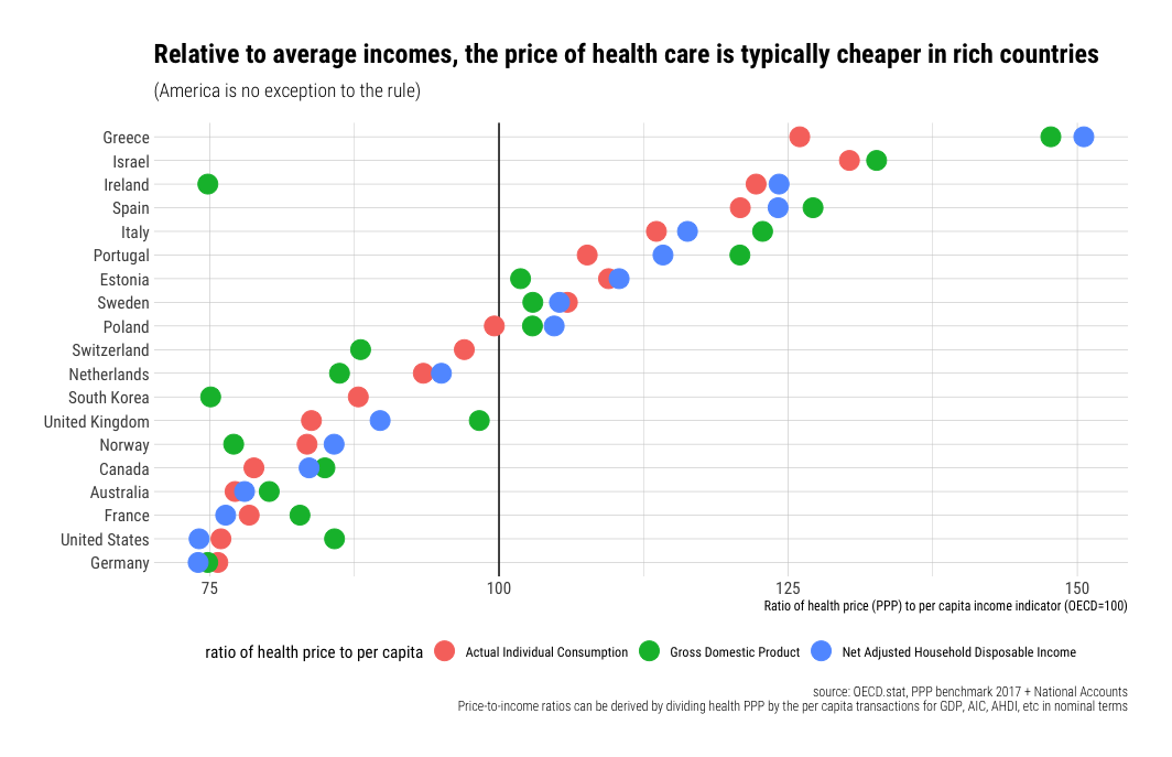
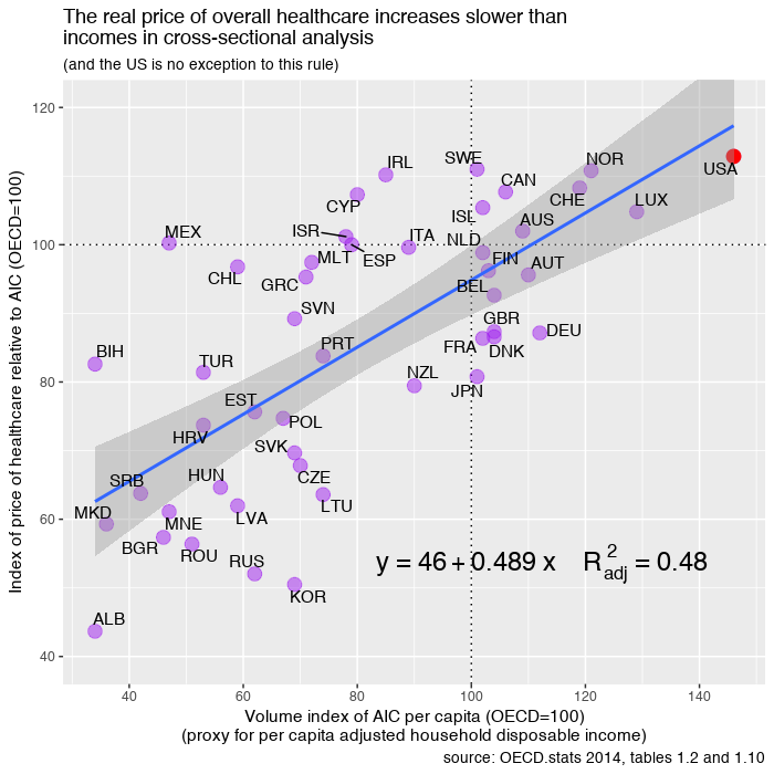
Much the same goes for international price comparisons in cross-sectional analysis.  The cost of an internationally equivalent basket of health care (both goods and services) rises a little faster than the cost of a broader, economy-wide/GDP, basket of goods and services with rising income levels, but it does not rise all that much faster with respect to income (actually somewhat less overall in the long run).

In order to significantly explain the presumably large US residual in NHE per capita (obviously I don’t quite agree with this perspective) there must be a large residual in the actual relative price levels; we simply do not find any evidence of this with the best available evidence.   With better data US residual is either slightly above trend (by no means an “outlier”) or below trend, depending on the precise predictor (e.g., GDP, AIC, average wages, etc) and the basket of goods and services employed.  In no case do I find evidence of a large departure from trend in any broad, highly impactful, index of health price levels that would suggest that high US NHE isn’t overwhelmingly explained by high volumes of (real) health care consumption.  More generally, the cross-sectional and time series data are actually quite consistent with each other, i.e., the issues that drive (US) expenditures up in time series are quite consistent with and related to the what we observe in cross sectional analysis between countries.


No, US school funding is actually somewhat progressive.

Note: I have already touched on these issues in a much longer, much broader post on education and on twitter at some length, however I thought it’d be useful to zoom in on this issue and marshal the evidence in one place for future reference.

It is still commonly supposed by much of the public that school funding is terribly unequal due to reliance on local funding mechanisms (especially property tax).   Although there were once modest inequalities associated with local income levels (several decades earlier), this information is generally wildly out of date today.   Within the vast majority of states districts with less advantaged students (read: higher poverty, lower income, fewer parents with college degrees, minority, etc) actually spend at least as much money per pupil (often more), both overall and in the narrower instructional expenditure category, and where there are inequalities these differences are usually quite modest and fleeting.

Though school funding is still significantly a local affair in most states there is substantial progressive redistribution of state and federal funds that effectively offset these potential inequalities (and then some).  Some districts may choose to spend more controlling for income/wealth (tax effort) and there is some variance (mostly poorly explained by any SES measure), so that malcontents can always find isolated examples to complain about, but various formulas employed at the state and federal level sets a floor and effectively acts to prevent there being substantial positive correlations between school spending and district median income (or low poverty rates, percent minority, school free lunch percentage, and so on …. this holds across multiple measures).