
About two years ago I created a long blog post arguing that the United States is not an outlier in healthcare expenditures per capita. Following renewed interest from a link from Marginal Revolution recently and some criticism from a few people on various comment threads, I thought I’d take the time to update the evidence, address some areas of criticism, and muster yet more lines of evidence to support my argument. This post should largely make the earlier post obsolete, but I will keep the earlier post up for posterity and to retain data/information that won’t necessarily be perfectly duplicated in this post.
Edit (12/12/18): I recommend reading this newer post instead if you’re haven’t heard from me before on this topic.
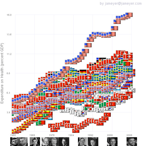
There exist several popular plots like these that people use to make the argument that the United States spends vastly more than it should for its level of wealth.


These plots and the arguments that usually go with them give the strong impression that US spends about twice as much as it should. However, these are misleading for several reasons, namely:
- GDP is a substantially weaker proxy for “wealth” and a substantially weaker predictor of health care expenditures than other available measures.
- The US is much wealthier than other countries in these plots in reality.
- The arbitrary selection of a handful of countries tends to hide the problems with GDP in this context and, oddly enough, simultaneously downplay the strength of the relationship between wealth and health care spending
- Comparing these two quantities with a linear scale tends to substantially overstate the apparent magnitude of the residuals from trend amongst the richer economies when what we’re implicitly concerned with is the percentage spent on healthcare.
When properly analyzed with better data and closer attention to detail, it becomes quite clear that US healthcare spending is not astronomically high for a country of its wealth. Below I will layout these arguments in much greater detail and provide data, plots, and some statistical analysis to prove my point.
Healthcare is a superior good
First and foremost, it’s important to understand that health care is a superior good, i.e., as countries get wealthier they spend an increasing share of their consumption (or income) on health care. I am certainly not the first person to point this out and, in fact, it has been well documented by others, but this tends to get swept under the rug or seriously downplayed when the issue of US healthcare spending comes up.
Academic economists have even pointed this out vis-a-vis GDP:

source
These elasticity estimates mean that health care consumes an increasing share of GDP as GDP increases.
Or see long run consumption data in the US (long before our modern healthcare system evolved).

source
The point being that the relationship between wealth and healthcare spending is not something unique to my analysis or my data. As countries get richer they tend to spend an increasing share of national income on health.
USA has a much higher material standard of living

Actual Individual Consumption (AIC) per capita is more than 50% higher in the US than in the European Union as a whole!
source
While a handful of small countries have higher GDP per capita than the US, the US has a large lead in consumption per capita. Further, the great majority of the major EU countries are much more compressed in consumption terms than they are in GDP terms (which creates some range restriction). This is true even when this consumption measure includes government transfers, subsidies, etc, notably including the vast majority of healthcare and education spending, as Actual Individual Consumption (AIC) does.
Since some people earlier seemed to miss to this point, I’ll repeat: the only form of consumption excluded from AIC is that which cannot be attributed directly to individuals or households, i.e, collective expenditures by government like military procurement and the like.

source
Actual Individual Consumption (AIC):
(1) can usually be trivially derived from most developed country’s national accounts data
(2) is explicitly published by OECD, Eurostat, WorldBank (ICP), and most developed countries as such (as in, “Actual Individual Consumption”)
(3) is regarded by many leading economists to be a better measure of material living conditions than GDP.
Further, we have other evidence for high US consumption besides national accounts aggregates.
For example:


The specific tables above are a little old, but the patterns are much the same today.
Here is a comparison between a measure drawn from a study based on PISA household inventory questionnaires to measure material well-being and AIC.

source
Note: These questions are pretty basic (e.g., desk: Y/N; own room: Y/N; etc), likely subject to some range restriction, and unlikely to be skewed greatly by a few high income families at top. However, the US still comes out #1 in the 3 years reported and is further from the mass of other highly EU developed countries (Germany, France, Great Britain, etc) than they are from, say, Greece, Spain, Poland, etc. These are not trivial differences in real consumption only found with this national accounts measure!
There is a similar pattern of divergence between consumption measures and GDP as we find with HCE and GDP


Consumption is a strong predictor of HCE
Using Actual Individual Consumption (AIC) we can explain the vast majority of healthcare expenditure differences between countries in any given year and the evolution of healthcare expenditure increases across more than 40 years!
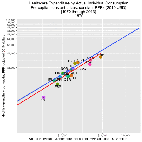
Although there is a small secular trend in the intercept by year, likely due in part to technological change, that influence appears to be quite modest. Clearly healthcare expenditures have increased dramatically virtually everywhere, but health care spending is generally well explained by differences in consumption between countries and across time, i.e., as countries have grown richer their HCE tracks closely with it. Countries that are where the US was decades earlier in constant PPP-adjusted consumption per capita terms (roughly the same material standard of living) tend to spend quite similar amounts adjusting for inflation and spending power.
Note: I am intentionally plotting both axes with log scaling. This lets us much more easily compare the growth rates in percentage terms and see the relative magnitude of the residuals (a country spending $1000 more than predicted at a base of $5,000 is much different than same at $25,000). It also lets us fit more data in a relatively small plot.
Likewise, we can observe a similar trend if we plot health care expenditures as a percentage of AIC.

The data appear noisier in percentage terms, but you can clearly see healthcare is commanding an increasing share of consumption across the board and that there is a pretty stable long run trend (some noise year to year due to economic cycles, introduction of new countries, etc)
HCE increases with GDP too (even if less well correlated)
If we look at this with GDP instead of AIC on the x-axis we can pretty clearly see a strong trend. As countries grow richer they spend more on health care.

And as a percentage of GDP…

Healthcare costs have been rising as a percentage of GDP and AIC pretty consistently everywhere and the reason is pretty obvious: they’ve been getting wealthier too.
If you eyeball the AIC and GDP plots you can see that there’s a lot more going on with GDP amongst the countries that OECD provides data on. Though I exclude data outside of the OECD data set from this analysis (did more in the earlier blog post), these flaws become even more apparent if you look at a broader array of countries with more diverse economies (e.g., high proportion export/capital equipment, large cross border/foreign worker sector, tourism, etc).

source
AIC holds up to these more extreme outliers much better. All of these extreme outliers actually have much lower consumption than their GDP per capita would suggest (see earlier post on this topic if interested in specifics).
[back to top]
AIC fits HCE substantially better than GDP
Even with the more limited data available in the OECD stats data set, there are obvious differences in the relationships here.

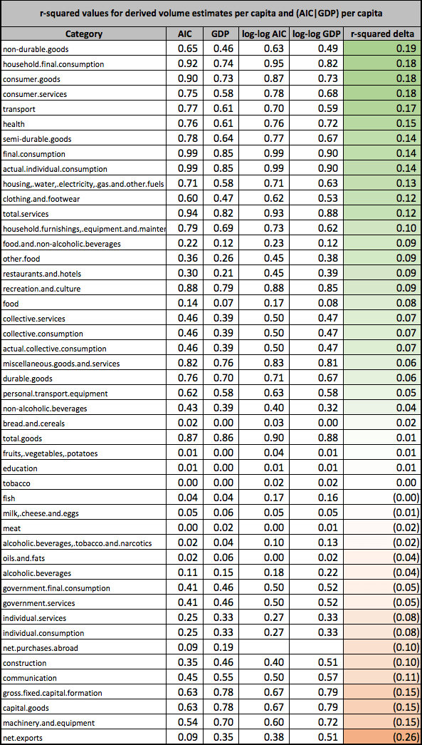
The plot above simply compares the r-squared values for AIC and GDP with HCE in per capita terms (all PPP-adjusted, 2010 dollars, etc) on a yearly basis. Whether the dependent variable is defined as a fraction of the relevant predictor (AIC vs GDP) or per capita HCE, log-10 or not, AIC holds up appreciably better and quite consistently across years (increasingly more now with more economies in the OECD data and more economic differences between countries). Clearly the stronger predictor here is AIC.
[back to top]
It matters how a country generates its GDP
Some people might think that a dollar of GDP is a dollar of GDP, no matter whether that economic value-add is derived from exports, consumption, or what have you for these purposes, but this is obviously wrong. Consider two countries of the same GDP where one derives fifty percent of its GDP (expenditure method) from net exports and the other zero percent. The latter will have much higher material standards of living almost by definition (most of that difference is apt to be found in consumption, not, say, capital formation).
Yes, export activity generally contributes to the material well-being of its citizens (profits, wages, taxes, etc), but we are already capturing that pretty well in other GDP expenditure categories (especially consumption). Similar issues apply to capital formation activity. Ultimately the consumption component of GDP tells us much more about how much money a country truly has for consumption and other more discretionary uses of its resources and thus how much much we can expect them to spend on healthcare.
The expenditure approach to GDP is defined like so:

I take the OECD figures for these components of GDP (expenditure approach) in OLS to estimate the predictive value of each component in various specifications below.
In model (1) you can see that the slope of log(AICPC) and log(HCEPC) is pretty tightly defined at 1.6 controlling for nothing but year fixed effects (i.e., allowing the intercept for each year to vary independently). Controlling for Final Consumption expenditures less AIC (collective expenditures in other words) as in model (2) reduces the AIC slope marginally, but clearly it’s still substantially positive and much larger than the estimate for collective consumption expenditures. Even if we remove HCE from AIC, to preemptively address complaints that the vast majority of HCE is allocated to AIC (and thus mechanically contributing to this relationship), we find much the same result!
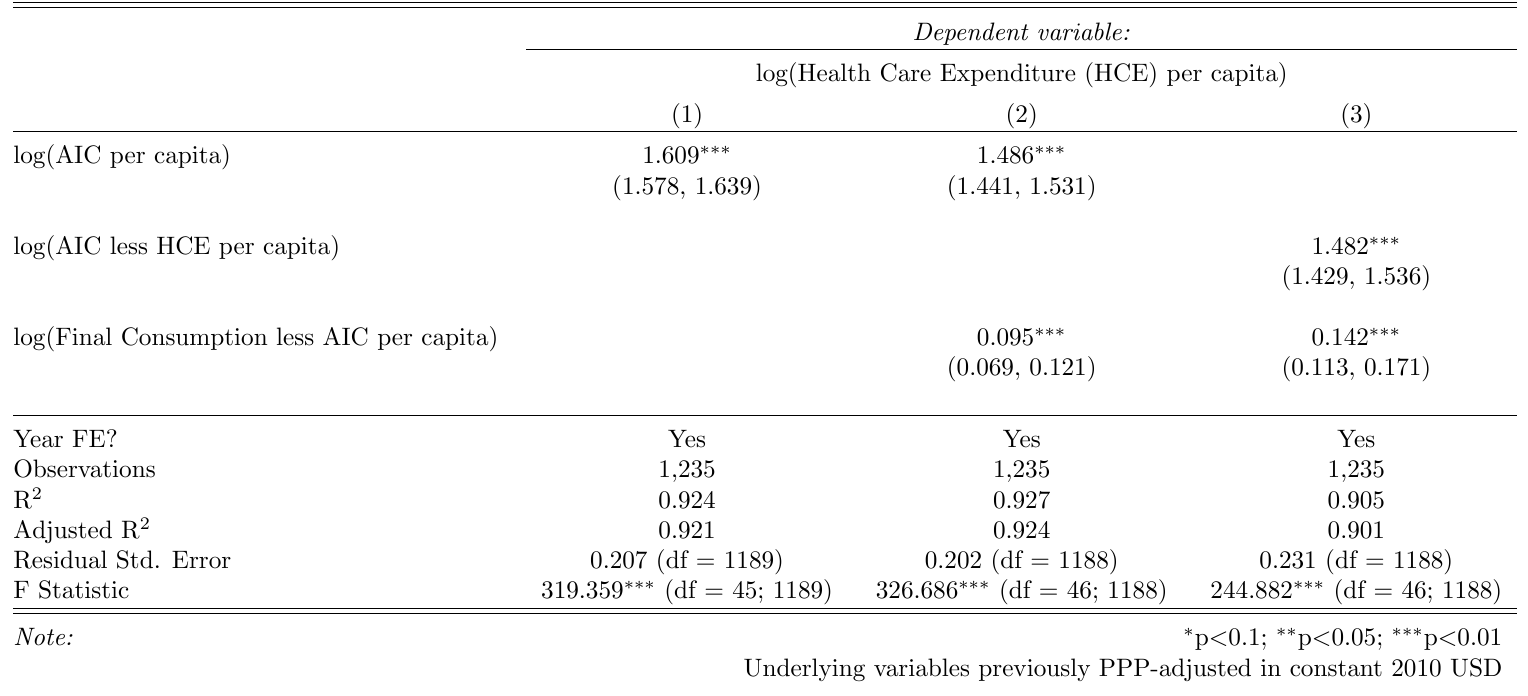
In model 3 below we compare AIC and GDP excluding AIC (basically collective consumption + net exports + fixed capital formation), we find vastly different slopes. If we go even further, as in model (4), and remove HCE from AIC we still find AIC beats out these other components of GDP by a mile.
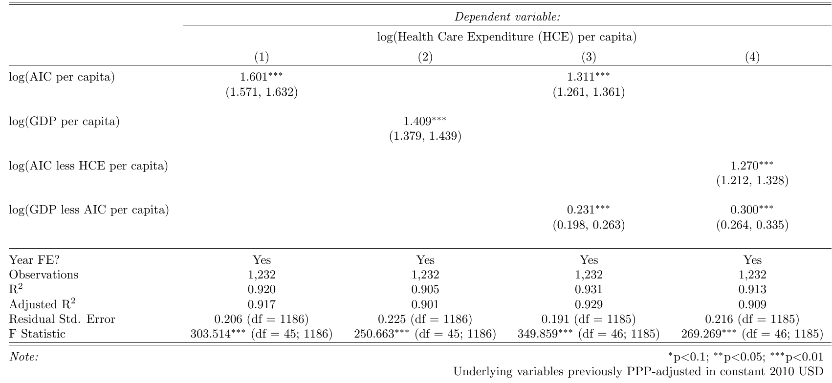
If I go a step further and break the GDP expenditure approach down into its major categories, albeit subtracting HCE from AIC, you can pretty clearly see that these different components have different implications for the amount of healthcare expenditure you can expect. In fact, this reduced subset of AIC appears to substantially mediate the predictive value of net exports.

If we break this to all the GDP expenditure components (mostly excluding the statistical adjustments to square the expenditure approach with the other approaches), without subtracting HCE from AIC, so that these should variables sum almost exactly with the GDP official numbers, we get something like this:
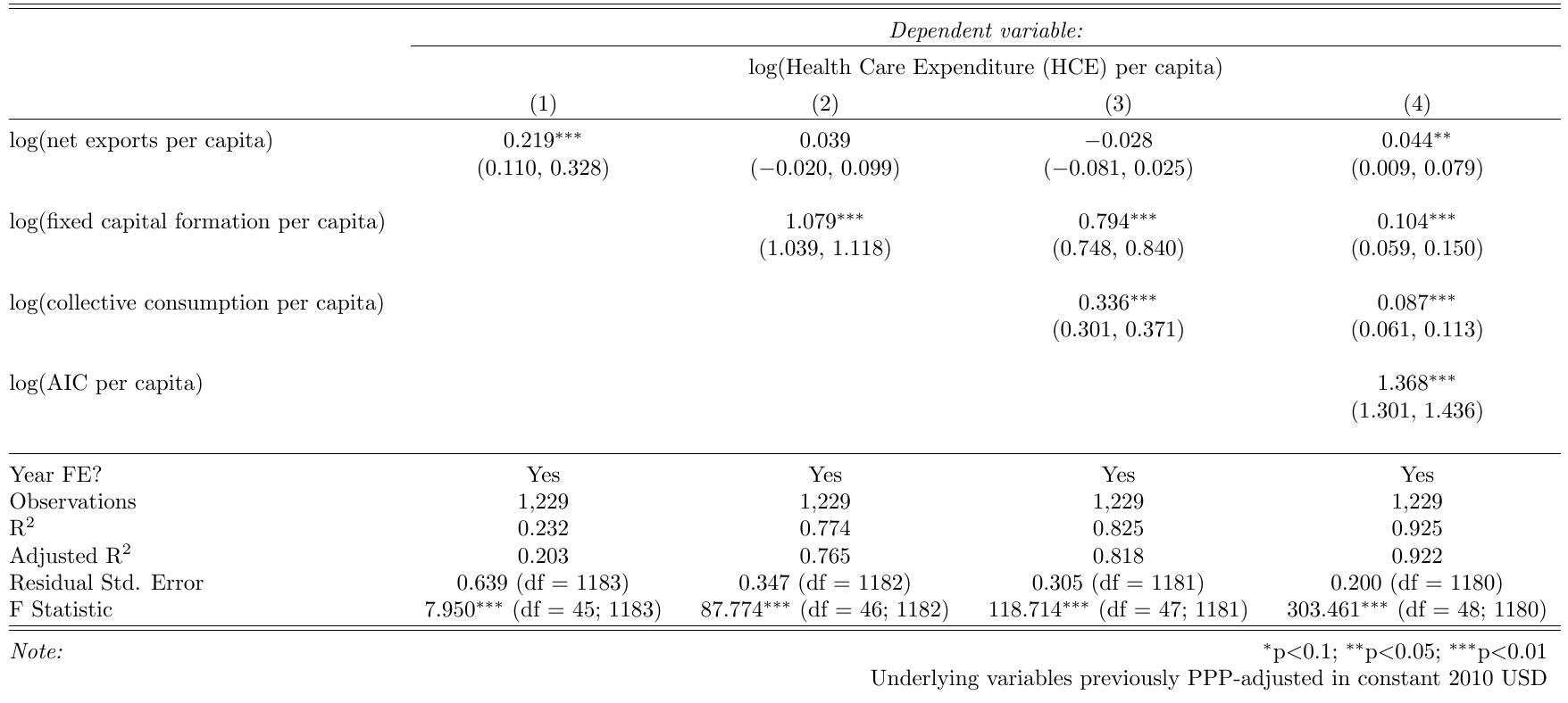
Even if I go a step further and introduce the United States as a flag variable (USA=1), you might observe (1) the other variables hardly budge (2) the model fit doesn’t much improve and (3) the USA hardly sticks out dramatically.
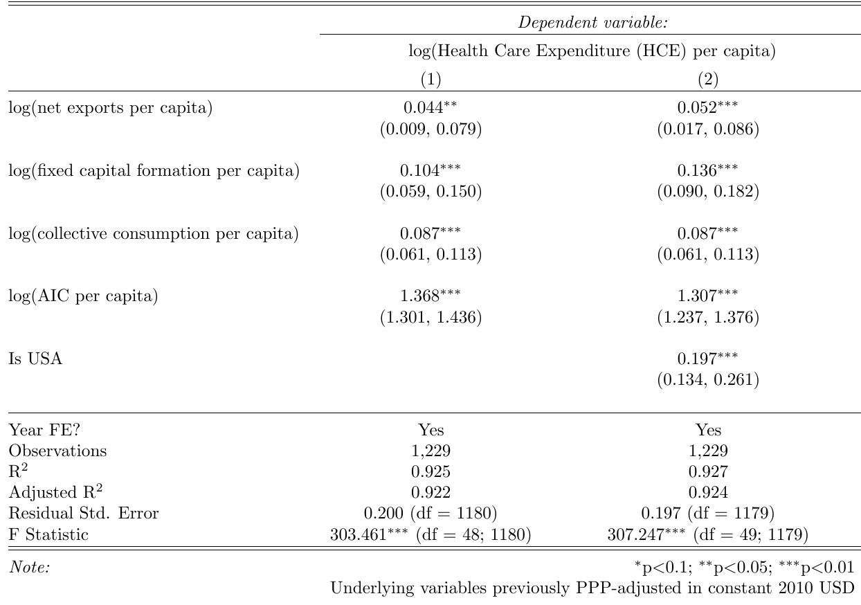
This implies the United States is somewhat above what you might expect controlling for these GDP components and year fixed effects over the time period in question, hardly “outlier” territory though.
[back to top]
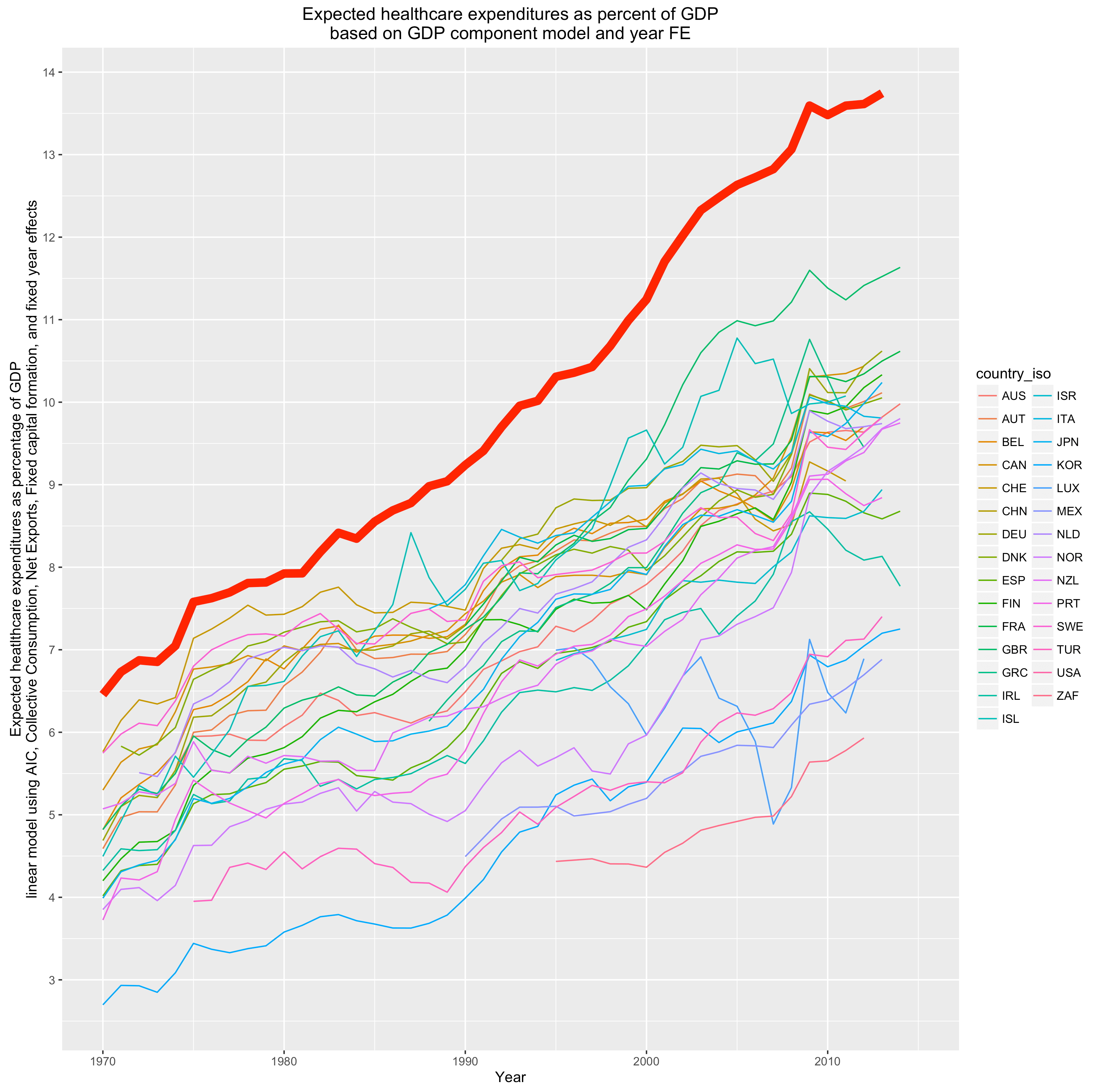
Comparing model predictions to observations
Using the model described above, the one with major GDP (expenditure method) components with year fixed effects, I can visually compare how this simple model fares over time.
With a log scale on both dimensions:

With a linear scale:

Note: The US and Luxembourg appear to tear away from the rest of the pack in both dimensions on the linear plot starting around 1990. The linear scales tends to create an exaggerated sense of the relative magnitude of these residuals amongst richer countries.
If I plot these log-log residuals, you can see how the US (the fat red line) compares to rest more systematically.


Note: the median US residual here is a bit less than 1 SD above the mean whereas, say, Great Britain is about 1 SD below the mean. You might also observe that several other highly developed countries are also above expectations and not that much lower than the US.
Another way to see the same data….

The US appears to be a bit on the high side (+1 SD) with this relatively crude, albeit reasonably well performing, model but it’s not like these residuals are several standard deviations above the mean. There is also considerable overlap with other more comparable countries. I suspect a substantial fraction of this residual can be explained by other factors, never mind the inclusion of some questionable countries in the OECD data set and forcing linear methods here, but it’s a bit beyond of the original scope of this blog post (my contention is that the US is not an outlier in a reasonably well specified model, not that there is no positive residual between the US and the model)
[back to top]
Modeling health expenditures as a percentage of GDP
Since some people might object to or may not quite understand the significance of the log-log modeling/residuals so let’s try this as a percentage of GDP instead. Since the focus seems to be on framing HCE relative to GDP (it ought be on consumption), the question we really want to answer here is: approximately how many percentage points from its expected value is the US HCE spending as a percentage of GDP? To do this we are going use the composition of GDP and year fixed effects to help answer the question using the OECD data set.
Both theory and the earlier regression analysis tells us that we can very expect different coefficients from different GDP components because all act on the denominator equally by definition whereas only some actually predict sizable increases in health care expenditures (the numerator). Ergo, even without having run this particular analysis, I’d fully expect that net exports and fixed capital to have significant negative effects on HCE/GDP for this reason. And this is precisely what I find:
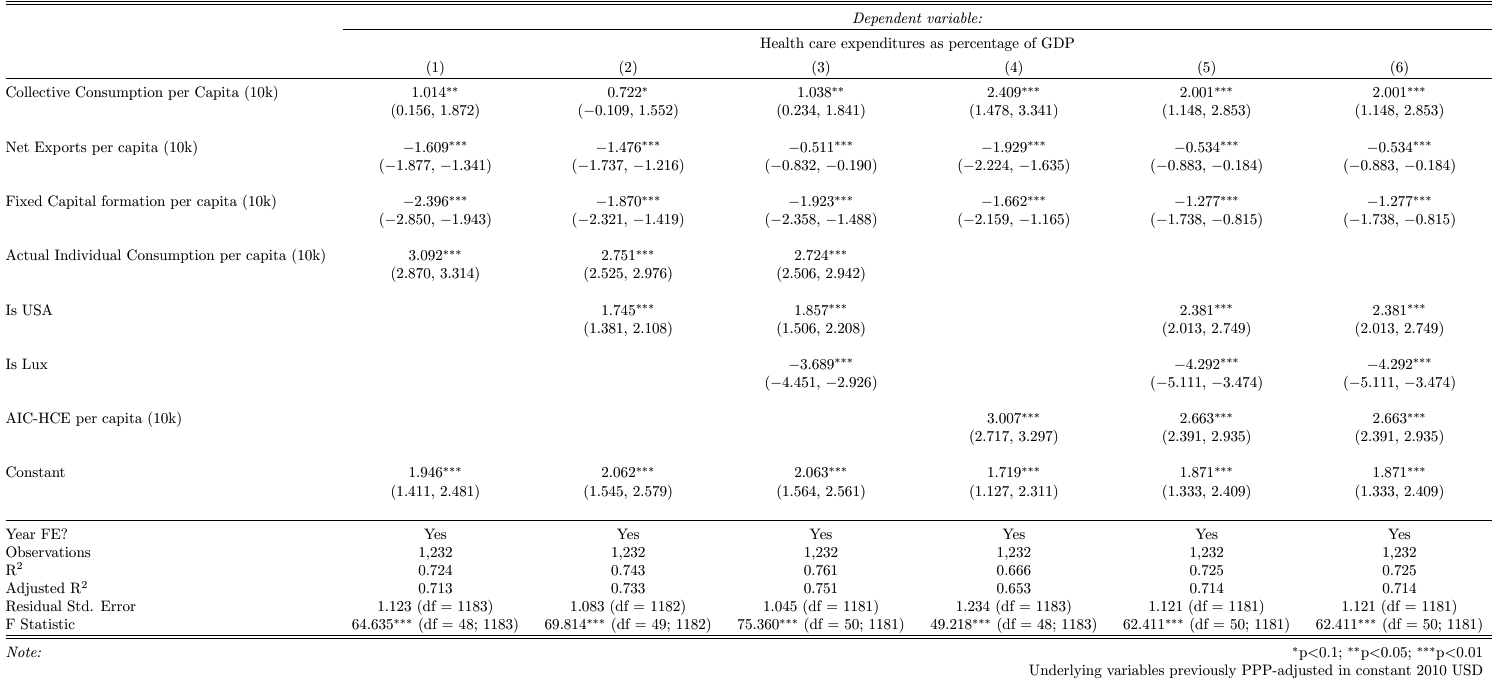
If you look at model (1) you’ll see that a 10K increase in AIC corresponds to about a 3 percentage point increase in HCE as a percentage of GDP whereas a 10K increase in Net Exports and Fixed Capital corresponds to about a 1.6 and 2.3 PP decrease respectively. Models 2 and 3 suggest this is robust to fixed effect adjustments for US and/or Luxembourg. Model 4-6 are much the same but instead of AIC I crudely subtract HCE from AIC to address potential concerns that HCE primarily falls under AIC and thus causes a mechanical increase…. and still a 10K increase in this predicts about a 3 PP increase in HCE as a percentage of GDP, that Net Exports and Fixed Capital Formation are still distinctly negative, and is robust to including USA as a variable (model 5) and so on and so forth.
I will use model 1 for plotting here since I feel that’s the cleanest and best model for these purposes.

The US looks above average in percentage of GDP terms starting roughly in mid-80s, but keep in mind (1) it’s well to right in expected terms, i.e., the great majority of the US lead in HCE/GDP terms is explained by its GDP size and composition (2) expressing this as a function of GDP tends to exaggerate the relevance of the residuals since HCE is driven largely by AIC and AIC comprises a larger fraction of GDP in the US than other highly developed countries (3) percentage point differences are somewhat overstated by substantially higher expected demand/cost, i.e., the same PP difference for a country that expects to spend 5% of GDP is different for a country that expects 10% of GDP (more discretionary resources->relatively more indifference to health care expenditures).


Note: These patterns are pretty consistent with what I observed modeling in per capita terms with AIC and GDP components earlier (not surprisingly).
[back to top]
Modeling HCE as a percentage of AIC
Very quickly, because I think AIC is a better baseline with which to judge against but do not wish to waste too much time, I will show also model for HCE as a percentage of consumption (AIC).

A 10K increase in AIC per capita corresponds to about a 3.6 percentage point increase in HCE as a percentage of AIC accounting for year fixed effects.


As a percentage of AIC the US HCE looks like even less of an outlier (median annual residual about +1.5 percentage points)
A bit on the spending divergence in the 80s
A few years back Cowen, McArdle, and others in my blog feed drew attention to this graph (and those like it) wherein the US pulls away from other OECD countries starting around 80s.
Although I certainly don’t think the divergence can be entirely explained by this alone, it’s worth pointing out that my HCE/GDP component model specification (above) certainly suggests that we should have expected the US to substantially diverge from the rest based just on differences in GDP growth and compositional changes in GDP.

Again, my view is that it makes more sense to look at this as a share of AIC (or, at least, consumption more broadly).
Here is one way to look at the data quickly:

Note: the thin lines here are loess trend lines for each country, the fat red line being the US, and the (linear) black dotted line the trend across all data points in the merged OECD data set. I am not correcting for anything tricky here or correcting for year fixed effect…. still a useful perspective though IMO
[back to top]
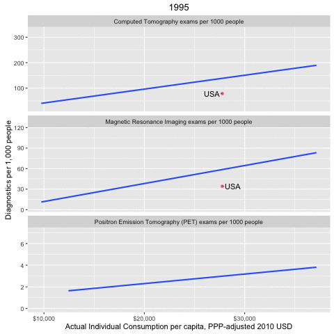
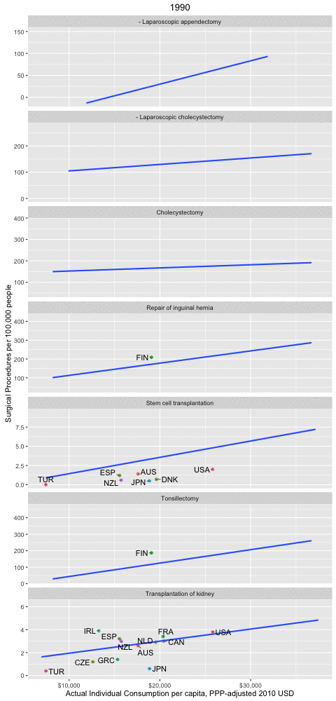
A bit of spending data on volume
Besides the top level figures on healthcare expenditures, we can also see, unsurprisingly, that significant drivers of expenditures like diagnostics, surgical procedures, and the like correlate with AIC, both between countries and within countries (across years). I am presenting all per capita (or comparable) data available in these series to avoid potential cherry-picking. The US isn’t always available in all of these series, however we can still observe that countries with higher material standards of living actually do more “stuff” in healthcare and the US is the wealthiest country in these series. When people talk about health care “inflation” they are not just (or even mainly) referring to actual price increases for the same good or services as an ever expanding package of goods and services and/or expanding coverage for more people to get pre-existing technology (diagnostics, procedures, pharmaceuticals, etc).
Surgical series, part 1
Surgical series, part 2
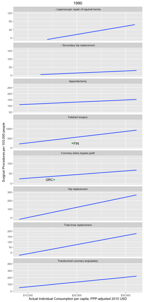
Note: I am presenting all per capita data available from OECD stats tables to avoid potential cherry-picking. Not worrying about formatting and aesthetics too much here!
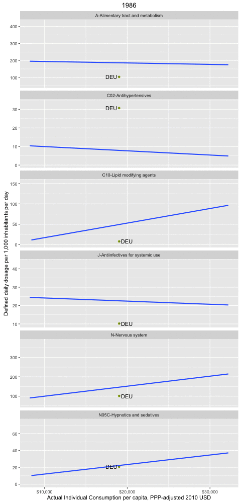
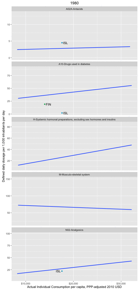
Those plots are admittedly a bit of a mess, but you can still see that quite a few of them correlate quite strongly with material living conditions and that, where US data are available, it tends to be at or near the top.
[back to top]
Overall pharmaceutical spending is not extremely high
US pharmaceutical spending is above average, but there is a reasonable relationship with wealth and the US is not way out of line with many of the others.


Nor are physician or nursing compensation out of proportion to AIC
US physician and nursing compensation is very much inline with what we would expect based on our material standard of living relative to others.
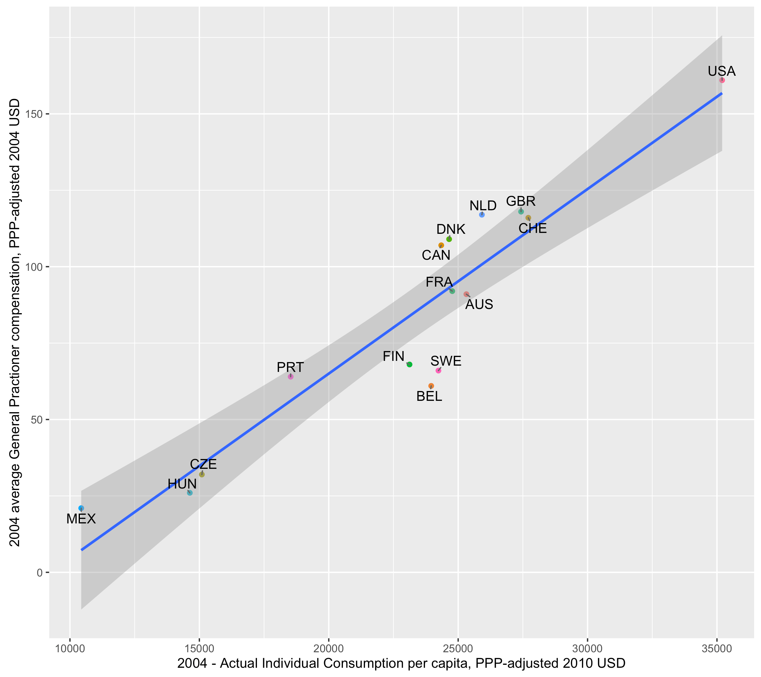

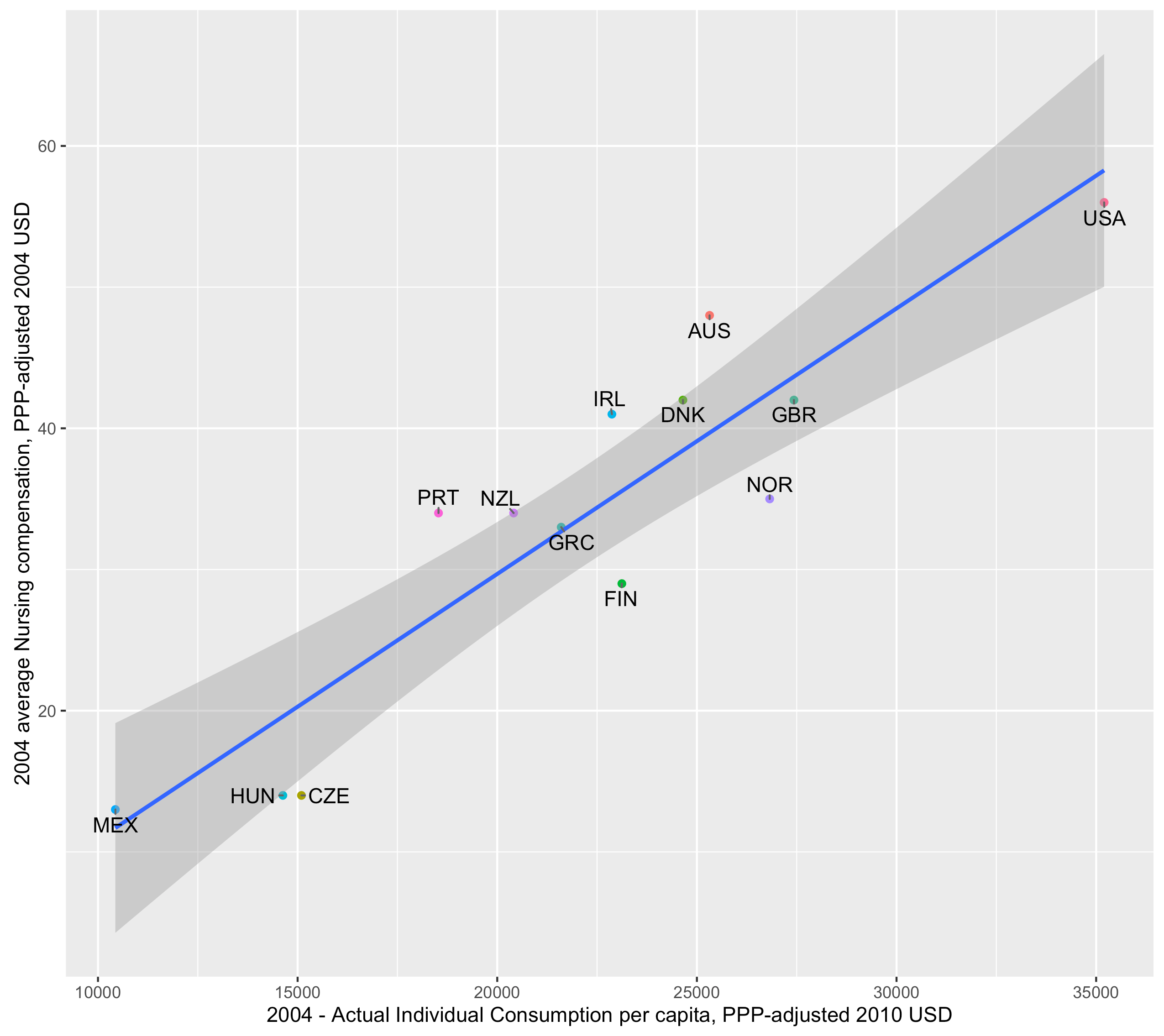
Actual PPP adjusted wages tend to correlate with PPP adjusted AIC much better than PPP-adjusted GDP.
[back to top]
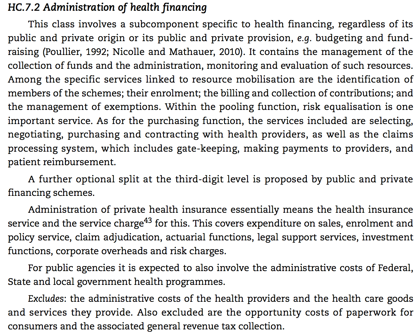
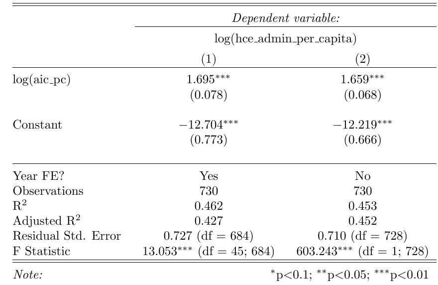
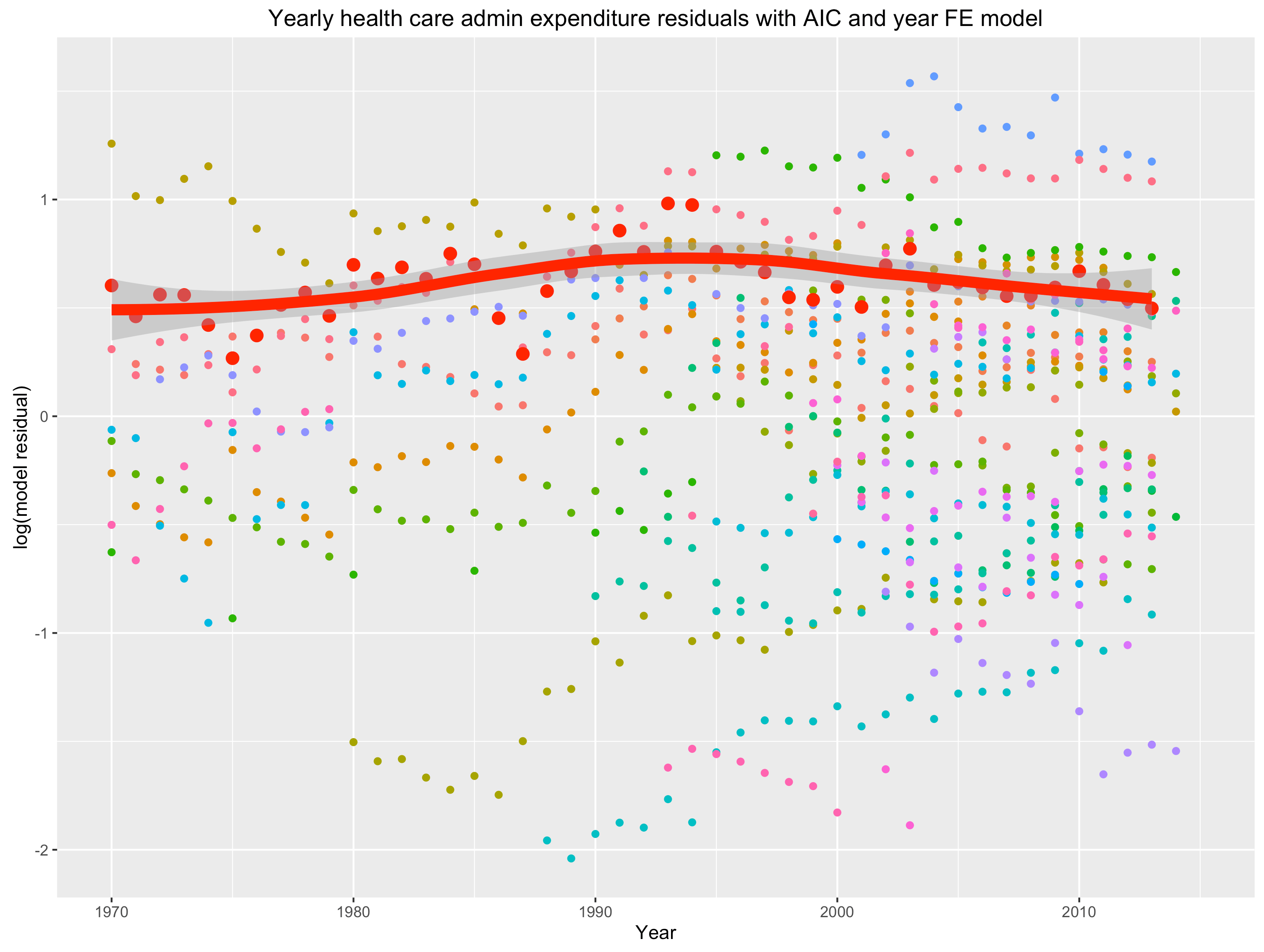
Admin costs are substantially above trend, but don’t drive large differences in spending
The OECD provides a category under the National Health accounts system called “Governance and health system and financing administration” that basically includes all collective aspects of the system (e.g., CDC, HHS, CMS/Medicare/Medicaid, private payer, non-profit services, etc) not on the provider/hospital side.
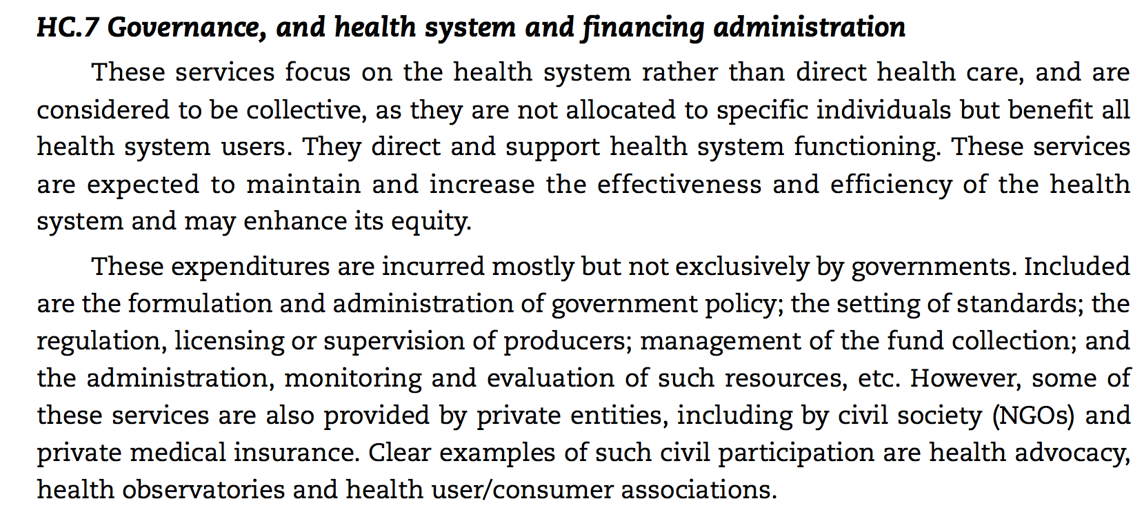
[snip]
source

These log-log residuals appear to be fairly stable over ~30 years:
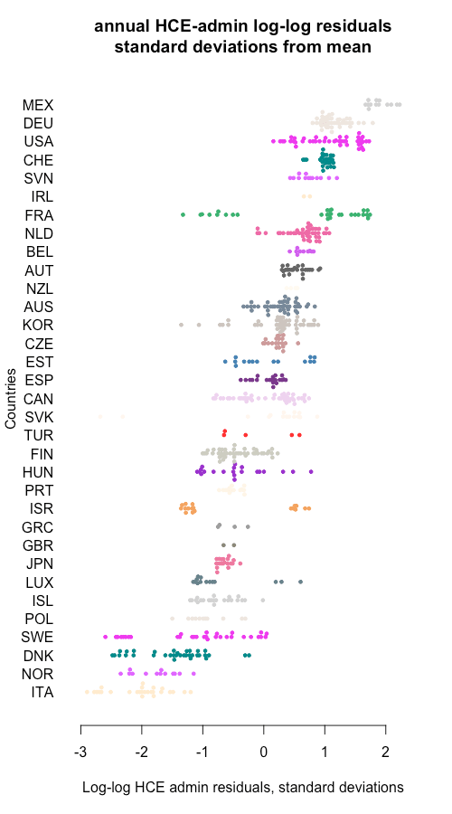
Of course on a linear plot this looks more extreme:

But it’s worth pointing out that (1) roughly 50% of US admin expenditures are attributed to the public, not private sector and (2) the actual dollar amount differences are pretty small in the scheme of things. Long story short, our complex reimbursement system simply cannot explain much here (especially not of the large apparent delta based off GDP per capita alone…. most of which, as I’ve been arguing, is well explained by AIC).
[back to top]
US price levels well explained by AIC
Though it is true that hospital expenditures drive a very large fraction of healthcare costs in the United States and that US hospital costs, according to most sources, are well above average this, too, is very well explained by Actual Individual Consumption (AIC).
Some OECD affiliated researchers recently studied healthcare-wide and hospital-specific price levels using both input (as in, labor cost, supplies, etc) and output methods (as in, average cost to do procedure X) comparing apples-t0-apples (as in, same procedures, treatments, etc) as best they could and discovered that, lo and behold, AIC per capita explains most of the variance in price levels internationally.

source
These “price level” indices here are defined as the ratio between health-specific PPPs, weighted for country-specific consumption patterns, divided by the exchange rate scaled relative to the mean for 28 EU countries. In their words:

This method isn’t without some limitations, but it’s nonetheless a good indicator of relative costs. We can clearly see that there is a very strong relationship between how wealthy a country is (particularly when measured with AIC) and what we can expect the same procedure to cost as compared to other countries.
They also found that countries with high economy-wide (GDP) price level indices (PLIs) have even higher health specific PLIs. In other words, health and economy-wide PLIs are positively correlated and health PLIs rise faster than GDP PLIs.
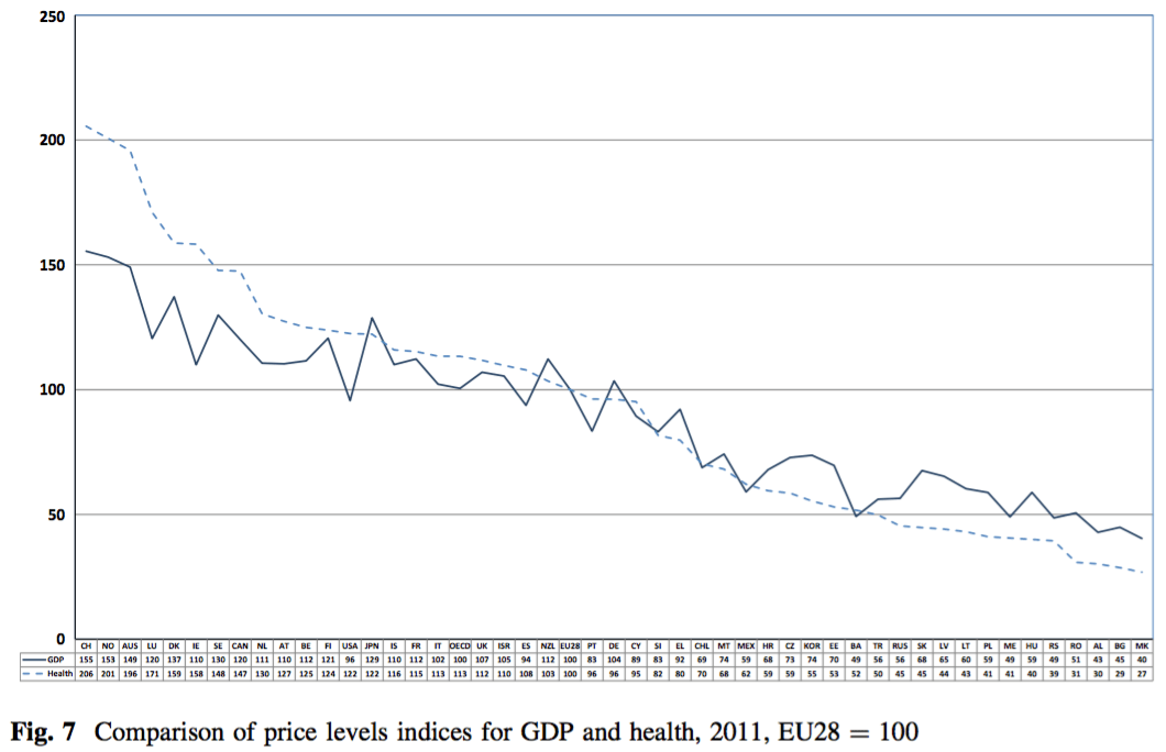
For example, while Switzerland (top) is 55% higher than EU-28 in GDP PLIs it’s 106% higher in health PLIs whereas Macedonia (bottom) is 60% less than EU-28 in GDP terms it’s 73% lower in health PLIs.
This much should be unsurprising to people that think about the issues carefully. Of course healthcare productivity can’t match productivity in, say, manufacturing, agriculture, etc.
They actually find that US is just slightly above EU-28 mean in both healthcare-wide and hospital-specific PLIs, 122 and 114 respectively, and that derived volume is twice as high as EU-28 (i.e., price levels substantially less and volume substantially more given AIC per capita).
I do not want to hang my hat on this, but I’ll briefly plot these from their own data for completeness (For now, I am more interested in establishing the strength of the relationship between health system price levels and wealth for now).


The plot above (volume) strongly suggests that the volume of health goods and services is much higher in the United States. This data argues pretty strongly against the popular notion that it’s prices that drive US health care expenditures (presumably due to lack of market power on part of payers) above trend, i.e., this data suggests costs are actually below what you’d expect with AIC and volume significantly above what you’d expect with AIC (note: it would also help explain why US spends more than average on administrative costs).
I also calculated the ratio between the health price index level and the GDP price index level:

This tends to suggest that health care is relatively more expensive, as compared to other goods and services in the same economy, in countries with higher material standards of living and, assuming this particular US data is reasonably correct, US doesn’t look like it costs more than you’d expect relative to AIC per capita. However, even if the US data is wrong, the methodology used is still sound and the relationship between AIC and price levels are very strong, ergo we should expect, ceteris paribus, US prices to be much higher than the modal EU country.
Now let’s look at some specific hospital pricing cost against AIC per capita:
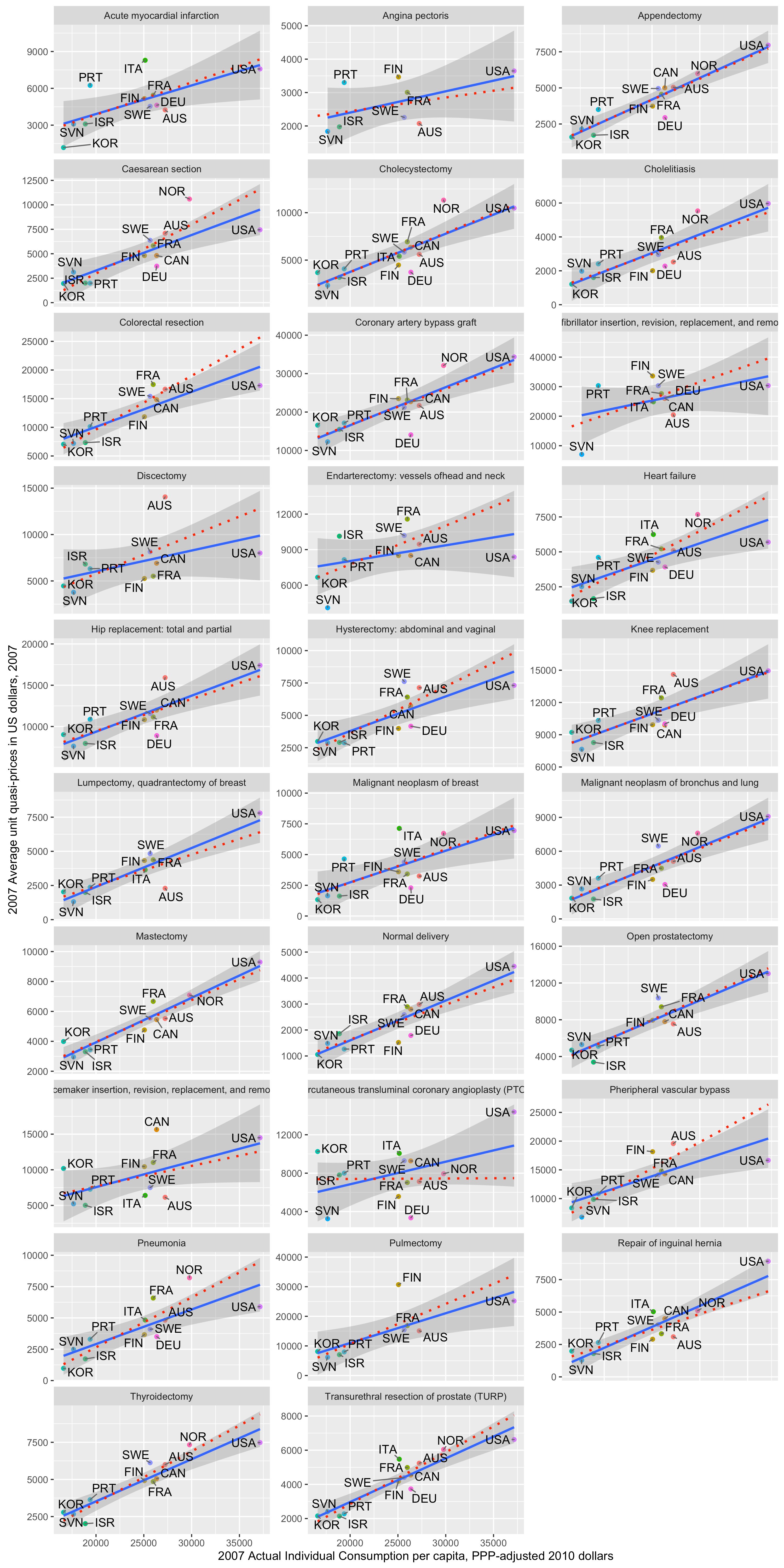
source
Note: The blue line is the trend line including US, the shaded area the confidence interval, whereas the red line is the trend line excluding the US.
Although there can be no doubt that US is usually well into the high end of the price range, it’s also abundantly clear in most plots that (1) (quasi)prices are well correlated with AIC per capita — even excluding the US (2) price levels in the US are not out of line with the trend (note the slope without USA is often steeper and US never significantly above trend).
Obviously I’d like more observations to make a tighter estimate, but if US costs were nearly as astronomical as they are thought to be this should stand out. It simply does not. This suggests that in approximately apples-to-apples comparisons US hospital prices are quite normal given our material standards of living (AIC per capita) even while being substantially higher than what you might expect in a more typical european country (with substantially lower material standards of living). [Note: This does not necessarily mean that hospital visits or treating particular conditions aren’t more expensive on average because the types of procedures, diagnostics, and various extras (e.g., private vs semi-private room) can certainly add to the overall cost]
Furthermore, if we look at all expenditures per capita in the entire hospital sector, we find a very strong relationship with AIC and that the US is generally well within normal range. (Note: This includes inpatient, outpatient, etc under hospital umbrella)

Comparison of volume of goods and services (PPP study)
Actually using the same volume derivation above, i.e., taking final expenditures by category from national accounts in local currency and dividing it by same item-specific PPPs, I can estimate the volume of goods and services consumed relative to the a common EU baseline (EU28=100).
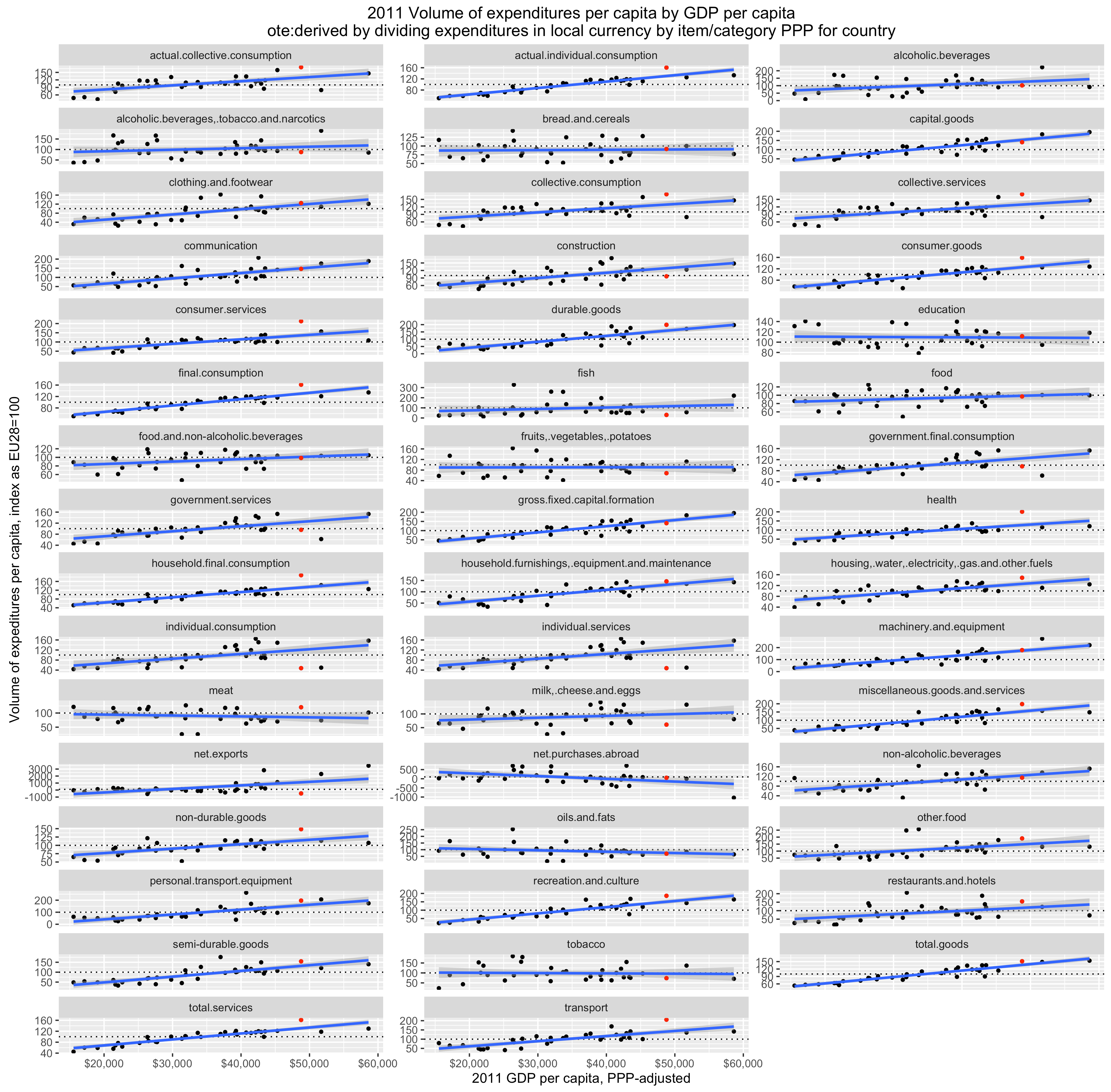
As you can see above the US (the red dot) consumes substantially more in volume across several major categories, not just health and not just when those categories include health, e.g., actual collective consumption, transport, non durable goods, recreation and culture, restaurants, etc. Similarly, many countries that are below trend in health are also below trend in these other consumption categories (as in, amongst high exporters like Norway.
Similarly, we find AIC per capita correlates better with volume across most categories (or at least those that fall relatively squarely under the broad consumption umbrella like health care!)
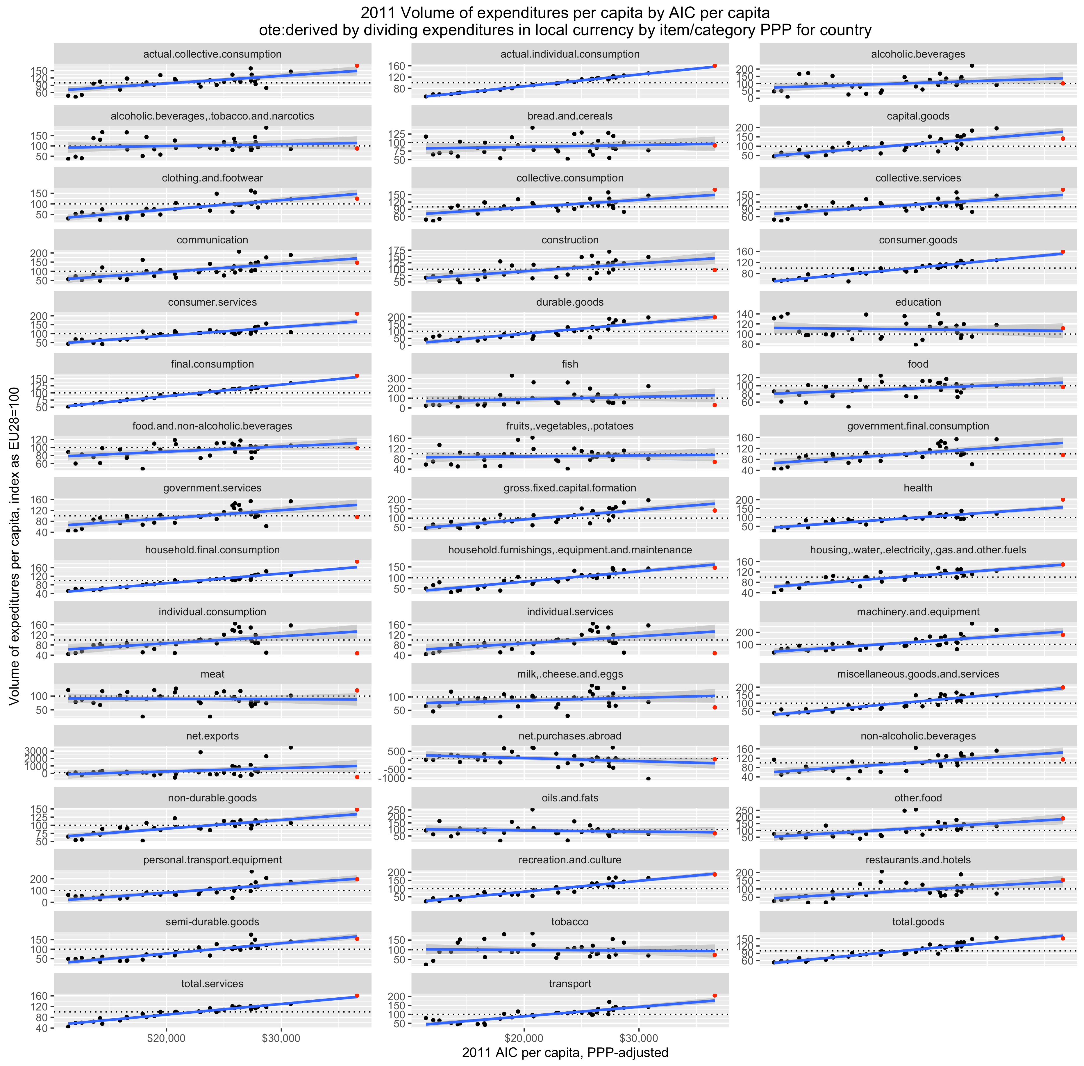
This is mostly as I would expect. You might note:
- PPP-adjusted AIC per capita can explain most of the variance in consumption volume in most categories
- Differences in category/item specific price levels appear to cause relatively little incremental variance, i.e., most price levels are fairly well correlated within countries
- Health appears to correlate similarly to several other major consumption categories in volume at least
- Wealth explains little of the volume differences amongst these relatively rich OECD economies in food, education, alcohol, etc
- GDP is generally better correlated with the non-consumption categories under the GDP expenditure method (exports, fixed capital, etc)
- AIC significantly outperforms GDP as a predictor of consumption volume across multiple categories (not just healthcare!!).
Comparison of multiple price levels
Again using the 2011 OECD Purchasing Price Parity study data, we can see that price levels are strongly correlated within a country. If you know the (broad) price level for GDP or AIC, you can pretty well predict the price level for health care with good accuracy (or at least the price level as carefully determined by these OECD researchers!). The GDP and AIC PPP estimates explain about 92% of the variance in health price levels.
Failing that, a reasonably broad measure of service price levels will get you pretty close too (hint: it will certainly more closely predict domestic price levels than, say, tradable goods).
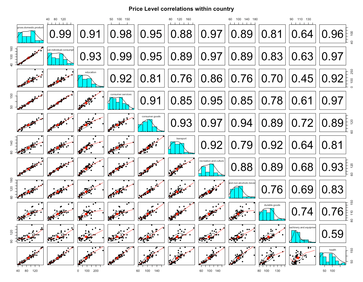
So, what I’m trying to say is, if you have a good PPP adjusted measure of material living conditions (as in AIC), the specific health price level data won’t tell you that much that you didn’t already know. That is not to say that there are not differences in price levels; there are, but they’re already quite well reflected in national price level measures.

Note: The red line is set to intercept=0 and slope=1 so that if price levels track roughly 1:1 the regression line should roughly correspond to it.
You’ll even find a decent correlation if you compare another heavily service driven expenditure like education.

Countries with high price levels for services tends to have high price levels for goods too, but these tend to rise and fall at significantly different rates.

In other words, the price level of services tends to increase faster than price levels of goods in rich countries with respect to wealth. However, while the United States has a relatively high price level ratio, it’s actually on the low side relative to its AIC.

Health price level ratio looks much the same!

In short, the other price level data seems to accord quite well with the health price level data. This tends to support the view that this isn’t being driven by apples-to-apples higher costs or, at least, not beyond that which you would expect given good measures of wealth. We may pay more for some particular goods and particular services (e.g., particular prescription drugs still on patent), but on average the best data suggests that we simply don’t pay appreciably real higher prices than you’d expect. Most likely the residuals I identified are better explained by higher volume (and/or consuming relatively more high cost services or services that simply aren’t as readily available elsewhere).
Even my models may overstate actual US excess
UPDATE (10/6/2016): See follow up post vis-a-vis non-linearity
In my earlier blog post I used many more observations from the WHO and WorldBank to analyze the data whereas throughout this analysis I focused on the handful of relatively rich countries for which OECD provides statistics (presumably better and more reliable data) over a period of several decades. It did strike me as pretty obvious at the time, even allowing for some error amongst poor countries, that there was a non-linear slope between NHE and AIC.
Re-plotting this data in R, it looks like this with the default loess regression line.

Alternatively if I run this as a percentage of AIC:

The green line is loess and the blue line is linear. It looks to me like most of the rich countries are significantly above the linear trend, middle income below, and poor slightly above — not really a very good fit.

This is mostly beyond the scope of this argument, since even the various linear specification with AIC shows residuals much smaller than what is popularly accepted, but it seems likely this process is not entirely linear. If so the linear specification will tend to penalize the US, in particular, for being so far out on the right (high wealth). If it’s not, then what does it mean when so many of these other presumably high functioning health care systems in wealthier parts of europe are also significantly above expectations? I don’t think this can be explained by data quality issues or a few genuine outliers.
To get an idea for how significant this bias can might be, check out this out:

The green points, which are overlaid on top of red, are all of the data points contained in the OECD observations for 2011. The blue loess line is the entire data set (all WHO data which includes the entire OECD set), the green is the linear trend for the entire OECD set (all green points), and the yellow is the linear trend for the entire OECD set with AIC greater than $20,000. If the blue loess trend line is approximately the correct latent trend, you can see how this will downward bias the trend for rich countries and for very poor countries. Whereas the yellow line better approximates the trend for those countries with AIC expenditures greater than 20K (my models and their models certainly included countries with less wealth than that!)
Some non-linearity makes sense to me given the interaction between wealth and price levels and wealth and volume. That is to say if rich countries (1) consume more volume of health care goods and services and (2) their price levels for services like healthcare are significantly elevated as compared to other goods and services (especially tradable goods), I would expect to see some subtle non-linearity in these relationships.
Oh…. and yes, GDP still looks pretty terrible this way (FYI- all countries are the same in both sets)


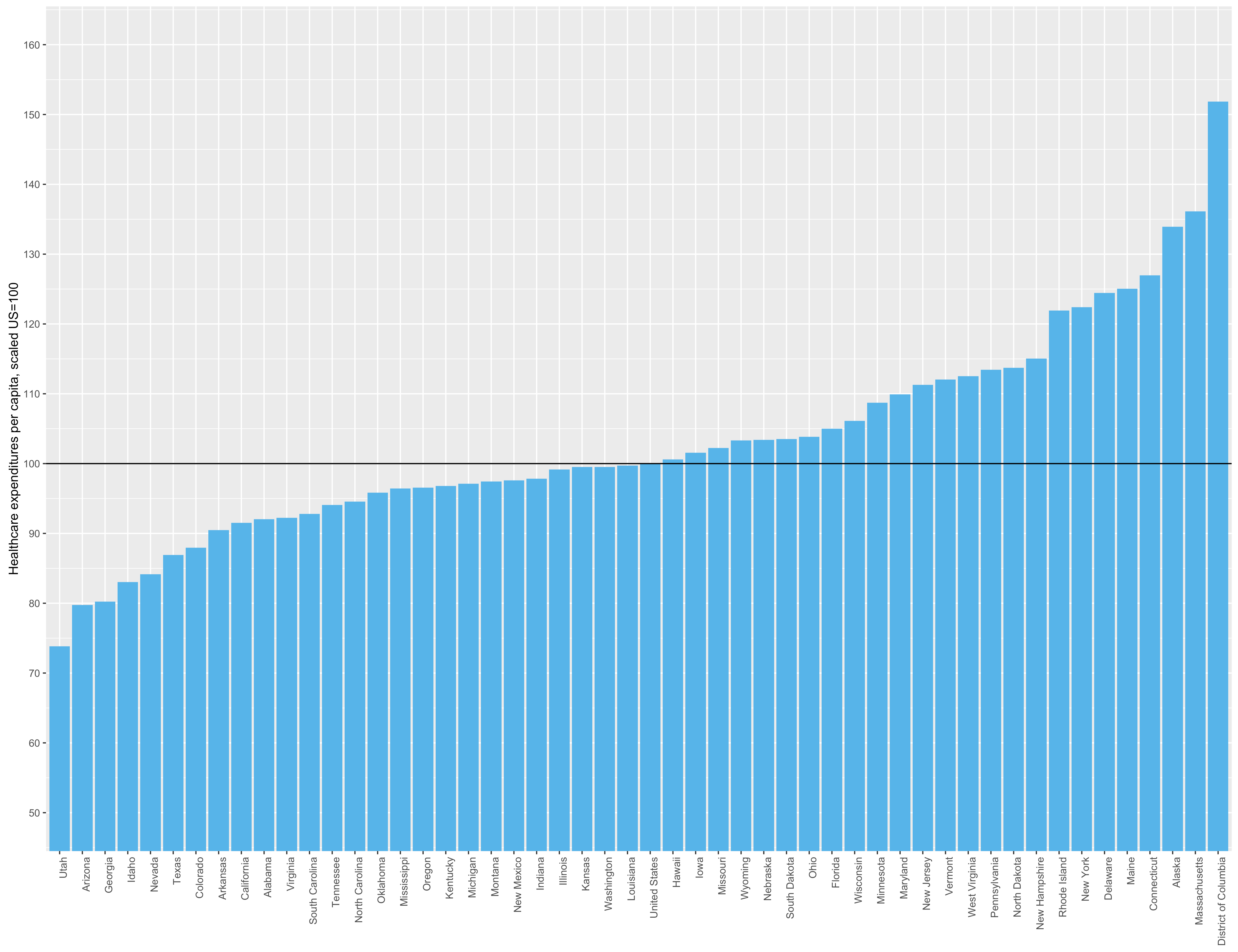
There is substantial variation in HCE between US states and consumption explains much of it
The highest spending location, DC, spends 106% more than the lowest spending state, Utah. Even if you throw out DC as a non-state, the highest spending state, Massachusetts spends 84% more! That is a huge difference.
And, as it turns out, if we take a reasonable measure of consumption, the Personal Consumption Expenditure (PCE) from the BEA we can also explain a large fraction of the variance at a state/place level within the US.
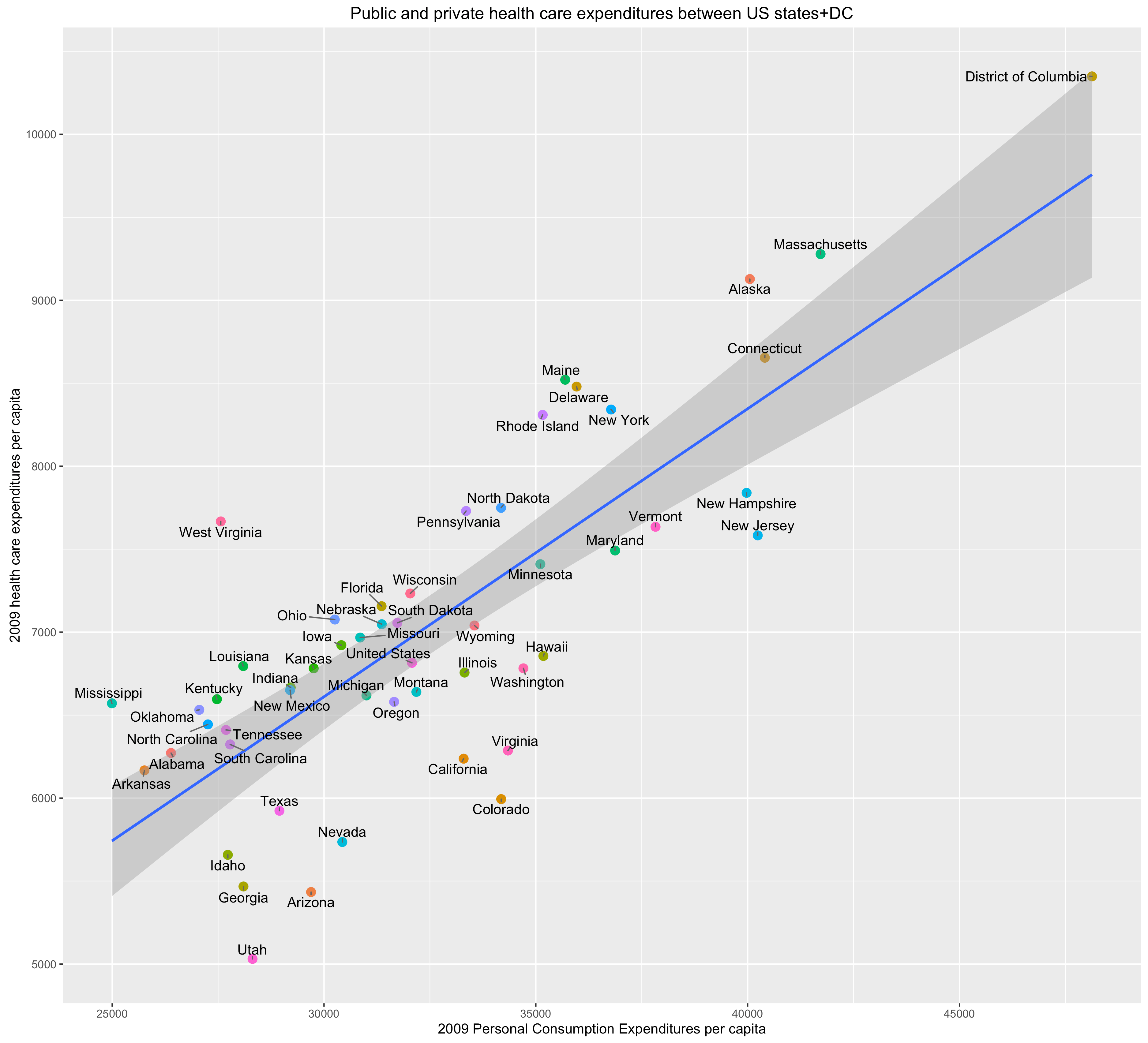
Note: PCE is not exactly the same as AIC, but it is a good broad measure of consumption and should generally correlate reasonably well within the US.
Now if we compare this to HCE:
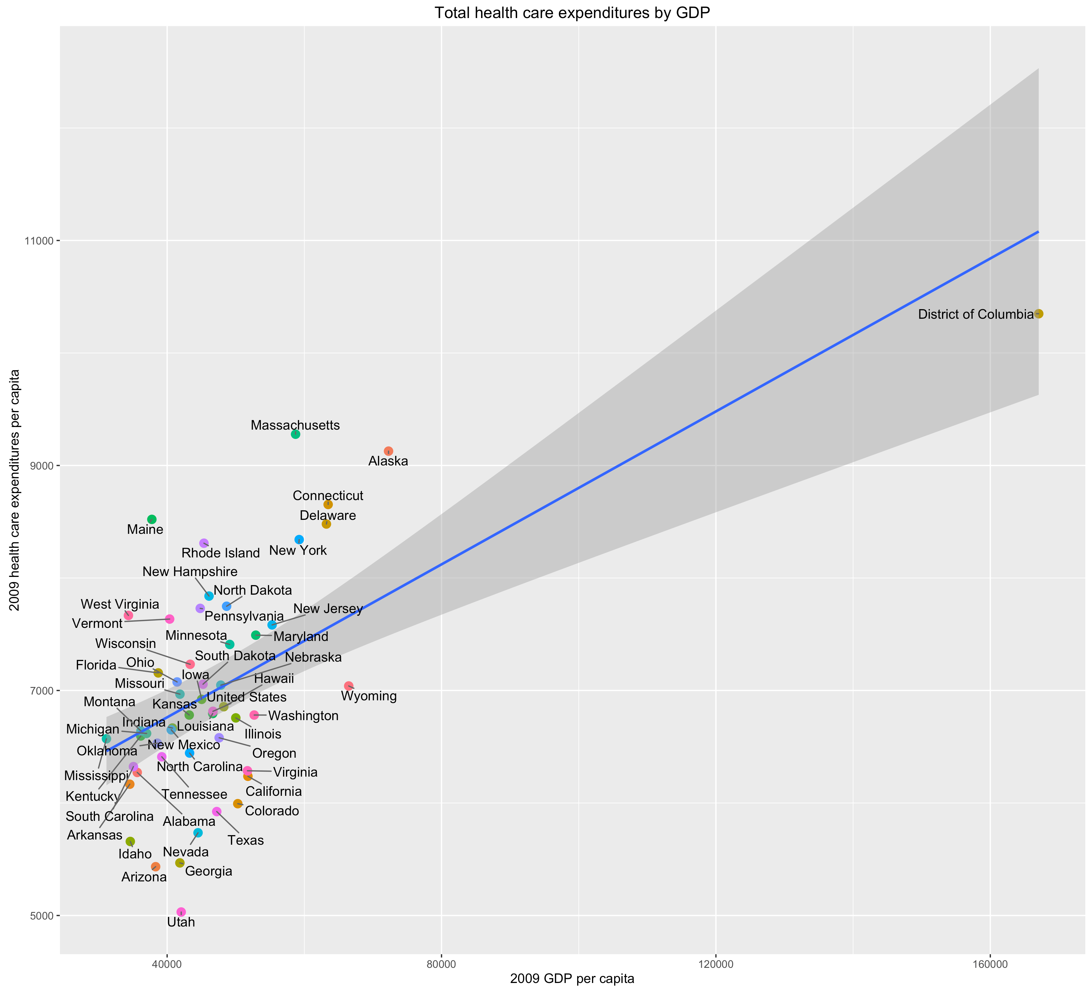
Personal Income performs reasonably well here, but PCE still outperform it.

Even if I treat DC as an outlier and exclude it from the data, PCE outperforms GDP by a large margin.

Ideally this data would be adjusted for purchasing power and the like, but still it shows that consumption is a good predictor of HCE and personal incomes at a state level (certainly much better than GDP).

I would think that people arguing over international differences in health expenditures would be much more interested in state differences and how spending can be so much higher in some states than others without the presence of single payer and the like.
Conclusions
Total per capita health care spending increases as wealth increases because people actually demand more goods and services (volume) per capita and because it is relatively labor intensive sector that does not enjoy the productivity gains found in some other sectors of the economy, i.e., overall costs increase through both volume and price together (volume * price). GDP per capita is a relatively weak measure for these purposes and those few other high GDP countries happen to be much more export dependent (which does not independently predict significant increases in expenditures). If you use a better measure like Actual Individual Consumption (AIC) or run multiple regression analysis on GDP expenditure categories most of the apparent excess health care spending shrinks quite dramatically.
Additional analysis of several major claims here (e.g., high prices due to limited market power of payers, high physician incomes, etc) show that these arguments suffer from similar issues. The best available evidence show that across multiple measures our healthcare labor costs and overall apples-to-apples price levels are generally very much inline with our material standard of living. US total per capita costs are probably somewhat more than expected, but this appears to be driven through higher volume (~100% more than EU28 average according to PPP study estimates), though even this is significantly, if not quite entirely, explained by our higher material standards of living.
Now, to be clear, my position is not that we ought to be spending as much as we spend. My position is that the issues we face are very similar to the issues faced in Europe and other prosperous countries (and are generally similar to patterns many decades earlier). They are largely differences in degree, not kind. Our large apparent cost differences mostly originate from our significantly higher material standard of living. The long term increases found in the United States and other developed countries are generally a product of ever increasing material living conditions and varying levels of productivity in different economic sectors (healthcare being labor intensive and relatively high skilled at that). Despite the fact that all developed countries allocate a large and increasing share of their consumption expenditures on health care these these richer countries, including the United States, still spend more on other forms of consumption.
Reducing overall health care expenditures, if that is really our top priority, involves choices. Merely setting up single payer (or otherwise blindly aping them) is unlikely to produce large cost savings and, even if we have the will and ability to do it right, those cost savings are not “free”. Those genuine and substantial savings (i.e., not that which is primarily the result of substantially less wealth) are not inevitable outcomes of those systems that merely come from some poorly specified efficiency improvements. They involve tradeoffs, many of them hard. Though I would be the first to argue that health care is subject to rapidly diminishing returns vis-a-vis life expectancy or mortality rates on (real) increases in expenditure and that some of this is of questionable subjective value, it is also quite clear that people actually want to consume more health care and do not much like being told “no.” Likewise, cost containment through price reduction has consequences as the health care market does not operate in a vacuum (e.g., slash physician reimbursement/effective income relative to other skilled professionals and the bright people will generally start to avoid it; reduce contracted prices for pharmaceuticals will reduce market incentives for R&D->less new drug development, etc).
Those systems that appear to actually generate cost savings, like the UK’s NHS, actually do a great deal more than other countries, especially the United States, to contain costs by rationing care and other cost containment strategies (and I have a hard time imaging stuff like this flying here when ~40% of the population would be excluded). There is much less low hanging fruit than people imagine, even less so at a political level when people can actually express their preferences at the voting booth and various other interest groups (providers, hospitals, etc) can influence the process.
More generally, it is not clear to me why we should want to specifically and target healthcare for broad cost containment over other expenditures we collectively make. (What else should we be spending our resources on???) A significant and growing fraction of these expenditures have little to do with increasing life expectancy (e.g., luxury, convenience, quality of life/subjective lifestyle/risk decisions, etc), so insisting that we judge it strictly in these terms strikes me as myopic. So long as there are reasonable cost effective options for more basic (proven) healthcare and so long as the government’s share of expenditures are not breaking our budgets I see little need for the government to intervene further in the affairs of the rest of the health care market (note: the fact that volume, not prices, are most likely driving these incremental differences has some bearing on this issue….). Government should not create economic distortions that encourage more expenditures through tax policy (e.g., taxing healthcare spending differently, save perhaps basic coverage), mandating ever broader coverage, and so on either though.
USA is taking care of their people while making huge spending on health sectors. It shows that the nation takes and concern more about the public health.
Interesting stuff, I enjoyed reading through it all.
An interesting article, consistent with my observation that much healthcare spending in the US is high-status, consumer non-durable spending. However, given our high levels of health expenditures, there is relatively little cost-benefit analysis on effects of healthcare spending, (e.g. measuring the cost of additional life expectancy or improved health status, comparing the costs of alternative treatments for given conditions, or, frankly, questioning medical judgment as to the benefits of specific treatments). There is an articulate advocate for every medical intervention, even for those with no demonstrable benefit.
For me the key question isn’t why we spend so much; it may be as the article demonstrates, because of our relative wealth. Rather, it is why the Federal government subsidizes healthcare spending so generously, from virtually unlimited subsidies (at least to date and given the resistance to the ACA’s “Cadillac tax” probably indefinite) for employer-paid “health insurance” to Medicare’s willingness to pay for new medical technologies without comparing their costs to equally effective, but less expensive treatments.
If the Federal government would establish a ceiling on public subsidies for healthcare spending for both public and private programs and let a market for payment for health services develop, we would find out whether Americans spend more on healthcare because we’re wealthy or because we value healthcare services more than cars and big houses. There are already several public models for such a market in operation: the ACA’s exchanges, Tricare, the Federal Employees Health Benefit, and Medicare Advantage (Part C) to name a few. Even with substantial Federal subsidies, there is evidence that markets can restrain growth in spending if consumers have enough choice.
Of course, there are a few that really hate this idea. They don’t want us to think about the costs and benefits of the services we use and think we aren’t smart enough to make important decisions about the value of those services. They think that there shouldn’t be a market for this type of spending and that unlimited healthcare services are a “right”. They include doctors, hospitals and pharmaceutical companies.
Well done again! I think you have done more to advance understanding on this point than anyone else that I know of. Thanks for advancing the state of knowledge.
Article is pretty convincing, but you don’t take into account inequality and preventive medicine.
*differences in income inequality
Thanks for clarifying… I was going to ask inequality of what? In what way would you expect inequality to affect the numbers compared to other developed nations?
The data I’ve seen on preventative medicine programs suggests it very rarely saves costs net-net because the treatment, screening, increased diagnosis rates, etc tend to outweigh the potential savings in medical expenditures (and usually also have near undetectable positive health effects overall)
I’m not quite sure what you mean by taking inequality into account tho. Do you imagine we’d spend more with less inequality? My intuition is it’d marginally increase utilization rates amongst lower income groups while reducing it amongst higher income groups, which would offset that to some degree. But mostly not much change at all because the differences in expenditures by individual income aren’t all that great adjusting for age, health, etc (lower income groups actually tend to consume more without any controls). My view is per capita consumption largely works indirectly through spillover effects and the like (as in, need critical mass of demand to build up the supply side, to change the standard of care, drive broader & more generous insurance coverage, increase perceived value of human life, etc) — so we can see this pretty clearly between countries, states & regions, and probably narrow geographic regions to lesser degree, but much less so if you look at individuals within a particular community at a particular point in time. In other words, it’s mostly the average income or consumption level that shapes the quantity of health care demanded in the long run and I wouldn’t expect the distribution to that income to matter terribly very much in a reasonably open/democratic society.
I’m not sure why you think that. Don’t we already know how geographically heterogeneous healthcare options are in this country? E.g., rural communities with one insurer, an urgent-care clinic, and that’s it? I mean that compares starkly against the kind of care you can get in a relatively wealthy urban center. Not to mention the way that the war on PP and abortion clinics has made women’s care inconsistent, to say the least. So it seems to me that average figures aren’t going to capture what we’re interested in–the assumption of homogeneity just seems out of place here.
Related is the point about income inequality. As high- and low-income households become increasingly isolated from one another, spillover effects and the like are going to be driven down; since poor people no longer live next door to rich people, they don’t get the benefits of premiere clinics and so on.
I’m no expert and I’d love to learn more 🙂
One more thing: it seems to me that, insofar as we talk the above analysis seriously, it actually looks like Medicare For All (a national, basic insurance) makes the most sense; given that the US’s healthcare system isn’t all that out of line in terms of expenditures, you might think we don’t want to muck with the model too much; and the model is one of insurance as separate from provision, basically; Medicare doesn’t muck with that, but it also redistributes wealth in a way that might produce more equitable healthcare outcomes.
My point was that individual income inequality, which is the stat people are presumably talking about here when they make x-country comparisons, is not likely to matter much since the best available data suggests the poor spend at least as much as the rich in the US (and virtually nothing suggests large differences). They also don’t seem to matter much in x-country regressions. Regional differences in income might have more salience, but (1) US isn’t particularly unusual in regional income differences [nor differences in regional health spending] and (2) there is a fair amount of redistribution and spillovers from rich to poor (which is why the regional income elasticities are substantially lower than the national ones).
Yes, in truly remote rural areas I suspect there is some health care penalty, but that pattern (shorter rural life expectancy) is present in other countries too and, to the extent the mortality gap is about health care, it’s largely about lack of scale as opposed to income and the like. Given the already high average level of expenditures and the fact that people can and do travel when they need cutting edge treatment I wouldn’t expect it to matter a great deal for most rural people at the margins we’re talking about today.
There are also a number of cross sectional studies in the US showing that *direct* health care indicators like % uninsured, medicare spending per enrollee, physicians per capita, preventative care, and so on and so forth explain essentially none of the variance whereas regional variance is very well explained by lifestyle factors (obesity, diabetes, smoking, exercise rates, etc). Quasi-experimental research studies also point in a very similar direction. If the effect exists it’s apt to be quite modest on the margins at which these expenditures are made today.
At the present moment at least that doesn’t appear to be a substantial factor because there exists substantial redistribution in private and public health plans (see expenditure levels) and these providers will tend to follow the money. I wouldn’t care to dispute that the absolute most cutting edge medicine will be more accessible in large metro areas with a significant educated class and the like, but the successful techniques, procedures, technology, etc tend to spread to the wider world rather quickly and in general the odds of a single advancement with high efficacy only being available in rich areas is pretty small (save, perhaps, for some extremely rare conditions where there’s pretty much only, say, 1-2 places to go in the whole country).
Reblogged this on Davi Lyra-Leite and commented:
This is an amazing analysis on healthcare costs versus consumption of goods in the US and Europe.
I’m having a hard time coming to terms with such seemingly disparate results of two studies mentioned in this article.
The study that tries to determines health price indexes is incredibly surprising to say least. That the US isn’t at the top of the chart is surprising enough, but below countries like Canada and Finland? This goes against practically everything I’ve ever read about international health care pricing.
The study which tackles specific hospital pricing costs is more in line with my expectations. That is, specific procedures are usually much cheaper to get in Canada, but not so much relatively cheaper when AIC is factored in.
So I guess that my question is: how do I reconcile these seemingly, vastly different results?
I am missing something with regards to the health price index study? How does the US do so favorably in this study when the high specific hospital pricing costs should suggest a more modest result?
Matthew:
Exchange rates are pretty volatile (which can make point in time PLIs between country comparisons a little bit unreliable since exchange rates are part of the equation). Also, probably more importantly, the US is a bit unusual as a de facto reserve currency and the like. All price level indices in the US are exceptionally low for such a wealthy country in this series and the others I’ve seen (which makes me think this isn’t something wonky with the health PPP estimates for the US). In my opinion it’s more informative to look at the *ratios* between price level indices as this largely removes exchange rates from the equation and gives a better sense of opportunity costs for domestic consumption in different economic sectors, i.e., how does the ratio between 1 dollar spent domestically on health and 1 dollar spent domestically on economy wide (GDP) compare. It’s worth doing that particular exercise to determine how much relative differences in price levels plays in health expenditures reported with the same economy-wide PPP adjustment (assuming this is what they actually use…. not always the case)
That being said, if we want to know how much of these differences are potentially attributable to idiosyncratic differences in health systems/policy as opposed to broader macro-economic forces or other domestic policy affecting everything else too it’s worth using a PPP or PLI that is closer to consumption (export, fixed capital, etc PPPs aren’t that relevant for most people directly), e.g., health-AIC ratio.
Most of these PLI & PPP are quite well correlated with one another. The broader total services PLI is extremely well correlated with health PLI (and slope= ~1), which suggests that the vast majority of the variance in health prices are attributable to prices in the broader service sector (likely due to prevailing real wages, benefits, etc) and that the US is generally about where service PLIs would suggest. On the other hand, we can pretty clearly see that service PLIs increase faster than goods PLIs, even though they’re reasonably well correlated, and that the countries with high PLIs are generally wealthier (which is consistent with baumol’s cost disease).
Based on the PLI ratios and generally high real wage levels in the US I’d expect the US to be amongst the most costly in (GDP) PPP-adjusted terms but not explicably so, i.e., generally very much consistent with real AIC per capita. The precise level will vary depending on the PPP chosen (sometimes they use consumption PPPs etc), year (exchange rates), and what’s going on in global markets (some shifts in basket of good composition). Personally I feel pretty confident that the concern over “health inflation” (prices) is much misplaced because these map quite well to broader service sector price level indices (and don’t seem to increase much systematically with AIC, NHE, etc), wage levels, etc. Some countries may do marginally more to keep health price levels (mostly wages/compensation) low as compared to other sectors, but it’s generally fairly modest (or not replicable — see russia) and mostly a one-shot deal (they can’t keep on lowering health wages to offset rising demand)
Re “PCE is not exactly the same as AIC,” can you provide or direct me to a crosswalk between the two measures?
I don’t have a crosswalk for that unfortunately and it’d probably take a good chunk of time to track down this information. I know they’re roughly in the same ballpark and that they ought to correlate well enough for my purposes (both being broad measures of final consumption), but I’m also pretty sure one covers some things the other does not and vice versa.
This document lays out PCE in broad strokes: https://www.bea.gov/national/pdf/nipahandbookch5.pdf
and this document how NIPA and SNA relate: https://www.bea.gov/scb/pdf/2015/06%20June/0615_nipas-sna.pdf
That said, even if one could equate them near perfectly, I wouldn’t expect the sub-national elasticities to be as large as the national elasticities due to spillover effects (e.g., standard of care will tend to reflect the national disposable income/consumption levels to large degree), nature of in-kind transfers & related subsidies like health (e.g. can’t convert federal health support to other spending categories effectively), etc, i.e., I would fully expect sub-national slope to be substantially less steep than the slope between nations and the intercept for poorer states higher than might be suggested at a national level (vice versa for richer)
Thanks for the pointer. It turns out that AIC is basically PCE by Function (NIPA 2.5.5) with a bit of rearranging, plus government final consumption expenditures on health, recreation, education, and social protection (GC070–GC100 in Table 1100, General Government Expenditures by Function, https://www.bea.gov/national/xls/sna_ar2016/tab1100_AR16.xls)–nearly three quarters of which are state and local government f.c.e. on education. I think I could share down government f.c.e. to the individual states using Census of Government Finance data, and thereby derive (to a reasonable approximation) state level AIC. But you are correct, it wouldn’t appreciably impact your findings regarding the underpinnings of HCE dispersion within the US.
I was also very happy to find in BEA’s SNA tables (119 and 800) breakouts of the household portion of taxes on production and imports (net of subsidies), detail I had searched for in vain within the Industry Accounts. These data (along with government individual consumption and [also in Table 1100] in-kind transfers) help unpack the net government impact on AIC.
Again, much thanks!
Thanks for all this research. Pretty interesting perspective.
Most of your discussion is in regard to the use of GDP as a valid figure for the ratio. I have some questions regarding the underlying data for the expenditures of the ratio. What is included in the figures for expenditures for health care and where does the data come from? Does it include insurance premiums, HSA and other health saving instruments, over the counter expenditures and so on? Would it be useful to review how these influence the analysis?
For example, my household spends about $1000/month on premiums and the insurance policy deductibles are high enough and our actual expenses are low enough we never meet the deductibles and pay for everything out of pocket. We also contribute the maximum amount to an HSA and the out of pocket expenses come out of that account. We also spend on OTC items such as drugs for allergy symptoms or cold & flu relief which is not covered by insurance and not an allowable item under HSA rules. My actual household annual expense for healthcare items is substantially smaller than the outlay for premiums and HSA contributions. I cannot say if this is a common scenario for Americans. However, the reality is I am actually paying a substantial amount for healthcare due to premiums and HSA contributions. I am just not getting much healthcare in return, compared to the amounts being spent. Obviously, in any given year, this could change dramatically for my household. Assuming my insurance policy is decent, my actual out of pocket expenses will be somewhat capped on an annual basis due to the policy’s annual maximum out of pocket expense limit.
I have similar questions for those with company sponsored plans where the employee pays some percentage of the premium and the company pays the rest. Although, I think even that may be complicated in the cases where the sponsored plans are self-funded. I do not think the company actually pays the entirety of the remaining premium. The premium shown the employee may only be an actuarial figure and, since the plan is self-funded, the company does not have to pay the entire amount.
For those company plans where the employee contributes $0, how is this handled?
Another question, assuming premiums are included: how is profit to the health insurance company accommodated? For example, I believe UHC posted over $10 billion in profits last fiscal year. Is this profit included in the health care expenditures? Would it be significant enough to change the final numbers if it was excluded?
If premiums are included, are payroll deductions for Medicare also included or should they be excluded. FICA deductions for Medicare are 2.9% of pay.
For Medicare, the household incurs the cost during their working years but the actual provision of Medicare paid healthcare, if any, for that household would not occur until reaching Medicare status, typically aged 65.
If the numbers are only for expenditures for direct medical care, how is this figure arrived at. I do not think it could be gathered from census data or income tax data since too many, particularly those with Medicare, have no real idea of how much cost was incurred for medical treatment.
If, for example, Medicare supplied data is included, those expenses are for households which are, generally, not really incurring much, if any, actual direct expenses. Wouldn’t this tend to skew incurred expense data into the future, particularly now as the very large baby boomer generation is becoming Medicare eligible? By this I mean, for example, an individual born in, say, 1951, paid Medicare “premiums” for roughly 40 or more years but only began incurring Medicare paid expenses in 2016.
Perhaps there needs to be analysis of healthcare expenditures for healthcare which is never received?
For me, I am skeptical regarding figures for healthcare outlays in any given year since there are so many possible items which could skew the numbers, perhaps quite dramatically. And I have no idea how the figures gathered for the US would be able to compare meaningfully with expenditures for healthcare in countries with mostly, or entirely, government funded healthcare systems such at Canada, GB, France, etc.
Again, thanks for this analysis. It has certainly be thought provoking and now I will need to browse through your other entries.
These are the official (current) national health expenditure figures that are cataloged and made available by OECD (and should be near identical to what WHO reports — assuming same measure, denominator/spatial adjustments), the same ones that have been used by many people to argue the US health expenditures are unreasonably high. Amongst developed countries, like the US, the NHE estimates should be quite accurate and quite comparable (as in, comparing like-with-like), especially in more recent years (post-2000) as these countries further harmonized their internal national health accounts systems with SHA 2011 (latest international system) and report the data internationally according to those conventions.
This is all based on expenditure accounting. Amongst other things, it lets them allocate these expenditures to different types of providers, functions, and financing sources. To speak one of your concerns, the difference between the aggregate amount received by private health insurance companies (as in, premiums) and what they pay out in benefits each year is termed ‘net cost’ by CMS and falls under current health expenditures in SHA as ‘Health administration and health insurance’ (HC.7). It doesn’t really matter if claims paid for >50% of beneficiaries are much less than the average per beneficiary premium (roughly in the ballpark of what is paid on their behalf) as they’re working with aggregates and tracking the difference (net cost -> admin cost bucket). [Note: due to the fact that private payers manage claims administration and related for a large fraction of public beneficiaries ‘net cost’ is apt to be a substantially inflated indicator of actual private administration costs]
If you want to learn more about this and don’t mind “geeking out”, you can start by reading the SHA 2011 methodology and this slightly older document from CMS discussing how these systems compare (albeit with a somewhat older SHA methodology). If you read carefully you’re likely to find it addresses your concerns very well.
P.S., You can browse NHE and slice and dice them in different dimensions, measures, etc on the OECD stats site.
Thanks for the links!
I have spent some time with each of the links but I am not really convinced the data is reliable.
Since the methodology takes over 500 pages to discuss, it is a pretty complicated problem SHA is trying to address. This appears to be the first major revision to their methodology. With this much difficulty, I have to wonder what the main flaws are, what magnitude they are, and which direction the issues tend to skew the numbers.
Perhaps my questions are merely rounding errors when compared to over $3 trillion in healthcare expenditures in the USA? How “real” is this figure?? Depending on your view of how solid the expenditure data is, you can probably just skip the rest of this post!
I read most of the first 100 pages or so of the SHA 2011 document plus Ch 7 which deals with how “health care financing” is handled. I mostly just skimmed through the rest.
The definition for healthcare consumption is given on pg 41:
“Total consumption and provision of health care for residents equals total revenues of domestic health care providers for health care less provision for non-residents plus residents’ purchases of health care abroad”
My first concerns are:
A. According to page 43 of the SHA document: “In practice, this involves a choice between accrual accounting and cash accounting. Health accounts should use the accrual method, in which expenditures are attributed to the time period during which the economic value was created, rather than the cash method, in which expenditures are registered when the actual cash disbursements took place.
This could be a pretty big issue. One thing I know being done by small healthcare providers in the US is, when using accrual accounting, they accrue the “clinic fee” as the revenue. This “clinic fee” is the figure which is billed to individuals and other payers but is rarely, if ever, actually collected. For example, a physician my have a fee schedule for a basic office visit which is $250. However, the various payers will not pay this and will only pay according to what is considered “reasonable and customary” or, if contracted with the payer, will be paid only what the payer’s fee schedule allows. So, for example, Medicare may only “allow” $105 for that particular item. The provider then adjusts off the difference of $145. I did not find in the 500+ page SHA document where they specifically accommodate this situation. If they do not, it would tend to over state healthcare expenditures in the US, possibly by a substantial amount.
The people doing this work are not idiots and surely thought about this but I do not find where or how they accommodated the issue.
To me it is an important question since the ratio of collections to billings is an often discussed topic among private practice providers, although I find it mostly useless since a clinic can set the fee schedule very high knowing the amount is unlikely to ever be collected. I have heard discussions from providers where they take the Medicare fee schedule and multiply it by as much as a factor of 7 to set their own fee schedule. When talking to these providers, the billed amount is often the figure used when discussing their actual performance. I understand the “discounted” amount can be accounted for in a variety of ways but apparently a common way is to book it as an expense as opposed to a reduction in revenue.
For large healthcare systems, I can’t say what rules GAAP uses to account for this.
I would have to guess in countries with national health systems this would be a different issue since the providers may not be setting their own fee schedules.
B. I did read through the sections dealing with public & private insurance and am still unsure how SHA handles this. They call it Health Finance (HF) which includes items like Medicare and private health insurance. Regardless, it is not clear to me how it is being handled, much less how it should be handled. My first thought is to take all the various expenditures made by the various forms of HF towards the specified allowable healthcare expenditures and then add in items such as out of pocket expenses.
C. I see they do include some OTC expenditures as long as they meet specific criteria. According to http://www.chpa.org, this is about $34 billion in the US for 2016.
The CMS document outlines some of the concerns they have with the data such as in paragraph 55: “However, it is widely recognized that: “The fields of health and education are certainly those where the
comparability of Household Budget Surveys’ data is the worst. … Even if households in every
‘reimbursement’ system in an EU Member State were to correct their health expenditures for
reimbursements, the comparability issue is not solved”
The issue with US health care is not what they are spending, it’s with what they are receiving. Why does the US spend so much and get so little for its spending? Are US doctors and hospitals less competent? This seems hard to believe. Does the US system provide expensive services of marginal utility to some people, while withholding essential services from others? This seems more likely.
Outcomes-based analysis is tricky here. In order to adequately assess what the US is “receiving” for its spending as compared to other countries, one must first understand the counterfactual, i.e., what would we expect to find under a healthcare regime that looked more like that of other presumably comparable countries. The trouble is that there are surely many other major factors impacting health outcomes between countries than the provision of health care alone. The US fares very poorly in many of these other determinants of health outcomes.
For example, the US has obesity and diabetes rates much higher than other countries — factors that predict much worse health outcomes other things equal. This is likely a result of differences in cultures, genetics, specific attitudes towards food, and historically high levels of wealth at the national level (factors which are probably interrelated) and probably has little to do with differences in health care (rich countries simply don’t have enough efficacious methods to reverse obesity, diabetes, etc, nor do enough of the stuff that sort of works, for this to be a decent explanation).
The US also had very high smoking rates in the past (number one according to some credible estimates) and the peak effects on mortality rates are thought to lag by decades. While the US may no longer have the highest smoking rates, it’s likely to be amongst the most visibly affected today (in terms of the disease currently experienced). Likewise, the US also has much higher rates of homicide, several categories of violent crime, etc as compared to other highly developed countries with which we are often compared, which has a rather large and direct effect on crude measures like mortality rates and life expectancy (and I wouldn’t be surprised if there were some spillover effects on health from living in highly disordered communities like this).
Unsurprisingly, if one looks at parts of the US that look and behave more like Europe, the health outcomes tend to be quite comparable despite still higher rates of obesity (low-to-modest by US standards). The poor health outcomes tend to be concentrated in communities (counties, MSAs, etc) troubled by precisely these sorts of factors; indeed they are highly correlated with these factors and appear to be uncorrelated with health spending and many other indicators of healthcare provision (e.g., physician density, visits per capita, preventative treatment indicators, etc). We find consistent outcomes outside of the US. For instance, parts of the UK (which not coincidentally sent a large proportion of the early US population) also see terrible outcomes today despite having a rather heavily socialized healthcare system that presumably shouldn’t face these sorts of alleged inequalities in care. There are also very large differences in health outcomes at an individual level throughout N/W europe associated with SES/social class (which should be strong evidence against the presumption that high and generally equal levels of health spending should somehow render behavioral differences irrelevant!)
I don’t believe the US’s mediocre health outcomes have much, if anything, to do with the distribution of health spending, let alone actually withholding essential services (which I interpret to be highly efficacious and cost-effective treatment). [N.b., while the distribution of health spending at an individual level is highly unequal in the US (as it is in most other countries due the incidence of disease, age, etc), reliable estimates suggest it’s largely uncorrelated with income levels]. It is likely that health spending is subject to rapidly diminishing returns and that much US’s high health spending does little to extend life. However, many other high-income countries have also long since crossed this inflection point and show no more sign of changing their aggregate health spending patterns with respect to income. Whether or not it’s “worth it”, high US spending has relatively little to do with idiosyncrasies in its health regime and much to do with its exceptionally high material living standards (actual households have exceptionally high average disposable income levels and high consumption levels and thus choose to spend a substantially higher proportion of household disposable income on health than what we tend to find in most of Europe).
P.S., I’ve reviewed some of the evidence regarding outcomes, spending patterns, and the like in other blog posts. Here are some that come to mind:
https://randomcriticalanalysis.wordpress.com/2016/11/06/us-life-expectancy-is-below-naive-expectations-mostly-because-it-economically-outperforms/
https://randomcriticalanalysis.wordpress.com/2017/05/16/the-explanatory-power-of-drugs-car-accidents-and-homicides-on-us-life-expectancy-gaps/
https://randomcriticalanalysis.wordpress.com/2017/04/15/some-useful-data-on-the-dispersion-characteristics-of-us-health-expenditures/
This is an incredibly informative piece and one that is especially relevant to the M4A debate.
Why don’t you talk about the real reasons why healthcare is so expensive?
Namely government intervention.
i.imgur.com/hjsZFPa.jpg