A few months ago I argued consumption, specifically Actual Individual Consumption, is an exceptionally strong predictor of national health expenditures (NHE) and largely explains high US health expenditures. I found AIC to be a much more robust predictor of NHE than GDP and at least an order of magnitude stronger than other components of GDP when disaggregated (collectively and separately) in multiple regression analysis.
However, because some people are inherently suspicious of consumption per se and because others are under the impression this is primarily about financing (health) consumption out of savings/debt, I think it useful to also demonstrate these patterns as it relates to household disposable income (tl;dr they’re very well correlated and produce very similar results in the long term)
Background
Disposable income has long been noted by federal and state health agencies, industry experts, and others in the US to be an exceptionally strong predictor of overall health expenditures. Centers for Medicare & Medicaid Services (CMS) notably relies heavily on disposable income when modeling and projecting future health expenditures (much more so than they do GDP and other macro-economic indicators):

source
CMS also alludes to the fact that GDP is used in international comparisons for data availability reasons (not because GDP is best) and that the long-term relationship between private health expenditures (roughly half of US NHE) is extremely robust with an elasticity of about 1.4 (much less so in the short term).


source
CMS, which is in the business of knowing these things and which has incentive to get their models right, relies heavily on disposable income over GDP for their aggregate and (most) sector-level internal models.
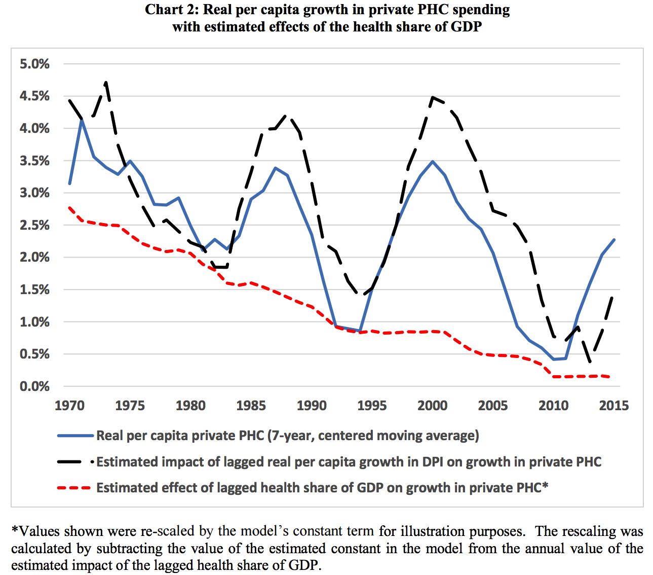
We can trivially plot growth rates for real per capita disposable incomes and health expenditures (as derived from the PCE) and see that these variables are quite well correlated in the long run with a loess smoother.

data here

AIC and household disposable income are well correlated
Before I begin analyzing OECD data again it’s worth pointing out that AIC, which I’ve already demonstrated to be an exceptionally strong predictor of NHE and which largely explains US NHE, is exceptionally well correlated with Household Net Adjusted Disposable Income and that the US is not below trend.

Based on the strength of this relationship and the near-zero US residual you can be pretty sure this won’t much change the results vis-a-vis AIC.
Variable selection
I will use a slightly different variable for this analysis instead, household gross adjusted disposable income, because household net adjusted disposable income (merely the subtraction of fixed capital consumption) is not available readily available. The OECD stats page provides this helpful description:
Disposable income, as a concept, is closer to the concept of income generally understood than either national income or GDP. At the total economy level it differs from national income in that additional income items are included, mainly other current transfers such as remittances. For countries where these additional items form significant sources of income the importance of focusing on disposable income in formulating policy is clear. Another important difference between national income and disposable income concerns the allocation of income across sectors. At this level significant differences arise, reflecting the reallocation of national income. Disposable income can be seen as the maximum amount that a unit can afford to spend on consumption goods or services without having to reduce its financial or non-financial assets or by increasing its liabilities.
A better mechanism for international comparisons when focusing on households’ “income” is adjusted disposable income because it takes into account transfers in-kind such as government provided education and health.Household disposable income is the sum of wages and salaries, gross operating surplus (income earned from renting a dwelling or the imputed rental income of owner-occupiers), mixed income, net property income, net current transfers and social benefits other than social transfers in kind, less taxes on income and wealth and social security contributions paid by employees (including social contributions payable by employers), the self-employed, and the unemployed. Household adjusted disposable income additionally reallocates “income” from government and NPISHs to households to reflect social transfers in kind. These transfers reflect expenditures made by government or NPISHs on individual goods and services, such as health and education, on behalf of an individual household.
See chapter 8 of 2008 System of National Accounts manual if you have any doubts/questions.
Note: This disposable income data was reported there only in current prices and current PPPs, so I transformed these to constant prices and constant PPPs (2010 base year). I did this using both forms (current price/PPP & constant price/PPP) reported by OECD for GDP to derive a multiplier to adjust disposable income to ensure all data was adjusted consistently with the same PPP and same deflator as was used in my AIC, GDP, NHE, etc series (which were provided by OECD stats in constant PPP and constant price terms with 2010 as a base year)
Statistical comparisons
Some quick plots to orient ourselves with this same 2013 subset.

You can see here that AIC and the two disposable income measures (gross and net) are all well correlated with each other and with health expenditures (NHE). GDP, on the other hand, is significantly less well correlated with everything else.

The solid black line has slope=1. Household disposable income is greater than AIC for most countries most of the time.

Household gross Adjusted disposable income accounts for a significantly larger fraction of GDP in the US than most (and certainly relative to Norway, Switzerland, Ireland, etc).
This plot makes it a bit more clear.

Or as a time series to see the impact before the economic downturn:

The US combines high GDP per capita with a significantly higher disposable income share of GDP than most (and especially other high GDP countries).
Many of the high GDP countries also have notably lower consumption (AIC) shares of everything (this is not just about health expenditures and dubious differences in efficacy of US vs RoW cost containment strategies).

Because so many of the high GDP countries also have low consumption shares their material living conditions are much more compressed than a naive reading of GDP would have you believe (which is the main reason US health expenditures appear to be anomalously high as a function of GDP).
Brief comparisons with recent data

This plot suggests the US ought to be spending about twice as much as the typical OECD country based on disposable income alone, which is much more reasonable for the US than what is suggested by GDP:

But slightly less reasonable than what is suggested by AIC

Time series (plotting shares)
Because there is some volatility and lag associated with these economic indicators it’s helpful to view this as a time series (countries have a tendency to revert to trend in the long run…. even those that start out significantly above or below)
The gross adjusted disposable income plots are considerably noisier than are the equivalent series for AIC, however you can probably see that most countries are following a very similar long run trajectory as the United States has been since the 70s. NHE is clearly eating up an increasing proportion of disposable income and doing so at a rate that is comparable to what the US spent at similar levels of real disposable income.

The consumption series is a bit easier to interpret and shows greater consistency (not to mention covers a considerably longer time span for some countries):

And as a share of consumption by disposable income.

Year-over-year growth comparisons
You might notice that the southern european countries most affected by the latest economic downturn saw substantial reductions in health expenditures that corresponded with a broader downturn in AIC and DI (when forced to reduce consumption countries will find ways reduce real health expenditures quite substantially, certainly much more than low-ball elasticity estimates would have you believe). Smaller countries with less fiscal capacity appear to be more responsive (less lag, less muted response to small perturbations, etc) and some countries respond with somewhat different lags due to different health finance schemes and the like but the relationships are generally pretty obvious even so.

Even if we back NHE out of AIC and plot the non-health consumption we can see these are pretty well linked (at least for those countries with the same time span covered!)

Some animated plots
These animated plots are a handy way to view the long term relationships.


Comparing AIC and disposable income in OLS

Things to note:
- The elasticities are very large for disposable income and AIC. Controlling for country fixed effects or year fixed effects does not reduce it (often the opposite).
- The dummy variable for USA suggest US expenditures are about 29% higher than would be suggested by disposable income (model 2) and about 9% higher with AIC (both models with year FE)
- Models with AIC (models 4-6) fit marginally better than DI (models 1-3)
- None of these models employ non-linear specifications and I have previously found significant non-linearity (which biases US residuals/dummy coefficients upwards)
Even with the least favorable model (essentially model 2, as above, without US dummy variable) US residuals overlap significantly with other countries

Moreover, quite contrary to the runaway divergence suggested by some US has actually been converging quite substantially according to this model since ~2000 (note: many countries have seen much steeper upticks than the US in the past decade or two)

Modeling exercises
And even with the same crude model above, the time trend for the year fixed effects is fairly modest (about a 0.4 increase in log(real NHE per capita), roughly 50%, between 1970 and 2015 can be attributed to time after we’ve controlled for log(disposable income)).

To put this in perspective the NHE growth rates in the US elsewhere have been growing much, much faster than that.

The time trends would include factors like technological change (new diagnostics, treatments, surgical procedures, etc), population aging, disease burden (see: obesity, diabetes, etc), health inflation (roughly as a residual of incomes), and much more. Even with these crude models it’s pretty clear that the real income factor can explain a hell of a lot and that time is generally much less significant than many people believe it to be. And the time trends are probably significantly over-estimated.
Applying a slightly different model (AIC instead of DI) to the same data the estimate is about half as large.

The log-log AIC model (plus year FE) generally fits the data better and is generally less likely to be biased by income smoothing, lags, etc.
And if I force the year as a continuous (non-categorical) variable to ease comparison:

There is probably also a non-linear relationship between consumption and health expenditure levels, which tends to somewhat over-state both the time trend and the US residual.

This table is kind of ugly, but if you look carefully you might notice that (1) all the terms with the 3rd degree polynomial (models 3 & 4) are significant (2) the US dummy shrinks quite considerably (from ~1.7% to ~0.9%) (3) model doesn’t appear to be very sensitive to US dummy exclusion (from model 3->4)
Borrowing model 4 we can quickly see how US compares:

And we can do this same exercise with disposable income:


Although the US appears to lean a smidge high with respect to disposable income it’s certainly not what I would call an outlier.
Income levels/changes explains quite a bit within the US
As I pointed out earlier, consumption and disposable income explains quite a bit at a sub-national level with the United States too:


The state/sub-national slopes (elasticities) are significantly less than you might expect to find based on international (between country) regression estimates, but this is pretty much as expected due to spillovers, transfers, etc. The main point here is simply that income (or good proxies for it) explain quite a bit of the variance within the US too.
International comparisons of growth rates (CAGR)
Health expenditures have been growing faster than disposable income everywhere (and US generally doesn’t look particularly anomalous)

Likewise for the longer time period (using AIC because it covers more time in this data).

CAGR isn’t a perfect method due to point in time volatility between observations (+/- reforms, lags, etc), but nonetheless you should be able to see that the US is generally within these long trends (these are all real, per capita, PPP-adjusted if it’s not clear from the labeling).
Absolute growth comparisons
Growth rates in US NHE have not been exceptional. The absolute increase was above average, but US disposable incomes started well above average and absolute growth in disposable incomes has also been above average. For instance, if we compare the period 1997 through 2014.


These things add up. Those countries with greater starting disposable incomes (DI) and greater absolute growth in DI saw greater absolute increases in real HCE per capita.


International growth trends/review
Growth rates in health expenditures have been decelerating significantly throughout the OECD and the United States is no exception here.

source
Contrary to conventional wisdom most of the increase in real NHE has been attributable to increasing volumes of health expenditure (i.e., real qualitative and quantitive increase, not so much health inflation above the general rate of inflation) and this has decreased markedly.

source
It is not that the US or other countries have suddenly figured out how to contain health expenditures, but mostly that the average growth rate in real disposable incomes in the developed world have declined significantly relative to earlier decades (and, probably to some degree, reaching greater equilibrium following a large expansion of health insurance before the 90s).

The slowdown in real disposable incomes causes people to demand relatively less health volume and, to substantially lesser degree, also reduces wage growth in health care and other service sectors (cost disease). However, as pretty much any of my time series plots above makes clear, this does not imply a large change in the long term relationship between real incomes and the health share of consumption (or disposable income).
A brief review of household disposable income

source
Put simply, household gross adjusted disposable income is much more closely related to individual income than is GDP per capita and it (the “adjusted” version) very much includes in-kind expenditures from government like health and education. The average disposable incomes and/or the material living conditions experienced by people in the United States today really are substantially higher than what is experienced in most of the OECD even after we take full account of in-kind transfers (which is presumably especially relevant with the welfare states in Europe). This is well explained by the fact that the United States combines high GDP per capita with consistently higher proportions of GDP finding its way to households net of taxes and transfers (especially relative to those few other high GDP countries).
We can crudely visualize the allocation of disposable income between sectors as a share of GDP like so:

data source
You might notice that these all roughly add up to ~100% of GDP. This isn’t surprising because national disposable income is defined by the identities:
Gross National Disposable Income = GNI + NSI = GDP + (NPI + NSI)
where NPI is Net Primary incomes [to/from rest of world] and NSI is Net Secondary Incomes [to/from rest of world] (or Net Current Transfers) and these usually account for a very small proportion of GDP most years. In other words, after we have accounted for GDP most of the action as it relates to household disposable income amongst highly developed countries is linked to the allocation of disposable income between economic sectors (which is net of cash and in kind transfers, taxes, etc).
Norway, for instance, has a very high GDP, but households only have a chance to consume or save around 60% of it whereas in the US the total is around 85% [varies somewhat year to year…. but similar patterns for a good number of years]. Some of this can be attributed to different industrial structure (elevated fixed capital consumption, foreign investors, etc to their oil/gas industry) but in large part it is due to government absorbing a very large proportion of GDP (and not turning around and distributing this to households in cash or in-kind). Some of this is clearly invested in their sovereign wealth fund because large proportion of their current GDP is derived from oil/gas it is prudent to engage in substantial consumption smoothing to avert economic crisis in the future when their oil/gas reserves decline (or the market for it craters). Norway also has strong safeguards that prevent them from spending this money on health or anything else and most of it is invested overseas.

Regardless, though US household disposable incomes may be a bit elevated by below average savings and (Federal) fiscal deficits, which in turn may spur additional national health expenditures, the US isn’t all that unusual in either of these departments, so it probably doesn’t have much explanatory value. It may explain a bit more on the public finance side of NHE (Medicare and Medicaid), insofar as if we had to raise more taxes to pay for it we would likely be somewhat less generous (especially in Medicare), but probably not much. It is also worth keeping in mind that total NHE clearly lags disposable income by a few years and the elasticities are very large (i.e., probably not reverse causation).
The allocation of national disposable income matters
As I demonstrated in a prior post on AIC and NHE, the composition of GDP has tremendous significance for predicted national health expenditures. There are very strong affinities between AIC or household disposable income measures and national health expenditures wherein once you control for either remaining components of GDP have little informational value.
To review the AIC evidence briefly: even if I fully subtract NHE from AIC (non-health individual consumption) and take the remaining parts of GDP (collective consumption, net exports, fixed capital, etc) I find the coefficient to be much larger.

Likewise controlling for year or country fixed effects does not significantly decrease the relevance of non-health consumption (often the opposite). This, of course, is a significant under-estimate of AIC and inflates the GDP components because we’re removing a large part of the signal from the AIC side.
We can do much the same with disposable income in broad strokes:


Or with the sectoral model (gross adjusted disposable income for each sector):

Note that government and non-financial corporations barely even register whereas even when we remove NHE from household disposable income the coefficient is still very large (and adding additional controls for year and country does not diminish).


Likewise, if I use a random effects model to let these slopes vary for each country independently, the slope for gross adjusted household disposable income less NHE (log_hh_less_nhe) is clearly clustered much above 1 (high elasticity) whereas the slopes for these other unmolested components are clustered pretty close to zero (and certainly no where close to >=1).


There aren’t a whole lot of observations for some countries, so some estimates are probably off, but is still a clear pattern. Even more so if I use HH disposable income without subtracting NHE.
 Similar results are obtained with AIC less HCE where we have considerably more observations (most going back to 1970 vs mid-90s for DI for most countries):


There is a consistent pattern here: the better the measure reflects the economic conditions of actual households, the better it predicts national health expenditures. Conversely that which is far removed from the individual has at best little independent association with NHE, i.e., once we have accounted for household disposable income or AIC these other variables become pretty negligible.
We can see much the same with simple bivariate correlations.

AIC and household disposable income perform pretty comparably followed by a good 5-10% amount explained by GDP and national disposable income. Removing AIC or HH DI from GDP or national DI badly damages their relationship with NHE whereas when we remove NHE from AIC or HH disposable income they still remain quite potent. This is very much consistent with what we find in multiple regression analysis (albeit AIC, HHDI, etc further mediate these relationships).

Likewise, if we slice this across the country dimension instead of time, we find similar patterns hold.


AIC and HH DI “explain” the vast majority of the variance (i.e., change in constant NHE per capita) and usually substantially more than does GDP. AIC and HH DI not only outperform GDP between countries in any given year, they also do a substantially better job of explaining NHE growth within countries over time too.
Modeling with sectoral disposable income
This is far from a perfect model. Combining year and country fixed effects in the same model tends to produce significantly deflated elasticities estimates (continuous economic growth + varying lag associated with response ) and there are probably significant non-linearities in relationship between disposable income (or consumption) and NHE. Nonetheless this lets us quickly produce a rough upper-bound estimate for how much above expectations US is in a model that is aware of allocation of GDP between between sectors and residual GDP (Net Secondary and Net Primary incomes with RoW)


Of course these country fixed effect estimates are suspiciously correlated with AIC still though!

Given the apparent non-linearities and large US lead in consumption, household disposable income, etc relative to most of the OECD this will tend to make US look worse than it really is. If you look at this animation you might understand how this plays out.

Or this with AIC (more observations before mid-90s)

I believe these subtle non-linearities are quite likely given the interaction between rising NHE volume (the lions share of the increase) and rising real prices (cost disease). Various papers have reported generally lower income elasticity with respect to NHE in lower income countries (albeit with GDP). We can even see these patterns (increasing slope) play out amongst the same set of comparable countries over time.


Those countries further out on the frontier with respect to disposable incomes (like the US) are going to tend to appear to skew high in any given year.
About those GDP regressions….
If you restrict analysis to more developed OECD countries and pick comps carefully, GDP looks like an excellent good predictor and the US appears to stick out like a sore thumb.

If, however, you widen the analysis to more economically diverse countries (especially those few with very high GDPs) the issues with GDP start to become much more apparent.

Essentially all of these outliers below the more obvious trend are high export economies, many with sovereign wealth funds and the like, with elevated fixed capital consumption, etc. These countries all have much lower average material living conditions than a naive reading of their GDP per capita might lead you to believe.

Even restricting the trend line to countries with reasonably normal consumption shares (>=60% of GDP) straightens these outliers out considerably.
But simply plotting this as a function of per capita consumption (AIC) does much to rationalize health expenditures across this very same data set without needing to resort to such crude measures.

The point here is simply that GDP fails badly with diverse economies where AIC holds up very well overall. It is likely comparable results would be obtained with good measures of household disposable income (I don’t believe reliable estimates for this are available much outside of the OECD). Although these sorts of issues are surely less extreme amongst the OECD today and therefore less obvious, they still have a significant effect on estimated elasticities, US residuals in various models, etc when GDP is the primary basis for estimation.
“But what about income inequality?”
Some people object that relatively high income inequality in the US as compared to other highly developed countries means that high US incomes are somehow not applicable. This objection is almost certainly wrong though.
Firstly, the literature shows income elasticities at the national level are large (usually >1.2) whereas individual income elasticities are usually exceedingly modest (close to zero) with state/regional aggregations being intermediate to this.


source
Secondly, the several US studies suggest income differences in health expenditures associated with income status are very modest.

Without controlling for health status the poor actually consume somewhat more according to these estimates. Even with some pretty extensive controls for health status there is not much to suggest a strong systematic relationship.
Thirdly, none of this should be surprising because the vast majority of health expenditures are paid for by third party payors (especially government & employer-sponsored health insurance companies) where costs are pooled across economically diverse populations with generally similar benefits offered to those covered. Moreover, the US also has somewhat below average out-of-pocket payments as a share of health expenditures.
Fourthly, US consumption inequality is substantially less out of proportion internationally and has changed markedly less over the past few decades as compared to reported pre- and post-tax income inequality.
Long story short, like quite a few other things in economics, the national average (income or consumption) is ultimately far more determinative than the individual’s own (income or consumption). Average disposable incomes and average individual consumption are obviously much higher in the United States than most other OECD countries (even when we include in-kind transfers from government like health and education) and these measures, broad averages of disposable income and/or consumption, are clearly exceptionally strong predictors at multiple levels of analysis. Given the high elasticities found for disposable income and overall consumption we should fully expect the United States to spend much more than the average OECD country.
But what about the uninsured?”
Other people also object that US NHE would be much higher still if we had fewer uninsured. I think this is largely misguided too.
1: The uninsured “only” constitute around 9% of the population as of 2015
2: A large proportion of them are uninsured by choice: they would rather save a bit of money or can’t be bothered with the hassle.
3: The uninsured still incur significant health expenditures (out of pocket, uncompensated care, etc) and these costs ultimately show up in NHE.

4: Per beneficiary health expenditures are much lower for private insurance than both of the two major public health insurance options

source: CMS
The uninsured population’s cost in this counterfactual are apt to look much more like the private insured than Medicare (mostly elderly) or Medicaid (mostly poor and/or very sick).
5: Actual health expenditures are heavily skewed towards the very sick.

source
Edit: The skewness in US NHE is probably not particularly atypical. See my new and short blog post on this topic.
Few of the uninsured are very sick. Many of the uninsured are only uninsured for a few months (about ~50% for more than a year), meaning potentially delayed expenditures, but probably not a large net reduction when averaged over a few years. Those unfortunate enough to get sick and that cannot otherwise afford private health insurance are quite likely to end up on Medicaid already (meaning potentially delayed expenditures, but not necessarily significant reductions on aggregate).
6: The overall level of expenditures are determined much more by what we are willing and able to spend than by objective need. Adding somewhat greater need to the system may change somethings, especially the allocation of expenditures, but it very likely won’t be large and it won’t have a proportional effect on overall NHE.
Net net I would not expect reducing the number of uninsured to substantially increase overall US health expenditures today, especially not if on a plan like Medicaid (stringier). (Which is not to say that adding more people to public health plans would not increase fiscal outlays significantly)
“But everyone knows US health prices are the primary culprit!”
I spoke to some of these issues in my earlier blog post in this topic, so I don’t want to belabor the point too much, but while it is practically received wisdom in some corners that the prices of US health care are the culprit (and more recently), the actual evidence for this perspective is quite weak and the analysis is largely missing. When I have actually looked into the sources for these claims in the media and various academic articles I come up with little more a few powerpoint (!!!) slides by IFHP.

IFHP is (1) not making apples-to-apples comparisons for the most part (2) they provide very little data on methodology (even currency conversion, PPPs used, etc!) and (3) select a small handful of countries seemingly without any rhyme or reason. It all seems very ad hoc to me. It is not a good basis from which draw sound conclusion, particularly not when there is very good reason to expect most of health care prices (especially those with significant service components) to correlate well with income levels and we are presumably interested in knowing how much relative differences price levels might contribute to the supposed large positive US residual on NHE & income regressions (hint: a scatterplot would be very useful…. and what’s with displaying percentiles for US only?)
In the other corner, we have several careful OECD affiliated studies pertaining to creating/revising health PPPs for the entire health sector and various areas within it, not to mention several years worth of health PPP and price level indices. Essentially none of them suggest US price levels are significantly higher than expected as a function of AIC, disposable income, etc and good number of them suggest US price levels are significantly less than expected (although the authors seemingly take pains to avoid drawing attention to this fact)!
I trust these methods and these contributors to establish the broad impact of price levels in health care far more than I do sloppy/ad hoc data from the likes of IFHP. Looking at hospital pricing, for instance, they take a broad comprehensive measure of all the cost components to estimate quasi-prices (recognizing that the prices nominally charged in different types of systems lacks external validity….)

And they find that the hospital price level index, the ratio between the specific PPP and the exchange rate, after they have combined all of these into a weighted measure is very well correlated with the average real material living conditions of a country (volume of AIC per capita)

We would fully expect US hospital PLIs to be amongst the highest because of its very high AIC, but it’s actually lower than most (replotted the same data with the US)

All of the major price level indices are significantly lower in the US because of the exchange rate as compared to other rich countries. However, the “official” OECD volume estimates and those found in these various papers all suggest that the US simply does much more volume than the typical OECD country (whether this is computed with input or output methods)

And, more generally, the volume of health consumption (at health PPPs) is well correlated with broad measures the volume of AIC (at AIC PPPs). Rich countries like the US spend more in (economy-wide) PPP-adjusted terms mostly because we do a lot more and more expensive types of things.
If you’re a little concerned about the exchange rate element, then try looking at the ratio between PLIs or PPPs to provide a rough sense for the domestic opportunity cost.

The US does not look unreasonable here either. Due to cost disease (mostly) non-tradable services like health cost relatively more than (mostly) tradable goods in rich/high wage countries, but this is clearly not the dominant factor people think it is when comparing health expenditures at economy-wide PPPs (again it’s really comparing the domestic opportunity cost– how far does that same dollar go if spent domestically).
Moreover, if you compare health PPPs to broader total services PPPs you will find that they are exceptionally well correlated (using PLIs to ease readability)

This strongly suggests that the variance in overall health price levels between countries is almost entirely explained by prevailing service price levels (which implies there is not a whole lot interesting going on with overall health prices that cannot be explained by prices in the rest of the service sector) and that the US is roughly in-line with expectations here too.
In any event, the OECD is several rounds into the construction of these health PPPs (these are certainly mature enough to establish some reasonable baseline for US health pricing vs the rest), US has been pretty stable, and I trust them far more than I do other sources I have seen. They do not suggest overall US health prices are the problem or wildly out of line with what we would expect for a rich country (cost disease). Even if we allow for some potential measurement error or under-weighting of, say, administrative costs it’s quite unlikely that high US expenditures are substantially explained by high costs given that these estimates are already on the low-side.
Likewise, the proxies for broader health prices, like physician and nursing compensation, are quite consistent with this view too. Whatever monopoly rents these groups receive in the US it doesn’t look like the situation is that different in other developed countries in general.


source
The data suggests physicians in virtually all countries enjoy large wage premiums over the average national wage (and those that don’t, like Finland, typically have substantially less demanding schedules, training, etc). US prevailing wages are substantially higher (especially when measured more comprehensively)


source
Note: I am not suggesting that there are no areas where US health prices are higher than we might predict with these economic indicators. The US, for instance, likely pays a substantially higher premium than most for pharmaceuticals. However, this sort of stuff does not appear to contribute all that much to overall costs and there are likely offsetting areas of US cost efficiency.
“But outcomes/efficiency!”
I largely addressed this argument at length earlier, but I want to very briefly touch on this: despite what illustrations such as this imply there is approximately no correlation amongst developed countries between the level of spending and life expectancy.

It’s basically all the core southern and northern european countries and the rest of the OECD/affiliates in eastern europe, south america, etc.

Within the core there is ~0 correlation despite large differences in spending.

What’s that I hear, endogeneity? I agree, it should be taken seriously, but even so, even if we instead take the changes between 1970 and 2014, we see no evidence of a positive correlation.

All these countries moved in a way that is consistent with long term widespread secular trend of increasing life expectancy. Countries that saw much larger real increases in NHE per capita did not see systematically greater increases in life expectancy (if anything perhaps the opposite…. which might be consistent with diminishing returns).
This data does not provide any obvious support for causation (NHE->life expectancy) and certainly not for the notion that there is any sort of predictable relationship between the two. In fact, we can create a pretty similar looking plot with AIC instead of NHE.

And AIC is at least as well correlated with these increases in life expectancy as NHE is!
Extrapolating extremely poor efficiency of the US health system from plots like these is pretty silly under the circumstances. If you take the blank slate view and actually expect roughly proportional returns to NHE you must also ask why these other wealthy countries also aren’t seeing corresponding returns to the NHE (both with respect to levels and increase). If, on the other hand, you take a more realistic view and recognize that health care only explain a small fraction of the variance, that there are endogenous differences between countries, that health expenditures are likely subject to rapidly diminishing returns, that other sorts of policy might matter, and so on you are apt to want to do considerably more research before concluding there is obviously something uniquely deficient in the US health system based on this sort of crude analysis.
Conclusion: causes matter
The real growth in NHE per capita and the differences between countries are almost entirely explained by good measures of or proxies for household disposable income (e.g., AIC). Technology and, to lesser extent, real price increases over and above the general rate of inflation certainly contribute, but they are largely proximate causes that are quite well explained by real income growth. There are lags, non-linearities, measurement error, etc so it is possible to arrive at a somewhat different conclusions with enough controls or somewhat different model specification (especially with an inferior income proxy like GDP), but it seems pretty clear this ultimately a product of rising incomes (perhaps combined with the widespread adoption of 3rd party payment systems …. which themselves are a product of the growth in incomes historically)
Given the wildly different elasticities and evidence generated by various experiments it seems likely that 3rd party payment systems (cost sharing) stimulate demand quite substantially above and beyond what we would see if people were paying for health expenditures out of pocket. However, once countries adopt these sorts of arrangements I see very little to suggest that different sorts of systems lead to large and sustained differences in expenditures (in the short run they might, but not so much in the long run). People seem to like these arrangements for various reasons and they demand increasingly expensive coverage to pay for all of it.
Most of the developed world has backed away from aggressive rationing over the past few decades as they have grown richer and preferences have changed. Probably the clearest example of effective cost containment in recent history was (and perhaps still is) Great Britain. They were practically the only country that exhibited a substantially different trend than the US with respect to consumption (AIC) for a number of years.

They did much to limit the volume of services provided and it largely worked to reduce NHE growth. However, this all changed around the mid-2000s as a result of backlash against these very same systems. My hunch is their new growth path will be quite similar to that of the US and most other countries in N/W Europe as these cost savings come with tradeoffs and most societies do not seem to be willing to make them anymore (or, rather, not to nearly the same extent).
The differences in the systems that evolved in Great Britain, being willing and able to aggressively ration care, are some combination of different attitudes, different political systems, and accidents of history. Although we can in principle reduce costs with more rationing of care, I do not think those systems of old are replicable here, especially not with very high and rising disposable income levels. I do not see much appetite for this today. Instead people keep on wanting to imagine a magic bullet exists to solve the problems (“it’s all prices!“) without really having to make hard choices. While there are some fairly unambiguous areas of “waste, fraud, and abuse”, the real action, that which we can plausibly hope to make a large net reduction in health (and related) expenditures, are in the vast gray mushy middle of diminishing marginal returns (not to mention subjective/qualitative differences and so on) and, by and large, a society’s willingness to chase these ever smaller returns corresponds quite well to their economic conditions. Public and private policy eventually catches up with changes in preferences (likewise for the supply side).
Put differently, the reason most of the world spends much less is not because their systems are that much more inherently resistant to waste or because they generate large price reductions, but that they have substantially lower real incomes and lower consumption overall. This causes them to be relatively less demanding of cutting edge technology, relatively more accepting rationing, and to have somewhat lower costs (as a product of lower real wages) as compared the United States, but as they get richer these patterns shift and will tend to look increasingly like the US does today in terms of overall health consumption, technology, etc (even if the systems, technology, etc themselves look a little different). This has played out in scandinavia, Germany, France, and beyond. Rising health care costs are not a solved problem. Those few politically palatable changes that manage to help contain costs on the margins without excessive pain get copied pretty widely.
The notion that we are going to save much money by blindly copying the modal system in the OECD is largely without merit. Whatever additional cost containment they demonstrate today is meaningless without the will to actually implement it and stick with it. None of this is to argue that there is absolutely no room for improvement today though. There are things we can do on the margins within the current system to reduce costs: substantially increase out-of-pocket share of NHE, remove tax distortions, increase gatekeeping, stop paying for outrageously expensive orphan drugs with minimal efficacy, and so on and so forth but these are likely still pretty marginal in the grand scheme of NHE and we still need to have the will to actually do them.
Amazing work. As a US healthcare provider, it’s great to see timely, effective and smart research into costs that doesn’t goal-seek the standard “US healthcare costs more than anywhere else without offering any benefit” criticism. Keep up the great work!