Predicting economic mobility from 10th grade test scores

In my last post I briefly touched upon economic mobility vis-a-vis the link between test scores and subsequent adult incomes.  Because these individuals were still pretty young, just a few years out of college (if they graduated), the earnings correlations were weaker than one might have expected.  Since then I discovered an interesting continuous SES variable (F3SES) in the ELS:2002 data set that is probably a better measure of future earnings or mobility.

F3SES is the average of 3 inputs (2011 earnings from employment, the prestige score associated with the respondents current/most recent job, and educational attainment), each of which is standardized to a mean of 0 and a standard deviation of 1 prior to averaging.

Data users should note that, as of the third follow-up, socioeconomic status may be less-than fully stable for some third follow-up respondents, e.g., respondents with graduate-level education who are just beginning or have yet to begin their careers.  Users should also note that F3SES does not account for the income, occupation, or education of the respondents spouse/partner, and therefore may not be fully indicative of household socioeconomic status as of the third follow-up.

NOTE: While the two versions of the BY family SES composites (BYSES1 and BYSES2) were created by differential assignment of prestige scores based on the 16-category BY occupation variables, F3SES is created by assigning prestige scores based on the 2-digit ONET code associated with the respondents current/most recent job as of the third follow-up.

While I am sure I could derive my own formula to produce a similar composite score, I’ll just use theirs for the time being.


ses_by_test_white_males

ses_by_test_white_and_black_comparison

There is no statistically significance difference between blacks and whites here.

ses_by_test_wba

Asian SES is higher than white SES for most of the distribution, but that’s not statistically significant either.

Exploring ELS 2002 data

The NYTimes turned me onto a new data source in a recent article on college graduation rates by SES.  They implied that college graduation rates are better predicted by “wealth” than by the students test scores (10th grade ELS scores taken in 2002).

Google Chrome

Being both curious about the underlying data and somewhat skeptical of the particular claims (or, at least, its interpretation) I decided to investigate it for myself.  Having done so now, I can tell you that it’s a pretty rich data set.  Unfortunately, a few key data points (e.g., SAT scores, HS GPA, etc) are censored or rounded/binned to protect anonymity, but there are still a lot of interesting data there to analyze.


Update (6/6/15):

As in my follow-up post on economic mobility, I realized that they actually provided 9th-12th grade high school GPA as a non-continuous variable in the publicly accessible file.  I have updated my post to reflect this new information in a few places!


First point

The parent’s educational attainment is a much better predictor of both test scores and subsequent child educational attainment than economic measures…..

 (Bachelor degree) Attainment rate by test scores, grouped by parent income levels

scatter_with_errorbars_by_income_levels

A bit of data on the income stagnation and related arguments

The main difficulties I have with the “falling incomes” argument is that the country has changed dramatically over the past few generations and people are often unclear about what they mean by this.

Here are just some of the key changes/issues:

  • Women constitute a larger proportion of the workforce than they once did
  • Minorities, especially latinos, comprise a larger share of the population (households, families, tax units, etc)
  • Families (and thus households) are substantially smaller than before because younger generations are less likely to get and stay married and because they have fewer children when they do.
  • There has been a marked increase in education credential attainment.  Comparing a HS (only) grad from 1960 to 2015 doesn’t make much sense.
  • Some subgroups have changed their workforce participation behavior dramatically over the past few decades

Thus when we talk about directional changes in income it’s important to understand what we are actually concerned with.  Is it more along the lines of “the same groups in the same job working the same number of hours are earning less in real dollars” (i.e., people are getting paid less for the same sorts of efforts) or is it a broader statement like “households have less income than they did generations ago” (regardless of work, household size, race/ethnicity, gender, etc)?   The latter category is much easier to argue than the former.

United States taxation compared to various European countries

It is well established that the United States has a much lower average tax burden than Europe (broadly).

Tax Revenue as Percentage of GDP OECD comparison

source: OECD Tax Database

However, some people seem to believe that ordinary people in Europe do not actually have to pay much higher taxes and that somehow (illogically) these countries with presumably lower income inequality are able to generate all of this tax revenue to pay for all this “free” stuff by just taxing the top 5% or some such.  This is complete nonsense!  These European countries generate this revenue, in the main, with a much broader tax base, both income and social security taxes (and consumption taxes to lesser extent).

Below are a bunch of graphs and figures produced from the OECD’s estimates from the statutory tax code (note: these are particularly sensitive to assumptions made)

National Healthcare Expenditure: United States versus Other Countries: The US is not really an outlier.

UPDATE (9/25/2016): I just created a new and (hopefully) much improved version of this argument here.  I suggest you start there instead.

Numerous people have asserted that the United States spends dramatically more on healthcare than other countries, presumably even more than countries of our level of wealth and affluence, and that this can only be explained by the fact that we do not have single-payer or some such.

Here are some examples graphs used to make this point

Above-expected-500x406 (1)

health-care-spending-in-the-united-states-selected-oecd-countries_chart02

These appear to be very convincing at first blush, but i never found these arguments particularly convincing due primarily to:

  1. Imperfect comparability between the selected countries
  2. Issues relating to comparing countries of the “same” GDP
  3. cherry-picking of countries

I knew the proponents of single-payer were, at best, making an incomplete argument and that it invited an exaggerated impression of what we should likely expect from a country like ours, but, up until now, I lacked the data and the time to present these argument comprehensively.  I recently got in an argument with someone over this subject and found a treasure trove of data all in one place (mostly) to thoroughly debunk this overly simplistic argument.

To make my points, vis-a-vis fundamental issues with naive treatment of GDP per capita and sensitivity to comparison countries, here is a quick chart showing National Healthcare Expenditure (NHE) as a percent of GDP by GDP per capita

NHE_as_Pct_GDP_by_GDP_per_capita


More silliness related to corporate profits

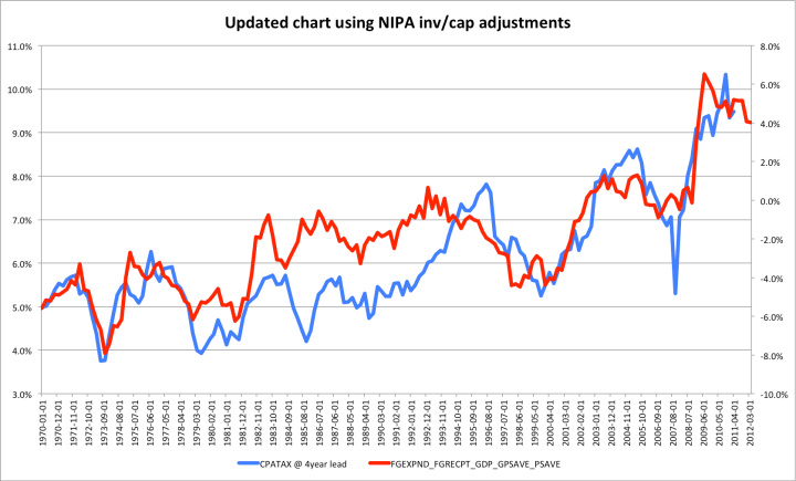
I was pointed to this work by Hussman through Business Insider.

The implication here is that total dissaving is not only strongly correlated with corporate profits, but is directly causative.

Although he doesn’t fully specify this methods, it’s obvious that Corporate Profits is after-tax corporate profits (including foreign profits) and I was able to approximate his results using this FRED2 link.

Update: I re-charted this using the NIPA corporate profits inventory & capital adjusted data that he clearly used (CPROFIT).  It doesn’t really change the outcome here, but it matches his chart more precisely.

Corporate profits is, in other words, after-tax and including foreign profits.

Savings is approximately personal savings (PSAVE) + the Federal deficit/surplus (FGRECPT-FGEXPND) (multiplied by -1 to match to shape of the profit line)

There are many issues with this analysis

Some data on IRS changing income concept

IRS report on changing AGI income definitions

The Tax Reform Act of 1986 (TRA 86) made extensive changes to the calculation of AGI beginning with 1987. These changes made necessary a revision of the calculation of the 1979 Income Concept, in order to make tax years beginning with 1987 comparable to the base years, 1979 through 1986. The law changes limited the deduction of passive losses and eliminated unreimbursed employee business expenses and moving expenses as “adjustments” (moving expenses changed back for 1994) in figuring AGI beginning with Tax Year 1987. Since passive losses had been fully deductible for both income measures prior to 1987, the disallowed passive losses had to be deducted in the 1979 Income Concept calculation for tax years after 1986. Some income items, such as capital gains, that had been partially excluded from AGI under prior law were fully included. The new law also eliminated or restricted some deductions. Therefore, if AGI is used to measure income, comparisons between 1986 income and tax data with that for years after 1986 are misleading. A more accurate comparison can be made using the 1979 Income Concept because it measures income in the same way for all years. Table B shows total income and selected tax items for 2009 using AGI and the 1979 Income Concept, classified by size of 2009 income. Before TRA 86 became effective, a comparison of income measured by AGI with that measured by the 1979 Income Concept showed significant differences at income levels of $200,000 or more.

But, with the elimination of preferential treatment of various income items by TRA 86, such as the exclusion of a portion of capital gains, much of the difference disappeared. Under tax law prior to 1987, the capital gains exclusion accounted for the largest difference at the higher income levels between the two income measures. For 2009, 1979 Concept income was 2.2 percent higher than income as calculated using AGI. This difference was primarily attributed to the inclusion of more than $343.4 billion in nontaxable pensions and annuities (including IRA distributions) in the 1979 Income Concept. Income for all returns, using the 1979 Income Concept, decreased 8.2 percent for 2009; income for the $200,000 and above group decreased 20.0 percent. Total income tax for all returns decreased 16.1 percent in 2009 after an decrease of 7.5 percent in 2008; and total income tax reported for the $200,000 and above income group decreased 19.3 percent for 2009, down from the 12.0 percent decrease for 2008. The average tax rates (income tax as a percentage of total income) for each income class and both income concepts for years 1986 through 2009 are shown in Figure 4. For the population as a whole, average tax rates for 2009 (based on the 1979 Income Concept) were 1.1 percentage points lower than those for 2008. Between 1986 and 2009, the average tax rates declined in all income categories except the $1 million or more category.

Average income tax rates using consistent 1979 Income Concept (direct from IRS data table)

Observation: The very top income groups are paying roughly similar taxes as they paid in 1986 when we actually use a consistent methodology like this.  Lower to middle income groups are paying substantially less and the methodology makes much less difference for them (AGI and TIC render similar results).

United States physician income in context

One of the issues that I have when people assert that United States physician compensation is much higher than other countries is that they make terribly naive comparison.  They compare, say, PPP-adjusted incomes to PPP-adjusted incomes in other countries without accounting for the fact that the “average” person in this country has a much higher PPP-adjusted income by most measures.   Likewise, they’ll compare physician income to “average income” or “average wage” ratios without comparing it to the more relevant labor pool in each country, i.e., at least college graduates (or better). example

Average Physician Gross Income to Average College Grad Gross Income [apples-to-apples]

Note: In both cases, “gross” is pre-tax income, including social security/payroll contributions.

Detailed analysis of Piketty and Saez top income growth data

Recently I have been scrutinizing the data produced by Piketty and Saez on the evolution of top incomes in the United States (“Income Inequality in the United States 1913-2002”)

Their data can be downloaded directly here in Excel format that covers 1913-2012.

Their analysis is not 100% comparable to the CBO for several reason:

  1. They are analyzing family income (not households, as the CBO does, and not individual earners, and not necessarily even tax units)
  2. They do not adjust their rankings by unit size (the CBO divides household income by the square root of the household size).
  3. Their “income” is essentially identical to IRS’s AGI figures.  (Unlike the CBO et. al, they do not include health benefits, payroll taxes, corporate income taxes, etc)
  4. They also are forced to make a lot of assumptions to create a historical series stretching back this far (again, unlike the CBO)
  5. Their “real” incomes are deflated with the CPI, whereas the CBO use the PCE index.

So while this data set has its issue and probably isn’t very relevant to income distribution per se, it is a useful and probably relatively accurate picture of the distribution of 90th percentile of top AGIs.

—-

My thesis here is that most of the apparent divergence that we have seen over the past several decades is a function of several things:

  1. A changing tax code and, especially, top marginal rates
  2. A large increase from the mid-80s of business owners converting to or starting up as pass-through entities instead of C Corporations (e.g., S Corporations, LLCs, etc).  [Note: This is probably substantially a result of the fact that these pass-through entities started  paying lower effective rates relative to similar investments in C Corporations).]
  3. A significant change in the household composition and types of income earned at the lower end (fewer people per household, a smaller proportion of income as cash wages, increase in payroll taxes, etc)

The data from P&S provide some pretty powerful evidence for my first two arguments.

The following charts probably sum this up best:

[This is all income EXCEPT for capital gains index in real dollar terms, indexed to the year 1917]