Recently I have been scrutinizing the data produced by Piketty and Saez on the evolution of top incomes in the United States (“Income Inequality in the United States 1913-2002”)
Their data can be downloaded directly here in Excel format that covers 1913-2012.
Their analysis is not 100% comparable to the CBO for several reason:
- They are analyzing family income (not households, as the CBO does, and not individual earners, and not necessarily even tax units)
- They do not adjust their rankings by unit size (the CBO divides household income by the square root of the household size).
- Their “income” is essentially identical to IRS’s AGI figures. (Unlike the CBO et. al, they do not include health benefits, payroll taxes, corporate income taxes, etc)
- They also are forced to make a lot of assumptions to create a historical series stretching back this far (again, unlike the CBO)
- Their “real” incomes are deflated with the CPI, whereas the CBO use the PCE index.
So while this data set has its issue and probably isn’t very relevant to income distribution per se, it is a useful and probably relatively accurate picture of the distribution of 90th percentile of top AGIs.
—-
My thesis here is that most of the apparent divergence that we have seen over the past several decades is a function of several things:
- A changing tax code and, especially, top marginal rates
- A large increase from the mid-80s of business owners converting to or starting up as pass-through entities instead of C Corporations (e.g., S Corporations, LLCs, etc). [Note: This is probably substantially a result of the fact that these pass-through entities started paying lower effective rates relative to similar investments in C Corporations).]
- A significant change in the household composition and types of income earned at the lower end (fewer people per household, a smaller proportion of income as cash wages, increase in payroll taxes, etc)
The data from P&S provide some pretty powerful evidence for my first two arguments.
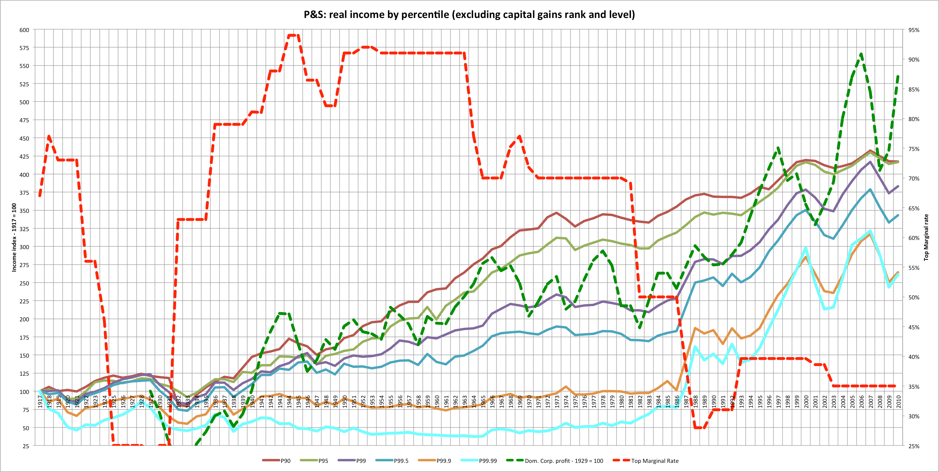
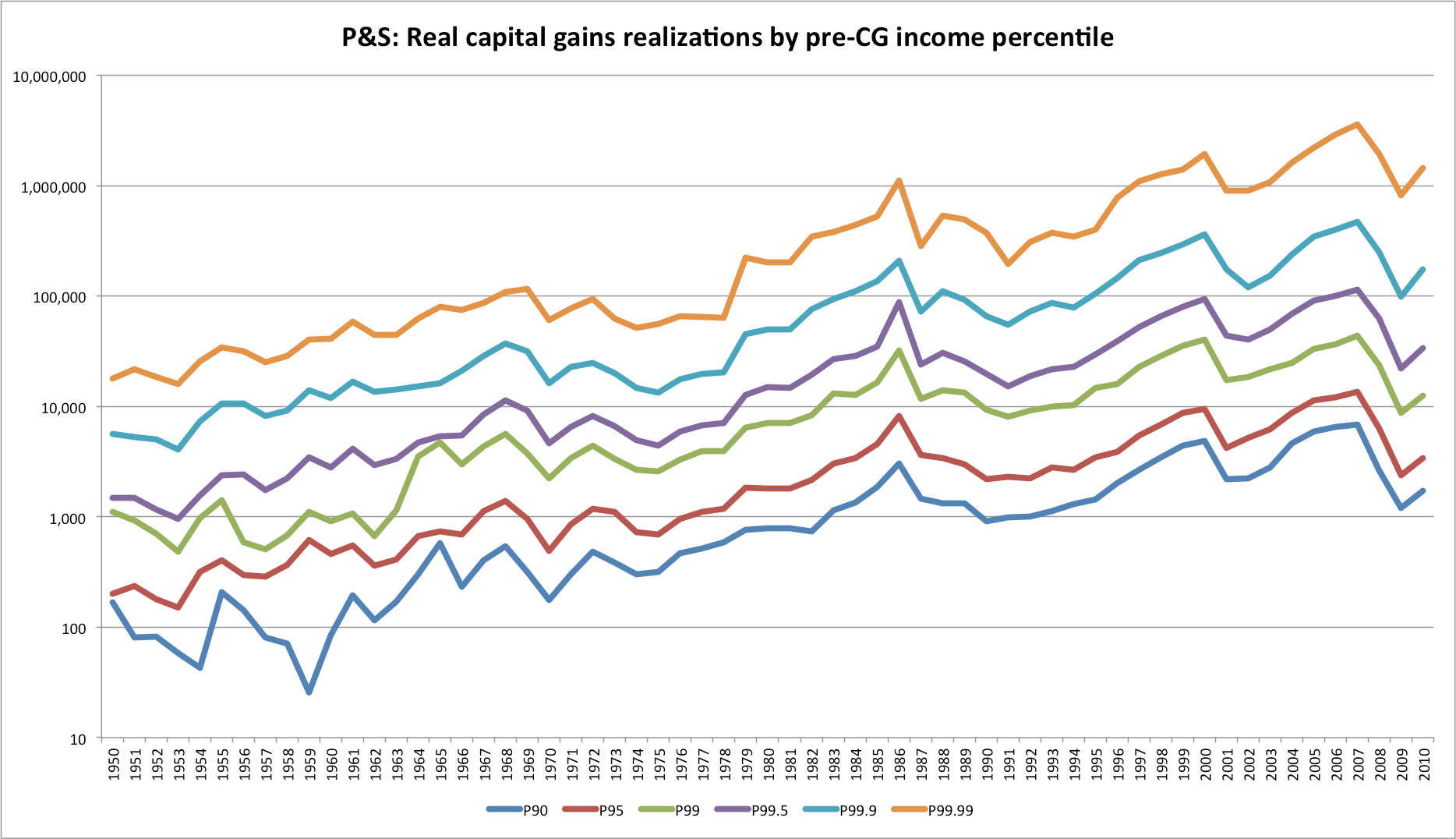
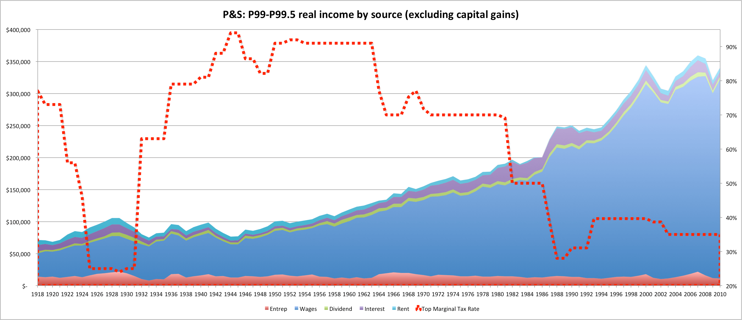
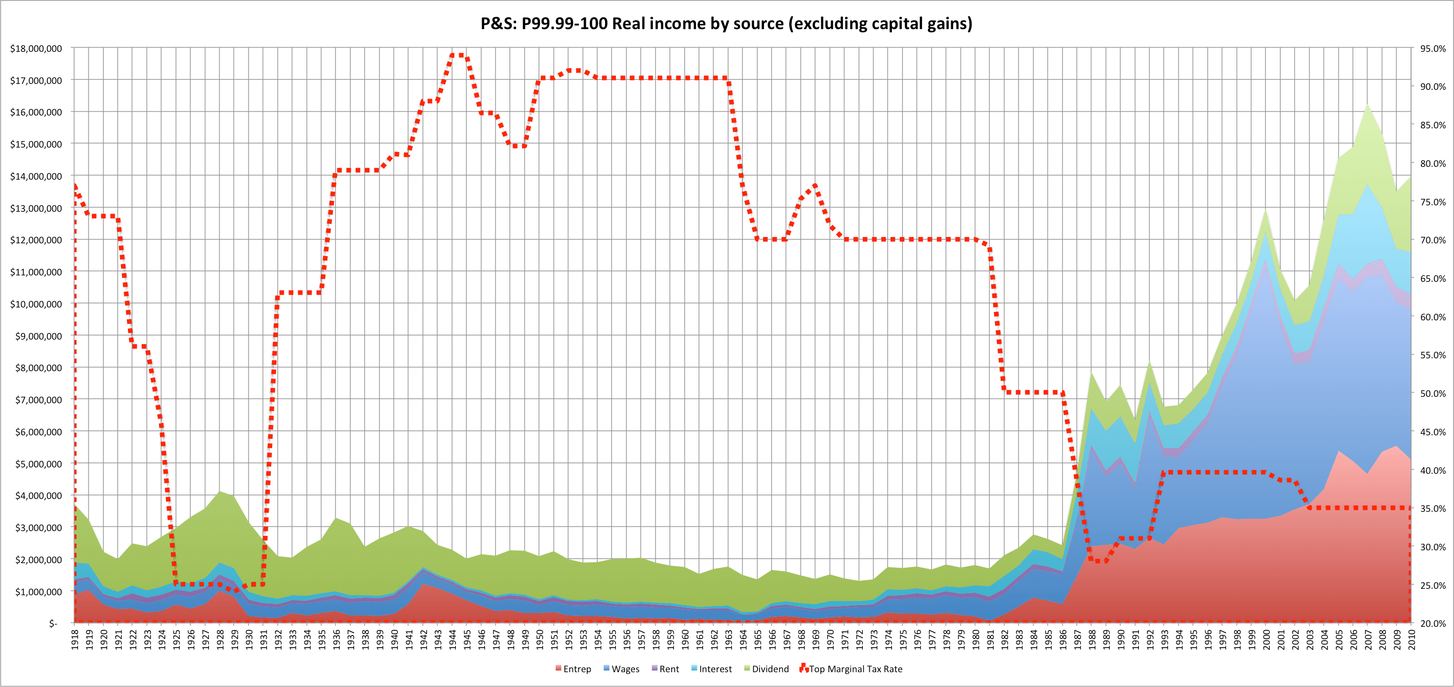
The following charts probably sum this up best:
[This is all income EXCEPT for capital gains index in real dollar terms, indexed to the year 1917]
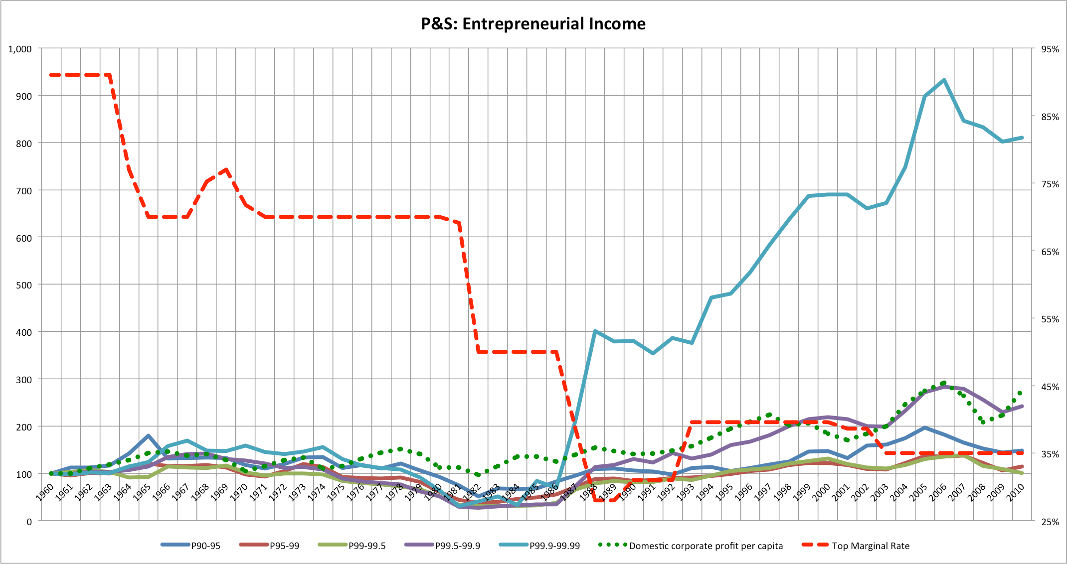
[Or, a little cleaner: just wage and entrepreneurial income since that’s the biggest delta]

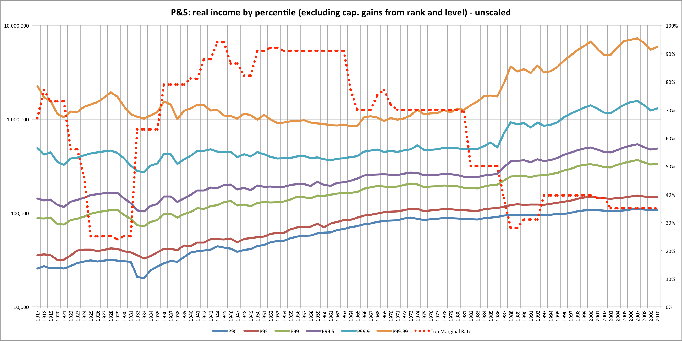
Actual “real” dollars on a log 10 scale
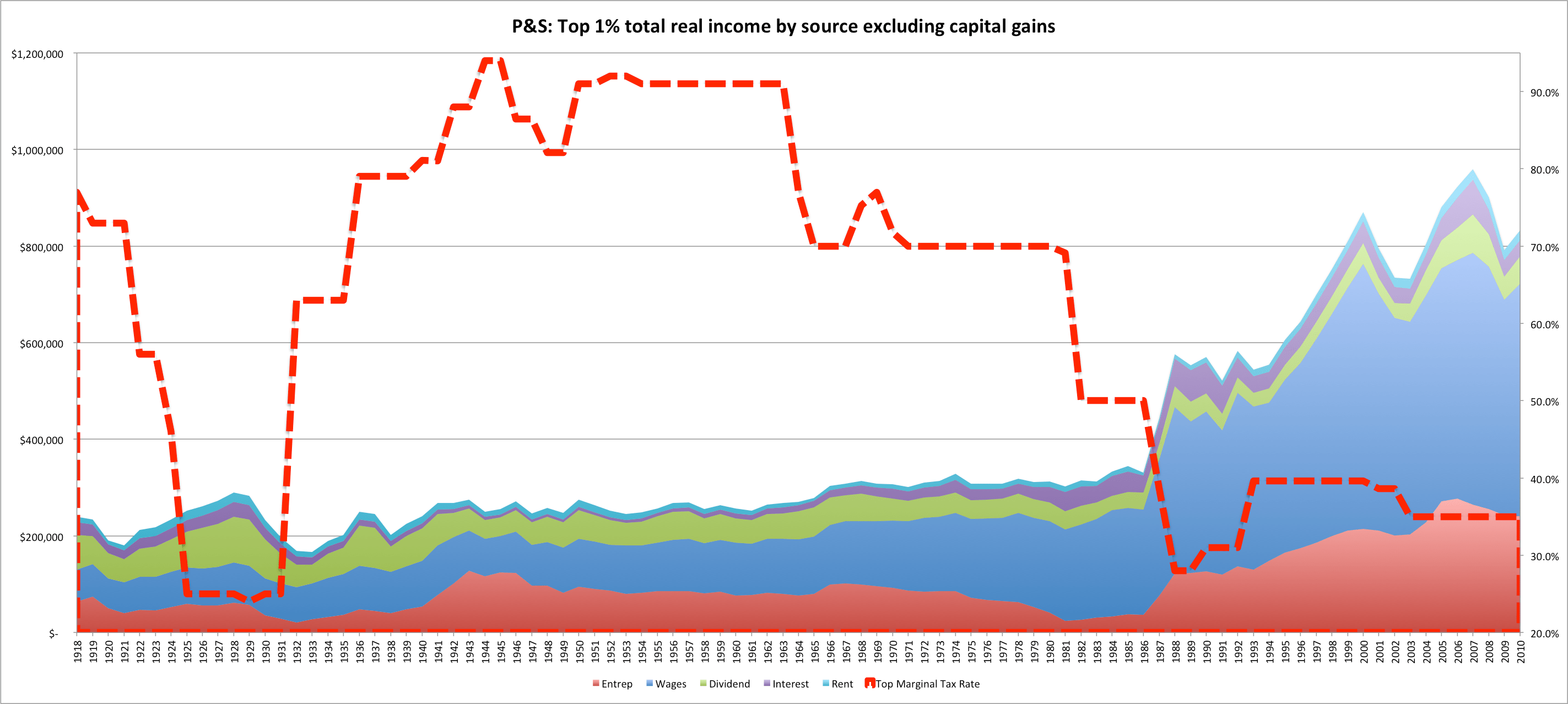
Observations: Between the late 30s and the mid-60s we see a period of rising corporate profitability and rising incomes at the more modest income levels, e.g., 90th and 95th percentile. We see essentially no rise in non-capital gain income for the very top income levels for almost 50 years!! In fact, the percentiles appear to converge during this period. The top incomes only trend significantly up and gain ground on the lesser groups when the top marginal rate is cut in the 80s and they do so implausibly rapidly — jumping almost two to three times their period levels in the space of just a few very short.
I think the reasons for this are very clear: the very highest income earners would pay a much larger share of their real incomes at the top marginal rates (if they were to actually do so at least) and they typically have more flexibility to plan when and how they report their incomes (relative to people that get most of their incomes from a regular paycheck). They can, for instance, spread their accumulated earnings out over several years or to otherwise find tax advantaged ways to minimize the impact of very high rates. In short: they demonstrate very high elasticity (at least with respect to taxable income).


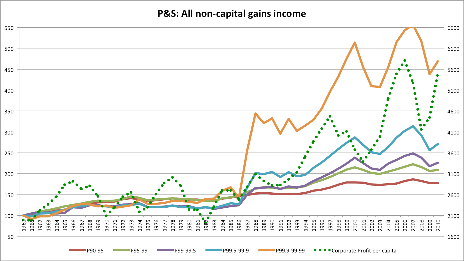
Observation: Capital gains comprise a large and volatile share of top incomes so looking at the total number or absoute share can be a misleading. The temporary spike in capital gains realizations in the mid 80s obscures the large and permanent jump in “wage” and “entrepreneurial” income that happened between 1986 and 1988. That said, dividend, rental income, and interest income — usually passive types of income, decrease in both relative and absolute terms. I rather suspect that after 1987 a growing share of entrepreneurs (especially owners of closely held businesses structured as pass-through entities) displaced the previous generation of passive “old money” types– their incomes simply got pushed into a relatively lower AGI group.
By income type
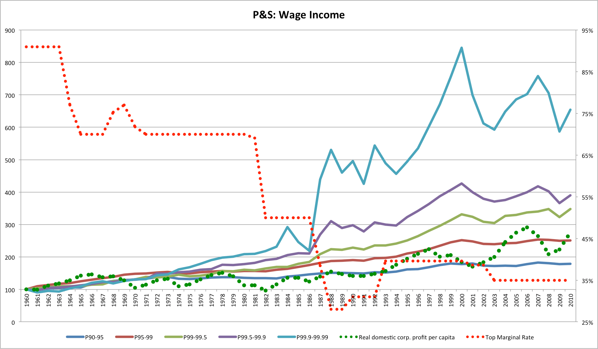
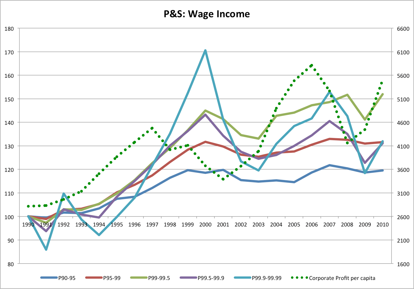
Wage Income
Note: “Wages”, in the P&S series, includes stock options and probably a significant fraction of other pass-through type income as well. To me, at least, the movement of the highest income “wages” seems to track broadly with the profitability of domestic corporate activity (especially post 1987) which suggests that it’s comprised largely of options,
Dividend Income
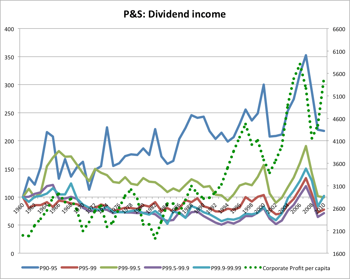
Observation: next to no dividend growth in real terms and, in fact, the highest incomes show less growth than relatively lower groups. One would think that if the highest income groups were merely getting vastly richer in real terms that they would diversify and accumulate more stock in less closely held companies…
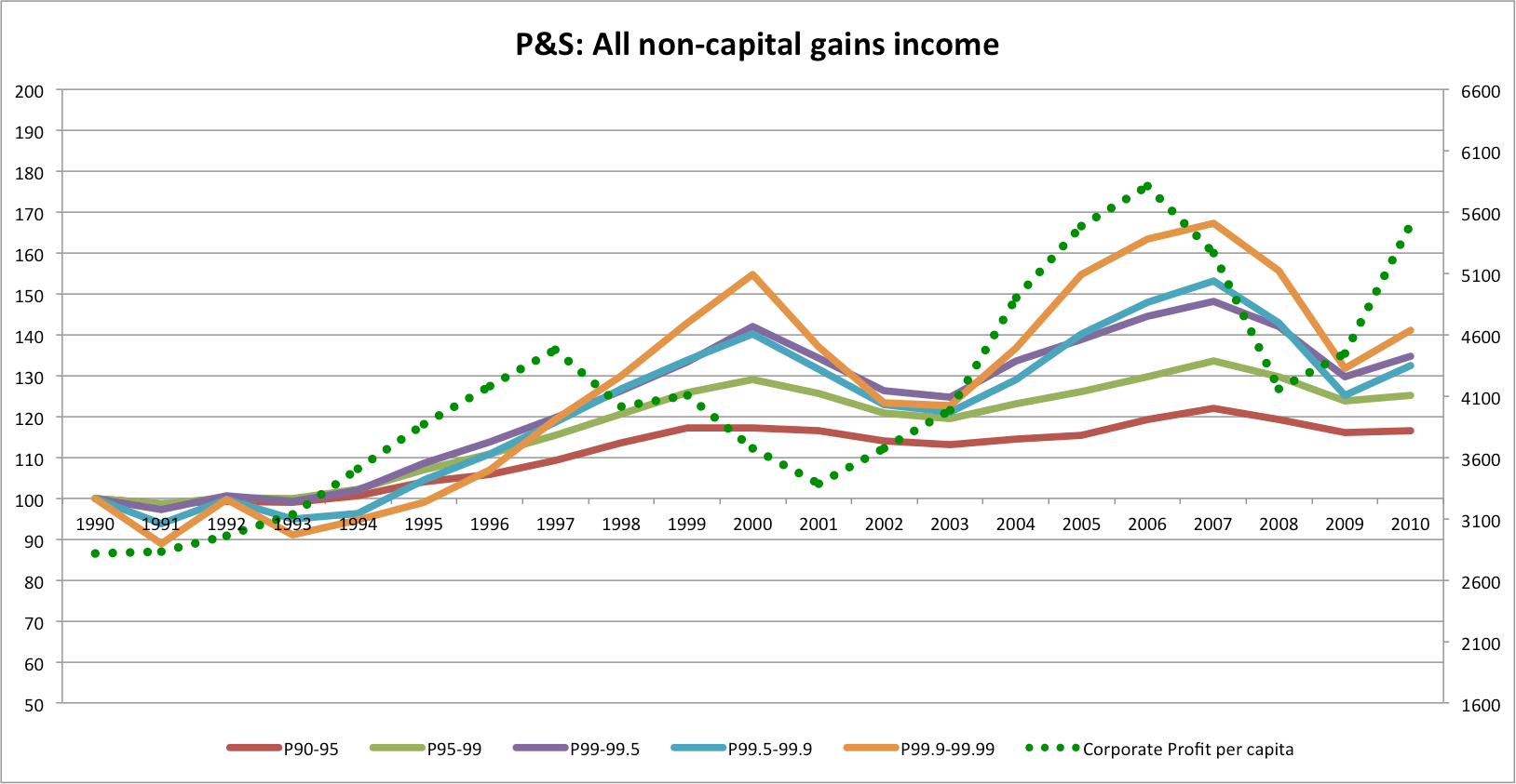
All non-capital gains income (includes entrepreneurial income as well as wage income–two very large components of income)
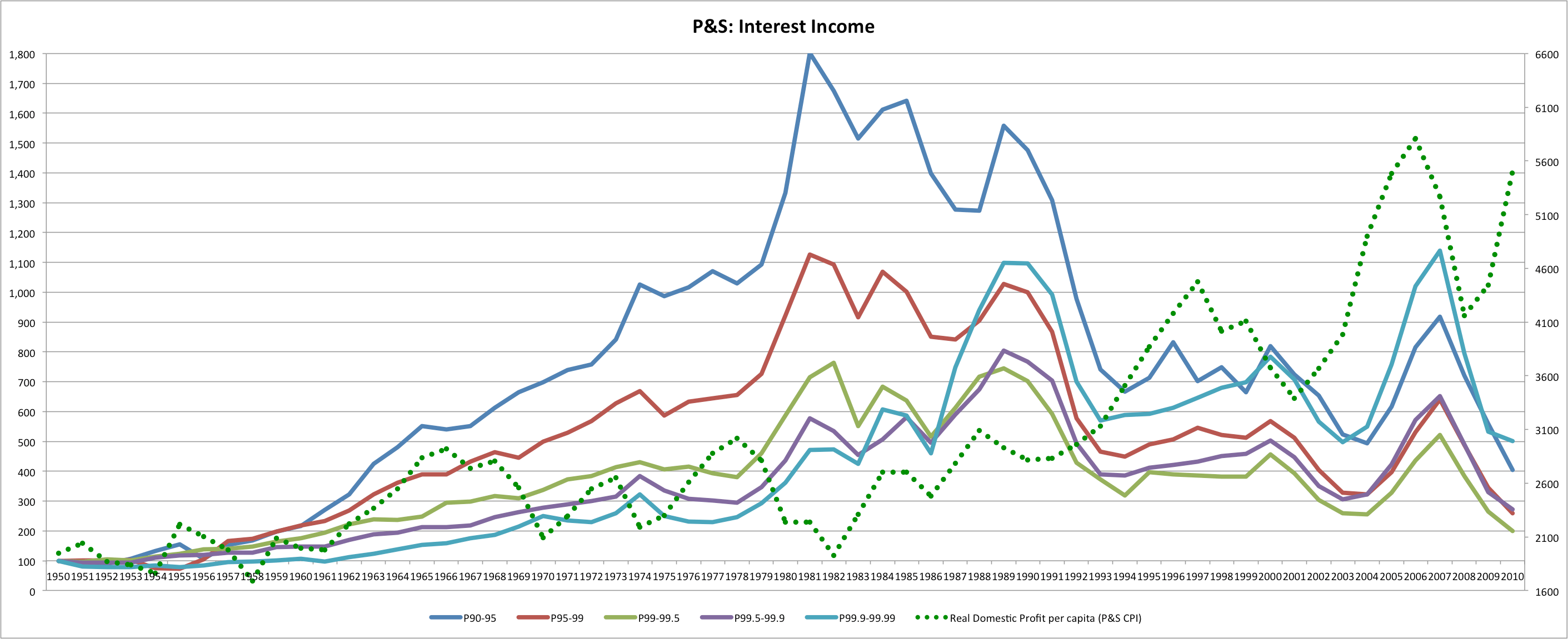
Interest Income (note: this comprises a very small fraction of total income for all groups):
Capital gains alone
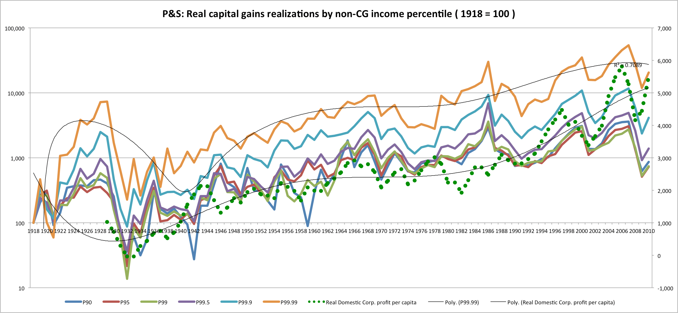
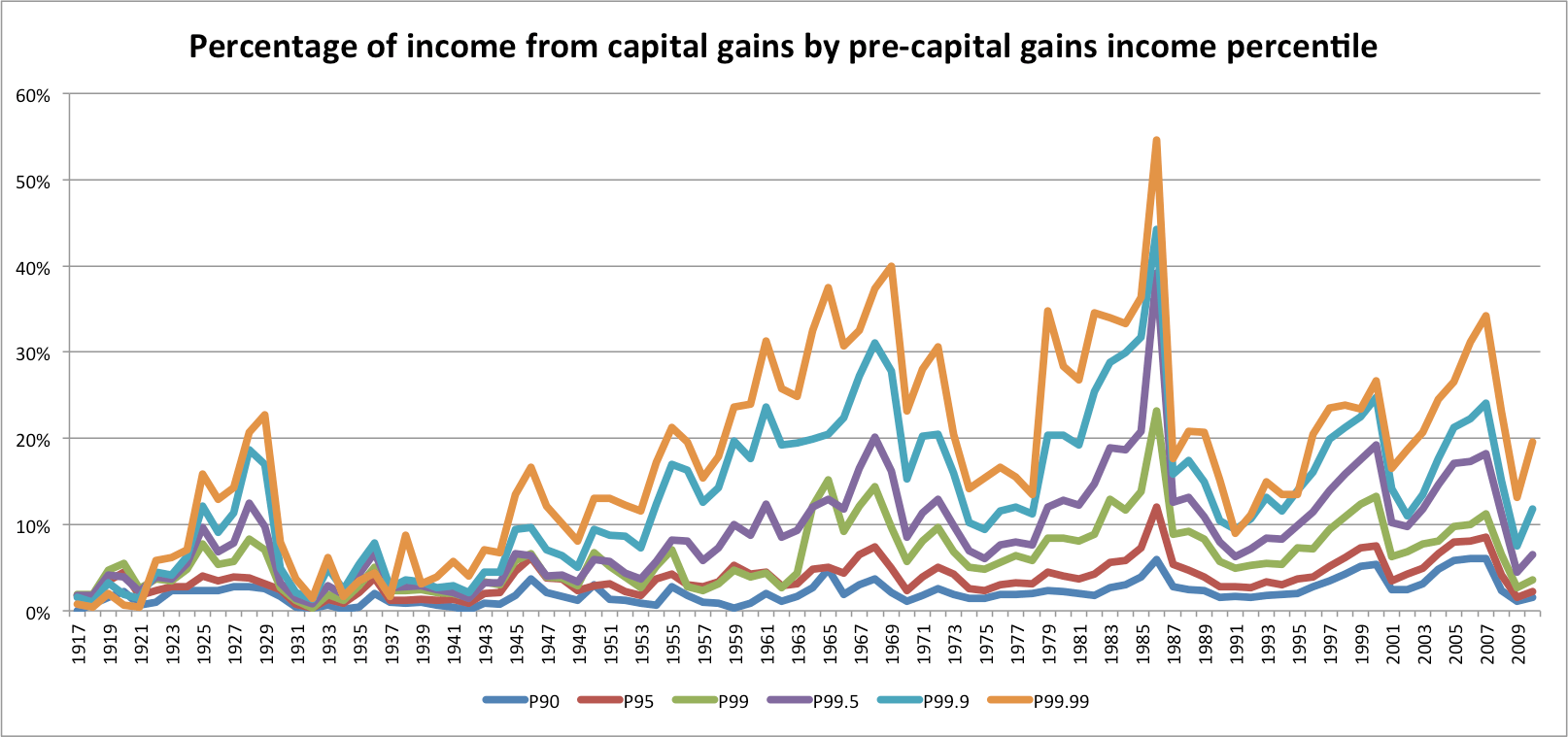
Observation: I don’t know about this data … it seems a little too neat to me. I suspect that they just allocated total capital gains realizations back to the various income groups according to their assumption (e.g., Pareto distribution or some such). That said, if it is accurate, it would indicate that capital gains realizations have not been driving inequality. [Perhaps I’ll investigate this later when I have more time]
In any event, what I find interesting is that since 1990, after the most significant reductions to the top marginal rate and the tax code was reformed, there has only been a 30-40% increase in real (CPI-adjusted) non-capital gain incomes income at the highest reaches.
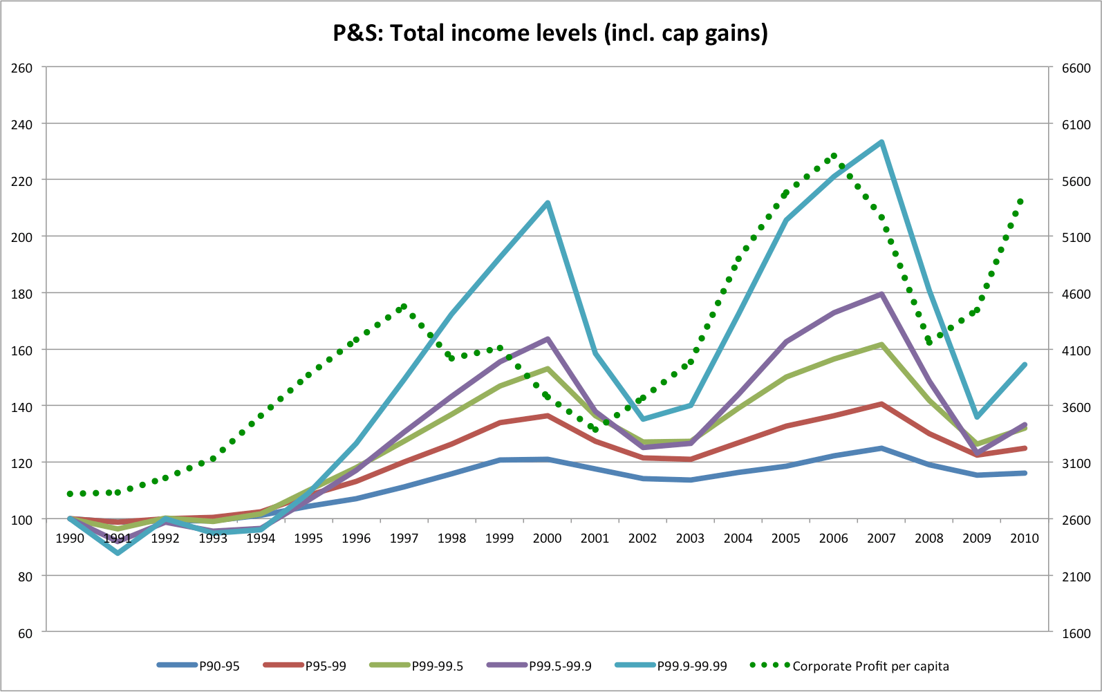
Observation: Not much more when you include the highly volatile capital gains component.
Observation: “Wages” alone are only up ~30% for the two highest groups here and these are both quite clearly linked to the market.
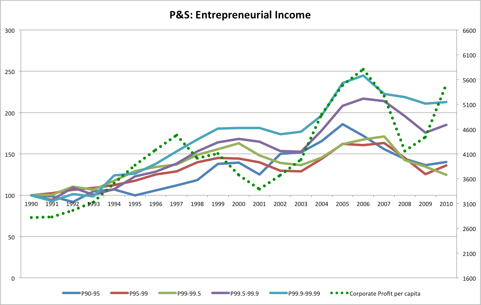
Observation: The entrepreneurial component is the only significant part that’s dramatically up (~2x) for the highest income groups and it in a relatively stable fashion.
Income composition of P99.99-P99.99
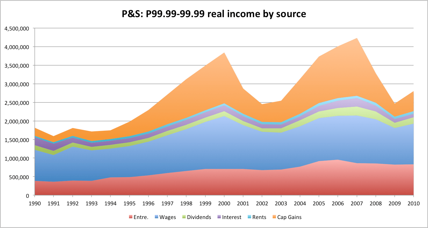
Now if we remove entrepreneurial and capital gains….

We get about a 16% “real” gain against their CPI index since 1990. I won’t claim it’s exactly this simple, since these various components are not necessarily as distinct as it might seem at the high end and some “entrepreneurial” income could be very similar to this “wage” income, but even allowing some fudge factor-it seems be roughly comparable to the comprensive income growth witnessed by most working people over a similar period of time (i.e., especially if we include healthcare and similar in-kind benefits).
Update
Please note that timing and composition of income gains amongst the top earners are very different along the grain you slice this (the top 1% itself is not nearly enough).
Observation: Even though you can see a significant response to tax rates the amongst the entire top 1% the fact the growing wages at the lower reaches obscures the extent of this…see below
Observation: The professionals, management, top sales people and the like occupying the lower reaches of the top 1% see a steady growth in their “wages” incomes throughout the entire period. The jump post-tax change there, but it’s relatively muted and the trend doesn’t seem to change terribly much afterwards either. Now compare this to the very highest (P99.99-100) group P&S offer up….
Enough said.