In my last post I briefly touched upon economic mobility vis-a-vis the link between test scores and subsequent adult incomes. Because these individuals were still pretty young, just a few years out of college (if they graduated), the earnings correlations were weaker than one might have expected. Since then I discovered an interesting continuous SES variable (F3SES) in the ELS:2002 data set that is probably a better measure of future earnings or mobility.
F3SES is the average of 3 inputs (2011 earnings from employment, the prestige score associated with the respondents current/most recent job, and educational attainment), each of which is standardized to a mean of 0 and a standard deviation of 1 prior to averaging.
Data users should note that, as of the third follow-up, socioeconomic status may be less-than fully stable for some third follow-up respondents, e.g., respondents with graduate-level education who are just beginning or have yet to begin their careers. Users should also note that F3SES does not account for the income, occupation, or education of the respondents spouse/partner, and therefore may not be fully indicative of household socioeconomic status as of the third follow-up.
NOTE: While the two versions of the BY family SES composites (BYSES1 and BYSES2) were created by differential assignment of prestige scores based on the 16-category BY occupation variables, F3SES is created by assigning prestige scores based on the 2-digit ONET code associated with the respondents current/most recent job as of the third follow-up.
While I am sure I could derive my own formula to produce a similar composite score, I’ll just use theirs for the time being.


There is no statistically significance difference between blacks and whites here.

Asian SES is higher than white SES for most of the distribution, but that’s not statistically significant either.


Plotting all males groups as one entity but coloring them differently to illustrate several points at once, (1) the trendline doesn’t change appreciably (2) it’s broadly linear throughout the entire score distribution (3) some populations are evidently over-represented on different parts of the distribution.
These cognitively loaded measures are strong predictors of population wide outcomes and there are large systematic differences between the populations. Due the shape of the each racial/ethnic groups score distributions (which can be estimated quite reliably with the mean and standard deviation) and different populations sizes, the distribution of income, educational attainment, occupational prestige is also quite predictable nationally (even though programs like affirmative action attempt to counteract the outcome disparities that follow from this situation, they’re not all that efficacious).
Below I plotted the actual test score data for racial/ethnic groups and sex by the observed scores in the sampled population, weighted by the (dept. of education) provided population weights (which should, in principle, cause these to plots to better reflect the population of sophomores nationwide as of 2002)….


You might notice that the SES distribution by race/ethnicity looks pretty similar to the score distribution data (especially math and especially given the different grouping levels here)….
Student reported SES distribution by race/ethnicity (males only)

Reading score distribution by race/ethnicity


Some people seem to have trouble translating correlation statistics into its real world practical significance, likewise for scatter plots, so here are other ways to visualize this same data.
Box plot for 2011 SES by 2002 composite test score

A brief note in interpretating boxplot, the horizontal line near the middle is the median, and the top and bottom edges of the box signify the 75th and 25th percentile respectively (meaning 50% of the values fall within it and most of them will generally be close to the median marker).
Average 2011 female SES by average 2002 test score (w/ error bars @ 95% CI)

Average 2011 male SES by average 2002 test score (w/ error bars @ 95% CI)


Some comparisons to other predictors
Male 2011 SES by parents SES

Female 2011 SES by parents SES

The parents SES includes a lot more than income, which makes it a better predictor than it would otherwise be, but it’s still pretty obvious, even from visual inspection, that test scores are better correlated with (adult) SES here. This is particularly apparent if we try to regress all groups together.

Income performs even worse. I added a bit of horizontal jitter (random variance) into the plot because this data is not continuous and it’s hard to see the density otherwise. This binning into discrete income clusters surely weakens the correlation a bit (perhaps later I’ll “reverse engineer” their (parents) SES formula to extract the continuous income signal :-), nevertheless but we can plainly see that this relationship is even weaker than the much more refined parents SES measure. In fact, moving from modest incomes to highest incomes seems to have rapidly diminishing returns, which probably contradicts most peoples intuitive expectations about the world.


Modeling the data
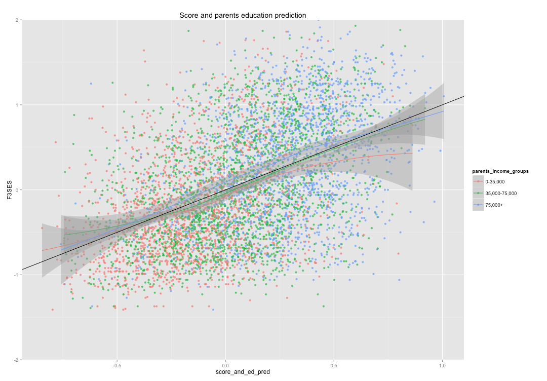
I produced two simple models. The first tries to predict 2011 male SES with 2002 test scores alone. The second uses test scores and parent SES to predict the same outcome (SES).
In the first two plots, I color parental income levels differently, but run a local polynomial regression for all groups together to indicate the overall fit.
By test scores only

By test scores and parents education levels

In the next several plots I split the predictions into several different groups by parents SES and parents income levels to assess potential bias in the predictions.
By test scores and parents SES, grouped by parents SES (2 groups)

By test scores and parents education, grouped by parents income (2 groups)

By test scores and parents education, grouped by parents income (4 groups)

By test scores and parents education, grouped by parents SES (4 groups)

In the following plots, I compare the average test score-only prediction by the average actual SES, grouped by parents income level and test score (0.5 SD chunks)

(filtering out points where n < 20 to reduce noise)

In the following plots, much like above, I compare the average test score & parent education prediction by the average actual SES, grouped by parents income level and test score (0.5 SD chunks).


The (average) fit is tight and definitely a bit tighter when we include the parents education levels (as opposed to test score only).
Below I am simply doing the same thing as above but grouping parent income levels into larger groups to increase the statistical power.
By test scores alone (grouped by 3 income levels)

By test scores and parent education levels (grouped by 3 income levels)
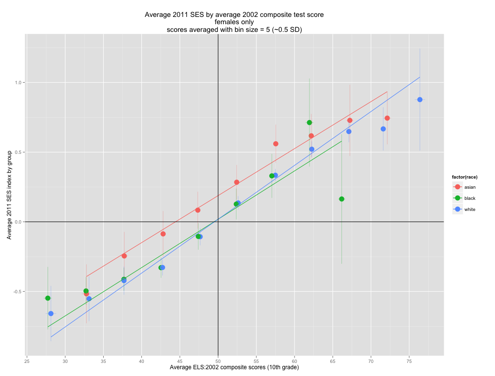
By test scores alone (grouped by race/ethnicity)

By test scores and parents education levels (grouped by race/ethnicity)


Conclusion
It is pretty clear that income or wealth per se are unlikely to explain much of the observed mobility or SES differences between groups. There is, of course, a correlation between these economic measures and outcome measures, but they are almost entirely mediated by the students 10th grade test scores and the parents education levels. Even these low-stake 10th grade test scores alone explain most of the systematic variance between groups. I suspect that adding in parents education levels, even if relatively crudely, improves the prediction accuracy because (1) even the best tests are not perfect measures of the true ability (2) these tests, in particular, were low-stakes tests (3) students in 10th grade are still maturing.
From a purely genetic point of view some of this is to be expected as 15-16 year olds have not yet reached their maximum heritability with respect to intelligence and other phenotypes.
Heritability of intelligence by age ( in rich/western countries)

Controlling directly for the parents education levels (which is, itself, far from a perfect measure) makes sense because it sort of approximates the first derivative of intelligence and other phenotypes of interest (e.g., conscientiousness, motivation, etc). Those students that score higher or lower than their true ability (especially on a low stakes tend) in ordinal terms will tend to regress somewhat towards their adult sub-group mean. That is not to say that those residuals (or even the test score differences alone) are necessarily purely genetic, but that are good theoretical reasons to expect something like this from a genetics point of view too. Regardless, we can still say that both race and income provide very little informational value once we control for test scores and parents education levels!
Updates
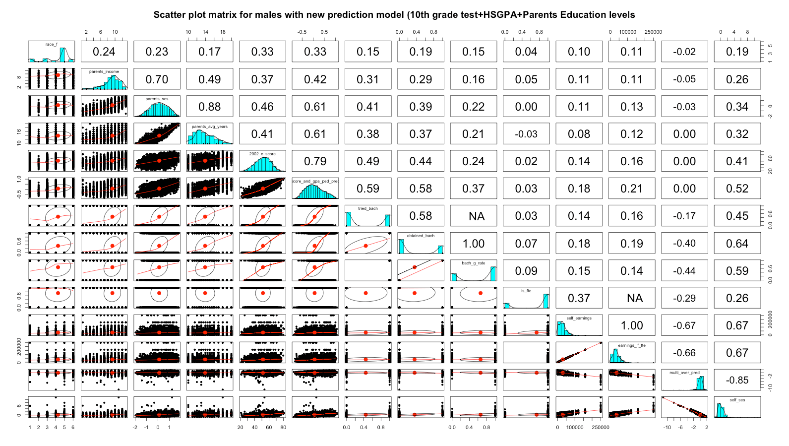
Edit (6/5/15): Since writing this post I noticed that there is, in fact, a publicly accessible HS GPA variable in the dataset that covers 9th through 12th grade! It is not continuous, but it nevertheless helps improve these predictions quite a bit. Score and HS GPA alone, for instance, basically close any apparent racial gaps (and this sort of makes sense given asian over-achievement and black under-achievement).

It improves further with the addition of parent education levels, but it’s really not necessary to close the racial gaps to trifling levels (well below statistical significance)

For comparisons I plotted income groups exactly the same over different predictors here: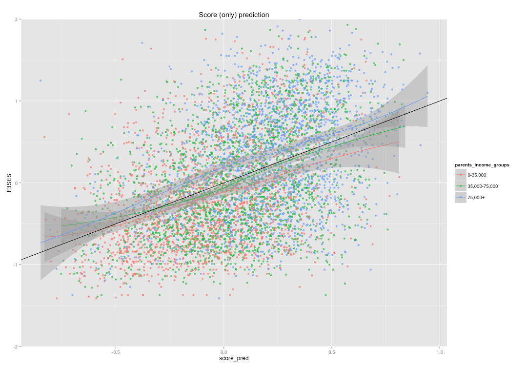

(Note: HS GPA without any adjustments is probably a bit biased against higher SES groups due to differing grading standards)

The overall SES correlation for all men with the new linear model (incorporating 2002 test scores, HS GPA, and parents education) is 0.52 versus 0.44 for the prior method (score & parents education). Likewise, it’s 0.18 with current earnings versus 0.14 with the prior method….