According to a large and growing number of progressives, the achievement gap between “minorities” (especially blacks) and whites can be traced directly to the effects of “concentrated poverty”. This implies that we cannot compare the outcomes of individual “middle class” blacks to whites of similar income because they don’t have the same amount of wealth, which would allow them to escape their poor neighbors, bad schools, or something along those lines.
Presumably the relationship between the actual neighborhood-level SES, as measured by poverty rates, income levels, education levels, etc, and academic outcomes should look something like this:
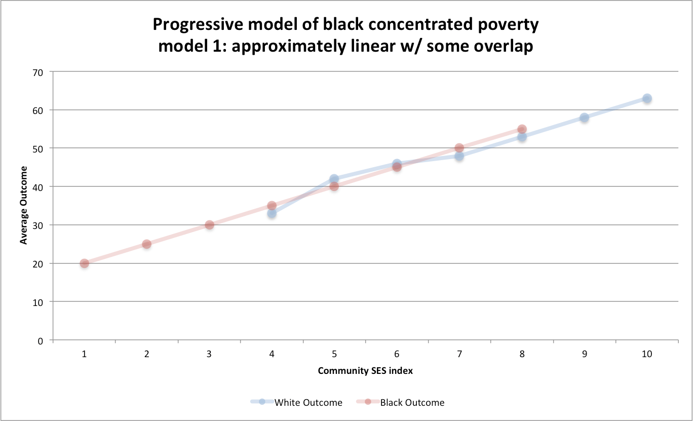
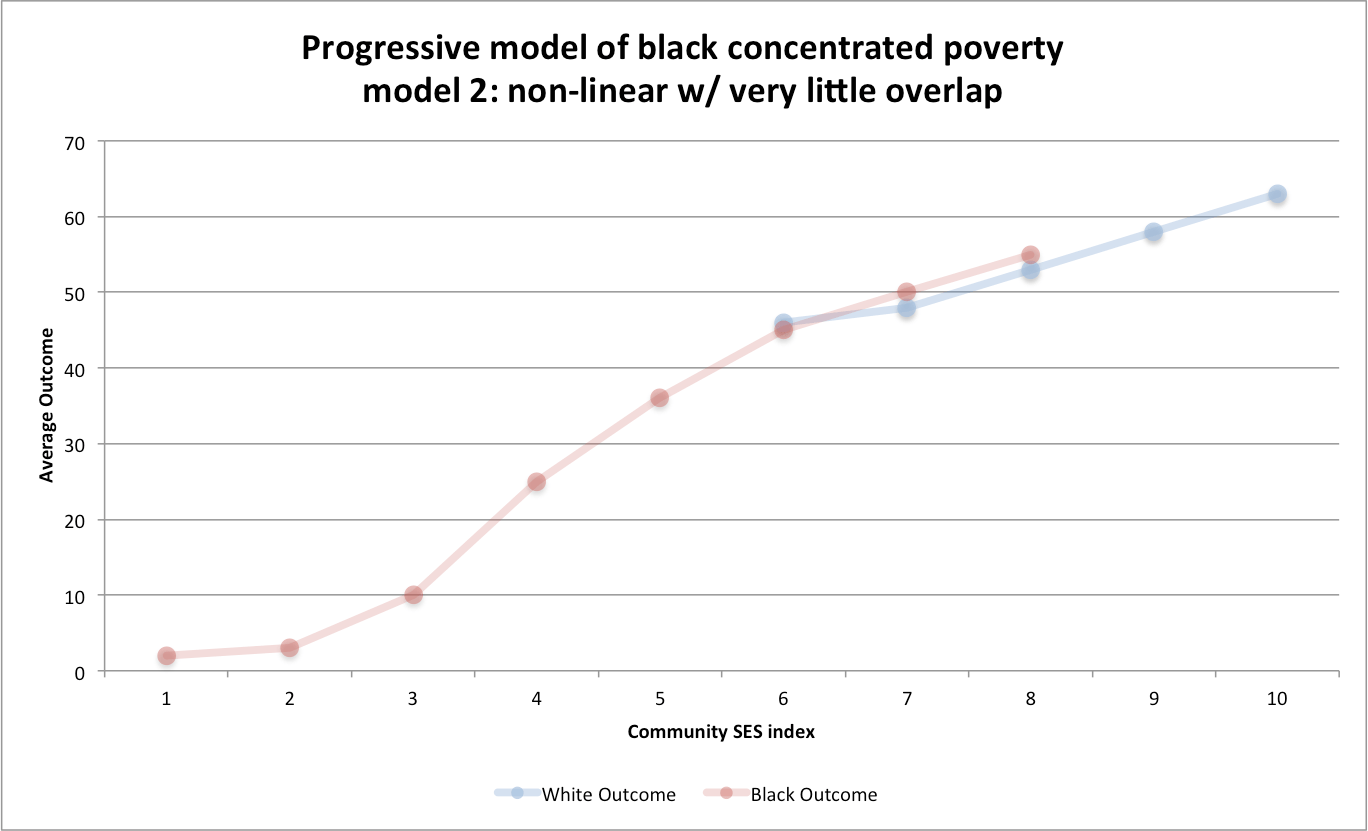
In other words, this achievement gap is presumably only found in areas of concentrated poverty, but those few families that manage to “escape” these particular bad environments converge on white outcomes or even close the gap entirely.
Having actually studied this data, I can tell you that reality looks more like this:
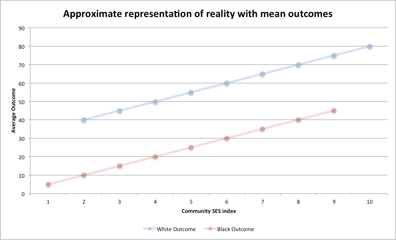
Put simply, there is no evidence to support convergence. Broader outcome measures generally show a solidly linear relationship with these measures. There is also much more overlap in material condition than the picture that most progressives present (curiously they sing a very different tune when they want to talk about these differences in other contexts). Below I will present some evidence to this effect.
****
I downloaded 4 years worth of test score data from California’s Department of Education, demographic data (ACS) for each school district, and financial and administrative information from the US department of education to do the analysis below. California is an interesting place to analyze since (1) it is a large state with lots of different school districts (2) it is fairly “diverse” (3) they provide more and better structured data than most other states. For most of the analysis below, I took a 4 year weighted average for each major subgroup (white, black, asian, and latino) by test (including breaking it out by grade where the test content is grade specific).
Regarding assertions about the presumed effect of “segregation” on this analysis, keep in mind that I am comparing each groups SES statistics within the school district, not the broader statistics for all racial/ethnic groups. If a black community as a median family income of, say, 100K/yr, we can be reasonably confident, whatever the precise spatial distribution, that they are not living in “concentrated poverty” on average [likewise if there are many college educated, low average poverty rates, etc]. If anything, this analysis will tend to overstate the neighborhood poverty rate for affluent blacks because it is presented for each community by group (i.e., as if there were perfect segregation).
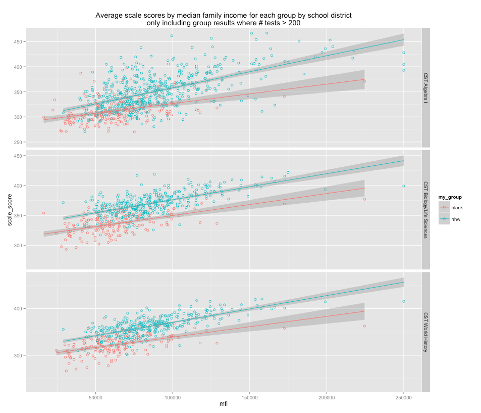
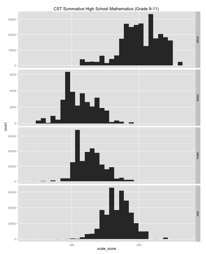
To keep things simple for now, I will start off with data for whites and blacks for 3rd grade and 11th grade English [the patterns are much the same in other tests and the relationships between other groups SES-outcomes are broadly similar at a community level too]
Scale Scores


Comparison between poverty and median family income/education
Now if we actually look at the poverty rate directly….

The poverty rate is a notably worse predictor than median family income and education levels. There is no evidence of convergence here or non-linear poverty effects in black community.
Cut scores paint an even starker difference
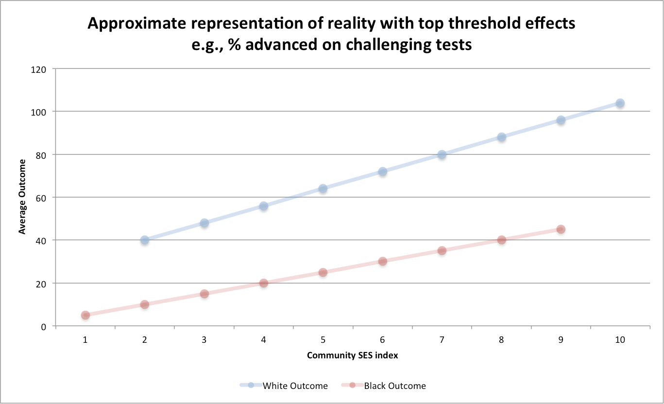
If, instead of using average scale scores, we use the percent of students in each group scoring “advanced” by these various metrics the divergence actually grows with these SES measures, i.e., the white slope is consistently appreciably steeper than the black slope.


If the problem was that a handful of black people in these more prosperous communities were dragging down the averages (as we might expect with somewhat higher poverty rates at a given level of income, education, etc), this % measure should be relatively more favorable. It clearly is not.
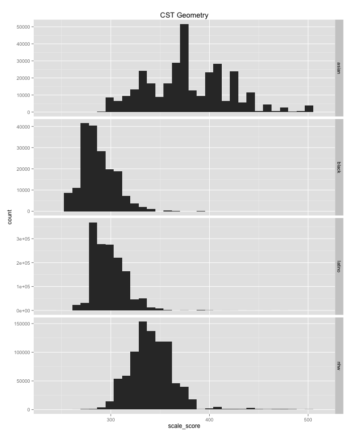
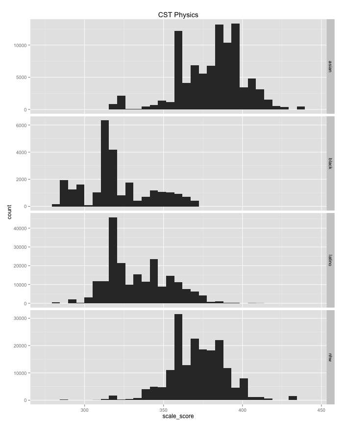
Repeat of scale scores including asians and latinos


You might notice that latinos actually have substantially lower incomes, less education, and somewhat higher poverty rates and yet they perform better in most community level comparisons. Likewise, low income or less well educated asian communities perform better (even in English!) than most other groups of similar income. It’s hard to credit explanations like selective immigration or the effects of FHA policies on wealth/mobility to explain these sorts of differences!
With cut scores again

[Note: the “asian” subgroup is more heterogeneous than others. I suspect there is something of a binomial distribution due the distribution of these groups within the “asian” category… i may investigate this later with the same data set as they do provide some breakout detail by ethnic group]


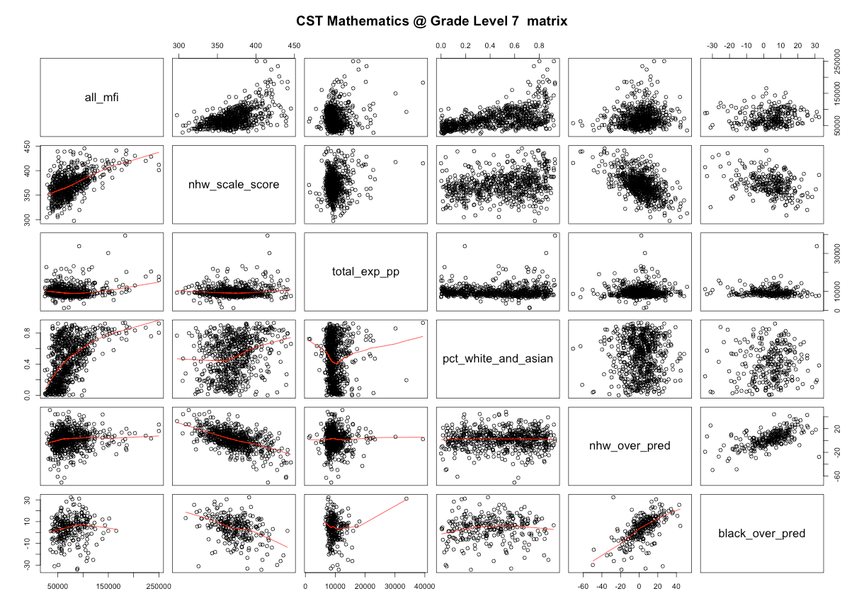
Math and science scores by median family income
These differences are by no means limited to english or related subjects. We find similar patterns in math and science classes (and they generally correspond to what we see on standardized testing nationally at an individual level).


Scale scores by education levels


Some subjects are appreciably more amenable to study, some are more intellectually taxing, and some HS-level courses have different take rates, so these patterns are sometimes a bit different, but nevertheless the ordinal patterns are broadly the same across all of these subjects and there is little evidence of gap closing here between blacks and whites (quite the contrary actually)
To save time and space, I graphed all of the CST tests (including some of the silly ones w/ insufficient) by median family income, poverty rates, and percent college education in *big* PDF documents (~90 “inches” tall). It’s not pretty, but you can see that I’m not just cherry picking.
You can download them here:
All tests: Scale scores by percent not in poverty
All Tests: Percent scoring “advanced” by percent not in poverty
All tests: Percent scoring “advanced” by median family income
All tests: Scale scores by median family income
All tests: Percent scoring “advanced” by percent of families with bachelor’s degrees or higher
All tests: Scale scores by percent of families with bachelor’s degrees or higher
Simple linear model comparison
If we try to predict each groups scores by school district based on race/ethnicity and SES indicators with a simple linear model we can roughly approximate the patterns we find. However, if you look at each group separately you’ll notice that groups that perform better overall tend to be out perform as they move towards to the right.


The reason is that these models are applying fixed effects for race/ethnicity and adjusting all groups the same for each increment in SES (education, median family income, etc). If the concentrated poverty thesis were true, we’d expect to find the opposite, as in, the black slope ought to be greater than the white slope.

The linear model here attached excess importance to race/ethnicity because the poverty differences just can’t explain nearly enough of the variance.

Even if we regress test scores using parental education levels, poverty rates, and median family income for each group in the school district without taking race itself into consideration, the gaps don’t disappear and the fit is still quite weak.

Only if we add race/ethnicity in do we get something more sensible out of this.

Although that you’d be hard pressed to tell it apart from the simpler race/ethnicity + education only model I showed earlier:
Analysis by California’s Department of Education
California’s Department of Education analysis of similar data is generally consistent with my views here:

Observe:
- Average parent education level is an appreciably stronger predictor than economic measures like “free lunch” (which correlates well with poverty rates)
- Average parent education levels are well correlated with these economic measures and race/ethnicity
- % Black is better correlated with API (test scores) than school poverty rates.
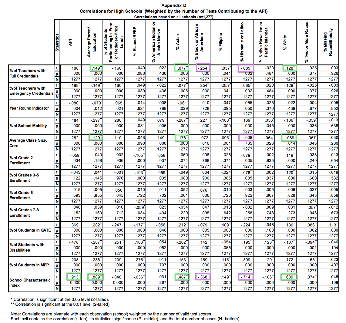
Observe:
- API and School characteristics are well correlated (r=.913)
- Parent education levels and school characteristics are also well correlated (.889)
- Teacher credentials are weakly correlated with % black and teacher credentials are weakly correlated with API (together this implies a very modest effect, at best)
- % black is negatively correlated with class size
(and so on)
Some more scatter plots of presumably important variables without controls


Some of these appear to be somewhat correlated with outcomes, but there is obviously great deal of overlap between ethnic groups and this is apt to be confounded by student/family demographics.
Predicting outcomes with a random mixed effects model
I used lme4, a popular R library, to produce a model to predict all average test scores in all subjects for each group using a simple random effects model, whereby the intercepts are defined racial/ethnic group (the fixed effects) and slopes defined by test and median family income (the random effects), the generalized model predicts outcomes quite well across the great majority subjects (especially those that are mandatory or have high participation rates). The tests need a combination of fixed effects and random effects because some tests have lower average scale scores than others and some are harder than others. Although I could produce a better fit with interaction effects for race/ethnicity and (test | median family income | etc ) or uptake rates, I am not doing so here because I want to a simpler model (easier to understand) and because I want to specifically use this model to address claims made about concentrated poverty and other presumably important influences.
Here are just a few plots to compare actual vs predicted:


PDF: Actual vs Prediction for all tests with mixed effects model
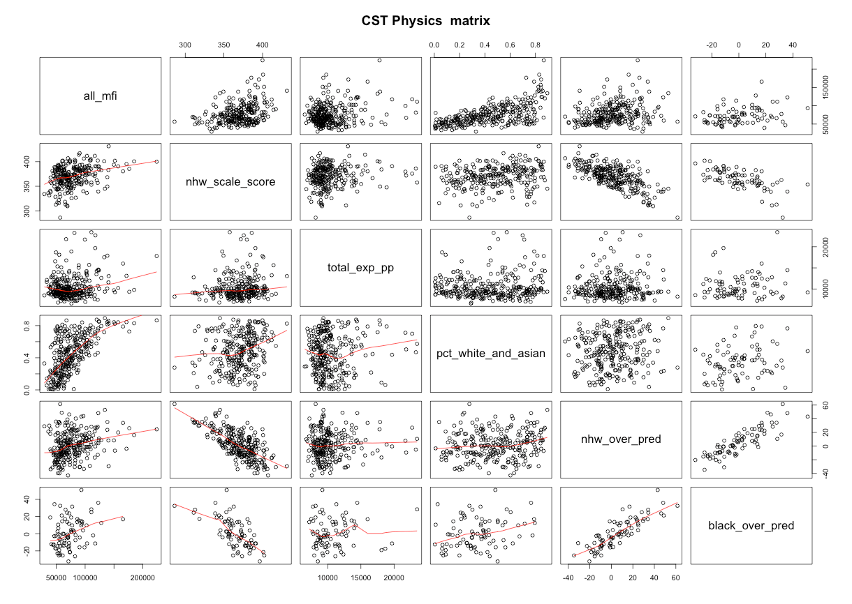
Since this is a generalized model it’s sometimes systematically off to some degree in the slope or the intercept for different groups on different tests (e.g., asians outperforming in math, whites outperforming in ELA), not to mention issues with subjects with low up take rates (e.g., physics). Nevertheless, it’s good enough that we can plainly see that this linear model generally approximates reality quite well and that these patterns are generally consistent across multiple tests at different age levels.
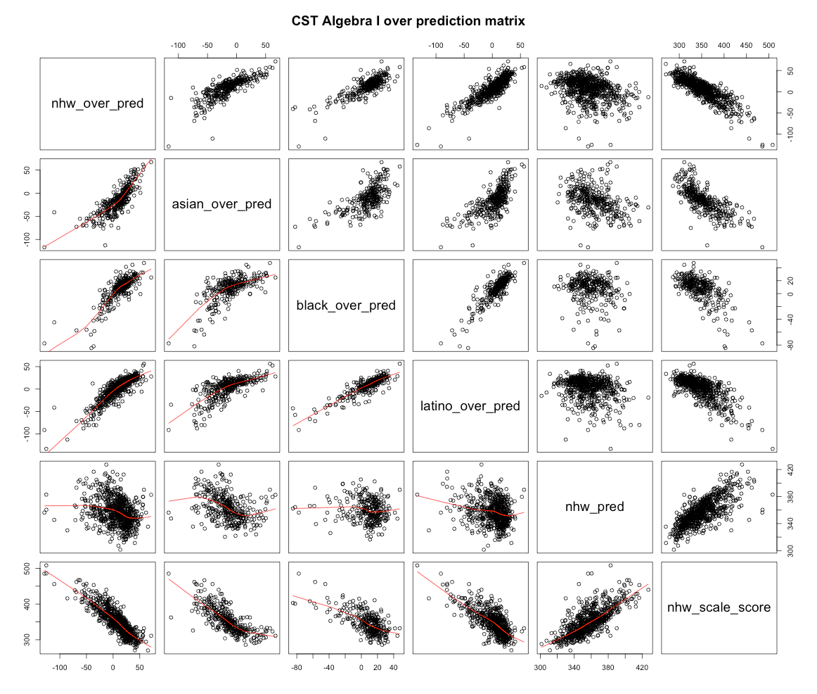
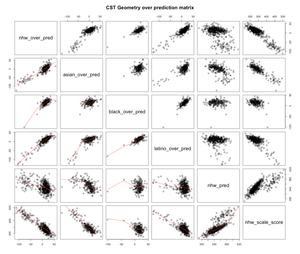
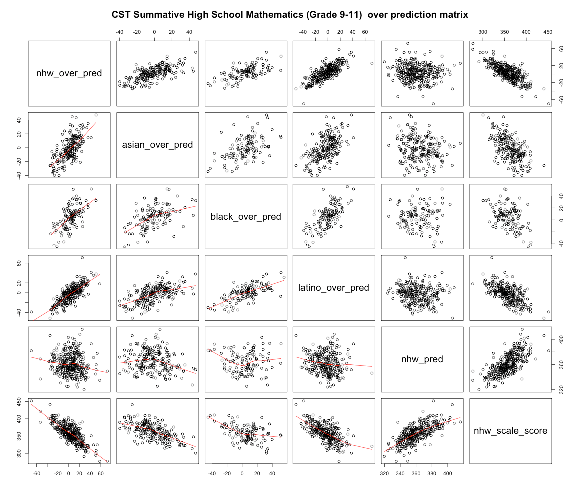
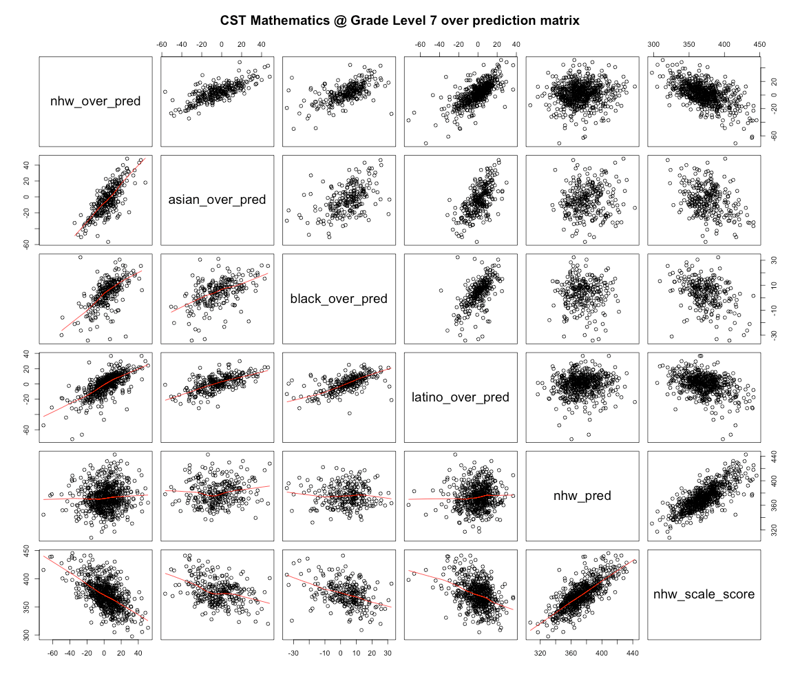
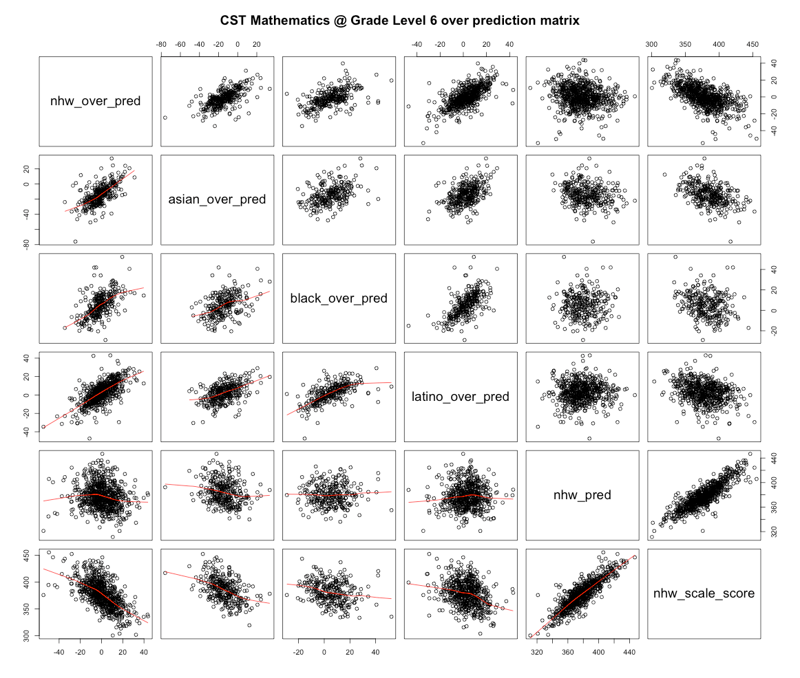
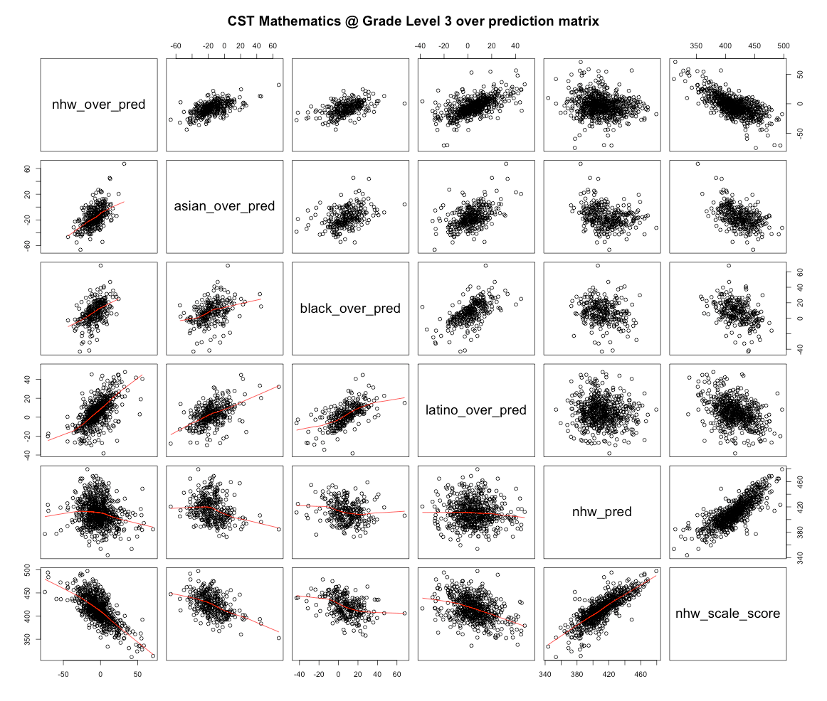
Below I will take these same predictions and calculate the over/under prediction for each district, group, and test relative to other predictors.
[Note: positive y-values = over-prediction; negative values = under-prediction]By percent of families with bachelors degree or higher

By poverty rate

[Note: The slopes with respect to poverty are nearly flat and there is no sign of poverty having particularly significant effects for blacks in particular, i.e., over and above that of our linear median family income prediction]
By median family income
By percent of school district white

[Note: Blacks, like most groups, do not perform better than expected in whiter school districts. If the concentrated poverty hypothesis were true we should probably expect to see some evidence of this here]
By percent of school district black
[Blacks, if anything, seem to do slightly better than expected in districts with larger black proportions]
By percent of teachers have masters degrees

[Teacher credentials don’t seem to correlate with marginal gains/losses]
By percent of teachers in probationary status

[Districts with larger shares of probationary teachers seem to outperform–slightly]
By percent of teachers substitute status

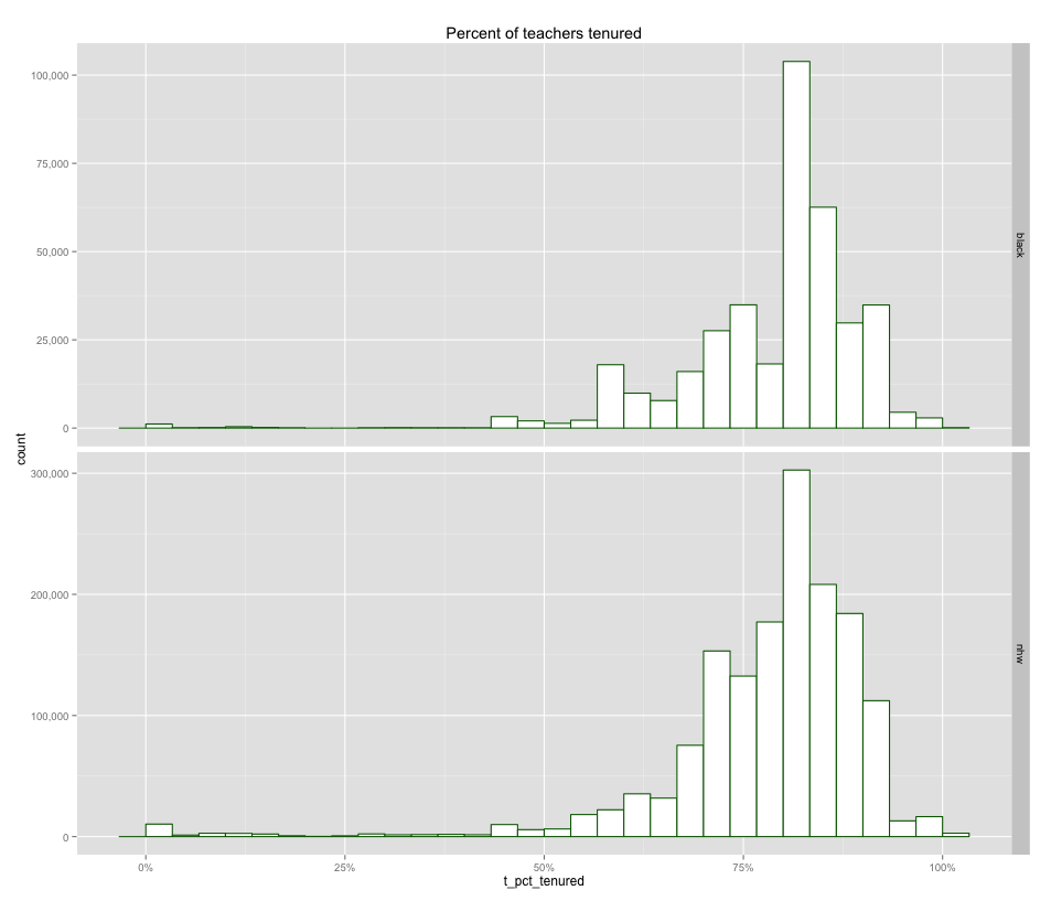
By percent of teachers tenured

[Districts with proportionally more tenured teachers teaching don’t seem to outperform]
By percent of teachers latino

By percent of teachers black

[Districts with more black and latino teachers seem to do somewhat better than expected]
By percent of teachers white
By average years teaching experience
 [Districts with more experienced teachers don’t perform better than expected. If high teacher turnover were driving bad results and blacks got stuck with the worse schools, we should probably expect to see evidence of it here for blacks at least]
By average years teaching within district

[Likewise for district-level turnover]
By pupil ratio

[Districts with larger average class sizes seem to do somewhat better than expected.]
By total number of students in district (log scale)

[Larger school district seem to perform better than expected in early grades and not appreciably worse beyond that]
By total number of black or latino students in district
[Districts with large URM populations seem to perform somewhat better than expected in early education, which is probably a function of heavy spending, but there’s not much evidence (yet) for durable impacts in later years]
By total expenditures per pupil
[Expenditures seem to have little independent effect, especially in high school and/or outside of math]
By percent of district funded with local tax dollars
[Districts funded with local tax dollars do somewhat better than expected in high school but worse in elementary school, which is about what we’d expect given that these districts are wealthier and given that this model is applying constant effects….]
By total non local revenue per pupil

[Non-local funding is associated with better than expected test scores, but there is no evidence for gains in high school]
By local revenue per pupil
Instructional expenditures per pupil
Some of these correlations hint at some possibly minor effects, but many of them run contrary to popular understanding (e.g., class size, teacher credentials, etc) and there is no sign that any of these could possibly explain the achievement gap given the actual relationships observed in the data.
Communities in the same school districts tend to be be pretty well correlated with respect to socio-economic status (see the predictions table below, which is driven by median family income).

Thus their scores tend to be pretty well correlated too:

They are not, however, significantly correlated with group poverty rates, racial demographics, per pupil expenditures, or the broader community median family income after controlling for group median family income (note the black_over_pred) column.


Again, since this model is generalized for all tests and all groups some predictions are consistently skewed under- or over- to some degree. More specifically, there is systematic error in the model with respect to race & SES with some particular tests due to the exclusion of interaction effects, varying test taking rates, etc. This error is generally inversely related to how well correlated the test is in the model (see table the median family income column in the table below). In other words, it is appreciably off in both the group intercept and slope with some particular tests. You might notice, for instance, that higher median income is correlated with over-prediction in physics for both whites and blacks.
Correlations table for several different models
| Test Name | Percent of parents with bachelor degrees or higher | Percent of parents education levels (4 in total) | Poverty Rate | Median Family Income | Median Family Income and All Education Levels |
| CST English-Language Arts @ Grade Level 10 | 0.9310 | 0.9544 | 0.9038 | 0.9545 | 0.9589 |
| CST English-Language Arts @ Grade Level 9 | 0.9334 | 0.9549 | 0.9017 | 0.9542 | 0.9589 |
| CST English-Language Arts @ Grade Level 8 | 0.9182 | 0.9513 | 0.8778 | 0.9481 | 0.9535 |
| CST English-Language Arts @ Grade Level 7 | 0.9127 | 0.9480 | 0.8763 | 0.9457 | 0.9506 |
| CST English-Language Arts @ Grade Level 5 | 0.9067 | 0.9484 | 0.8702 | 0.9465 | 0.9505 |
| CST English-Language Arts @ Grade Level 6 | 0.9117 | 0.9464 | 0.8765 | 0.9467 | 0.9504 |
| CST English-Language Arts @ Grade Level 4 | 0.9078 | 0.9472 | 0.8632 | 0.9460 | 0.9497 |
| CST English-Language Arts @ Grade Level 11 | 0.9197 | 0.9477 | 0.8952 | 0.9467 | 0.9495 |
| CST Science – Grade 5, Grade 8, and Grade 10 Life Science @ Grade Level 10 | 0.9212 | 0.9436 | 0.8912 | 0.9424 | 0.9464 |
| CST Mathematics @ Grade Level 6 | 0.9170 | 0.9392 | 0.8817 | 0.9389 | 0.9412 |
| CST World History | 0.9070 | 0.9353 | 0.8834 | 0.9351 | 0.9392 |
| CST English-Language Arts @ Grade Level 3 | 0.8933 | 0.9324 | 0.8600 | 0.9342 | 0.9377 |
| CST Science – Grade 5, Grade 8, and Grade 10 Life Science @ Grade Level 8 | 0.8989 | 0.9336 | 0.8700 | 0.9308 | 0.9352 |
| CST History – Social Science Grade 8 Cumulative | 0.9010 | 0.9343 | 0.8647 | 0.9285 | 0.9345 |
| CST Science – Grade 5, Grade 8, and Grade 10 Life Science @ Grade Level 5 | 0.8929 | 0.9323 | 0.8487 | 0.9297 | 0.9335 |
| CST Mathematics @ Grade Level 3 | 0.8963 | 0.9270 | 0.8721 | 0.9279 | 0.9312 |
| CST Biology/Life Sciences | 0.9030 | 0.9251 | 0.8781 | 0.9256 | 0.9302 |
| CST U.S. History | 0.8971 | 0.9251 | 0.8722 | 0.9215 | 0.9264 |
| CST Mathematics @ Grade Level 4 | 0.8922 | 0.9243 | 0.8631 | 0.9226 | 0.9261 |
| CST English-Language Arts @ Grade Level 2 | 0.8836 | 0.9172 | 0.8524 | 0.9220 | 0.9260 |
| CST Mathematics @ Grade Level 5 | 0.8895 | 0.9204 | 0.8543 | 0.9177 | 0.9216 |
| CST Mathematics @ Grade Level 2 | 0.8790 | 0.9063 | 0.8486 | 0.9109 | 0.9140 |
| CST Mathematics @ Grade Level 7 | 0.8599 | 0.8868 | 0.8307 | 0.8854 | 0.8895 |
| CST Chemistry | 0.8446 | 0.8578 | 0.8127 | 0.8563 | 0.8595 |
| CST Summative High School Mathematics (Grade 9-11) | 0.8360 | 0.8513 | 0.8139 | 0.8495 | 0.8513 |
| CST Algebra II | 0.8297 | 0.8456 | 0.7925 | 0.8445 | 0.8471 |
| CST Geometry | 0.8168 | 0.8351 | 0.7616 | 0.8337 | 0.8359 |
| CST Algebra I | 0.7819 | 0.8106 | 0.7264 | 0.8133 | 0.8158 |
| CST Physics | 0.7284 | 0.7462 | 0.7216 | 0.7454 | 0.7462 |
| CST Earth Science | 0.6939 | 0.7194 | 0.6957 | 0.7167 | 0.7228 |
| CST Integrated/Coordinated Science 4 | 0.5065 | 0.6642 | 0.7098 | 0.6651 | 0.6641 |
| CST Integrated/Coordinated Science 1 | 0.6325 | 0.6459 | 0.6192 | 0.6494 | 0.6468 |
| CST Integrated/Coordinated Science 2 | 0.6451 | 0.6436 | 0.6255 | 0.6409 | 0.6441 |
| CST General Mathematics (Grades 6 & 7 Standards) | 0.6185 | 0.6369 | 0.5762 | 0.6335 | 0.6372 |
| CST Integrated Math 2 | 0.4861 | 0.4876 | 0.4814 | 0.4815 | 0.4875 |
| CST Integrated Math 1 | 0.3974 | 0.4078 | 0.3965 | 0.4066 | 0.4075 |
| CST Integrated/Coordinated Science 3 | 0.3899 | 0.3759 | 0.4068 | 0.3663 | 0.3750 |
| CST Integrated Math 3 | 0.2867 | 0.2954 | 0.2771 | 0.2758 | 0.2966 |
[Note: All of these correlations factor in each groups SES indicators separately and apply a constant fixed effect for race/ethnicity across all tests. Different tests have different have fixed effects (to account for the baseline score) and random effects (slope/to adjust for test difficulty/sensitivity to the predictor). Some of these tests are optional, remedial, or have uptake rate for other reasons, so the weak SES correlations with the bottom few aren’t surprising]
That being said, it is interesting to note that the over-predictions between groups are often pretty well correlated. In fact, the white over-prediction is better correlated with other groups’ over-predictions than the white median family income (see the nhw_pred) and the white average scale score. [The same holds for other groups as the baseline as well, but since the media and progressives often use whites as the sole baseline I’ll stop there for brevity’s sake]


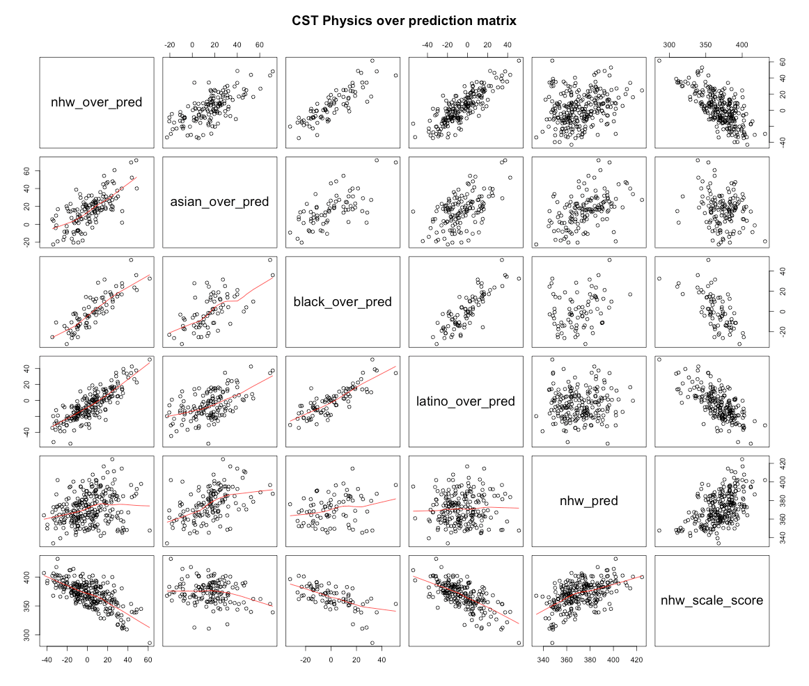

Some of this is likely to a consequence of the above mentioned modeling issues. It may also be that some of this is driven by observable or unobservable family characteristics since the prediction for each test is determined entirely by the median family income of each group (I’m not controlling for parent education levels, regional/suburban/urban setting, etc here). However, even if there actually are some important systematic differences in school “quality” or the broader school environments (including peer effects) behind this data, we can say with some confidence that they are generally weakly correlated with the affluence of the community. Put differently, (white) students in predominantly high income school districts largely succeed because they are high income (see: genetics, family environment, etc), not because the school systems they tend to be found in actually are actually are systematically better (at least not with respect to the ability to help instill substantially more competence than predicted in these sorts of subjects). Likewise, other groups perform better on average in these more affluent districts because they tend to be higher SES themselves.
This suggests that school “reformers” should focus on performance relative to the racial/ethnic and SES baseline, not absolute differences. They should not simply assume that copying the attributes of schools in predominantly white (or asian) high income suburbs will lead to superior outcomes. Moreover, given the magnitude of the influence of race and SES, they should not assume that schools with high average scores are better as a result of school inputs or, at least, not without attempting to somehow control for the characteristics of the students.
Distribution data by school district
[Note: These histograms are weighted by the reported number of students in each ethnic group within the school districts]


[Note: Latinos suffer a poverty rate every bit as large and there are many more of them in California]


The poverty rate as a function of income is higher in the black community. This is apt to be a result of there being proportionally more single parent households and less employment success generally speaking. Nevertheless, I think we can say that (1) median family income is still a pretty good predictor of poverty rates (2) most of the W-B difference in poverty rates can be predicted with median family income (3) there clearly is enough overlap in both of these dimensions to allow for sensible comparison.
Moreover, given the facts that (1) the black poverty rate is consistently higher at any given level of income or education (2) black median family incomes are generally lower at given levels of nominal educational credentials and (3) that these patterns are clearly spatially distributed, we ought to be able to safely conclude that this problem has little to do with “concentrated poverty” as formulated by progressives today, i.e., it’s clearly not just found in the “ghetto” or similar environments. Observed poverty is apt to be largely a function of educational outcomes, ability, lifestyle choices, and more and the differences between groups has little to do with neighborhood location.


Poverty rates are a symptom of other issues and not (substantially) the cause.
On neighborhood poverty reporting
Some of the supposedly scholarly analysis of this data, which has been broadly reported, overstates the scope of the differences.

“Disadvantage” includes a whole lot more than just economic poverty (e.g., unemployment, welfare, single-mother, “segregation”, etc) and many of these are notably higher in the black community (even controlling for poverty, income, etc).
Even their straight poverty figures are a bit weird:
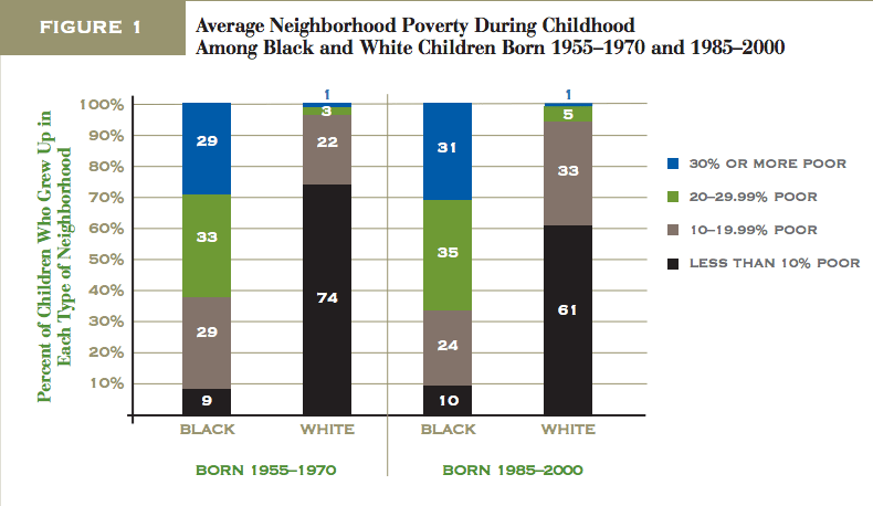
Compare this to the data for California by school district:

Or for income:

Despite the fact that the report made some sweeping claims about the effects of concentrated poverty, the actual observed mobility differences are modest and not even statistically significant. Their binning method by income quintile and neighborhood poverty decile(ish) is also likely to overstate these differences and this potentially observed difference cannot even be reasonably argued to be an “effect” because they made no attempt to control for background characteristics.
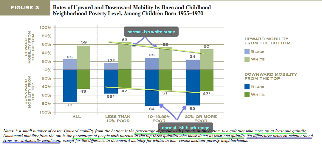
The results in Figure 3 look at only three levels of neighborhood poverty, and because those three neighborhood types are examined separately (and separately by race), it is difficult to draw reliable conclusions about how mobility is affected by neighborhood poverty. Figure 4 shows results from multivariate models that attempt to overcome the imprecision in Figure 3 by looking at all neighborhoods and all people together.
Unsatisfied with modest and statistically insignificant “effects” in their first analysis, they then decide to clump everyone together to find the presumed “effects” of concentrated poverty, presumably because they didn’t have enough statistical power to resolve differences at these ends. Unfortunately, this approach is sure to produce larger “effects”, but those so-called “effects” are likely to be spurious, i.e., they are apt to be a consequence of the significantly different poverty rates between whites and blacks and (uncontrolled) racial interaction effects within their controls (e.g., income, education levels, etc). If they cannot find the presumed effect within racial groups, they really ought to re-consider their hypothesis.
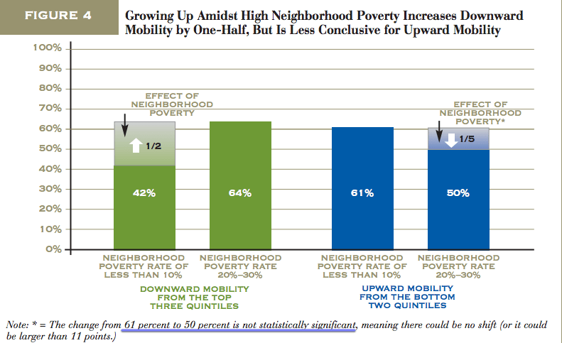
Figure 4 illustrates how the risk of downward mobility from the top and the chance of upward mobility from the bottom are affected by neighborhood poverty. In neighborhoods where the poverty rate was under 10 percent, 42 percent of children (regardless of race) in the top three quintiles were downwardly mobile. Had the neighborhood poverty rate been 20 to 30 percent instead, 64 percent would have fallen down a quintile or more. In other words, an increase in neighborhood poverty from under 10 percent to 20 to 30 percent increases the likelihood of downward mobility by 52 percent. Turning to upward mobility, in neighborhoods where less than 10 percent of the population was poor, the typical child who started in the bottom two income quintiles had a 61 percent chance of moving up one quintile in adulthood. If those children had grown up in a neighborhood with a poverty rate of 20 to 30 percent instead, only 50 percent would have been upwardly mobile. However, once again, the effect is not estimated precisely enough to be confident that it is greater than zero.
It is quite likely that the block level data with respect to poverty rates looks something like what I find in this much larger district level data set in California.


Given that the majority of low poverty communities are white (or asian) and the majority of high poverty communities are black (or latino), a fixed effects model is likely to overestimate the actual effects of community poverty rates if racial groups are lumped together (especially if they model this in linear terms). Controlling for variables like income and education will not eliminate this problem because we know that different groups achieve at very different rates academically with respect to both of these variables and that there is good reason to think that academic outcomes data are good predictors of economic mobility (especially when aggregated).
Some analysis of mobility differences from better designed studies
Pew: Upward Intergenerational Mobility in the United States
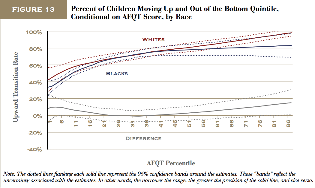
Individuals with higher test scores in adolescence are more likely to move out of the bottom quintile, and test scores can explain virtually the entire black-white mobility gap. Figure 13 plots the transition rates against percentiles of the AFQT test score distribution. The upward-sloping lines indicate that, as might be expected, individuals with higher test scores are much more likely to leave the bottom income quintile. For example, for whites, moving from the first percentile of the AFQT distribution to the median roughly doubles the likelihood from 42 percent to 81 percent. The comparable increase for blacks is even more dramatic, rising from 33 percent to 78 percent. Perhaps the most stunning finding is that once one accounts for the AFQT score, the entire racial gap in mobility is eliminated for a broad portion of the distribution. At the very bottom and in the top half of the distribution a small gap remains, but it is not statistically significant.
The differences in the top half of the AFQT distribution are particularly misleading because there are very few blacks in the NLSY with AFQT scores this high.
Even controlling for nominal educational attainment levels does much to minimize the gap:
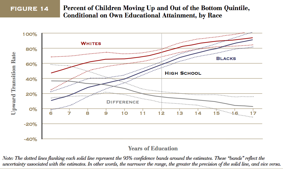
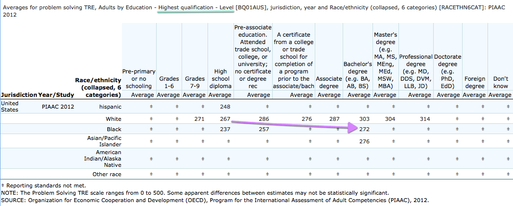
….and we know that there are appreciable differences in test scores at all credential levels, especially at the HS or lower level. This is even true of tests designed for applied skills that are highly relevant to economic success:
Literacy

Numeracy
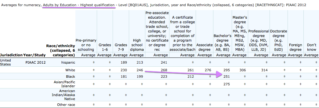
Technology problem solving
Downward Mobility from the Middle Class: Waking Up from the American Dream
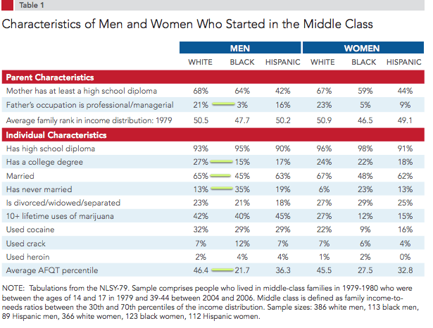
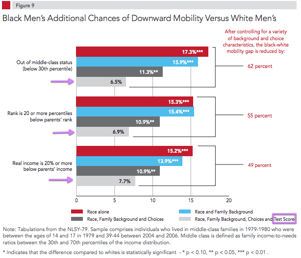
[Note: their decision to include the parents educational credentials probably reduces the accuracy of their model…]Adding AFQT scores to the model, however, reduces black-white differences in downward mobility so that the two rates are statistically indistinguishable. The steadily shrinking bars in each panel of Figure 9 indicate that after taking AFQT scores into account, along with the family background and choice factors, the black-white downward mobility gap among men is smaller by 49 to 62 percent, depending on the mobility measure. The fact that the gaps are no longer statistically distinguishable from
zero means that these factors may explain the entire gap. And AFQT scores are the
single biggest predictor of black-white differences in downward mobility from the middle class among these factors.
From their footnote (#19):
Consistent with the results in Figure 9, AFQT score differences appear to be the most important factor behind black-white downward mobility differences. No other factor considered in this report had a statistically meaningful effect—or a substantively large effect—on any of the black-white mobility gaps among men, except that the gap in the likelihood of falling 20 percentiles would have been even larger if not for the fact that the parental family income rank of black men was lower on average than that of white men. Even more strikingly, the collective effect of the family background factors and of the choice factors was never statistically significant. Between 27 percent and 47 percent of the black white mobility gap among men is explained by black white differences in the means of the various factors included in the report. Of course, AFQT scores reflect family background and other influences to some extent, so it is not technically accurate to say that differences in cognitive skills, scholastic achievement or knowledge explain the gap.
Now keep in mind that the test scores look something like this with respect to poverty rates and median family income.

I used a local polynomial regression to fit the trend line for poverty because the white relationship is clearly non-linear at a community level (which isn’t very surprising because both median family income and education levels are non-linear for whites as this level too–see above graphs).
I did the same for median family income, a better predictor, for comparisons sake:

Of course the evidence suggests that the relationship between academic outcomes and median family income is actually broadly linear for the vast majority of the income distribution (both at an individual and at a community level).

Put simply, there is much evidence that the differences in test scores mediate virtually the entire economic mobility gap and the differences in poverty rates are unlikely to explain either gap. Ergo, the differences in poverty rates are likely largely driven by other underlying differences that we observe, in part, through test scores (amongst other measures).
Some more qualitative and quantitive data
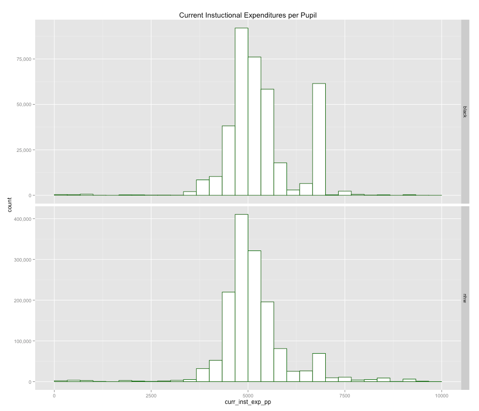
Below are a bunch of histograms I generated at a school district level for some presumably important statistics in California. Some may not think these speak to possible school level disparities within districts (especially large cities), but they certainly can help rule out the notions like the belief that there are vast funding disparities between dense urban areas and the surrounding suburbs (or differences in teacher “quality”, class size, etc) or complete lack of overlap in school characteristics. Generally speaking very few of these statistics favor whites and almost none of them consistently so.
Current Instructional Expenditures per pupil
Total Expenditure per pupil

Total Revenue per pupil

Local Revenue per pupil

Non local revenue per pupil

State Revenue per pupil

Federal revenue per pupil

Pupil-teacher ratio

Average years teaching experience

Average Years teaching in school district


Percent of teachers white

Percent of teachers with masters degrees

Percent of teachers tenured

Percent of teachers in probationary status

Percent of teachers in substitute status

Percent of district pupils white or asian

Percent of district pupils black or latino

Percent of district pupils white

Percent of district pupils black

Percent of district pupils latino

Percent of district pupils asian

Some quick histograms to compare asians and whites
Percent of district pupils white or asian

Median family income by group by district

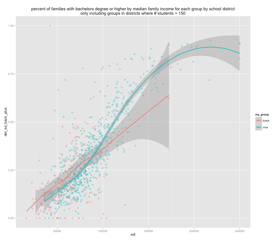
Percent of families with bachelors degree or higher by group by district

Percent of families in poverty by group

…
My point here is that asians (in broadly defined OMB/census level terms) are generally situated fairly similarly as compared to whites in terms of suburban orientation, income, poverty rates, and more today (somewhat “better off” in some dimensions, somewhat less so in others). I, for one, don’t think that the FHA, GI bill, etc etc etc (presumed historical inequities) are apt to explain why asians do so much better than blacks and latinos on these measures or, for that matter, why asians generally outperform whites academically.
Histograms of average test score data by group by school district
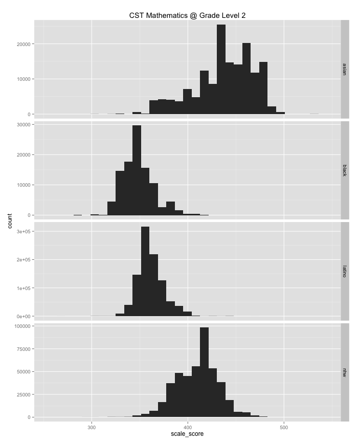

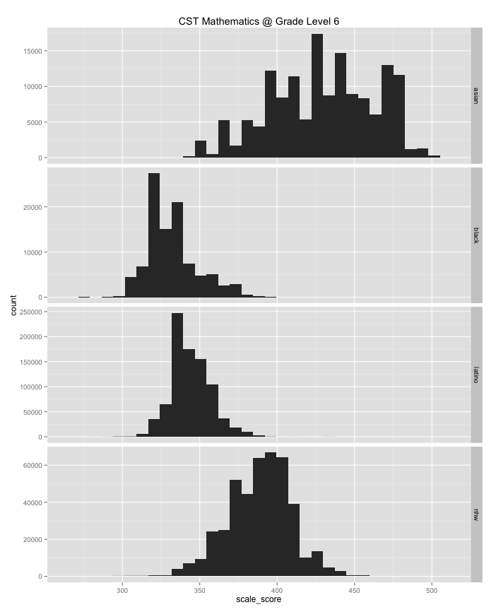


These score distributions look much more like the income distributions within communities than poverty rates….


Also note that even if you filter these histograms by income or poverty rates there are still large achievement gaps between groups.


 (Note: When the white poverty rate is this high, family education levels tend to be much lower relative to blacks).
School level “segregation” data
**** UPDATE ****
I added a few histograms for grade and school level (“class”) demographics using school level enrollment data from California’s department of education (4 year totals, 2013-2010). This helps characterize the degree of so-called school “segregation” across the state of California.
Percent of class black for black students

[Only a small fraction of blacks are in anything even approaching majority black schools in CA]
Percent of class URM (black or latino) for black students

Percent of class URM for latino students

Percent of class URM for white students

Percent of class URM for asian students

Percent of class URM for other students

Percent of class URM for ALL students

Some quick comparisons to test scores with this new classroom level data….

[Note: The better correlated tests here show virtually no effects here that cannot be predicted by each groups median family income]


Virtually none of this data suggests that blacks or latinos do appreciably better than expected in less segregated school districts (as defined by their weighted average of the classroom in the district that are black or latino), i.e., after we adjust for median family income. To the contrary, the model tends to suggest they do slightly better than expected in districts with more segregated schools in earlier grades and in some subjects , although that’s probably some modeling error (over-estimates the SES effect in earlier grades) and some combination of actually heavier investment in urban school districts having some modest effect.
Of course the average scale scores without any adjustment are worse on average for each group, but that’s because these individuals in these districts tend to be lower SES.


Conclusion
First, the achievement gaps are large and span large differences in socio-economic status.
Second, the evidence generally falsifies the notion that “concentrated poverty” per se has much explanatory power. To summarize: (1) poverty rates have little to no incremental predictive validity once median family income is accounted for (2) both the income and poverty effects appear to be broadly linear with respect to achievement (3) the data indicates no convergence in high income / low poverty black communities.
Third, differences in school quality are unlikely to explain these differences because (1) there is precious little evidence for systematic differences in school inputs that would disfavor the black community (generally the opposite) (2) the evidence tends to suggest that these inputs have, at most, minor effects on outcomes (3) these same sorts of differential outcomes are found routinely found in the same schools, same classrooms, etc (including, notably, a good number of high income predominantly white suburban school systems).
Fourth, there is substantial evidence that the test score differences themselves mediate almost the entire economic mobility (or income) gap between blacks and whites. The difference in poverty rates are largely a symptom of differing income and employment levels.
Fifth, many of the studies in support of the concentrated poverty theory and large independent effects on economic outcomes are generally poorly designed and make a lot of bad assumptions. They also fail to identify a clear causal mechanism behind this that could be empirically tested.
Sixth, contrary to the position espoused by Ta-Nehisi Coates and company, there is precious little evidence that historical policies like redlining explain much of the so-called “wealth” gap today, that current wealth gap substantially explains the spatial patterns that we find today amongst high SES blacks, or that these “spatial advantages”, in turn, explains the outcomes we continue to find today. Their arguments involves a chain of assumptions, many of which are weak or have little explanatory power, and collectively they just do not add up to much (especially not in the face of much stronger evidence for competing explanatory hypotheses).
Waking up from the American Dream.
So harsh, can’t you at least use some sugar-coated description?
Your work is impressive, and clearly the result not only of statistical erudition but passion and dedication. Unfortunately what comes through is unreadably detailed, with far too many figures. You should learn to present your findings more tersely.
Thank you! I sort of figured that it is a bit too wordy and too detailed for the casual reader to get through successfully. That’s partially because it’s sort of a working draft, partially because this is a highly contentious subject with a lot of misinformation to contend with, and partially because I am doing this anonymously and have zero reputational credibility to lean on. I will probably put together a more concise and better worded version of this later, most likely in another blog post and/or in PDF format, with the extraneous figures and statistics available in a supplement file or two.
Impressive data but I echo the sentiments of others, presentation matters. This is simply too much even for the most technical of readers.