Towards a general factor of consumption

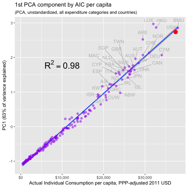
Previously I demonstrated that actual individual consumption (AIC) is a superior predictor of national health expenditures (NHE) and largely explains high health spending in the United States.  Towards this point it is instructive to show that not only are health expenditures generally coordinated with AIC, but that all other major categories of expenditure are too, i.e., at given level of real consumption per capita all countries will tend to allocate their consumption quite similarly.

In this post I make extensive use of Principal Components Analysis (PCA) and related dimension reduction techniques to better characterize consumption patterns across several major categories of consumption in both the spatial and temporal dimensions.  I find that there is a latent factor that explains the great majority of the variance in consumption, that it is exceptionally well correlated with AIC, and that GDP has essentially zero incremental validity once we have accounted for AIC for practical purposes.  I also show that this factor holds up well to price adjustment for each consumption category and correlates similarly with AIC within the OECD.

Although my interest here is (was) largely in verifying my prior analysis as it pertains to health expenditures, i.e., that AIC is real, meaningful, and the measure we probably ought to prefer when discussing the efficacy of cost containment regimes, my analysis has broader implications.  For instance, it provides evidence (albeit in a roundabout fashion) that argues rather strongly against Scott Alexander’s widely cited post on cost disease, i.e., if health, education, construction, and so were truly uniquely expensive in the United States, the United States ought to stick out like a sore thumb in PCA and the like.  Instead what we found is that the US consumption patterns track well with its high overall level of real consumption (AIC).  Moreover, anticipating the argument that perhaps cost disease is simply well correlated with AIC, when we adjust for category specific price levels (i.e., “volumes”) we find PPP-adjusted AIC holds up very well in explaining the variance in the actual volumes consumed overall and that the US is, again, well on trend (which suggests actual apples-to-apples differences in cost are not the problem and actual increase in the quantity and quality of goods & services consumed in these categories drive most of the variance).

Health, consumption, and household disposable income outside of the OECD

Previously I have shown that household gross adjusted disposable income and actual individual consumption (AIC) are superior predictors of national health expenditures (NHE) and that they largely explain why US national health expenditures (NHE) are so high.  However, my analyses have been restricted to the handful of mostly highly developed countries affiliated with the OECD for time series and the World Bank’s International Comparison Program (ICP) for cross section for ~all countries in 2011. I know of no simple ways to retrieve AIC or adjusted household disposable income outside of OECD in readily comparable formats, so I decided to spend a little time constructing these estimates for a much broader array of countries using the official system of national accounts tables available from the UN statistics division, which mostly covers between 1990 and 2014.

This analysis is largely a reproduction of prior work, but I felt I would write this up because:

  1. the data themselves are useful (sharing data & code this time around)
  2. it provides additional support for my general position vis-a-vis the utility of these measures in this context
  3. time series nature of the data helps demonstrate the non-linear relationships between these measures and NHE

On popular health utilization metrics

This Commonwealth Fund report has been widely cited for explaining why US health expenditures are so high.

The analysis finds that the U.S. spends more than all other countries on health care, but this higher spending cannot be attributed to higher income, an aging population,
or greater supply or utilization of hospitals and doctors. Instead, it is more likely that higher spending is largely due to higher prices and perhaps more readily
accessible technology and greater obesity.

Since I have already spoken to the incomes argument at some length and explained why I find overall “high prices” to be unpersuasive as it pertains to NHE in general and the US specifically, I will instead focus narrowly on this utilization argument since there are a number of similar analyses with identical/similar indicators.

The report proffers this table as an explanation for why high utilization cannot explain high US health expenditures.

screenshot_1749.png

Similar analyses are found elsewhere:

screenshot_1752.png

source

My problem with these sorts of analyses is that these sorts of indicators do not themselves account for enough NHE directly or correlate with NHE well enough to claim to account meaningfully for utilization and other major non-price drivers of NHE (if you wish to remove quantities of technology, prescription medicines, etc from “utilization” for semantic reasons).  When (1) your utilization measures can only account for maybe 10-15% of the variance (2) only relates to a modest proportion of NHE in most developed countries and (3) one ought to know there are other major cost drivers to account for, it’s pretty silly to claim that your half-hearted attempt to explain the variance honestly means it cannot be utilization and that it must be (mostly) the result of some US specific prices.

Some useful data on the dispersion characteristics of US health expenditures

Some people (1, 2, 3, 4)  have made hay out of data showing total health spending in the United States is heavily concentrated on a small fraction of the population:

screenshot_1587.png

source

My intuition and knowledge of the health care industry has long led me believe this likely not too dissimilar from what goes on in other developed countries (the young and/or reasonably healthy simply do not need or want much in the way of health care).   If nothing else it seems unreasonable to use this data to argue the US is an outlier without at least going through the exercise of comparing it to other countries.  Unfortunately the OECD and related entities provide little in the way of public data along these lines, so I have not been able to do this analysis myself.

However, I recently stumbled across a blog post from IFS regarding a study they published that speaks directly to these and related topics, so I thought I would briefly share this and related information in a quick-and-dirty blog post (full-text copy here).

Disposable income also explains US health expenditures quite well

few months ago I argued consumption, specifically Actual Individual Consumption, is an exceptionally strong predictor of national health expenditures (NHE) and largely explains high US health expenditures.  I found AIC to be a much more robust predictor of NHE than GDP and at least an order of magnitude stronger than other components of GDP when disaggregated (collectively and separately) in multiple regression analysis.

However, because some people are inherently suspicious of consumption per se and because others are under the impression this is primarily about financing (health) consumption out of savings/debt, I think it useful to also demonstrate these patterns as it relates to household disposable income (tl;dr they’re very well correlated and produce very similar results in the long term)

US life expectancy is below naive expectations mostly because it economically outperforms

In my prior few posts I made a strong case that the United States’ exceptionally high health care expenditures are well explained by its unusually high material standard of living.   In response to this several people I have interacted with have fallen back to the position that something still must obviously be uniquely wrong with the US health care system because US outcomes are significantly below what one might expect given its level of spending:

rcafdm_306_life_expectancy_by_hcepc_oecd.png
Life expectancy in OECD

They believe it cannot be a coincidence that the country that spends so much more than expected (according to naive expectations) also gets worse outcomes than expected and generally gets worse outcomes than the most developed countries of predominantly European and Asian origin.

In this blog post I will address the so-called “outcomes” dimension and explain why these apparently sub-par outcomes are not only not otherwise inexplicable, but can actually be explained in a fairly straight forward and parsimonious fashion  For the moment, I will narrow my focus on the subset of factors that drive US health outcomes significantly below naive expectations (not necessarily the full residual) and that I have good reason to suspect are significantly causally related to the expenditures issue.  Later, perhaps in another lengthy blog post, I will address other factors that are mostly orthogonal to expenditures and that further affect US health outcomes.

Predicting health care expenditures in OECD panel data as a non-linear relationship

In my prior post, wherein I argued at length that US health care expenditures are reasonably well explained by Actual Individual Consumption (AIC) and that GDP is an inferior predictor, I pointed out toward the end that the linear specification I used is likely to significantly overstate US residuals because there is good evidence for non-linearity and because the US is far out on the frontier vis-a-vis consumption.

This non-linearity can be seen pretty clearly if you look at the 2011 data derived from the World Bank (for AIC) and WHO (for HCE).

rcafdm_52_who_and_worldbank_nhe_by_aic
In per capita terms
rcafdm_54_who_and_worldbank_nhe_pct_aic_by_aic
In percentage terms

Since some people may (1) doubt the accuracy of these statistics outside of the few highly developed countries (2) imagine that these poor countries are somehow qualitatively different in a way that’s not well correlated with their level of economic development or (3) are particularly reluctant to accept non-linearity as a potential partial explanation for the US here, I thought I’d approach this from a somewhat different angle.


High US health care spending is quite well explained by its high material standard of living

About two years ago I created a long blog post arguing that the United States is not an outlier in healthcare expenditures per capita.   Following renewed interest from a link from Marginal Revolution recently and some criticism from a few people on various comment threads, I thought I’d take the time to update the evidence, address some areas of criticism, and muster yet more lines of evidence to support my argument.   This post should largely make the earlier post obsolete, but I will keep the earlier post up for posterity and to retain data/information that won’t necessarily be perfectly duplicated in this post.

Edit (12/12/18): I recommend reading this newer post instead if you’re haven’t heard from me before on this topic.

There exist several popular plots like these that people use to make the argument that the United States spends vastly more than it should for its level of wealth.

above-expected-500x406-1

health-care-spending-in-the-united-states-selected-oecd-countries_chart02

These plots and the arguments that usually go with them give the strong impression that US spends about twice as much as it should.  However, these are misleading for several reasons, namely:

  1. GDP is a substantially weaker proxy for “wealth” and a substantially weaker predictor of health care expenditures than other available measures.
  2. The US is much wealthier than other countries in these plots in reality.
  3. The arbitrary selection of a handful of countries tends to hide the problems with GDP in this context and, oddly enough, simultaneously downplay the strength of the relationship between wealth and health care spending
  4. Comparing these two quantities with a linear scale tends to substantially overstate the apparent magnitude of the residuals from trend amongst the richer economies when what we’re implicitly concerned with is the percentage spent on healthcare.

When properly analyzed with better data and closer attention to detail, it becomes quite clear that US healthcare spending is not astronomically high for a country of its wealth.  Below I will layout these arguments in much greater detail and provide data, plots, and some statistical analysis to prove my point.

National Healthcare Expenditure: United States versus Other Countries: The US is not really an outlier.

UPDATE (9/25/2016): I just created a new and (hopefully) much improved version of this argument here.  I suggest you start there instead.

Numerous people have asserted that the United States spends dramatically more on healthcare than other countries, presumably even more than countries of our level of wealth and affluence, and that this can only be explained by the fact that we do not have single-payer or some such.

Here are some examples graphs used to make this point

Above-expected-500x406 (1)

health-care-spending-in-the-united-states-selected-oecd-countries_chart02

These appear to be very convincing at first blush, but i never found these arguments particularly convincing due primarily to:

  1. Imperfect comparability between the selected countries
  2. Issues relating to comparing countries of the “same” GDP
  3. cherry-picking of countries

I knew the proponents of single-payer were, at best, making an incomplete argument and that it invited an exaggerated impression of what we should likely expect from a country like ours, but, up until now, I lacked the data and the time to present these argument comprehensively.  I recently got in an argument with someone over this subject and found a treasure trove of data all in one place (mostly) to thoroughly debunk this overly simplistic argument.

To make my points, vis-a-vis fundamental issues with naive treatment of GDP per capita and sensitivity to comparison countries, here is a quick chart showing National Healthcare Expenditure (NHE) as a percent of GDP by GDP per capita

NHE_as_Pct_GDP_by_GDP_per_capita


United States physician income in context

One of the issues that I have when people assert that United States physician compensation is much higher than other countries is that they make terribly naive comparison.  They compare, say, PPP-adjusted incomes to PPP-adjusted incomes in other countries without accounting for the fact that the “average” person in this country has a much higher PPP-adjusted income by most measures.   Likewise, they’ll compare physician income to “average income” or “average wage” ratios without comparing it to the more relevant labor pool in each country, i.e., at least college graduates (or better). example

Average Physician Gross Income to Average College Grad Gross Income [apples-to-apples]

Note: In both cases, “gross” is pre-tax income, including social security/payroll contributions.