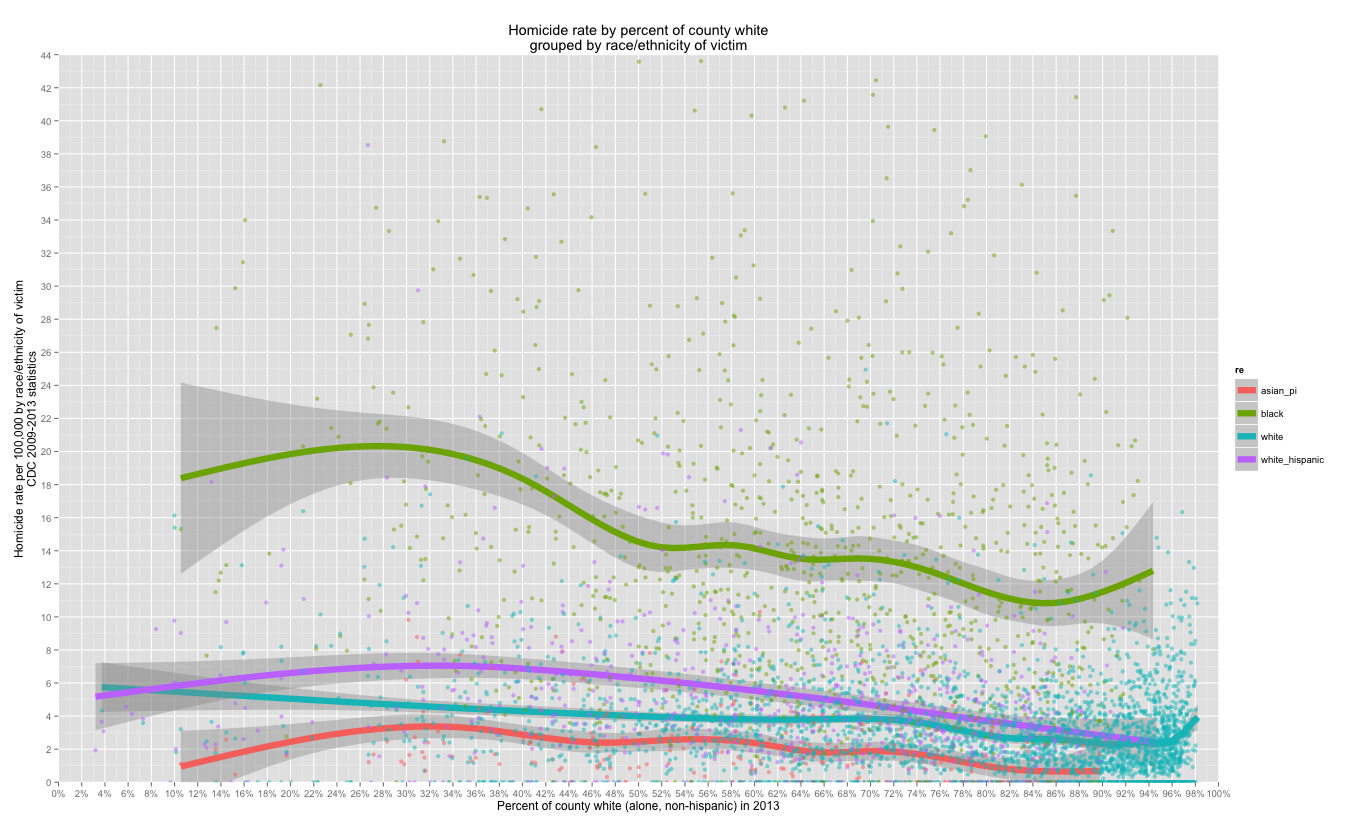
In my last post, I plotted the overall US county-level homicide rate (all groups combined) by racial/ethnic demographics. Much of that correlation is being driven by high black-on-black homicide rates throughout the country.
If I plot the rate by the race/ethnicity of the victim this pattern becomes clear and the group-level correlation weaken somewhat (especially asians and whites), but it’s still there…


Since non-hispanic whites are a little hard to see with the combined plots, here are a few with whites split out:
minimum population size >= 10K (r=0.29)
 minimum population size >= 100K (r=0.39)

Some of this may be driven by underlying regional patterns (a question for a follow up post maybe), but there’s a fairly strong correlation and there are good reasons to think there is a causal relationship driving at least some of the observed relationships (also see similar patterns with asians above).
That’s it for now.