Today I am exploring college completion data from IPEDS which provides detailed information on major choice, admissions related information, and the like.
Amongst universities requiring test scores and reporting them, 6-year graduation rates by estimated SAT score.
I have long been of the impression that most of the gender gap in academic achievement is skewed towards lower SES groups and URMs, that much of it has much to do with a comparative lack of male engagement in primary and secondary school, especially with respect to home work compliance, so I decided to exploit my prior efforts to try to assess the accuracy of this view. Of course this data isn’t broken out by race or SES per se, but the right side on the x-axis is generally higher SES and more white and asian (whereas the left side is generally more black and latino and generally lower SES).
In a prior post I compared the performance of various ethnic groups directly against each other within the same schools. That method has the advantage of reducing the effect of racial/ethnic composition from influencing the apparent relationship between each groups performance within school environments. However, there aren’t always enough of both groups to clear the minimum reporting requirements for student privacy and the school average is a better indicator of “school quality” in some peoples’ minds. Below I simply took the reported average for all students on the x-axis so that I could compare multiple groups at once.
I do not believe that this is a particularly good way to view the data, since it’s confounded by racial/ethnic composition and sorting by education levels (despite the obvious correlation), but if you do happen to think that the average score is a particularly good measure of “school quality” this approach might be eye opening.
I also plotted this same data for poor and non-poor blacks and whites and (all race/ethnic) scores by parental education level below. You’ll need to scroll down a ways to see it though.
UPDATE: I realized after the fact that I botched the asian rate data a bit because California reports Filipinos as a separate group for some strange reason, i.e., they’re not included in the reported suspensions/numerator, and my denominator uses the normal federal/OMB definition, which includes doesn’t put filipinos in a separate category. Filipinos are about 1/4th of the (federal) Asian category in CA schools and probably have a higher suspension rate than east asians (which is extremely low). I don’t think it’d alter the between group differences all that much, especially not in ordinal terms, but I don’t feel like re-doing these all plots right now, so keep that in mind.
Out-of-school suspension rate (“(OOOS”) by district (weighted)
OOSS by district (weighted), y-axis as log-10
Observation: There are clear racial/ethnic patterns here that cut across many different school districts.
To exploit some of my prior work with California’s test score data, I decided to extend this analysis to SAT, ACT, and AP scores in the state of California, i.e., to compare the relationships of these different tests within and between schools.
Notes/Caveats:
To achieve more stable results with schools with small numbers of test takers I averaged 2-4 years worth of test score data together.
Unfortunately, AP results are not broken out by subject (some are much harder than others and there are apt to be different test taking patterns at different sorts of schools)
SAT/AP/ACT data is not available by race/ethnicity
ACT vs SAT (r=0.97)
[It’s almost like they’re testing the same construct…. :-)]
Back in my earlier post on the effects of concentrated poverty, I mentioned that California provides test score data for various specific “Asian” ethnic groups (e.g., Chinese, Japanese, Korean, Hmong, Indians, etc) and that I might update my analysis with that information later.
To aid interpretability across multiple tests, I first converted all average scores into standard deviations above the non-hispanic white mean (both are weighted for the number of test takers in each school district to better approximate the actual individual distributions) and then plotted these as box plots for detailed ethnic groups, poverty status by race/ethnicity, and education levels. All of these box plots are also weighted by the number of test takers in each group.
X = 0 should correspond to the weighted white mean across school districts in California (which ought to be very close to the individual white average state wide), ergo groups or parts of groups (e.g., IQR) that are on the right hand side are generally outperforming the white mean and vice versa for groups on the left hand side.
This is just quick update to my prior post on concentrated poverty. I re-ran the California test score data at a school-level to compare within school black-white differences in test scores and converted all of the scores data to standard deviation units relative to (above) the non-hispanic mean by school, weighted by the number of test takers. The pattern can be observed as early as 2nd grade and it is quite consistent for all major/mandatory tests.
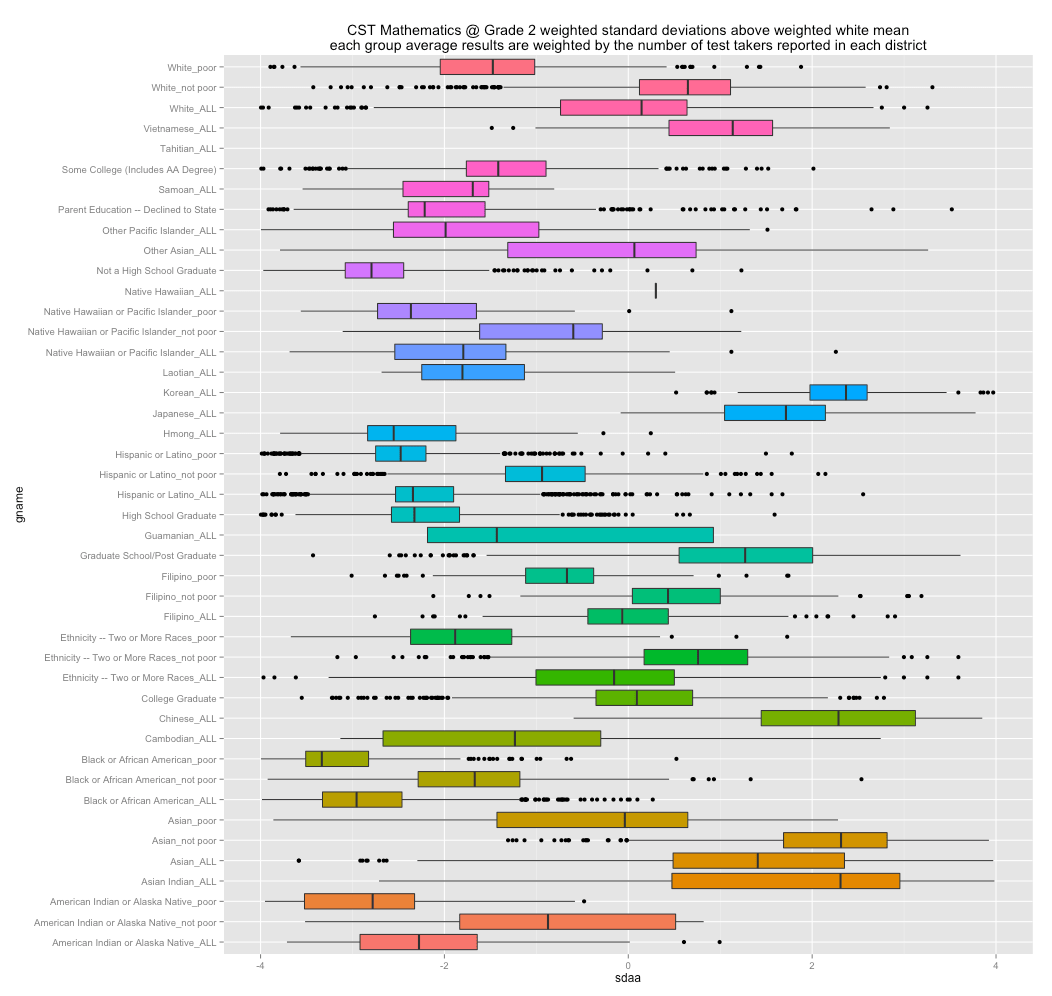
According to a large and growing number of progressives, the achievement gap between “minorities” (especially blacks) and whites can be traced directly to the effects of “concentrated poverty”. This implies that we cannot compare the outcomes of individual “middle class” blacks to whites of similar income because they don’t have the same amount of wealth, which would allow them to escape their poor neighbors, bad schools, or something along those lines.
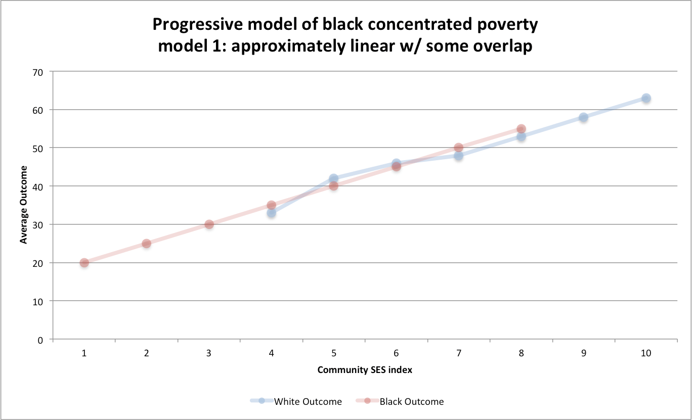
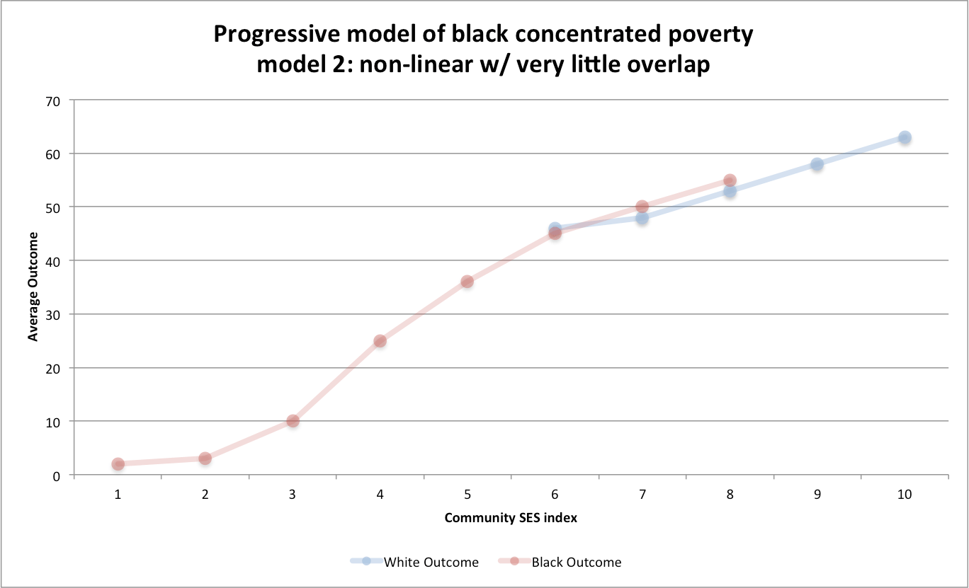
Presumably the relationship between the actual neighborhood-level SES, as measured by poverty rates, income levels, education levels, etc, and academic outcomes should look something like this:
In other words, this achievement gap is presumably only found in areas of concentrated poverty, but those few families that manage to “escape” these particular bad environments converge on white outcomes or even close the gap entirely.
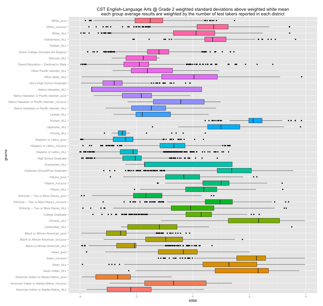
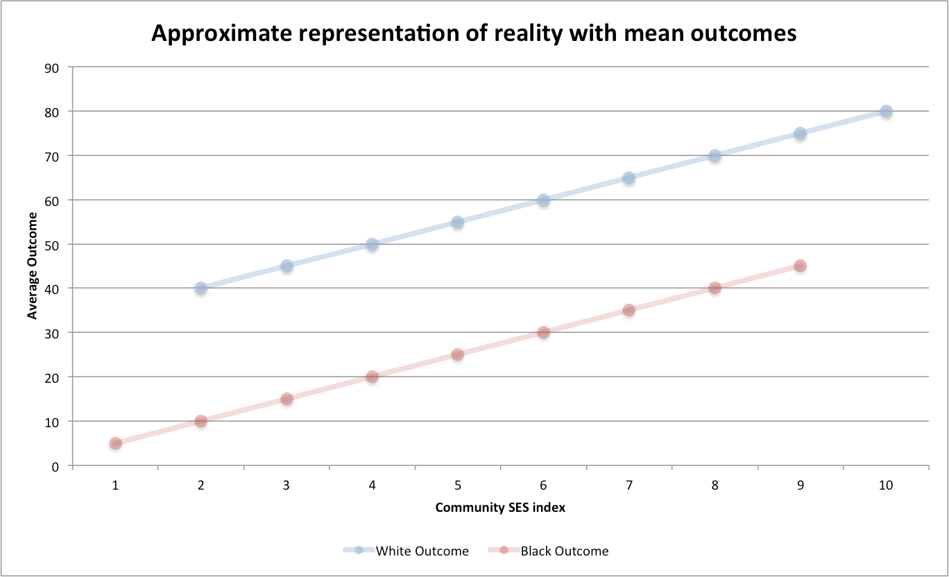
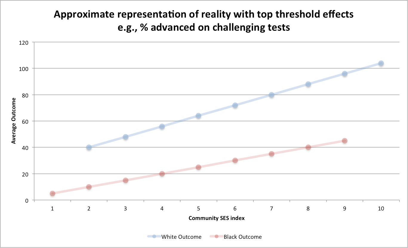
Having actually studied this data, I can tell you that reality looks more like this:
Put simply, there is no evidence to support convergence. Broader outcome measures generally show a solidly linear relationship with these measures. There is also much more overlap in material condition than the picture that most progressives present (curiously they sing a very different tune when they want to talk about these differences in other contexts). Below I will present some evidence to this effect.
I am going to share a little analysis I’ve done by combining Pennsylvania’s PSSA test scores, Census ACS data, and Department of Education statistics to refute a few popular progressive notions about education, namely, that:
Warning: This is long somewhat meandering post and a work-in-progress
My intent here was to compile the evidence in a narrative fashion. There are more detailed and more technical sources for much of the information I presented here, but much of it is scattered and much of it is targeted at people that are both knowledgable and willing to invest the time. My approach here was to present the information in a relatively accessible, top-down fashion, i.e., first identify the magnitude of problem, then characterize it, then present evidence that the favored environmental explanations do not add up, and then (briefly) touch upon some more controversial hypotheses….
One of the first things that clued me into the fact that school systems and socioeconomic status cannot explain the black-white (B-W) academic achievement gaps was seeing SAT data like this:
The obvious pattern here is that high socioeconomic status (SES) blacks do no better (and often worse) than low SES whites, whether measured by their parents’ income or their parents’ educational credentials. This is really hard to explain away as being mainly a product of poverty, bad schools, and things of that sort either.