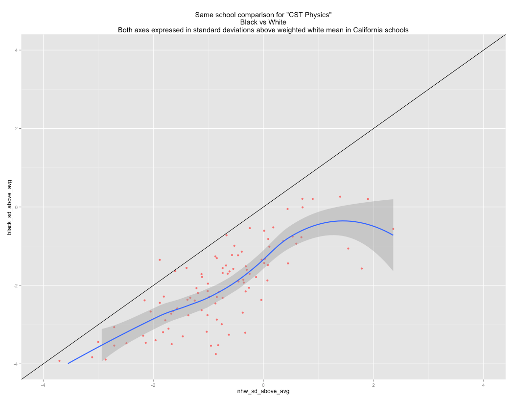
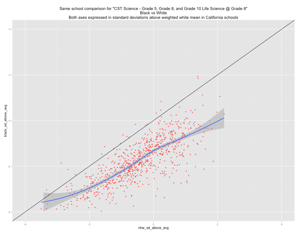
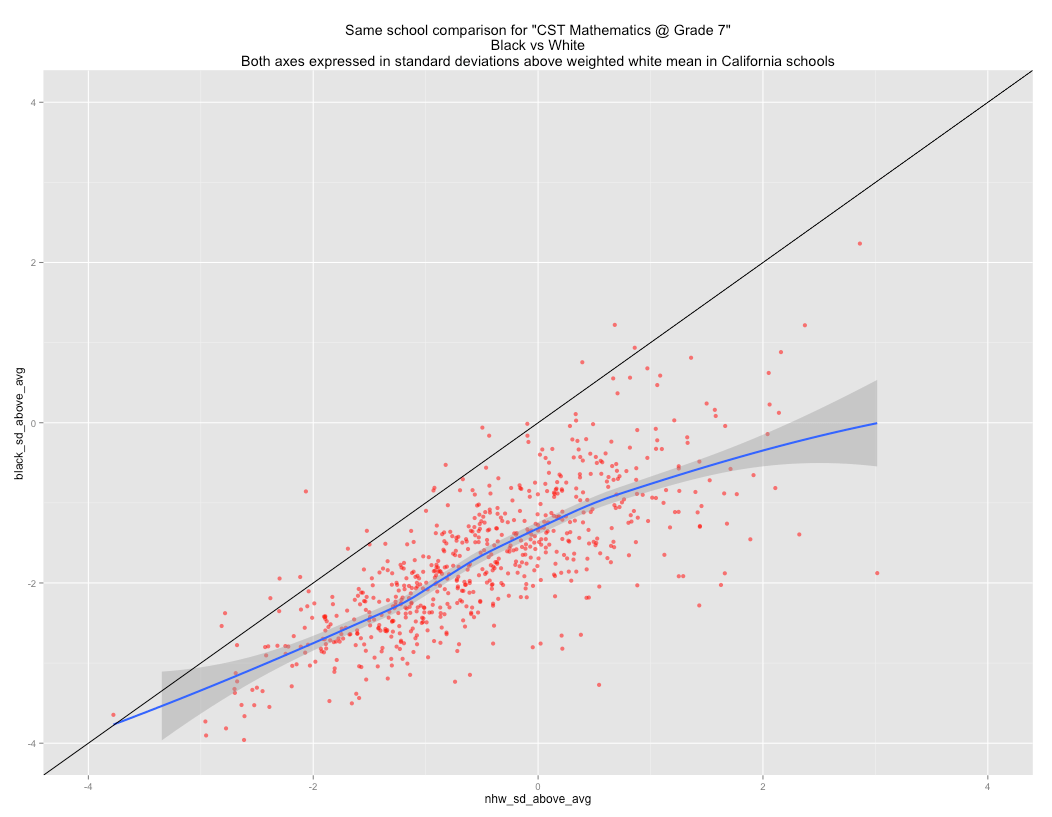
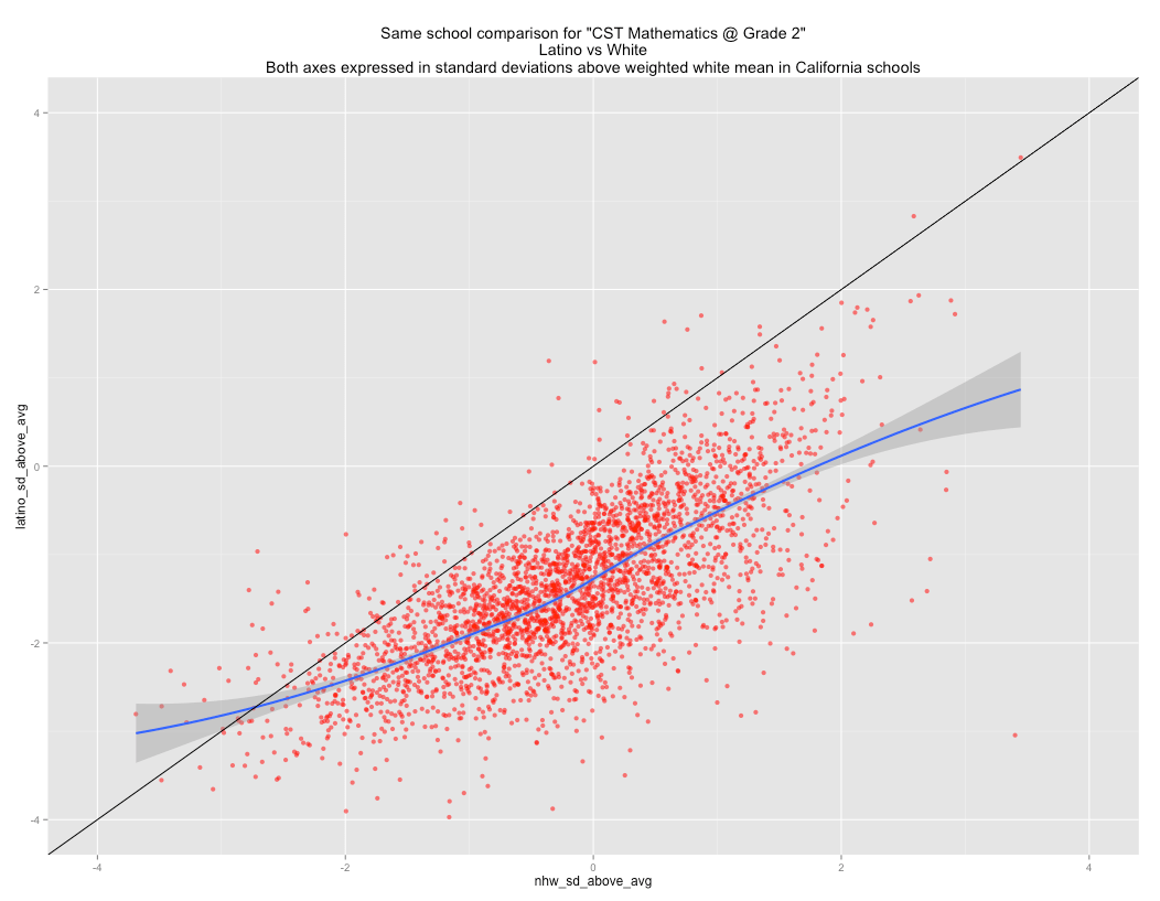
This is just quick update to my prior post on concentrated poverty. I re-ran the California test score data at a school-level to compare within school black-white differences in test scores and converted all of the scores data to standard deviation units relative to (above) the non-hispanic mean by school, weighted by the number of test takers. The pattern can be observed as early as 2nd grade and it is quite consistent for all major/mandatory tests.
Black vs White within school comparison
Grade 2 English

Grade 2 Math

If I plot all tests at once (after standardizing the scores), the plot comes out like this:

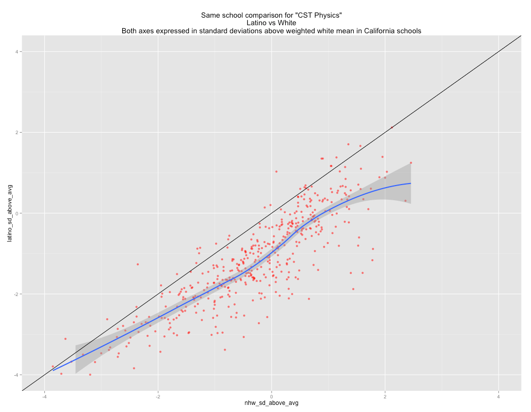
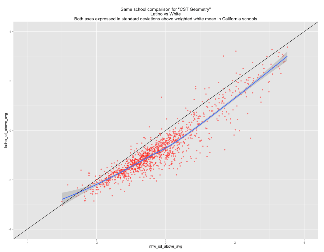
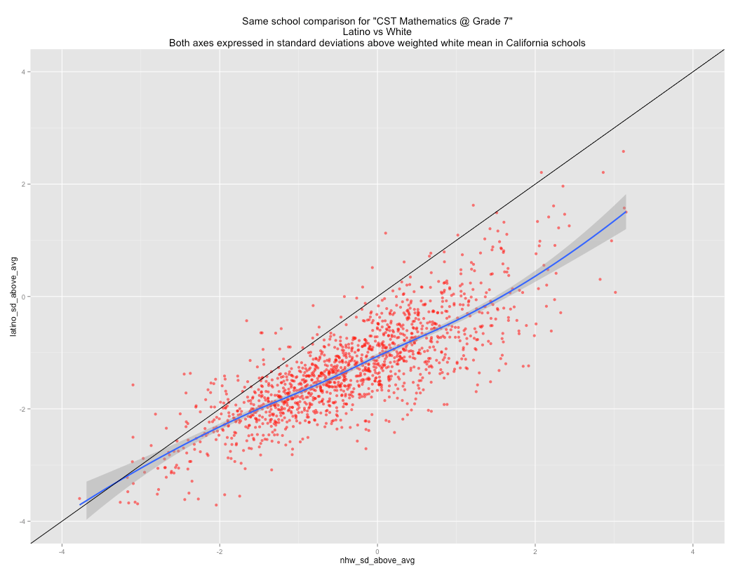
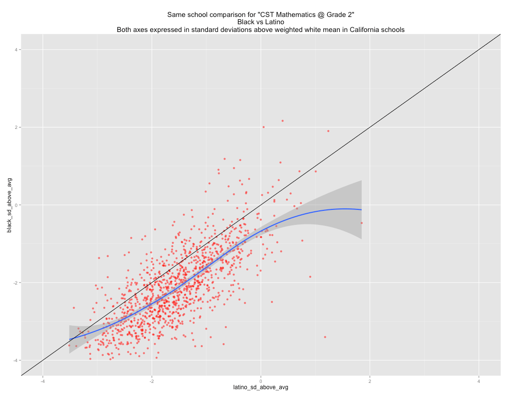
Most individual test plots seem to follow a pretty similar pattern with respect to the underlying shape and the relationship between the intercept(s), i.e, roughly -2.8@ -2 SD, -1.2 @ 0 SD, -0.2 @ +2 SD. The within school gap grows in schools where whites perform at a higher level(the right side) and shrinks in schools where whites perform well below average (the left side). [The higher performing schools are almost certainly mostly higher SES schools, but perhaps I’ll plot this data once I find a good measure of school level SES for both groups later]
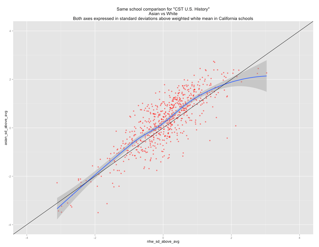
U.S. History

World History

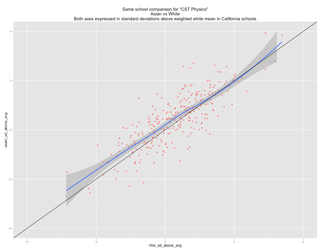
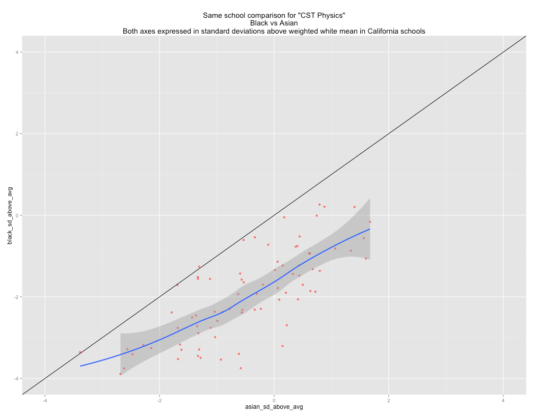
Physics
Chemistry

Algebra II

Algebra I

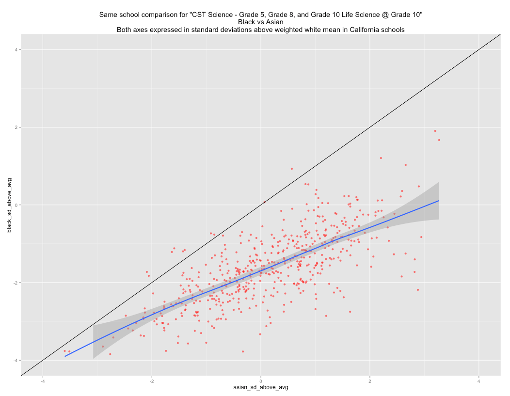
Grade 10 Science

Grade 8 Science
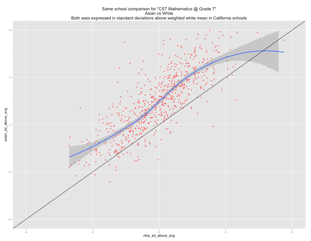
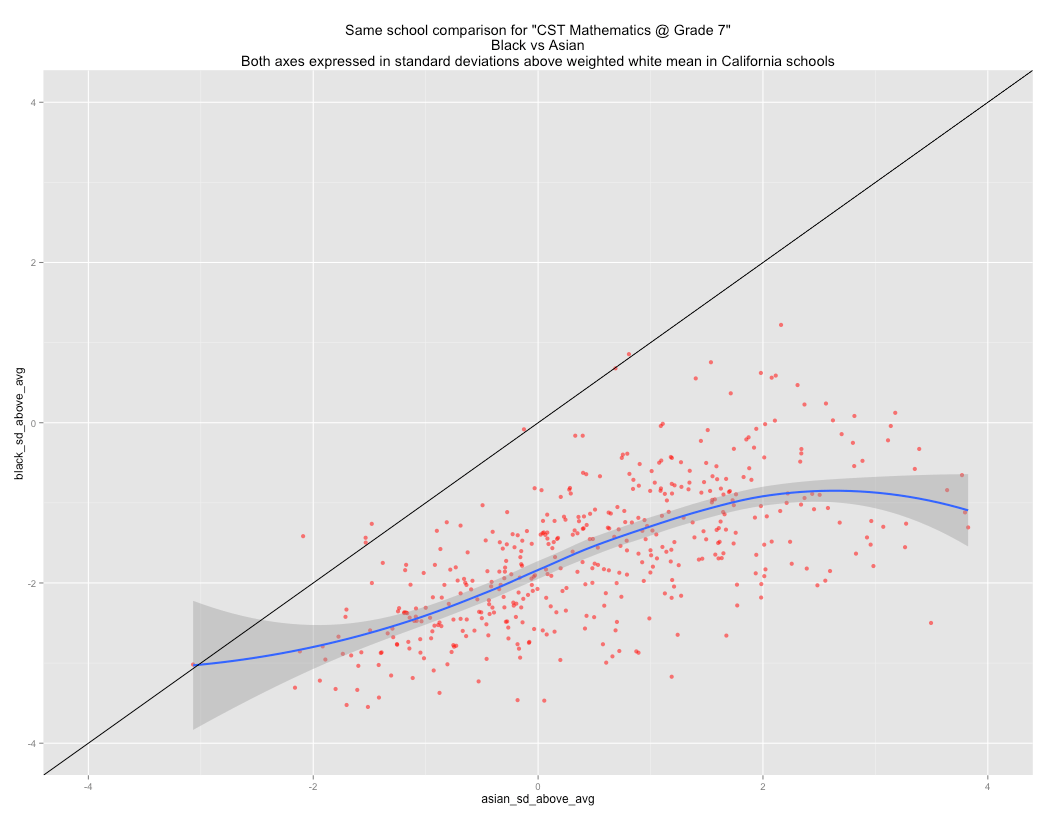
Grade 7 Math
Grade 11 English

Grade 7 English

Latino vs White within school comparison


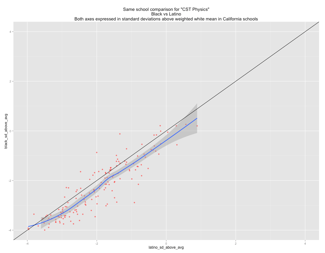
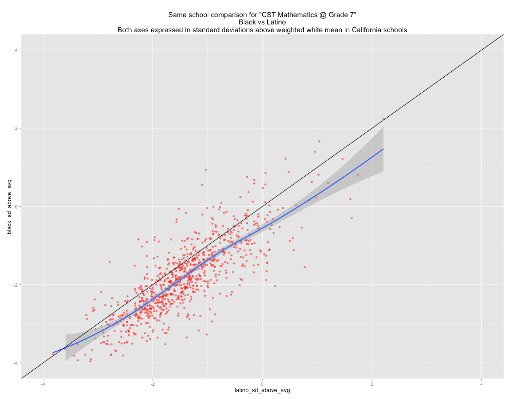
Black vs Latino within school comparison


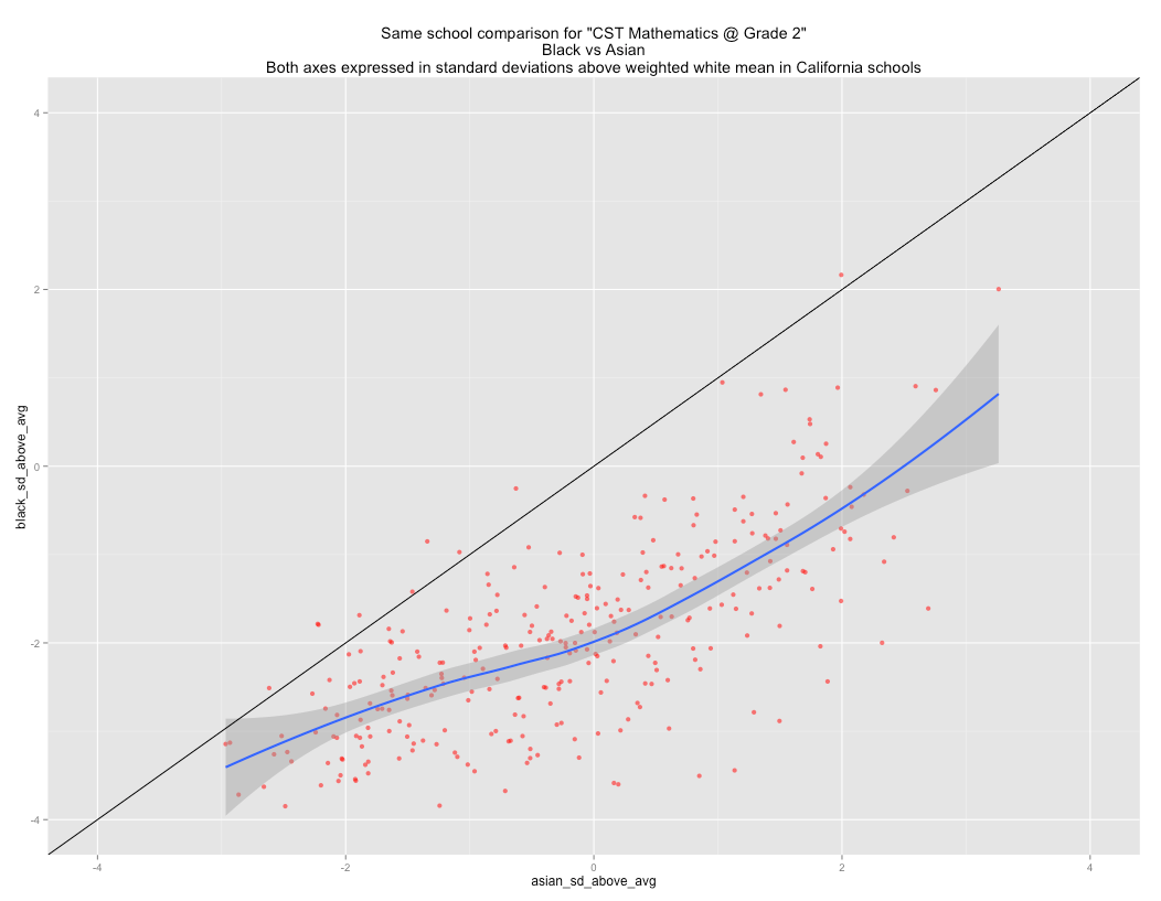
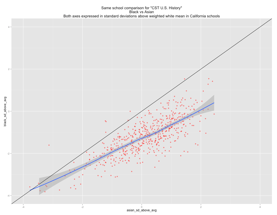
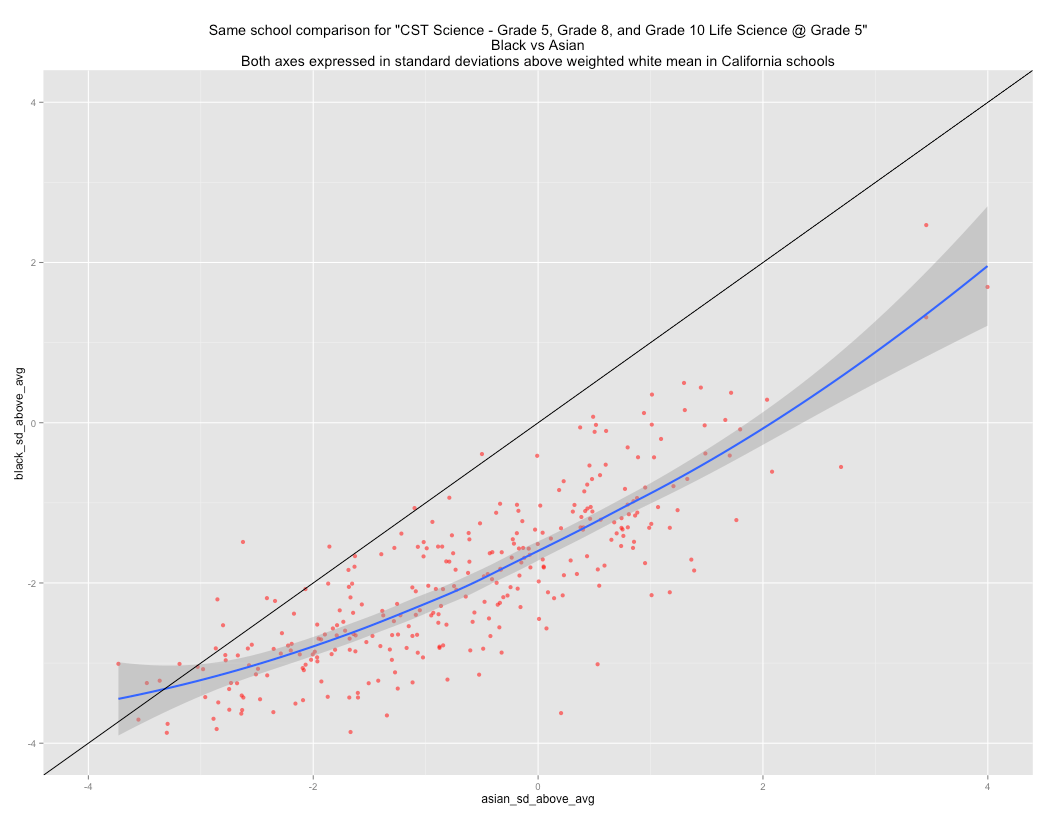
Black vs Asian within school comparison


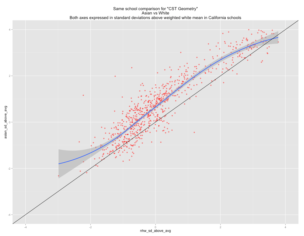
Asian vs White within school comparison