
Alex Tabarrok of Marginal Revolution linked to my primer and other research on health care recently. This brought a lot of extra attention to my work. Most of the response was positive, I think, but several people angrily lambasted my analysis. The adverse reactions generally amounted to little more than name-calling, and much low-quality material was amplified by the usual suspects.

I will not respond to name-calling. I will, however, reply to the few seemingly substantive critiques for the benefit of those that have trouble recognizing how weak these arguments are. I will also use this opportunity to drive home the point that health spending growth has clearly been increasingly non-linearly as a function of income, with the slope increasing, increasingly, in global cross-section and OECD panel data analysis. Indeed, I will show that the constant rate of relative increase implied by log-log regression specification, which triggered certain people, tends to underestimate the slope at higher income levels significantly.
America has trivial effects on the model
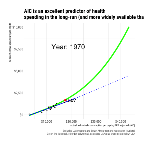
Jason Smith made a big stink about my choice to include the United States in the regression model in the first plot of my primer.
 It should be apparent to people familiar with statistical analysis that the US observation cannot be doing much work in this model. Though some argue the United States is an “outlier” based on other evidence and other types of analysis, it is not an outlier here. The US is much too close to the trend here to have an appreciable effect on this regression — the residual is utterly unremarkable.
Using slightly different data, Jason got a slightly different result with the same apparent specification.1 Even with his own (not exactly identical) data, the effect of omitting the USA from the regression was small potatoes from my perspective.

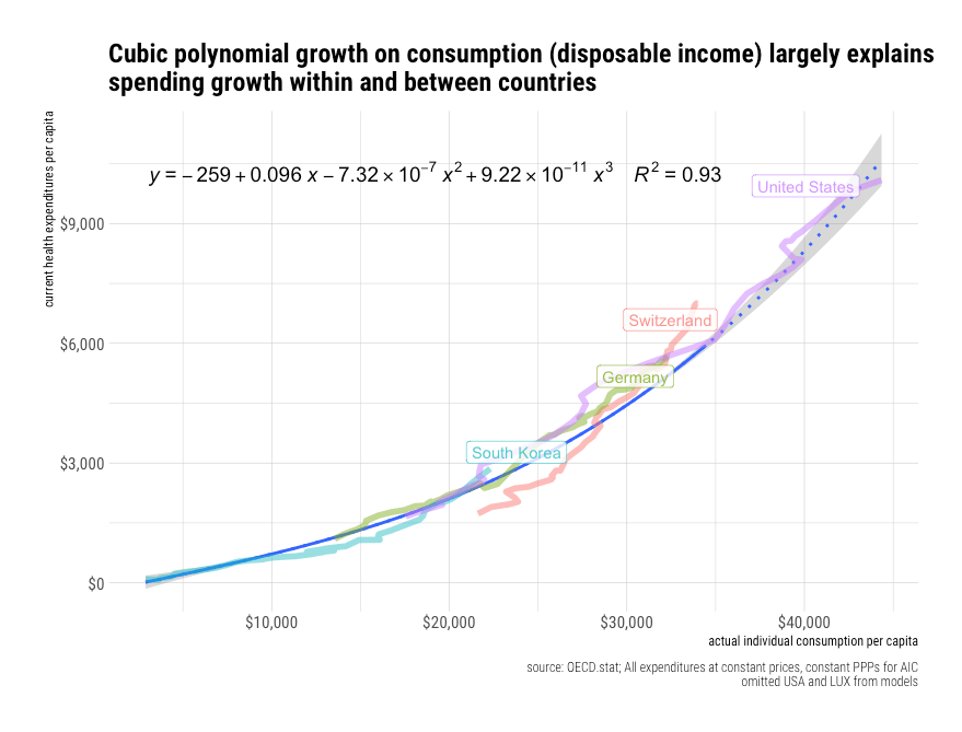
The regression results are virtually indistinguishable in my original data with the initial modeling strategy I employed. However, since I wish to share data and code here at some point, I’m using updated data live from OECD.stat with still comparable results.2
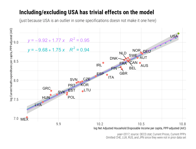 Indeed, if I include observations for countries that I did not previously have at my disposal, the slope increases.3
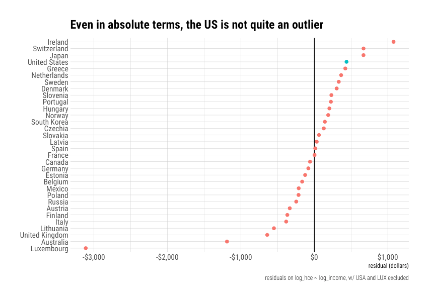
 If we plot the residuals, it’s even more apparent the United States is not an outlier.
 Even if I convert these residuals into their dollar equivalents, the US is still within the normal range of variation, and with a much higher income to afford these differences!
“Linear space” is not objectively superior
Although Jason claims not to understand this point, log-log is very common in economics. It is the conventional way to estimate elasticities. By opting to model it with bog-standard methods as a first pass, I reduced my degrees of freedom in my overview. I do not need to resort to more esoteric techniques to show US health spending can be straightforwardly explained within OECD.
He also seems to believe that the only reason I might neglect to include plots of this data in “linear space,” as he calls it, is that I am trying to hide the ball. However, this stems from an apparent fundamental misunderstanding on his part. When we run log-log regressions, we are asking different things from OLS. With log-log, we want to know the ratio of the relative changes, whereas, with the linear specification, we are asking for the ratio of absolute differences. The “correct” specification depends on one’s assumptions about the underlying data generating process.

Setting aside potential issues with the data he used, analyzing residuals in absolute terms (“linear space”) when we are asking for relative terms (“logarithmic space”) isn’t necessarily meaningful since the residuals we are interested in are effectively relative (percentages). Different answers follow from different questions.
If the underlying data generating process is a function of relative change, rather than absolute change, we can’t necessarily judge the efficacy of cost containment regimes based on the residual expressed in dollars even if we presumably care about these more (far from clear!). Under such circumstances, the log-log residuals, which correspond to the percent above or below expectations, tell us more about how representative a particular observation is in the dependent variable is than its equivalent visually expressed in dollars.
It’s generally understood that economies tend to grow exponentially. Even though growth rates may change, projecting economic growth and expenditures with strictly linear specifications tends to produce poor results over the long run. A $100 per capita increase in growth has very different implications at a level of $1000 than at $10,000. Likewise, $100 is much dearer to the pocketbooks of poor countries than rich countries. On the other hand, coming in 10% over or under budget is more or less similarly interpretable across national income levels. We are better off with relative changes than absolute changes because these better reflect the nature of economic growth and consumption patterns.
 The US residual in dollar terms is also unremarkable in my new and improved data set.4

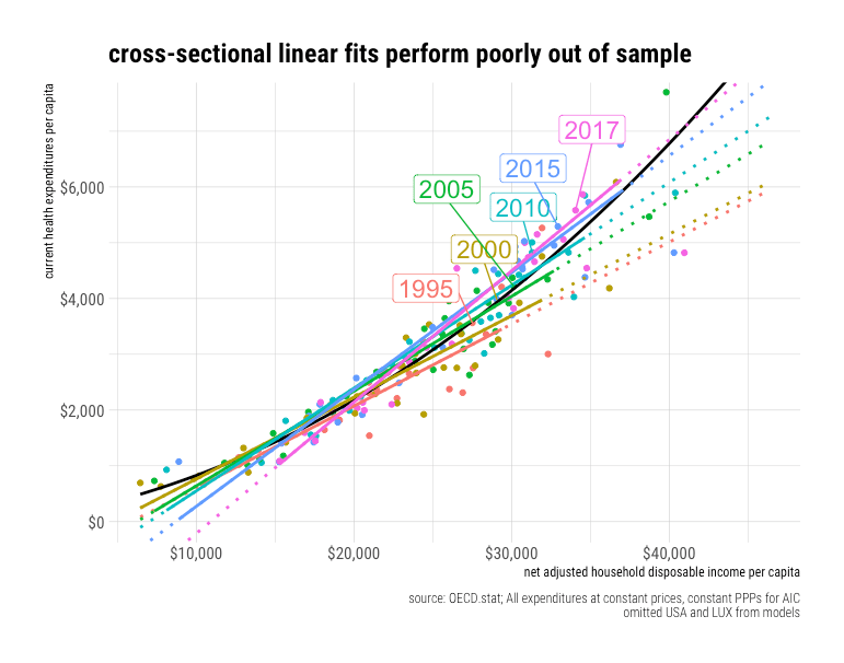
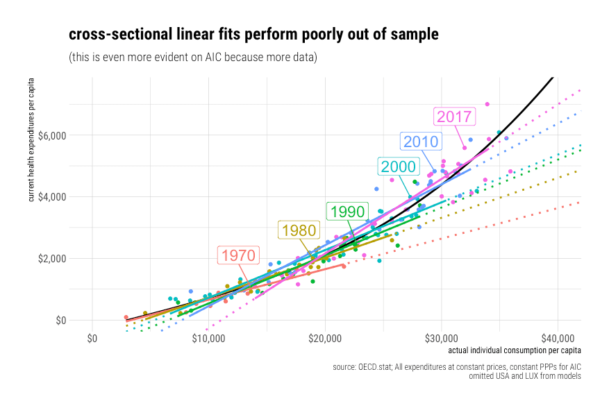
These linear models perform poorly out of sample
It’s possible to fit a model that seems superficially reasonable, but which nonetheless holds up terribly out of sample. This is particularly problematic when the model specification itself does not correspond to the underlying processes, and the model is fit to a narrow range of data. The flaws of the model may not be immediately apparent in the goodness of fit alone, particularly when there are only a few dozen observations in the OECD in any given year, mostly in a relatively limited income range, and with transient noise thrown in (institutional lags, consumption smoothing, etc.).
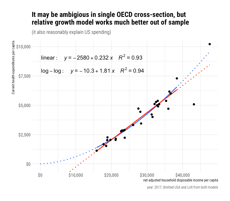
Sorry, Ndugu, but Jason, who totally doesn’t have strong feelings on this topic at all, has “bent over backward” to produce a correct model of the world, and it says you get negative health care. Alternatively, Jason’s model, which presumes a constant change in dollar terms, is economically naive and produces systematically biased predictions at high and low incomes.5 The poor performance of Jason’s model is not merely a theoretical possibility of what might happen when we extrapolate a model out far, far beyond experience to some distant hypothetical future. This is something we can actually observe in the available data in the here and now.
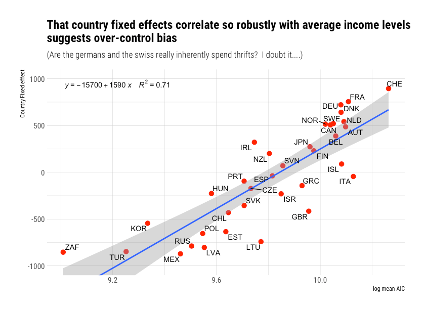
For example, we can broaden the household income frame (using AIC as a proxy) by drawing on the World Bank’s ICP 2011 data.
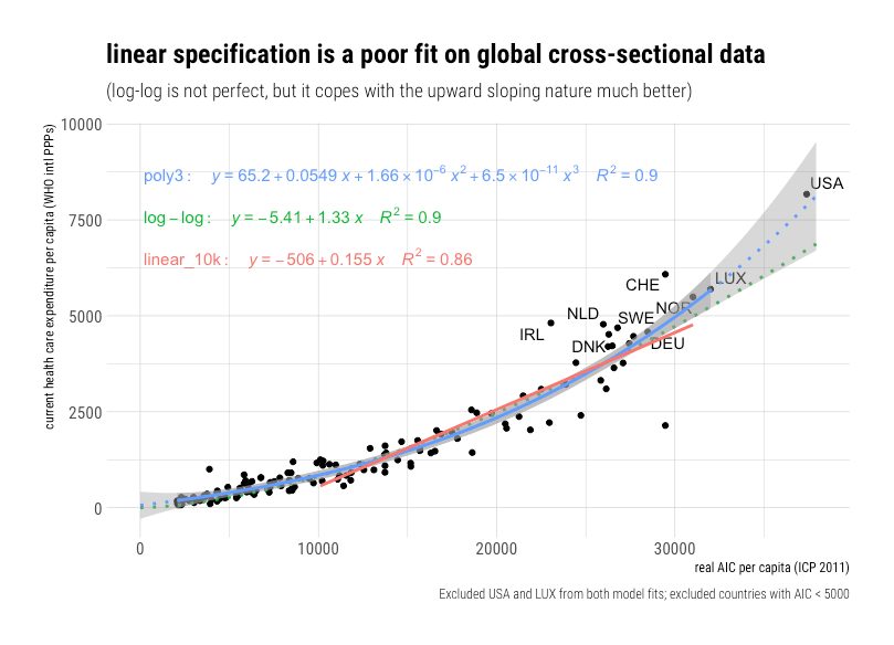
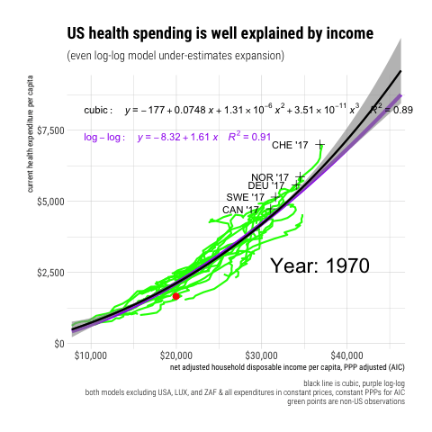
It is quite apparent this relationship is not strictly linear. Yes, we can fit a linear model to some region of the data, and even explain a fair amount of the variance, but it produces systematically biased predictions. The linear specification is effectively attempting to fit a straight line (constant absolute change) through a growth path that is obviously curved (relative change, which increases increasingly).
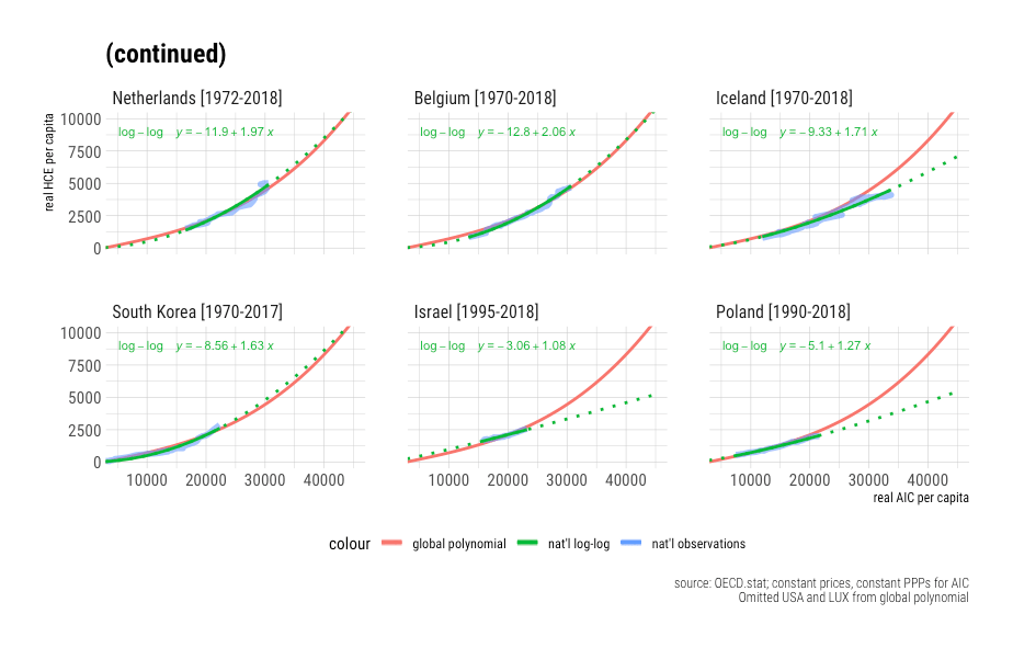
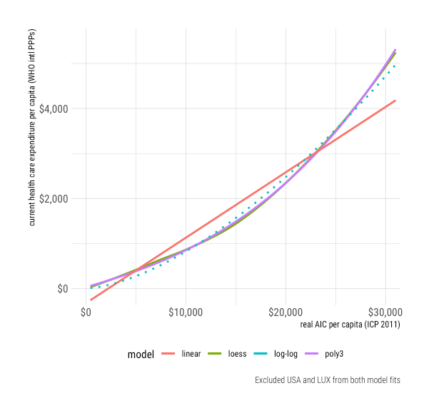 Even the log-log method, which assumes a constant rate of relative increase, underestimates health spending at higher real income levels.
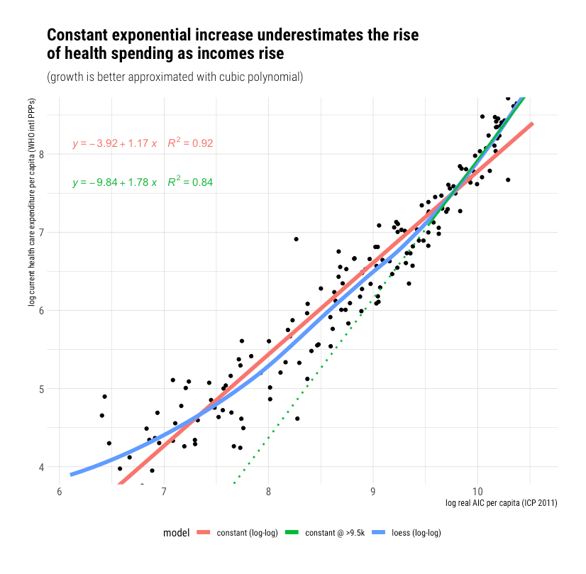
If we constrain the model to a narrower range of real income (consumption) levels, we can obtain a fit that seems reasonably tolerable at first blush. Still, as the frame changes appreciably in either direction, it becomes readily apparent the linear model produces weak, systematically biased predictions. The log-log method merely works tolerably well over a relatively extensive range of incomes, but this growth is really better modeled with a polynomial function.
Along these same lines, we can see the limits of the constant linear approach OECD panel data with all expenditures at constant prices and constant PPPs (adjusting for inflation and spatial price levels). While the OECD observations may span a limited range of incomes in any given year (cross-sectionally), real incomes have actually changed a lot for most countries, ergo we run into similar issues when we model with constant PPPs.
 Likewise, if we reference Actual Individual Consumption (AIC)6, this becomes even more apparent because we have more data to work with here.
Let’s drive this point home with a quick animation.
 Similar results are obtained with real GDP, even when restricted to the same set of countries.
Upper-income countries like Germany are spending much, much more than would have been predicted based on the observed linear income slope decades prior. The log-log approach fares much better, and the polynomial even better still. Indeed, we can explain almost all spending in both dimensions (time and space) with a simple polynomial function.
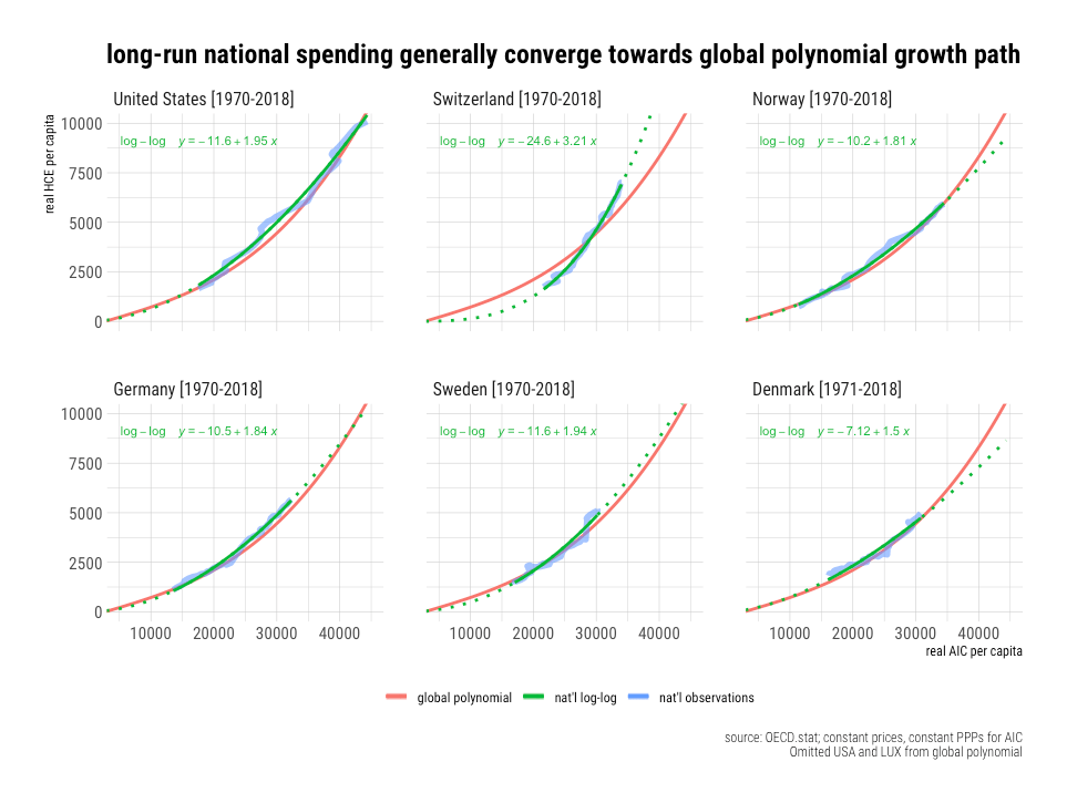
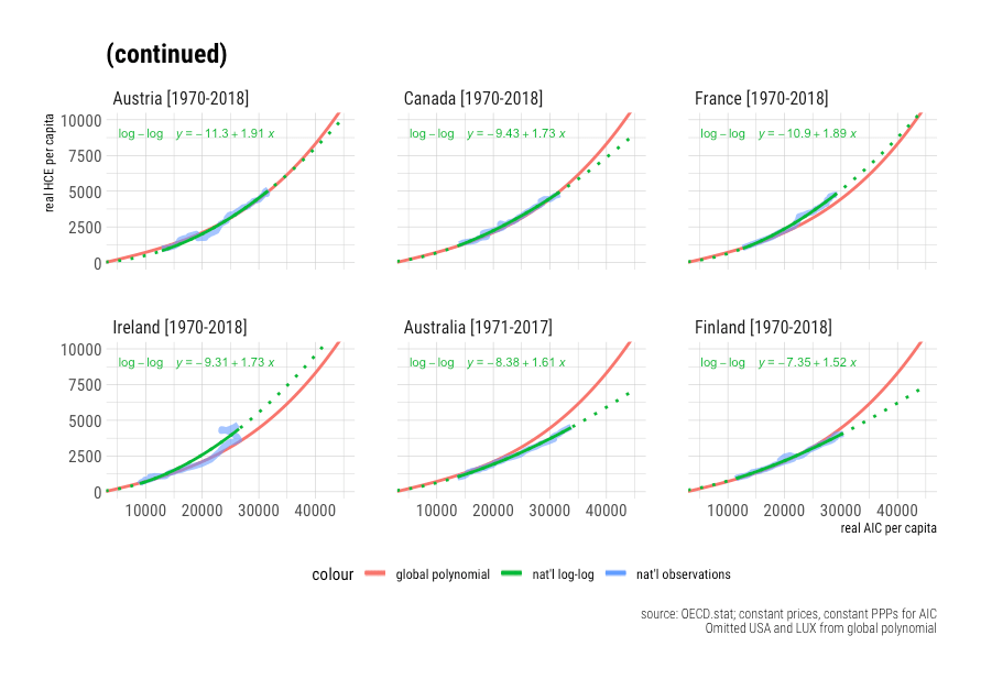
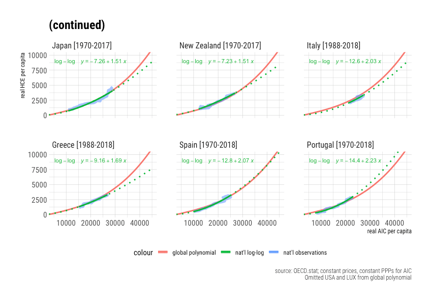
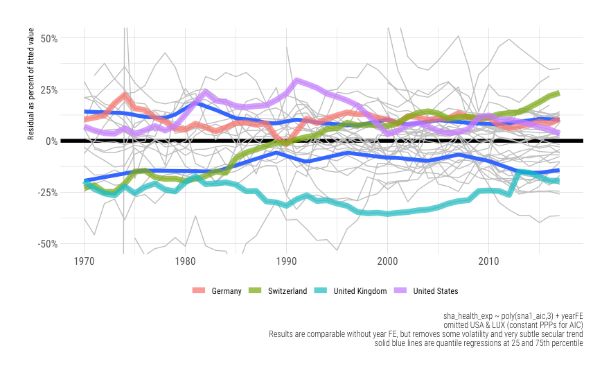
National spending tends to converge on the global polynomial trend
In the short run, some countries may appear to be increasing spending much more quickly than the United States conditional on incomes, others less much rapidly, but for the most part, it’s consistent with the global growth model. The residuals at the national level are mostly transient. Those countries that depart from trend show a strong tendency to converge back towards it.
Income is not mediated by time or country fixed effects
The trends we detect here are quite robust to the inclusion of country and year fixed effects. Once we account for real resources available to households, we find there is virtually no time trend on health spending. The increased expenditures over time and the differences between countries can be overwhelmingly explained by increases in the real incomes available to households.
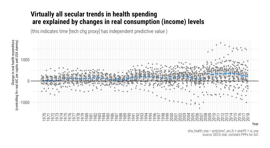
We observe some short term systematic effects here (e.g., global economic shocks). We also some very subtle secular trend — a systematic difference of perhaps $250 per capita over fifty-some years. Still, it’s apparent income explains virtually all of the long-run change we observed in high-income countries, and even these small, apparently independent, effects may disappear with a better modeling strategy (e.g., building in lags, averaging income, or adding another term to the polynomial).
On the other hand, the income relationship is almost entirely unaffected by the inclusion year fixed effects.

Likewise, when we model with country fixed effects — the slope is broadly similar.

For the most part, the country fixed effects and their associated residuals are very modest. The vast differences we observe between countries are generally well explained by income, and even most of those differences are transient (with rare exceptions).
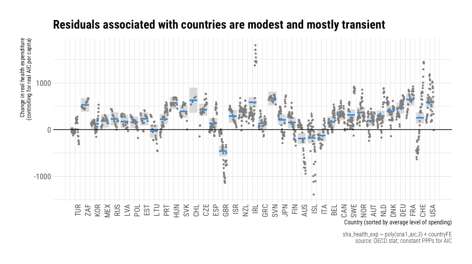
There are a small handful of credible instances where cost containment may have had some larger than expected effect, i.e., conditioning on income levels, but for the most part, there’s just not a lot of action here.7 Income remains highly predictive within and between countries.8
Seeing is believing
We can quickly show how health spending has evolved over time with real changes in the household perspective with animations. These are useful because they succinctly demonstrate the growth path within and between countries. We can see, for example, that there is little secular change in health spending unless it is accompanied by changes in the real household perspective. Likewise, we can observe that changes in the economic situation of households are a robust predictor of long-run changes between countries. The cross-sectional slope mostly aligns very well with the long-run growth path here.
Comparable results are obtained for AIC per capita.
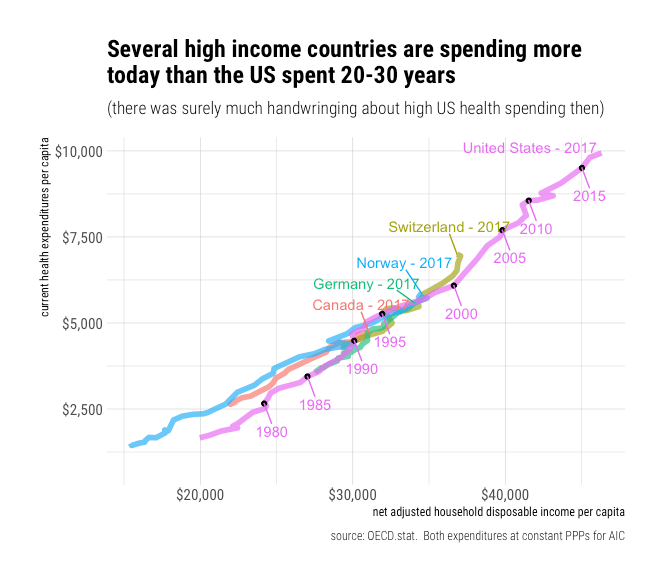
 US health spending has historically been quite consistent with what other countries have spent at comparable income levels.
 Though America likely diverged from the underlying trend starting in the late 70,s it converged a decade or two later. Current American spending appears to be very close to the trend observed in other OECD countries when extrapolated out.9
Relative income predicts relative health spending
Since some people presumably believe there’s some x-factor, which happens to be almost perfectly correlated with well-measured income levels in cross-section, it’s useful to show that relative changes in income levels are strongly linked to relative changes in health spending. That is, countries that have seen real income convergence with the United States have shown a strong tendency to converge in health spending and vice versa. Generally, comparable relationships are found throughout the OECD, so I’ll show a few notable examples for the sake of expediency.
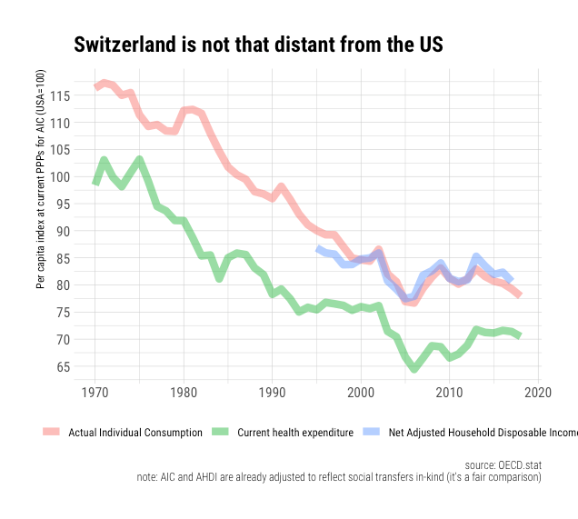
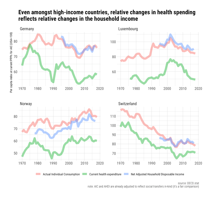 You might notice that Switzerland’s household income level is currently ~23% less than America’s and that it’s been declining relative to the United States since 1970 (which parallels the relative decline of their GDP until very recently).10
 Likewise, if we look a little lower in the income spectrum, we find a similarly robust relationship. Portugal, Italy, Spain, and Greece saw rather significant relative declines in health spending as their income levels further diverged following the housing crisis and associated economic distress.
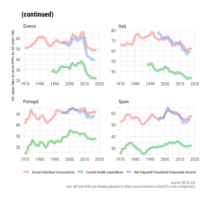 Conversely, those countries that have experienced real secular convergence have converged closer towards US health spending.
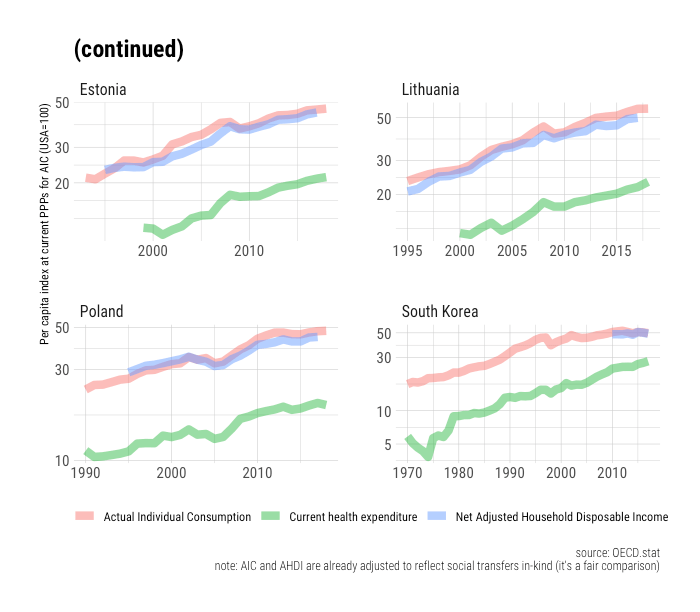 It’s also worth pointing out that where real GDP has evolved markedly differently, it’s visibly apparent health spending followed the household perspective rather than GDP.

Relative differences are explained with a polynomial growth model
Since the relationship between household income levels and health spending is non-linear, it may seem like the health spending gaps are more extensive than can be explained by well-measured income levels despite the apparent strength of the correlation. However, if we simply compare the fitted values from the polynomial model discussed above, we can see these the evolution of these gaps is very consistent with changes in the household perspective.
Keep in mind that we are comparing the United States to other countries here and thereby effectively doubling our error term (residuals for both countries). All the same, the differences are typically within a few percentage points, and they usually do not last for very long.
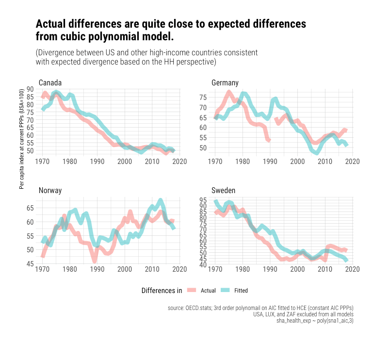

 It’s apparent these gaps are somewhat overpredicted in the 80s and 90s when the US departed from the trend, but outside of this, we see little evidence of systematic bias, and the model holds up well.

Click here for an animated version
Despite the progressive steepening, the model still holds up well.
I have not argued this process will continue on forever. Indeed, I have argued this is likely to stop well short of 100% of income. Still, I maintain average spending in the OECD at or beyond current US spending levels is the most likely outcome once these other countries have the real incomes Americans currently enjoy. We can learn from experience and extrapolate a fair way out to better predict future spending. In the absence of some fundamental limiting factor here, which no one has credibly enumerated, the smart money is on health spending continuing to grow apace as the real resources available to residents of other high-income countries approaches that most Americans take for granted today. Jason presumably believes otherwise.

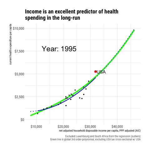
To this point, we can show that other high-income countries are still behaving in a fashion consistent with the polynomial model. For example, we can compare fitted vs. actuals for 2017.
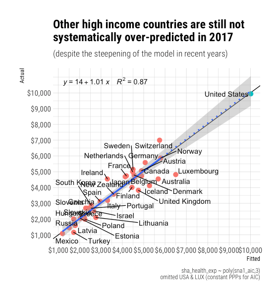
We can also look at their growth paths. There’s nothing here to suggest their tendency to increase spending as their incomes allow is falling behind the long-run predictions of the model. I must confess I am a little confused about the proposition that we ought to reach satiation well short of the current US spending levels. What’s so special about this particular point?
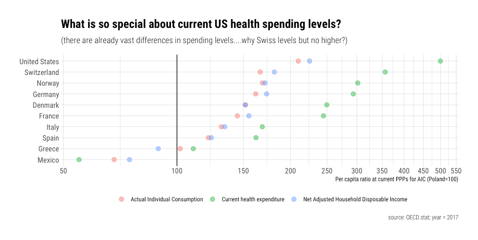
There are currently vast differences in health spending between countries. Consider, for example, that Switzerland spends 3.5 times more on health care than Poland, and even more than the likes of Mexico. Prices may slightly reduce the apparent expenditure, but it’s nonetheless evident that these differences are almost entirely real, and there’s every indication that countries want to consume a lot more health care as they can afford it.
Why should we presume the rest of the OECD will stop at, say, Switzerland’s current spending levels? Switzerland and other high-income countries appear to be increasing their spending even more rapidly as their income allows, and they haven’t obviously spent less than the US did are comparable income levels.
(Note: This addresses another confused argument Noah Smith amplified. )

For the record, one could well have “argued” equally well that OECD should have reached satiation ages decades ago with logistic regression curves on real GDP.
 It clearly has not worked out this way.
You can’t have your cake and eat it too
The conventional models that best explain health spending internationally indicate US health spending is quite well explained by its income levels.
For context, Switzerland has income and health expenditures “only” 22 and 30 percent less than America, respectively.
 These differences may seem significant when viewed in absolute terms. Still, in relative terms, which better reflect the nature of the empirically more reliable models, the US is much closer to Switzerland than Switzerland is to, say, Poland (let alone Mexico!), and these models have nonetheless help up well in this even more extensive range.
That out of the way, Jason’s arguments seem internally inconsistent.
He argues:
(1) outliers should be judged “relative to specific trends or models…An outlier is an outlier compared to something” [I agree!]
(2) one cannot extrapolate models out far from the observations [depends on the context!]
(3) The US is obviously an outlier [not in my model!]
Only when these are brought into “linear space” (absolute differences) does the US appear particularly distant from the rest of the OECD. The issues are magnified when the plot is cropped without the benefit of Switzerland in the frame.
Regardless, I could sort of respect a principled refusal to extrapolate out even slightly from any trend due to uncertainty about the trend. Still, even if one accepts that this is the correct framing (ignoring all evidence to the contrary!), one can’t very well argue (1) there is massive uncertainty about the trend and (2) that the US is still obviously an outlier. If we genuinely do not believe we can credibly extrapolate the trend, we also can’t claim to know the residuals in this region either, ergo discussion of “outliers” is entirely misplaced in this context.
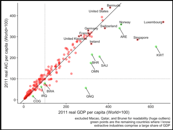
GDP is a poor way to judge this today
Jason also argued the US is an outlier based on GDP.

I don’t care to dispute this claim as it is at once trivially true (under some constructions) and utterly misses the point. I particularly don’t care to quibble over the share of GDP, as this adds a layer of an unnecessary layer of obfuscation. I am concerned with how much we actually spend and its causes. GDP is a proxy for the variable of interest here; it only predicts health spending to the extent it predicts the household perspective (AIC or AHDI). The other components of GDP affect the denominator without having any robust independent effect on the numerator.
For all intents and purposes, the population of countries (resident households) are the sole beneficiaries of health care and bare the entirety of its incidence.11 Monies spent on health care are resources that, in all likelihood, would otherwise still appear in the (adjusted) disposable income of resident households. Although the elasticity of health expenditure on the real income available to residents is very high, changing GDP has no significant effect on health spending if it does not also change the income available to a country’s population as measured by their real adjusted household disposable income.
Real GDP can and does vary systematically with the real income available to resident households primarily because (1) GDP measures production within borders12 (2) a significant and varying amount of income flows across borders13 (3) other resident sectors absorb varying shares of this income14 and (4) the price level of consumption varies with the average price level of GDP. 15 There are some other causes I could discuss16, but these particular globalization-related factors explain most of it.
Consider the case of Ireland in 2015.

As a share of GDP, net income flows out of Ireland were ~25% of GDP and the disposable income of non-financial corporations another ~25% of GDP.17 Both of these figures were unusually large and are surely explained by the outsize presence of foreign-owned corporations18. Still, this was Ireland’s official GDP, which was presumably calculated correctly according to National Accounts conventions, even though Irish households only enjoyed ~44% of what was presumably produced within their borders — an unusually low share.19
While Ireland may be a particularly pronounced example, it’s by no means the only one, and it’s the exception that proves the rule. Such factors play a significant and varying role across the OECD today. The belief that there must be a direct 1:1 relationship between domestic production (GDP) and household income (AHDI) was never based in reality. Still, these issues are much larger today due to the rise of globalization. Income and capital increasingly flow across borders, especially with the corporate sector, which makes it increasingly hard to use GDP to predict household income levels.

The United States is somewhat on the other side of this spectrum20. America combines a high real GDP per capita, with a high household share of GDP, with relatively low consumption-to-GDP price levels.21 Several other high GDP countries combine low household shares with high consumption prices.
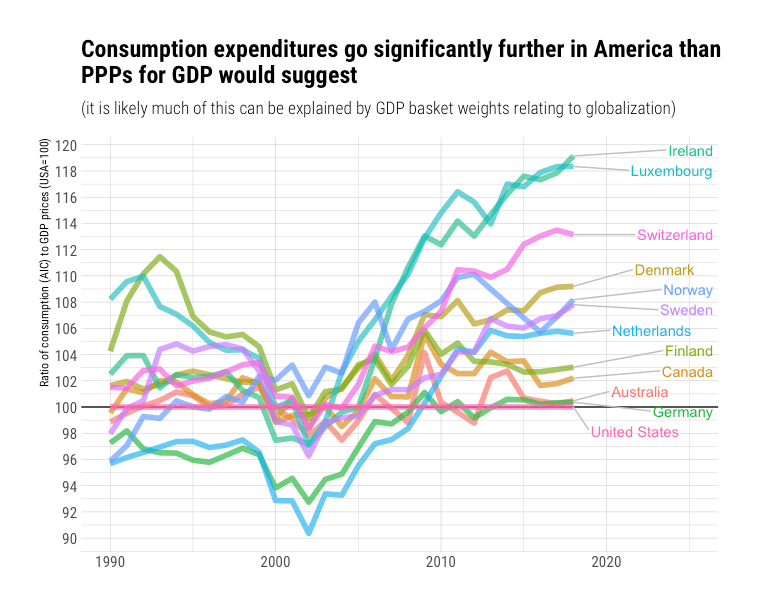
Consequently, there are considerable differences between real GDP and real household income.

Similar results are obtained for real final consumption in recent global data.22 It’s the real household perspective that drives spending. Hence we spend so much more than rest in health care in the long run, as in most other elastic expenditure categories. The implied differences between these two indicators can be vast because the elasticity on well-measured income available to households is so damn high, and the coefficients for other resident sectors are basically zero.
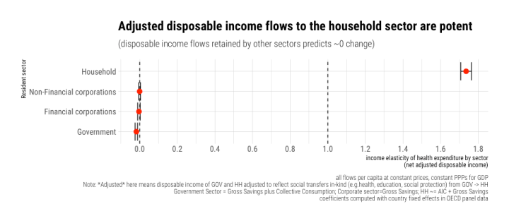 Even if health spending is crudely subtracted from the household sector’s income, the basic pattern remains the same (albeit with an even more significant coefficient).

Likewise, if we allow the slopes on these sectors to vary between countries in a random-effects model, we still find the household sector dominates consistently.
 Conditioning on real GDP per capita, we find that each 1% more than expected real AIC per capita predicts about 1.6% more than expected health spending per capita.
 Conversely, when we flip this process on its head and ask how much incremental information real GDP brings to the table, the answer is basically bupkis.

Even if we include country fixed effects to remove potentially fixed differences between countries, we still find the household perspective shines through GDP.

We also find real AHDI shines through real GDP.23

Likewise, for real AIC.24

Notes
(see below)
- The data I was working with then were downloaded around November of last year. Data are subject to revision, and OECD changed its PPP reference year. He may have downloaded newer data, or he may have digitized my plot, as he’s needlessly done several times before. Either way, this can introduce small differences in the coefficients that are largely irrelevant to my arguments and say nothing about my competence.
- The coefficients and expenditure data may look a little different due to revisions in the underlying data, and because OECD updated their reference year for their constant prices, constant PPP series.
- Yes, I excluded Luxembourg here. It’s a small city-state and a persistent outlier. Although the real household perspective is much more resistant to issues associated with globalization than real GDP, it’s not wholly immune. In the case of Luxembourg, amongst other issues, it’s fairly obvious their large non-resident workforce, and cross-border shoppers substantially skew their consumption basket. All the same, excluding the USA, still does not appreciably change the regressions.
- No doubt doubters can produce a slightly different model by changing the exclusion criteria (e.g., including a genuine outlier such as Luxembourg), and thus make the United States out to be more of an outlier. Such differences may appear large in absolute terms even though they’re modest in relative terms.
- It also produces biased results at middling incomes even to data with which it was fit, though it takes a large range of income or a lot more observations to be able to reliably detect this!
- AIC is a robust proxy for Adjusted Household Disposable Income (AHDI) and more widely available in OECD and internationally.
- I’d even argue that those countries with relatively stable residuals, which don’t obviously have unreliably measured income levels (e.g., Luxembourg), will eventually relent (further) on their rationing schemes, and regress back towards the trend. The UK/NHS, for example, clearly made a major correction upwards around the mid-2000s, and I don’t think they’re done with this sort of “reform.”
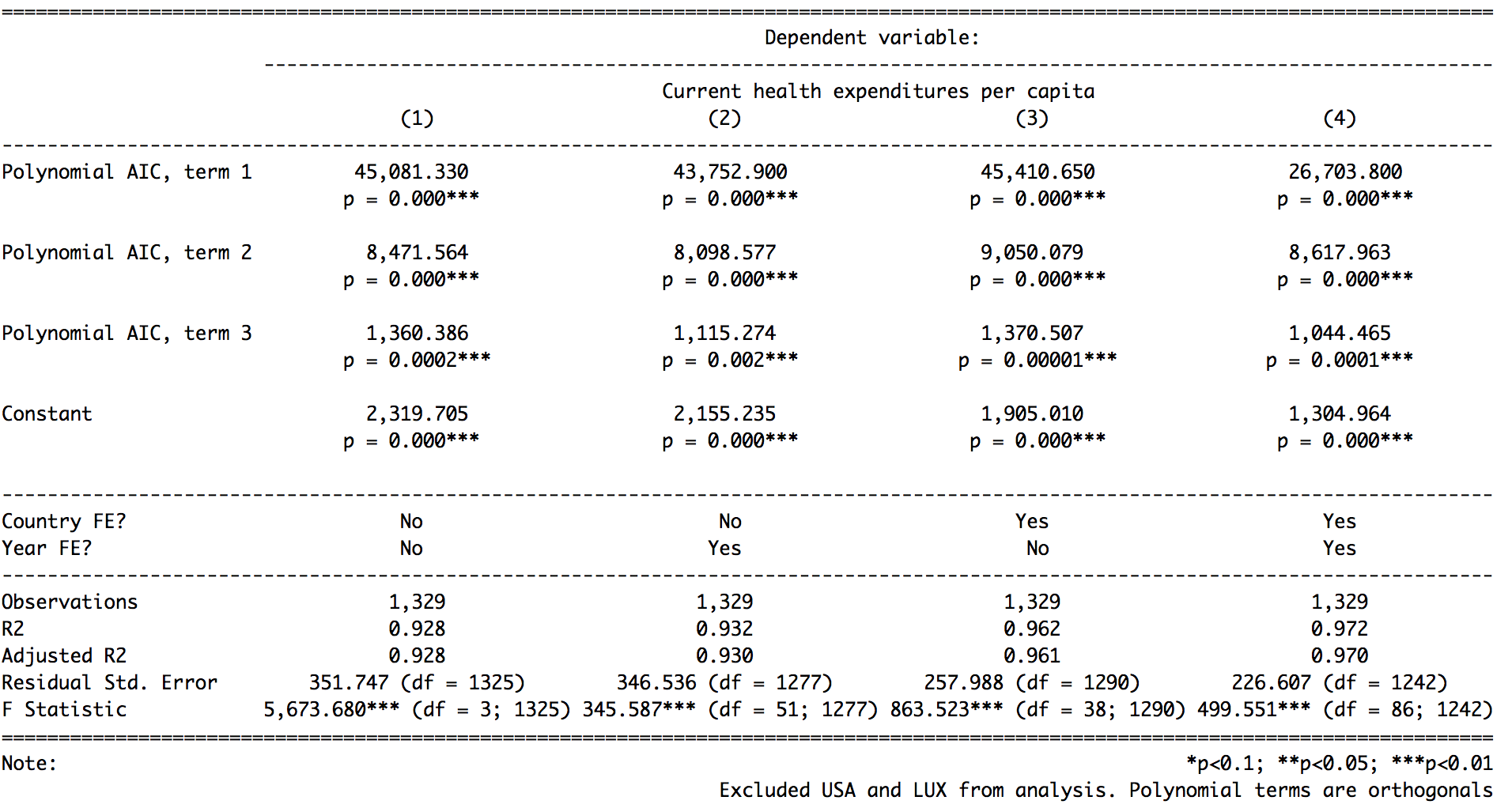
- If one controls for both country and year fixed effects simultaneously, the income effect is moderately diminishing. However, given lags, measurement error, and related issues, this is likely to be a result of over-control bias. We don’t find particularly significant effects with either separately.


That we still find a clear and convincing trend despite probable over-controlling bias invites more confidence.

- One can speculate this might change, but (1) this hasn’t happened yet, and (2) the slope shows every sign of steepening over time. I, for one, would not bet on this process stopping until the consumption shares of those categories that have been falling over time, thanks largely to productivity improvements, approach zero.
- The argument that America’s income levels are far too high to make reasonable inferences about expected health spending is a tad overwrought!
- At least in the developed world!
- It’s the value-add generated domestically, i.e., within borders. In national accounts, this is distinct from the national concept.
- For example, net primary incomes, such as dividends, rent, employee compensation, and net secondary incomes (transfers), such as remittances.
- Other resident sectors include non-financial corporations, financial corporations, and government. In the main, this comes down to the retained earnings of the non-financial corporate (NFC) sector. There has been a large build-up of savings amongst NFCs, which is associated with foreign ownership, and which largely has not been used for capital investment (mostly net lending). Even when these flows are actually invested into domestic capital stock, it’s necessarily not a safe assumption the resident households of a country hosting these corporations are the ultimate beneficiaries of this investment.
- Individual consumption is typically the primary component of GDP expenditures, but GDP also includes gross capital formation, net exports, and collective consumption. When foreign ownership and other global factors play a large role, these other components are apt to take on larger weights and thus systematically alter skew PPPs for GDP relative to the consumption subcomponent.
- Norway, for example, is something of a special case. The GDP accounted for by Norway’s oil production is an inherently temporary and highly volatile income flow (oil prices). Petro states like Norway can’t consume out of their income like most other countries of the same GDP would because of these issues — they’d otherwise risk serious economic problems should the price of oil collapses or when the oil runs out. Their permanent household income levels are considerably lower than their current GDP would suggest. Regardless, Norway’s government has effectively taken the decision out of the hands of individuals (households) since most of these free oil revenues get deposited into their sovereign wealth fund, i.e., the resources aren’t available to Norwegians to consume or save on their own accounts.
- While I’m expressing this as a share of GDP to drive home the magnitude, the total disposable income of resident sectors need not add up to 100% of GDP, likewise for their consumption and gross savings.
- Affiliates of foreign-owned corporations are counted as residents for the purposes of national accounts. Although we can observe income leaving the economy in the form of dividends, rent, etc. when we observe Gross National Income and Gross National Disposable Income, that which isn’t distributed or paid to employees, i.e., the savings retained by the corporate sector, may still ultimately accrue to the benefit of residents of other countries due to the global nature of capital today.
- Due to the incentives to shift the appearance of profits (profit shifting) to corporate tax shelter countries, such as Ireland, there can be some debate as to how much value-add was truly generated in Ireland, especially with IP-intensive companies like Apple.
- No doubt in part because the United States is home to several of these large corporations that inflate the much smaller economies like Ireland and the Netherlands. However, our economy is much, much larger, so these inflows have very subtle effects on our economy while they are blatantly obvious in the likes of Ireland.
- The price level tends to rise with nominal GDP due to rising wages. Countries that keep consumption prices relatively low will tend to have higher real consumption even at the same real GDP.
- Real final consumption is conceptually equal to real Actual Individual Consumption (AIC) plus real collective consumption. America is no slouch in collective consumption either, but we mostly care about the household perspective here, as in AIC. The differences in the household perspective are even larger than indicated by final consumption (it’s likely costs associated with hosting global trade increases the need for collective consumption in some economies).
- I quite intentionally did not include a USA dummy here to show how the divergence between the real household perspective and real GDP can explain much.
- I would not try to read too much into residuals for particular countries or observation years. The relationship between well-measured income and health spending is even more non-linear than log-log regressions would indicate. We’re also taking both health spending and HH measures as a residual of GDP (a proxy). Though this gives us a general sense of the relative magnitude of these different predictors, it’s not an optimal way to model anything.
