Disclaimer: The title of this post is somewhat tongue-in-cheek and I fell slightly short of one million charts. Also, Noah probably isn’t wrong about everything he’s ever said on this topic, just the central points under contention, and he has tons of company.
Noah Smith (Noahpinion) recently published a column in Bloomberg with the title “Health-Care Costs Are Still Eating the U.S. Economy.” This came to my attention because he was kind enough to link to my blog when he alluded to my arguments on health spending. Though there are obvious areas of agreement (e.g., that health spending has risen faster than income; that the so-called “cost curve” hasn’t been bent; that rising health spending puts a very real crimp on take-home paychecks amongst the working class), I strongly disagree with the central arguments he advanced and feel that he did not quite accurately characterize my views.
Noah wrote:
“In sum, health care is still eating the economy, and that’s still cause for alarm….Why is this happening? Some argue that the U.S. is just very rich, and that prosperous countries choose to spend more on health care, which drives up prices. They note, for example, that although U.S. health-care spending is unusually high as a percent of gross domestic product, it’s not th at high as a percent of individual consumption. But this isn’t very convincing, because consumption is a result of high health-care prices as well as an effect — high health care prices force Americans to use more of their income than people in other rich countries.”
He seems to misunderstand the argument and appears to be insufficiently aware of the evidence against his assertions. Since he is surely not alone in these thoughts, I am going to put some time into weaving together statistical evidence, supporting data, and thoughts I have strewn over a good number of blog posts, tweets, etc. over the years. My goal in this post is to parsimoniously explain the evidence at multiple levels, clear up misperceptions, and address probable objections for the benefit of those that have invested considerably less time into assessing the evidence for themselves.
(warning: this is going to be even longer than usual).
Income and causation
On material living conditions and its role in health spending
Practically all informed people recognize income is a particularly strong determinant of national health spending. Many of these same people also argue the US spends too much using Gross Domestic Product (GDP) as their preferred income measure.

source
The problem is GDP is not even particularly a good proxy for the income of households (individuals). GDP is designed to measure how much value add is produced within domestic (territorial) boundaries. It usually does a fairly decent job of this, but it does not directly tell us about the household perspective, as in, the average level of real incomes or real consumption enjoyed residents of a country (a.k.a. “material living conditions“). Most importantly, it is an increasingly unreliable proxy for this concept.
My position is national health spending is overwhelmingly determined by the average real incomes of countries’ residents in the long run (differences in propensity to consume may have a small role to play). The elasticity of national health spending with respect to reasonable measures of income or consumption is exceptionally high, averaging around 1.6 in OECD panel data, meaning that a 1% increase in income is expected to increase health spending 1.6% at a national level. Americans are exceptionally rich by these same measures, so it is hardly surprising we spend a tremendous amount on health care — far more than would be implied by simple regressions with GDP and far more than most people appreciate.
I first made this argument with Actual Individual Consumption (AIC) because it is a good indicator of material living standards and because that data was more readily available at the time. AIC is a comprehensive measure of household consumption that is adjusted for government transfers in-kind (e.g., health, education, etc.). Unlike earlier measures of household consumption (e.g., household final consumption) found in National Accounts, it does not systematically under-estimate the material welfare of social democracies where in-kind transfers constitute a substantially larger fraction of comprehensive household consumption or disposable income.

I subsequently demonstrated this same point using (Gross|Net) Adjusted Household Disposable Income (AHDI). Net Adjusted Household Disposable Income is little more than AIC plus Net household savings.
Note: “Net” simply means savings have been calculated to reflect consumption of fixed capital — basically depreciation — whereas “gross” does not account for this.
Unsurprisingly, wherever the data are available, they tend to be exceptionally well correlated.
For example:

So it can hardly be surprising the results don’t much change vis-a-vis health spending or representations of material living conditions. Even when we don’t have AHDI available directly, we can be reasonably sure AIC is a good proxy for it and vice versa.
Like Gross Domestic Product (GDP), these economic aggregates are derived from National Accounts (SNA and its domestic counterpart). However, GDP and GNP are measures of production; they were designed for different purposes, and they actually measure different things. Although these measures are typically reasonably correlated, with AIC averaging around 70% of GDP, (Net) AHDI a smidge more, the relationship between production and welfare variables can vary quite dramatically within countries over time and between countries for systematic reasons. Significant differences can persist for quite a long time, and they are often explicable. Contrary to popular impression, it’s often not just transient noise.
Here are the primary reasons GDP does not relate directly to the household perspective:
- The movement of primary incomes across borders
- The incomes earned by non-resident workforces follow the workers home even if earned within the territory
- The incomes earned by foreign-owned corporations/quasi-corporations are counted in GDP even when distributed as dividends, rent, etc to residents of other countries.
- The movement of secondary incomes across borders
- Personal transfers, remittances, foreign aid, and international cooperation can raise or lower the standard of living in some countries in ways that are not reflected in GDP.
- The allocation of disposable income between domestic sectors
- In some countries, the corporate sectors account for a considerably larger share of GDP and/or national disposable income in the form of retained earnings (which don’t necessarily accrue to the ultimate benefit of residents).
- Differences in gross fixed capital formation requirements
- Some countries need to invest considerably more and face higher rates of depreciation just to maintain production levels.
- Higher rates of corporate investment, for example, might be better ceteris paribus, but countries with higher rates of investment aren’t necessarily better off.
- GDP itself may be systematically miscalculated due to corporate tax avoidance whereas the household perspective is relatively more immune to the incidental effect of this gaming.
- The prices faced by consumers are not the same as those faced by producers.
For these and several other reasons, the relationship between GDP and measures of material living conditions varies substantially between countries and within countries over time.
Histogram of AIC as a percent of GDP

Histogram of disposable income as a percent of GDP

Household material living conditions can evolve quite differently than GDP over many years.

And the cross-sectional relationships can vary over time (note: the connection has decayed notably in the OECD over the past few decades).

These measures enjoy substantial theoretical support.
AIC and AHDI are identical to those recommended by Joseph Stiglitz, Amartya Sen, and other notable economists in the “Report by the Commission on the Measurement of Economic Performance and Social Progress” (a useful primer) and they have been part of System of National Accounts (SNA) for quite some time. These indicators have a strong theoretical basis, and they are widely preferred by experts over oft-cited production measures (e.g., GDP) when we want to compare how many resources households actually have at their disposal.
Here are some relevant quotes that speak to some of the issues:
Adam Smith – An Inquiry into the Nature and Causes of the Wealth of Nations:
“Consumption is the sole end and purpose of all production; and the interest of the producer ought to be attended to only so far as it may be necessary for promoting that of the consumer. The maxim is so perfectly self-evident that it would be absurd to attempt to prove it.”
Simon Kuznets – 1934 Report to Congress:
“The valuable capacity of the human mind to simplify a complex situation in a compact characterization becomes dangerous when not controlled in terms of definitely stated criteria. With quantitative measurements especially, the definiteness of the result suggests, often misleadingly, a precision and simplicity in the outlines of the object measured.”
[snip]“The welfare of a nation can, therefore, scarcely be inferred from a measurement of national income as defined above.”
1993 System of National Accounts:
“GDP is a measure of production…movements of GDP on their own cannot be expected to be good indicators of changes in total welfare unless all the other factors influencing welfare happen to remain constant, which history shows is never the case…Disposable income as measured in the System can be compared with the concept of income as it is generally understood in economics. From a theoretical point of view, income is often defined as the maximum amount that a household, or other unit, can consume without reducing its real net worth.”
2008 System of National Accounts:
“Per capita growth rates in real national income or in real actual consumption generally provide a better measure of the changes in the average “welfare” of a country’s population than the changes in GDP volumes. GDP is a measure of production within a country but the inflows or outflows of income from or to the rest of the world can have a significant effect on both the level and growth rates in real national income per capita. Similarly, the level and growth rates in GDP volumes can differ significantly from those in the final consumption of households because of the varying shares across countries of capital formation and net exports within GDP.”
[snip]“The adjusted disposable income of a household can be interpreted as measuring the maximum value of the final consumption goods or services that it can afford to consume in the current period without having to reduce its cash, dispose of other assets or increase its liabilities for the purpose. Its consumption possibilities are determined not only by the maximum amount it can afford to spend on consumption goods and services (its disposable income), but also by the value of the consumption goods and services it receives from government units or NPISHs as social transfers in kind.”
Report of the Commission on The Measurement of Economic Performance and Social Progress:
“In a world of globalization, there may be large differences between the income of a country’s citizens and measures of domestic production, but the former is clearly more relevant for measuring the well-being of citizens…the household sector is particularly relevant for our considerations, and for households the income perspective is much more appropriate than measures of production.”
The Report — [Recommendation 1: Look at income and consumption rather than production]
“GDP mainly measures market production…. However, it has often been treated as if it were a measure of economic well-being. Conflating the two can lead to misleading indications about how well-off people are…Material living standards are more closely associated with measures of net national income, real household income and consumption – production can expand while income decreases or vice versa when account is taken of depreciation, income flows into and out of a country, and differences between the prices of output and the prices of consumer products.”
The Report — [Recommendation 2: Emphasise the household perspective]
“While it is informative to track the performance of economies as a whole, trends in citizens’ material living standards are better followed through measures of household income and consumption. Indeed, the available national accounts data shows that in a number of OECD countries real household income has grown quite differently from real GDP per capita, and typically at a lower rate. The household perspective entails taking account of payments between sectors, such as taxes going to government, social benefits coming from government, and interest payments on household loans going to financial corporations. Properly defined, household income and consumption should also reflect in-kind services provided by government, such as subsidized health care and educational services. A major effort of statistical reconciliation will also be required to understand why certain measures such as household income can move differently depending on the underlying statistical source.
Understanding National Accounts, Second Edition [OECD publication]

In short, while GDP is not always a wholly unreasonable proxy in lieu of better alternatives, we reliably know it is not actually directly measuring the variable of interest (the resources available to residents), and we see this proxy (GDP) can be wildly misleading.


In summary, if we want to compare the resources available to residents of countries to spend, we should strongly prefer measures of material living conditions (direct measures) over indirect economy-wide production measures like GDP wherever the data allows.
This is about prediction and causality.
Contra Noah, my argument is not merely that US health spending “is not that high as a percent of individual consumption” whereby presumably changing the denominator from GDP (territory-wide production) to AIC (comprehensive household consumption) makes US health care look less unreasonable. It goes far beyond the United States or which denominator we reference. My position is the average level of real resources available to residents of a country is the ur-cause of the vast majority of health spending everywhere and that AIC and AHDI are plainly superior measures of this, ergo these indicators are vastly superior means to evaluate the efficacy of cost containment regimes everywhere.
As a proxy for the actual causal variable GDP is (increasingly) subject to various types of error. These errors both attenuate the apparent relationship between income and health expenditures in general and, specifically in the case of the United States, undoubtedly lead to dramatically downwardly biased predictions. We can do better.
Note: Economy-wide production, as measured by GDP, is clearly very important in the long run, but countries differ in their endowments, and there is not a simple linear relationship between measured GDP at any point in time and current income, or even the permanent income, countries’ residents — the r-squared is clearly much less than one. This is not an argument against the importance of production or even of the utility of GDP as a measurement for any and all purposes, but mostly an argument against naive application of it. We have better tools to understand how and why households behave as they do. The “rubber meets the road” at the household level in health consumption, even if mediated mainly by public and private institutions in the short run, as in most other forms of consumption.
AIC and AHDI are theoretically and empirically much more robust indicators of the resources available to residents of a country to spend or save. GDP only significantly determines health spending to the extent it determines material living conditions and the relationship between these indicators varies in the spatial and temporal dimensions.

This fits essentially no high-income countries on the regression line–indeed, they increasingly diverge! If one accepts GDP is reasonably well measured amongst high-GDP countries, and that “income” (GDP) is a strong determinant of health spending, this really ought to raise eyebrows. Clearly, something is rotten in the state of Denmark.
I say the meager health spending of most of these presumably high-income countries is remarkably consistent with their sub-par material living standards conditional on GDP. It is surely no coincidence that virtually all of these same countries tracks with their comparatively modest material living conditions.

We can also see some evidence of this in OECD panel data.

Likewise, we find AIC mediates GDP in this same USA-free panel data.

The 3rd specification above does relatively little to improve model fit and is likely over-fitting to some degree (it’s picking up defects in the model), nonetheless, it suggests changes in GDP means little for health spending without corresponding changes in AIC.
Alternatively, if we subtract AIC from GDP [note: this leave us with a figure comprised of collective consumption, gross capital formation, and net exports as defined in GDP expenditure method] so that the two predictors used in the 3rd model sum up exactly to GDP (expenditure method):

Model 3 implies that a 1% increase in AIC yields a ~1.43% increase in health spending whereas a 1% increase in everything else GDP (i.e., GDP-AIC) yields only ~0.11% increase (an order of magnitude less).
Lest you imagine this is some sort of mechanical effect, a consequence of health spending being included in AIC, we see similar patterns when we crudely subtract health from AIC!

The comprehensive household consumption is the clear victor over GDP in this horse race. These patterns become even more pronounced the more these indicators diverge, as in broader international data (not just OECD) and in cross-sectional analyses of OECD data from more recent years. We also find very consistent patterns in the cross-sectional data (i.e., between countries by year) and time-series for the vast majority of nations (wherein elasticity for health spending on AIC is clustered well north of 1 and GDP around 0, likewise for r-squared coefficients, etc.).
Household disposable income mediates GDP and other domestic sectors at least as well.
When we try to predict health spending using adjusted disposable income or the distribution of GDP according to its institutional sector (+RoW), we find a very consistent pattern: the resources (disposable income) in household sector are vastly more important than everything else. The resource found in the household sector effectively mediate everything else in GDP.
For example, in OECD panel data using Gross Adjusted Housing Disposable Income we find the coefficients for the household sector are several orders of magnitude larger than that for all other sectors combined and separately (including, notably, government!).

Similarly, if we assess these relationships as time series for each country, it’s quite evident that elasticity with respect to the household sector is clustered well north of one whereas it’s grouped around zero with respect to other sectors (government and corporate sectors).

Likewise, even if we subtract health spending from the household sector (RE: the mechanical argument), we find the same pattern.

We can also plot these regression coefficients, along with confidence intervals, to compare the effect of disposable income in the household sector versus government (see earlier link to see the other sectors–not much different)
elasticity with respect to household disposable income less health spending

elasticity with respect to government disposable income

It abundantly clear that GDP that shows up as disposable income in the household sector is vastly more predictive than GDP allocated elsewhere (e.g., rest of the world and other institutional sectors within the country). Clearly, this cannot be explained as a US-only phenomenon or as a mechanical consequence of how we allocate healthcare to household consumption or disposable income.
These measures are also superior predictors of just about every socially relevant metric!
This is not just about health spending! AIC is also a substantially stronger predictor than GDP with respect to the vast majority of socially relevant outcomes and their covariates. AIC also tends to mediate GDP for the vast majority of the variables we would associate with “wealthy” countries, whether for good (usually) and for ill (e.g., obesity rates).
Note: Most of these the outcome variable assessed below are lagged by several years relative to our economic predictors (FY 2011), suggesting this is picking up something more than just short-lived benefits of consumption.
Health outcomes
For example, AIC is substantially better correlated with nearly all of IHME’s health access and quality metrics.

Unsurprisingly, we find AIC mediates GDP in multiple regression (OLS) for these same metrics.

Note: The flipped associations for some cancer rates is likely a consequence of higher rates of diagnosis and longer life expectancy in rich countries. It is consistent with AIC being a better predictor of real health care consumption (quantities) and overall health outcomes.
Social Progress Indicators
To give another example, we find AIC trumps GDP with just about every metric available via the Social Progress Index.


World Happiness (survey measures)


Prosperity Index
Legatum’s Prosperity Index, a measure of business and economic conditions


Eurostat Quality of Life
These patterns described above aren’t likely to just be a consequence of some exceeding poor or backward countries because we find much the same in Eurostat’s QoL measures (mostly high-income countries)


Survey-based estimates of disposable income
AIC also aligns better with survey-based estimates of disposable income like Luxembourg Income Study (LIS).

While these survey-estimates are, in my view, quite flawed (substantial missing income, missing taxes, etc.) and inferior to their National Accounts-based cousins, it’s nonetheless notable that AIC does a better job picking up the signal they do detect.

There is much, much more I could show along these lines (I probably already wasted too many inches of screen space!), but the pattern ought to be clear: measures of material living conditions are not always well correlated with production across the whole domestic economy for a variety of reasons. None of this means that production (GDP) isn’t ultimately important, but it does suggest the relationship between measured production within territorial boundaries and the welfare of residents of a country is not as straight-forward or as tightly linked as some like to imagine. When the relationship between these aggregate measures diverge notably, we should put much, much more (instrumental) weight on the likes of AIC and much less weight (~0) on the likes of GDP if we’re interested in these sorts of questions, e.g., people, their preferences, household budgets, and lifestyle.
The US is not much of a consumption outlier.
Contrary to what Noah and others seem to imply, the US does not exactly stand-out in its consumption (AIC) to GDP ratio or its disposable income (AHDI) to GDP ratios. Amongst the OECD dataset (relatively high-income, high-HDI countries), the US is reasonably close to trend — a smidge high, but not particularly so.

Luxembourg, Norway, Ireland, and Switzerland, on the other hand, lie much further away from the trend and far below it. This is very likely a consequence of idiosyncratic features of these countries, such as their economies’ exceptional economic reliance on cross-border workforces, corporate tax inversions, banking and financial services, and (temporary) oil-exports, which critically reduces the statistical relationship between material living conditions and measures of production (e.g., GDP).
Given the very high elasticity of health spending with respect to material living conditions (~1.6), these high-GDP outliers with large negative residuals will dramatically reduce the apparent “income” to health expenditure relationship if one imagines GDP is a good stand-in for individual income and does not selectively omit them from consideration. It is not as if these countries are unusually disciplined with respect to how they spend on health, most of the implied resources (GDP) over and above the EU28 mean just don’t show up anywhere in the household sector. As regards current health expenditures, their spending is far better understood concerning the resources available to residents (the Y-axis) than the amount of economic production happening within territorial boundaries for national accounting purposes (the X-axis).
We see much the same in the broader international picture (World Bank 2011 ICP).

(Or without trimming the particularly extreme outliers)

This is mostly about differences in the disposable income of households.
I have tended to use the consumption approach to material living standards because AIC is more widely available and probably slightly more reliably measured, but wherever the estimates are available or can be calculated from its constituent parts, it yields very consistent answers. Of course, this is not surprising given how closely household consumption and disposable income are correlated (which is likely attributable to the relatively small role differences in household savings rates play, both on a raw and “adjusted” basis).
For example, the patterns we find concerning net adjusted household disposable income as reported in OECD’s latest “Better Life Index” metrics are very similar.


Like we find with consumption (AIC), US net adjusted household disposable income is also apparently high conditional on GDP.

As I mentioned earlier, US consumption appears to be very much in line with its high disposable incomes.

Despite what many seem to believe, the US household savings rate actually compares quite favorably with much of Europe when disposable income is measured in a way that is invariant to whether government provides a relatively high proportion of goods and services in-kind (as opposed to them being purchased privately by households) — see health, education, etc.
Even if we don’t adjust it sensibly, US household savings rates are merely middling (and haven’t changed much over the past 20-30 years). If we use the more sensible “adjusted” measure of disposable income (AHDI), the US moves up in relative terms because the denominator in many social democracies is artificially low due to the relatively larger role of in-kind transfers in those countries [without adjusting for in-kind transfers the US lead in disposable income is far larger still].

Or, perhaps more revealing, comparing the trend in household financial net worth to comprehensive household consumption:

We can also compare a snapshot of household savings to GDP.

This is mostly about differences in the income actually enjoyed by households. The apparently high consumption of US households conditional on GDP is well explained by the high adjusted disposable incomes conditional on GDP.
Nor does this hinge on the exclusion of collective consumption.
I initially settled on indicators of material living conditions (the household perspective) because that is what economic theorists have settled on for welfare analysis. Many theorists argue collective consumption is (mostly) extraneous for welfare analysis; that it is an intermediate input to produce the welfare we measure at the household level. To quote the commision:
“Expenditures required to maintain consumption levels or the functioning of society could be viewed as a sort of intermediate input – there is no direct benefit, and in this sense they do not give rise to a final good or service. Nordhaus and Tobin, in their seminal 1973 paper, for example, identify as “defensive” those activities that “are evidently not directly sources of utility themselves but are regrettably necessary inputs to activities that may yield utility”. In particular, they adjust income downwards for expenditures that arise as a consequence of urbanization and a complex modern life. Many such “defensive expenditures” are incurred by government, while others are incurred by the private sector. By way of example, expenditure on prisons could be considered a government-incurred defensive expenditure and the costs of commuting to work a privately-incurred defensive expenditure.
[snip]First, focus on household consumption rather than total final consumption. For many purposes, the former is a more meaningful variable. And all of governments’ collective consumption expenditures (which would include things like prisons, military expenditure and the clean-up of oil spills) are automatically excluded from household final consumption.”
My own study mainly supports this: collective consumption is a much weaker predictor of health spending and the vast majority of other things we care about. That being said, the results I have found really do not hinge much on whether we try to predict with final consumption (AIC+collective consumption) or AIC alone.
In other words, US final consumption is still high conditional on GDP because US collective consumption is also actually quite high and final consumption tends to correlate quite well with AIC in practice.

The US is no slouch in collective consumption either.

So it can hardly be surprising the US residual is similarly modest concerning final consumption.

Nevertheless, I still prefer the household perspective (AIC, NAHDI, etc.) because of its theoretical strength and because it holds up better in repeated analyses I have performed.
For example:

Even if we crudely “adjust” AIC by removing health spending to address the “mechanical effect” objection, as in model 4, it still mediates collective consumption quite clearly.

The disagreement is mostly attributable to differences in the GDP share of the corporate sector and the flow of incomes across borders.
While the household perspective is surely the one we should be concerned with for our purposes, some people argue these results are primarily a consequence of some combination of differences in government savings/borrowing/investment or (collective) consumption behavior. One effective way to speak to this concern is to just combine the Net National Disposable Income (NNDI) of the household and government sectors together as if they were one entity, and compare it to the size of the corporate sector and Other (non-NNDI) as a share of GDP. NNDI is consumption + net savings, so this effectively addresses concerns over in differences in real savings too.

The combined sector for the US is still above average as a proportion of GDP, but more importantly, several countries in Europe are way below average. Their shortfall is explained both by proportionally larger corporate NNDI and “Other,” i.e., expenditures included in GDP not found in NNDI. “Other” includes things like consumption of fixed capital (depreciation) for all sectors, but it’s mostly large observable differences in net primary incomes (e.g., dividends, wages, rent, etc.) and, to a lesser degree, net secondary incomes (e.g., remittances) moving outside domestic boundaries. In some countries, such as the United States, the income going-in in modestly exceed those going out whereas, in others, such as Ireland and Luxembourg, they’re massively going out on balance (as a proportion of their small economies).
Another way to visualize this:

This gives a rough indication of how much is across borders (or depreciation) and how much is between domestic sectors (households+goverment vs. corporations).

Ireland and Luxembourg are just two particularly pronounced examples. However, similar patterns have been playing out elsewhere in less apparent but still cumulatively significant ways vis-a-vis the predictive powers of GDP and its association with the variable of interest. They are even more substantial when magnified by differences in GDP per capita and differences in PPPs (consumers vs. producers).

Differences in the relative size of the government sector, neither its savings nor its (collective) consumption, can’t explain away the US lead and, especially, the apparently large residual vis-a-vis GDP.
It’s also notable that US government net lending appears to be pretty close to its long-term average.

Nor have US household savings obviously departed from their long-term average.

Overall these results are consistent with the different impacts of globalization and the increasing importance of directly measuring material living standards instead of relying on proxies like GDP. [You might try reading this for a discussion of differences in the evolution of GDP and AHDI]
Nor is it likely US consumption has become detached from economic fundamentals.
As argued recently by Karen Dynan and Louise Sheiner in a Brookings paper on GDP and welfare, real GDP and real consumption have moved near identically in the US.


In other words, while the consumption share of GDP may have increased a few percentage points in nominal terms, it’s not “eating the US economy” in real terms. The difference between nominal and real movements must be resolved by differences in the evolution of price indices for producers versus consumers. This, in turn, is likely substantially explained by substantially under-estimated increases in nominal GDP (which probably relates to transfer price, profit shifting, etc.– which is reflected in differences in net exports, capital investment, etc.)
To quote Sheiner and Dynan:
“the rise of global supply chains and the legal latitude that companies have in declaring in which countries their economic activity takes place lend material downward bias to estimates of U.S. nominal GDP. In particular, ‘transfer pricing’ and other practices allow multinational enterprises (MNEs) operating in the United States to underprice the sale or lease of intangible assets—such as blueprints, software, or new drug formulas—to affiliates in low-tax jurisdictions so that more of their profits are booked in these countries.
The economic importance of such transactions has been documented in a variety of ways. For instance, in 2012, a Senate subcommittee questioned Microsoft about its agreements to shift some R&D costs and regional royalty rights to affiliates in Singapore and Ireland… In 2013, the subcommittee found that Apple used favorable transfer pricing agreements to shift billions of dollars of profits from the United States to Ireland… More generally, Hines (2005) and Lipsey (2006) show that U.S. MNEs register more profits in tax havens than can plausibly be accounted for by economic activity. [researchers] find that U.S. companies that have a cost sharing agreement with a foreign entity appear less productive than similar companies without such an agreement, and foreign companies that have a cost sharing agreement with a parent company in the U.S. appear more productive than similar foreign companies. A 2016 OECD brief described how such transactions drove a 26 percent increase in measured GDP in Ireland in 2015. And, Tørsløv, Wier, and Zucman (2018) estimated that nearly 40 percent of multinational profits are shifted to low-tax countries each year.
Under current methods, transfer pricing and profit shifting have led to an understatement of both nominal GDP and nominal gross domestic income (GDI). Consider the example of a smartphone whose software, blueprints, and branding are developed in the United States. If the phone is assembled in the United States, then the full value of the phone (priced at its market price) is included in GDP. If the phone is assembled abroad, then so long as the contract between the company doing the assembly (e.g. Foxconn) is an arm’s length transaction, GDP will still be correctly measured, as it will include the value of the phone less the amount paid to the foreign assembler. However, if a foreign-affiliate of the U.S. company is introduced in the transaction, GDP could end up understated. Here’s one way this could happen: the U.S. company leases the rights to the intangible capital—the software, blueprints, and branding—to an affiliate in a low-tax country (say, Ireland) and it prices that lease at a value that is much less than its market value. Then the Irish affiliate contracts with Foxconn to do the assembly. Phones are then exported from Ireland to the United States and from Ireland to the rest of the world. In this case, only the value of the lease from the U.S. company to the Irish company will be included in U.S. GDP, and if this lease is priced at an artificially low level, U.S. GDP will be too low as well.
Under current methods, estimates of imports associated with sales of the phone in the United States will be too high because the economic activity associated with the leased assets is unlikely to be attributed to this country. In particular, imports will be too high (because they will overstate the Irish content of the phone imported from Ireland), and exports will be too low (because they will understate the U.S. content of phones exported from Ireland to the rest of the world). The same bias would occur in GDI because of the understatement of the company’s U.S. earnings. Note that this transaction works because there is intangible capital that is hard to value and hard to pin to a location, and because the Irish company is an affiliate of the U.S. company, so that it does not matter to shareholders whether the Irish affiliate or the U.S. headquarters books the profits.
This problem is of increasing concern both because of the evidence discussed above regarding the importance of profit-shifting in today’s economy and, more generally, because of the growth in MNE activity in recent decades. MNEs are now a large part of the global economy… they accounted for $4.7 trillion of global value-added in 2017, an amount that was about the size of the fourth largest economy in the world at the time. The statistical community recognizes the issue, and the international statistical guidelines most recently adopted by the United Nations Statistical Commission (System of National Accounts 2008) called for estimates of the production activity of MNEs to reflect the economic ownership of intangible assets rather than the legal ownership.
Nevertheless, the near identical movement of real GDP and real consumption in the US does not mean we can necessarily expect the same in other countries’ time-series or that there is any closer of a correspondence between real GDP and real consumption (or household disposable income) in cross-sectional analysis than I have already shown at length. Quite the opposite, given the increasing challenges of accurately measuring GDP as a result of globalization, measuring consumption (or consumption possibilities for AHDI) directly becomes relatively more important for tracking the evolution of material living conditions between countries.
US health spending did not diverge from other developed countries until material living standards diverged from GDP internationally.
US health spending was thoroughly unremarkable for most of the seventies (and even later).

Despite the fact that one could tell the same story about the alleged importance of market failures in health care, excess health inflation, high physician wages, and so on and so forth before, the United States was not the highest spending and it was very close to the GDP-indicated trend up until around the late-70s to early 80s. If these presumably distinguishing factors didn’t cause relatively high expense before, why should we believe they explain high spending now? What changed?
I submit it’s no coincidence that US material living standards, while always high by OECD standards, did not start to diverge from other high GDP countries until around this same time period.

This difference, however, owes less to the change in US behavior than the much more substantial change amongst a handful of small high GDP countries, the combined effect of which broke the strong relationship between AIC and GDP that had existed previously within the OECD.

Even as late as 1980 the link was strong and the US was clearly close to trend, but in the eighties, nineties, and aughts the position that GDP maps consistently to individual income across countries or across time became increasingly untenable.

So it shouldn’t be surprising health spending followed a somewhat similar trend, albeit magnified given the high income elasticity of health expenditures.

The long-term trend for the US is pretty similar to what my crude model would predict when fitted without the USA in the training data, both regarding its initial position and the split from the rest.

It’s even closer when fitted with the United States, of course. Given the observed non-linear relationship, the magnitude of the US lead in AIC, the plausibility of the model, lagging/variable rates of response (not directly modeled), and so on I don’t think this is entirely unreasonable as a means to provide some context.

We see similar shifts play out in the consumption share of GDP.

To be clear, the PPP-adjusted panel data is very consistent with the argument that real consumption did not grow appreciably faster than real GDP in the United States. The difference is mostly found in other OECD countries where real consumption (and real household disposable incomes) failed to track with real GDP growth. This was likely substantially due to globalization, such as, increased cross-border workforces and tax avoidance behaviors of corporations (particularly predominantly US-owned corporations), which probably had an outsized inflationary effect on the GDP a handful of small countries (e.g., Ireland) while modestly deflating US nominal GDP.
US consumption patterns are highly consistent with its indicated material living conditions.
When Noah et al. blithely dismiss these arguments with assertions like “this isn’t very convincing, consumption is a result of high health-care prices as well as an effect,” I wonder if they’re paying attention. Never mind (1) that US health spending is also explained by high adjusted household disposable income or (2) the residual with respect to household disposable income is modest or (3) US leads in health-spending-adjusted-AIC and there is a significant positive residual in relation to GDP and so on and so forth, we can also see to degree to which this claim is plausible based on how consistent US consumption patterns are with its indicated material living conditions (AIC or AHDI).
If measured AIC and the like are inflated in a way that Noah suggests, I would expect the US to clearly stand apart out from the rest because presumably, health is pushing up consumption to a degree markedly different than other countries. That is, I would expect that health spending would be unusually high conditional on measured AIC and other categories, especially those with high elasticities, would be unusually low for a country with such high indicated material living conditions. We find no such evidence.
For example, if we run Principal Components Analysis on indices of the volume of expenditures per capita across all available expenditure categories and use the first component score, which explains the majority of the systematic variance, we find this score is very well correlated with AIC and that the US is very much on trend.

Note: we see this after adjusting for price levels for each category, as in the “real volume” measures above, and we find this when these categories are instead adjusted with broader PPPs like AIC or GDP
This same factor is comparatively poorly correlated with GDP (which, unsurprisingly, is entirely mediated by AIC)

Even when we progressively pare down the principal components analysis of these consumption categories in real per capita terms (as in, quantities per capita) we find tremendous alignment with the real AIC per capita indicated by OECD and others. For example, if we run PCA on real expenditures per capita excluding health, education, and transportation, things which people presumably believe the US is uniquely distorted in, we still find it’s well correlated with AIC and the USA is very close to trend.

And, again, we find GDP is comparatively weakly correlated with the extracted component.
Given the substantially different loadings/elasticities found in these analyses, we really shouldn’t expect to see this if our consumption was distorted as Noah implies, i.e., our real consumption in non-health categories should be notably consistent with a more impoverished country than indicated.
On the other hand, if you don’t trust dimension reduction techniques like PCA, you can painstakingly analyze the data category-by-category. You can still see that the US compares favorably on all categories reasonably well correlated or with reasonably high elasticity with respect to wealth, that it’s on the AIC trend and usually above the GDP trend. It’s not the negative outlier it ought to be if Noah’s supposition were correct.
As with these dimensionally reduced results, as with health spending, AIC is consistently substantially better correlated with these indicators of consumption and mediates GDP with respect to virtually every consumption variable with prosperity [with the apparent exception of alcohol and tobacco in OECD data — which is almost certainly due to non-resident shoppers in Luxembourg!]. We find this in broad international data (World Bank ICP), and we see this amongst the narrower subset of mostly high-income countries located in the OECD databases (a pattern which is even more evident if we regress on the remaining components of GDP after subtracting AIC)

The US plainly consumes much more across the board. It does so in a way that is highly consistent with the measured AIC or adjusted household disposable income.

And it’s often well above what would be indicated by GDP.


Interestingly, across a large number of consumption categories, the elasticity of consumption varies and varies in a way that is rather consistent across time with some modest exceptions, e.g., the growth of IT/communications (in real terms). In other words, if we have a reasonable estimate of real AIC per capita, we can make pretty good predictions across these consumption categories (especially those with higher elasticities), both regarding their real per capita and terms of their share of consumption expenditures. Again, despite different loadings, transforms, etc. used in these analyses, we find the US allocations across categories tracks well with real AIC per capita over time (even when framed on an annual basis as in this animated GIF)

Substantial reverse causation is not likely.
Typically when one wants to argue A (health spending) primarily causes B (overall consumption), A must plausibly precede B. However, the arrow of causation moves overwhelmingly from increases in (measured) material living conditions to increases in health spending because changes in household disposable income are followed several years later by even larger changes in health expenditures.
As discussed by none other than Centers for Medicaid and Medicare Services (CMS), disposable personal income (DPI), the domestic counterpart to AHDI, is a particularly strong determinant of health expenditures (elasticity =~ 1.4) and health spending lags it by several years due to delays in institutional responses (payers, employers, providers, etc.).
As discussed at length earlier in the paper, real per capita DPI is a highly influential variable in our model of private PHC spending. While our estimates are based on time-series data for the United States alone and include spending only by private payers, the importance of this variable is consistent with a large body of literature examining the empirical relationship between national income and health spending. A number of studies based on time-series cross-country data for the [OECD] economies confirm the importance of the link between health spending and income. It has been repeatedly shown that variations in real per capita GDP (used as a proxy for income due to data availability) account for a substantial share of variation in health spending across countries and time.
In the econometric model of real per capita private personal health care spending, income has a lagged effect on health spending. To capture the timing of these lags, the income term in our model of PHC spending is incorporated as a polynomial-distributed lag estimated over 7 years (from 6 previous years through the current period). Our estimates imply that the effect of income on private health care spending growth rises to a peak at a lag of about 2 years. The specification of the model with all variables expressed as log-differences (growth rates) implies that coefficients on model variables can be interpreted as price and income elasticities, which are constant over time.
Though fluctuations in growth in aggregate income have some immediate effects on growth in private PHC spending, these initial impacts are usually fairly small. The current-period income elasticity in the NHE Econometric Model is only about 0.2... The estimated lagged effect of income for private PHC spending growth peaks at a lag of 2 years. The effective long-term income elasticity of private PHC spending (the sum of estimated coefficients over 7 years) is 1.4…..
The long lags that are built into this model reflect several important characteristics of markets for health services. In particular, since private insurers or public payers account for the large majority of health expenditures, this spending is largely insulated from contemporaneous changes in household income. Furthermore, consumers generally do not pay for most medical expenses directly at the point of purchase. For the most part, the decisions of insured patients are not immediately affected by changes in income except in those cases in which substantial parts of the expenditure are paid for out-of-pocket….
The other critical element captured by the lag in the impact of income growth on private PHC spending is the role of multiple intermediaries between consumers and medical providers….Consequently, substantial delays may be required to implement any response to changes in underlying consumer preferences, both to negotiate any changes to contracts and regulations, and to implement such changes in a way that would influence choices of medical treatment in practice. In addition, in response to any modifications in the design of their health plans, employees may take time to respond to changes in incentives under the conditions of insurance coverage by gradually changing their patterns of health care consumption over time. Further, doctors and other medical providers may also respond gradually to changes put in place by payers. In the long run, responses could include altering treatment protocols in response to the incentives inherent in methods of payment for care and in response to constraints on coverage imposed by insurers. Because of these interactions among intermediaries, consumers, and providers, it is reasonable to expect that the response of the system to changes in income growth will extend over a period of years.
Furthermore, CMS clearly doesn’t think GDP is all it’s cracked up to be. Indeed, they use the disposable income of households as the dominant exogenous predictor variable in their long-term forecasts, and they note that real GDP per capita is “used as a proxy for income due to data availability” in international comparisons.

I have likewise plotted the all personal health expenditures (public AND private) in relation to analogous measures of material living conditions without incorporating any lags directly into the smoothers to make the sequencing a little more obvious (over the past few decades, as the role of 3rd party payment, has increased, the lag in response has grown).

The robust link between these variables goes back even further in the data I have reviewed, but the lag is readily apparent over the past few decades due to the growing role of 3rd party payers, both public and private (i.e., less and less of the economic burden of health consumption is on the consumers of health care).
Prices and Inflation
The relative increase in health spending is poorly explained by the increasing price of healthcare.
Contrary to Noah Smith’s ostensible argument and contrary to the explicit arguments of Josh Bivens of EPI, the rise in US health spending relative to incomes over the past several decades is poorly explained by any broad index of health inflation in the United States. All mainstream indices of designed to track the rate of inflation in the actual overall health prices, including the BEA index Bivens used, show that health price inflation can only explain a modest fraction of the observed increase in health spending relative to GDP, disposable income, or overall consumption over reasonably long time spans. Much to the contrary, the indices of health expenditure volume derived by BEA, CMS, and others imply the increase is mostly a consequence of real health consumption (as in “volume” or “quantity”) rising faster than real incomes. I suppose some may try to dispute the accuracy of these inflation measures, but this is clearly what is indicated by all of the major price indices!
While it is true the measured health inflation reported by these same indices typically exceeds the broader rate of inflation by a healthy amount, the long-run rate of measured health inflation has usually not even surpassed the long-run rate of nominal growth in income or consumption (certainly not by much for long).

data on FRED
The identity is price * quantity = value, ergo if the percentage change in price is less than the percentage change in the denominator with which we are evaluating value (e.g., nominal health spending / nominal GDP), the health share will decline unless the increase in quantity is substantially higher than zero (in this case appreciably greater than percentage change in GDP per capita).
If the health share of GDP (or PCE, DPI, etc.) actually increased, which it most certainly did, then it must be true that the quantity (volume) of health consumed increased faster than GDP increased. One just cannot reference an index of this sort to claim the increases have been driven primarily by price inflation. Adjusting for excess medical inflation (health inflation over and above the broader rate of inflation) reduces the apparent rate of real health spending growth somewhat, but clearly, the dominant factor according to these estimates is volume (quantity).

For example, between 2000 and 2016, a period in which nominal health spending more than doubled, nominal GDP and nominal disposable personal income grew significantly faster than the rate of measured inflation across broad indices of health prices and most of the sub-components (except for prescription drugs and hospital services with respect to GDP).

We find much the same in CMS’s price indices [Personal Health Care (PHC) being the price index of overall healthcare costs]

There is broad agreement on these points amongst CMS, BEA, and related government/statistical agencies with regard price indices designed to track the overall rate of inflation in the health care sector; all of them imply the (broad) inflation-adjusted increase in health expenditures (as in, deflated by CPI, PCE, etc.) over the past several decades is overwhelmingly a consequence of the quantity (volume) of health consumption rising faster than real incomes because these price indices simply have not substantially exceeded the rate of nominal income growth.
The results in earlier decades might be a bit more debatable because our price measurements likely weren’t as good. Nevertheless, even there the consensus view amongst experts that have actually researched this is that “excess” or “relative” health inflation (i.e., health inflation over and above the rate of general inflation) explains at most a modest fraction of the observed growth in health spending.

source

The majority of health inflation is not even reasonably attributable to “market failure.”
The health sector is a predominantly a domestic service sector. It is a labor-intensive industry that does not enjoy substantial productivity gains that result from technological improvements (e.g., automation) and, unlike most goods, the services cannot be readily traded with other (lower-wage) countries. As implied by Baumol’s cost disease, the productivity gains found in other areas of the economy tend to spillover as real wage growth throughout the economy, including the healthcare sector, and this wage growth will tend to be reflected as excess price inflation in the healthcare sector. The existence of cost disease is about as close to a consensus view as can be found amongst economists.

source
Health prices have only increased modestly faster than the overall service price index.

This is also much slower than the rate of inflation in education, not just higher ed, but also pre-K, primary, and secondary education. We also find inflation significantly over and above the average price index for most others services. One might be tempted to dismiss inflation in health and education as somehow unique, arguably a consequence of government intervention or market failure, but why else would we find this in so many other areas? So long as wages in these services reflect real income growth and their productivity does not increase as rapidly as the broader economy, I don’t see how we can reasonably expect much different than what we observe.
These are even less likely to be primarily attributable to unique features of health care in the United States because the evidence we see in other countries is broadly consistent with this.
For example, the pattern we see cross-sectionally is what Baumol’s effect implies: the relative prices of goods in high-income countries are much less than what we observe in low-income countries, vice versa for services. These patterns are even more obvious and more consistent with respect to AIC (as has been noted by OECD researchers), but I’ll display it with respect to GDP for doubters.

What this tells us is that services in general, not just healthcare, cost substantially more on average in high-income countries. Residents of these countries typically earn higher real incomes than residents of lower income countries and productivity gains are not enough to offset them.
Likewise, the relative price of healthcare is substantially higher amongst richer countries in OECD/Eurostat every year.

Put differently, as compared to the EU28 mean the real price of a comparable basket of medical goods and services varies substantially and is quite well explained by national wealth (albeit still not enough to explain more than a small part of the relationship between income and health spending).
We can also clearly see this as a trend in relative prices (health inflation over and above the rate of general inflation) amongst several European countries.

source
Likewise, the Harmonised Indices of Consumer Prices (HICP) published by OECD suggests health inflation faced directly by individuals has substantially exceeded that of overall inflation (“All Items”) in most developed countries and in the EU28 as a whole.

The modest excess healthcare inflation found in the United States is in no way unique. It is located in most other service sectors (those which are actually particularly reliant on domestic labor), and comparable results are found in the health sectors of other developed countries.
The best evidence indicates US health prices are consistent with its income level.
According to the price indices and derived volume estimates in several years worth of OECD’s PPP benchmarks, along with several closely related studies, both overall health prices and prices for the hospital services (surgical procedures) are not unusually high for a country of its income level. In other words, US health spending is overwhelmingly explained by volume (quantity).
For example, according to this 2017 OECD publication, the index of real volume per capita when adjusted by health PPP (prices) was 210.

This implies the US consumed 110% more health care than the average OECD country when adjusted for health prices whereas we consume 140% more at GDP prices. This, of course, reduces the imputed volume of health care consumed, as it tends to do in higher-income countries, but not unusually so.
The results I found in the published data for 2014 reveal much the same pattern.

Their published tables and plots for prices, both PPPs and price level indices, are entirely consistent with this, but they require some extra work to allow for ready comparison. For example, they show the price level index (PLI) for US healthcare was 114 in 2014 (just 14% above the OECD average), and PLI for hospital services was 130 (30% above the OECD average).
Both of these are far the highest and would be much less than what one might naively predict based on incomes (see here for a clearer illustration for 2011).

PLIs are a little hard to interpret because it is the ratio of the PPP to the market exchange rate and, particularly in the case of the US, can be a bit misleading. My preferred method to illustrate pricing is to just divide the PPP (e.g., health) by the broader PPP to give a reasonable sense of domestic opportunity cost. As in, how much more of a basket of consumption/expenditure (AIC or GDP) must one give up in given country to buy an equal quantity of health services as compared to the OECD average.
This approach yields practical, readily interpretable results comparable to how people usually try to compare the prices of individual goods and services.
So, for example, we compare the price of overall health care to our index of material living conditions– we can see that the real cost of healthcare does appear to rise with national income levels (consistent with cost disease theory)

Likewise, but for hospital services (surgical procedures)

I trust the data produced by these OECD researchers for recent health PPPs a lot more than others because (1) they obviously put a lot more care into design, (2) they disclose their methods, (3) they draw on a much more extensive array of countries than the slip-shod stuff most people cite on these issues, and (4) they work in conjunction with multiple national health agencies. Most importantly, their methods actually allow us to reasonably infer true price differences because it allows for reasonably “apples-to-apples” comparisons.
Although I much prefer the finished product found in the published PPP benchmark estimates to assess the likely role of prices, one can also see earlier results comparing quasi-prices for individual surgical procedures by many of the same researchers in published papers. I took the liberty of plotting all available prices some time ago, but here’s a truncated version (results are very similar–US is not notably above trend).


And read this…


To give an example of the planning they put into this, click the links for types of costs assessed, case types used for hospital services, sample criteria for a particular case type, data collection sample for compensation, and mapping of occupations and skills. It’s surely not perfect, no method is, but it’s clearly been carefully done over many years, and it surely stands a good chance of being able to pick up the alleged sources of high costs in the US.
After this substantial effort, these researchers clearly found that the volume of health consumption per capita correlated strongly with material living conditions (AIC) and that the US health spending was still very high, regardless of the method used to deflate health expenditures (input or output).
And that price levels of health tend to be well correlated with broader price levels (usually higher than AIC in high-income countries, lower in low-income countries).

Let’s compare this to the International Federation of Health Plans (IFHP) results, which Josh Bivens and just about everyone else has inexplicably relied upon over the past few years to argue US challenges with healthcare are fundamentally unique and primarily about prices.
Despite IFHP’s nominal disclosure, it’s nonetheless apparent they mix and match data for different sectors and different regions of countries without any rhyme or reason:

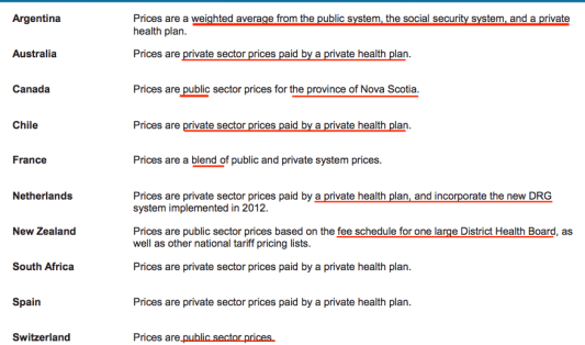
They also combine data from different institutional settings.
![]()
And make comparisons across different bundles and goods and services.


![]()

They even sometimes have acknowledged some of the issues raised by their so-called “methods.”

Most of these comparisons are also drawn across a tiny number of countries and across a small subset of payer than often don’t reflect the actual composition of spending in those same countries. Their efforts in no way, shape, or form allow us to make “apples-to-apples” comparisons of prices in different countries.
I would also think some critics would be reluctant to take the ad hoc results of small, otherwise little-known, private health insurance trade group, that seemingly started publishing these powerpoint documents around 2009, that otherwise has not been active in producing data for public consumption, and is not particularly transparent about how they go about this, but maybe that’s just me. A few grains of salt are in order. Regardless, potential conflicts and institutional reliability aside, this data smells.
Their prices don’t seem to be as well correlated with national income or with the price levels of other countries as determined by OECD in their Hospital Services PPP. This suggests measurement issues that extend far beyond US-specific measurement. Reliably measuring prices, particularly health prices, is hard even when it’s not a politically charged topic and I see no reason to take their half-hearted attempts seriously.
Utilization and Intensity
Metrics that do not meaningfully predict spending elsewhere should not be used to argue US expenditures are not driven by volume.
Many people insist on using metrics that are poorly correlated with health expenditures to argue the challenges the United States faces in health finance have nothing to do with excess volume. As many others have done before, Bivens cites what he calls “broad measures” of health activity, namely physician visits and hospital stays (discharges), to argue “Americans use less health care.”

While these measures may seem to make sense superficially and might have made some sense circa 1930, when physicians provided most of what little the sector could offer patients, they don’t make much sense as a way to assess differences between countries or changes over time in recent years.

source

source
Even more on point, they clearly do not correlate with spending cross-sectionally within the OECD.
Doctors consultations are not correlated with health spending.

Nor in-patient discharges!

Nor curative care discharges!

Nor curative care bed-days

It’s not like we don’t have plentiful evidence that health spending is rising more rapidly than income in other countries and that this is mostly a result of rising real consumption–both within and between countries. However, the same indicators proffered by others fail to meaningfully explain the rise in health spending elsewhere!

You may not like it, but this is what peak healthcare performance looks like.

If you accept the premise spending is rising rapidly in other countries and that this is mostly real (not prices), as the evidence strongly suggests, you ought to re-evaluate how you think about the drivers of health-care costs (especially volume.)
It’s the intensity, stupid.
There is an important, much neglected, omitted variable in most popular analyses of health spending. Much evidence suggests (1) real health consumption is rising much faster than incomes throughout the OECD and (2) measured utilization and its covariates (e.g., disease burden) have not changed very much. There is no necessary reason why these facts must be at odds with each other.

source
We see this same pattern inside and outside the United States. There is a huge, often omitted, third variable, a categorically different way to think about this: we do much more per health system encounter and/or per sick patient than we once did.
Let’s call this intensity.
Expenditure = Price * Volume
Volume = Utilization * Intensity
Expenditure = Price * Utilization * Intensity
Even if price and utilization actually remained wholly unchanged (they’re not quite), both volume and expenditures can rise rapidly and in-lock-step with percentage increases in intensity.
The overall growth in health care relative to income cannot be plausibly explained primarily as a consequence inflation over the past few decades because these changes are pretty well captured by differences in the types and quantities of these goods and services and poorly explained by price changes for the same goods and services.
For example, above and beyond the earlier discussed price index data and derived volumes, researchers found the substantial overall growth in health spending amongst the privately insured was approximately 100% explained by rising quantities.

These results are highly consistent with the price and volume indices constructed by government agencies (BEA, CMS, etc.) going back decades and compatible with virtually every other study of reasonable scope.
Some other people have argued it’s “price” and cited several studies to support their arguments, but the underlying studies are not methodologically equipped to support this claim (though some authors imply otherwise when talking to the press or in other public fora).
Here is a typical example:
“A recent study in JAMA by scholars from the Institute for Health Metrics and Evaluation in Seattle and the U.C.L.A. David Geffen School of Medicine also points to prices as a likely culprit. Their study spanned 1996 to 2013 and analyzed U.S. personal health spending by the size of the population; its age; and the amount of disease present in it.”
If you actually look at the study what they actually measured is what they call “price and intensity.”

This is little more than the average cost per health system encounter, as in, per visit, per bed-day, and per prescription filled. Changes in price were not actually assessed and no account was made for differences in treatment on a per encounter basis (new or changing composition in surgeries, drugs, devices, diagnostics, etc.). In other words, their data are very consistent with my arguments and with the indices reported by CMS and BEA, even though how they sometimes lead people to believe something very different.
Given the available evidence from other OECD countries (e.g., bed days, discharges, physician visits, etc.) it’s likely their (domestic) data if assessed with similarly granular “utilization” indicators, would show much the same. In other words, most would show at most very modest increases in “utilization” and thus most of the observed growth could be similarly lumped into “price and intensity” if it were reported similarly. Meanwhile, as in the US, we know the price indices don’t support this over reasonably long time spans (not in most developed countries at least), so that pretty much leaves us with “intensity” and there are a good number of indicators to support this view.
My arguments on the role of price, volume, and income are also consistent with the empirically-derived assumptions used by CMS’s Office of Actuary (OACT) in their 75-year medical expenditure models.


Put differently, the rise in health expenditures relative to income is primarily one of technological change, not excess medical inflation, and CMS OACT models it mostly as an enormous income effect.


In short, the government actuarial models, a reflection of mainstream thinking amongst subject matter experts, places little weight on prices, little weight on utilization, and a great deal of importance on technology (and its relationship to income) in the growth of health spending over the past forty years and going forward.
Incidentally, the dominant role of technology/intensity (broadly speaking) as a proximate cause of health spending helps partially explain the differences between the income-elasticities observed at a national (>1), regional ( > 0.5, < 1), and individual level (~0). Even if utilization and prices vary little with income at these levels of analysis, the intensity of medicine is primarily determined at higher levels of aggregation. For instance, if the standard of care is mostly determined by the average (mean) resources available in the larger community, the intensity with which health providers and hospitals diagnose and treat given symptoms/conditions isn’t likely to vary appreciably with the individual income of the patients (save for to the extent this indicates the mean of the broader community).
Given that the individual income elasticity for health expenditures is approximately zero in the United States and most other developed countries, the plot for average expenditure by income decile should look roughly like this within the OECD.

A very rich person in a poor country, for example, isn’t likely to get an MRI scan if he presents with a head injury at an emergency room in his own country. Even if he could afford the fees at US prices, there isn’t the critical mass of people that could afford, let alone demand, that on the margins. Conversely, a low-income person in a rich country may prefer to take a bit more risk under comparable circumstances in the United States and opt-out of such cutting-edge medicine if the choice was left up to him, finding such cutting-edge care to only be worth a fraction of what it costs society (probably similar patterns at the state/regional level with spillover effects and cross-subsidization from rich to poor states/regions )
The United States does more procedures, uses more diagnostics, and exhibits other characteristics that actually are associated with higher income, higher spending, and higher intensity.
Technology and that which is associated with it (additional staff, training, etc.) is the overwhelming proximate cause of rising health spending within and between countries, as in, more new procedures, diagnostics, pharmaceutical/biotech, medical devices, and so on and so forth. While the US may not consume more of those things that are mainly uncorrelated-to-even-modestly inversely associated with health expenditures in both the temporal (over-time) and spatial (between-country) dimensions, the bulk of the available objective measures indicates the United States does more of those things that actually are correlated with income and health spending in both dimensions.
Noah is just wrong on this bit:
“Looking at how often Americans use specific medical services such as knee replacements and C-sections, he finds that they generally tend to use fewer of these procedures than people in a number of other developed countries.”
(emphasis mine)

More importantly, the US is typically right about where we would expect it to be concerning those direct measures of volume which are well linked to higher health spending (especially when they are). Examples of these in published data include CT scans, MRI scans, coronary bypass, knee replacements, hip replacements, kidney transplants, and so on and so forth.

We also do less of those things (and covariates) that are inversely associated with income and health spending (especially when they are).

Of course, these sorts of indicators are just the tip of the iceberg. They are not nearly comprehensively enough to directly explain even half of the difference directly– not in the US or in other OECD countries–exhaustive indicators of this sort aren’t even available domestically (I wish!). By the time OECD, WHO, and company get around to tabulating and reporting such metrics across a reasonably large number of countries, the indicators often already a little dated, as in, higher-income, higher-spending locations have already started moving onto newer tech, procedures, etc. Nonetheless, where such data are available they are (on the whole) very consistent my arguments and the body of literature I’ve cited.
As discussed in yet another blog post, one can assess the available indicators somewhat more systematically, e.g., compare the loadings or correlation coefficients to the average values for the US as compared to other OECD countries. Here, too, we find observable characteristics in procedures, diagnostics, and the like offer a reasonable amount of explanatory power overall and we see the US generally on-trend.

It’s not a coincidence the US has a much larger health workforce than others — a major input into health care costs.

Nor is it a coincidence health sector’s share of employment (head counts, not wages) has grown markedly.

source
Indeed, if one looks at health spending from the point of view health expenditures per full-time equivalent (FTE) employed directly in the health services sector, it is likely there has been approximately no significant sustained increase over and above material living conditions.

In other words, this isn’t likely to be explained by health wages or profits rising substantially faster than real economic growth in the long run. Instead, this is primarily explained by rising real inputs [e.g., number of employees, their skill level (see nursing and technicians) and, to a much lesser degree, the costs of those inputs rising with average incomes without productivity improvements fast enough to offset them (mostly Baumol’s effect).
We also find health employment rates explains a substantial portion of the considerable variation in health spending found between states (both of which correlate robustly with material living conditions at the state level).

source
Further perspective
Health spending is “eating” all OECD countries.
Every OECD country that has seen their standard of living rise over the past few decades has experienced a substantial increase in the health share of Adjusted Household Disposable Incomes and as a share of Actual Individual Consumption.

Indeed, the overall pattern conditional on real AIC per capita in constant dollars is very similar, i.e., approximately the same level and roughly the same slope (with a pattern of reversion towards the trend observed amongst other countries). Few appear to be obviously “better,” and several appear to be “worse.”
I don’t have the panel data for Net Adjusted Household Disposable Income handy right now and there’s not as much of it available in the databases, but it’s clear these patterns would be near-identical if assessed on that basis instead.
The US has distinguished itself principally insofar as it is further along the household income frontier — an exceptionally rich country without any true contemporaneous peers (as of yet). That being said, even if one insists on using GDP despite much evidence to the contrary, one can hardly reasonably claim that health spending is not “eating” most OECD economies if one applies this term to the US.

The tiny handful of countries that have a weak claim on following a markedly different (especially “better”) trend are those with highly atypical economies (see Ireland, Luxembourg, and Norway)
Moreover, the fact that health spending arguably increased much less in a handful of (atypical) countries with respect to measured GDP does not speak to Noah’s apparent concern about the effect of health costs on take-home wages since these same countries are also the ones with abnormally low wages, and unusually low adjusted disposable incomes, conditional on GDP. The question really should be whether these countries’ residents can enjoy the sort of real average incomes US households do currently and still spend a lot less on health care in the long run.
The evidence thus far suggests not! For instance, in a rudimentary model on OECD panel data to predict health expenditures controlling for year fixed effects, GDP, and AIC, I find AIC effectively mediates both the increasing secular trend associated with time (as in “technology”) and with GDP.
Here are some quick visualizations for how these terms play out in the model:


Likewise, if I change GDP to be the remainder after subtracting AIC, I get much the same result.

GDP and time (a proxy for technology) have at most very modest independent predictive value once we have a reasonable measure of material living conditions (e.g., real AIC per capita in constant dollars). I obtain similar results in many different specifications, both with and without the USA included, and with and without outliers (e.g., Luxembourg). One need not “work at it” to attain such results (it’s not particularly sensitive to these choices). Furthermore, the very modest coefficient on non-AIC GDP would be even smaller if modeled using its income counterpart, i.e., AHDI instead of AIC.
Norway, one of the main outliers, can serve as an illustrative example to clarify some issues here (I hope!).
The disagreement between GDP and material living conditions we have observed in Norway over the past few decades, whether measured by household income or consumption, largely reflects what they can afford. If we regress GDP several decades hence against current GDP, informed observers are apt to predict Norway will have a substantial negative residual (especially relative other countries high in human capital) because their extractable oil resources are unlikely to keep up with the production from countries less dependent on extractive industries. That is, their current GDP over-predicts future GDP.
Consequently, they are quite reasonably engaging in substantial consumption smoothing, as are many other petrostates. While they might theoretically be able to consume much more of their gross value add (GDP) today, even failing to make additional capital investments necessary to maintain current oil production (and hence profits), this would exceed what they could actually sustain and they would rapidly cede ground in the material living standards dimension to other developed countries. But, anyways, the point is that as their oil revenues dry up and they start leaning relatively more heavily on their sovereign wealth fund to maintain their relatively high material standard of living, the trend in the consumption (or disposable income) share of GDP will get flipped around.
Presumably, the Noah believes this implies a relative decline in health spending whereas I would predict very much the opposite, i.e., the health share of GDP will increase markedly because their material standard of living shouldn’t be much affected, but their GDP (especially capital investment and net exports) will decline in relative terms. I’m not the only one to make this sort of observation (though perhaps to approach it systematically?).
Indeed, this was pointed out in a recent OECD health working-paper on Norway’s health spending:


[snip]

[snip]

[snip]
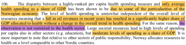
While they do not necessarily explicitly articulate my position, let alone generalize it, their argument is nonetheless consistent with mine and quite inconsistent with the GDP-as-individual-income presumably endorsed by Noah and others.
The cross-sectional slope between real material living conditions and health spending has increased markedly over time.
The visible cross-sectional slope amongst OECD countries has increased considerably over time (even excluding the US).

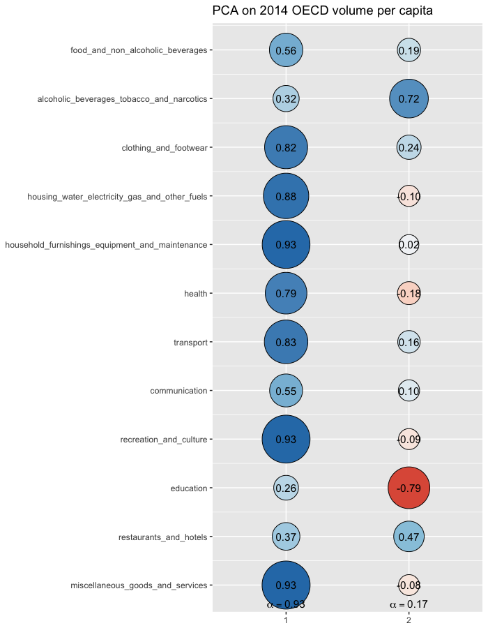
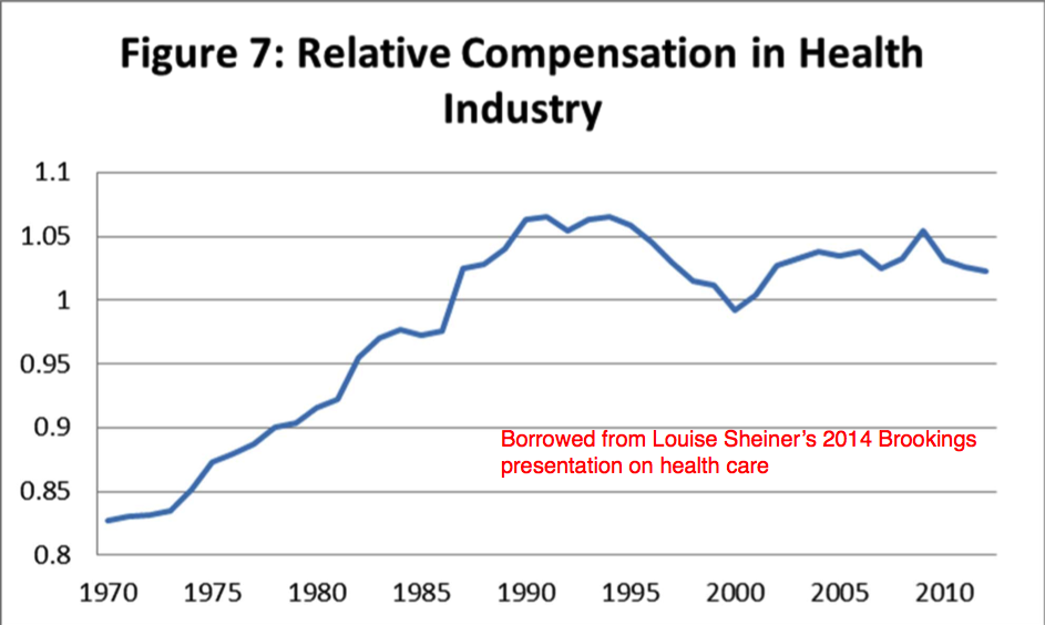
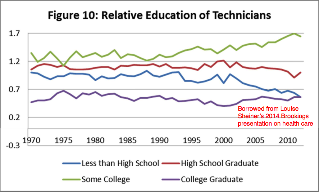
If one were to try to extrapolate health spending today based on the observed linear trend in 1970, they’d under-estimate the expenditure of most high-income countries today by almost 100%. These patterns are generally inconsistent with technology as a major root cause of health spending, save for its effects on broader economic productivity.
My main point here, however, is just that cross-sectional results are pretty much the exact opposite of what people arguing the rest of the world has the health expenditure problem pretty well figured out imply. Indeed, rather than declining as a share of income, or even holding kinda-sorta steady, it’s clearly increasing increasingly. Further, it is doing so in a way that is quite well described by a third-order polynomial when assessed across all years simultaneously.

If this particular non-linear model is a true model, in the sense that it’s a much closer approximation of the true non-linear processes behind the income effect, it implies the cross-sectional models in this same data are also likely biased. In other words, not only do the linear models on the cross-sectional data fit less well (at least relative to what we can determine from panel data), they are systematically biased with respect to income because the linear fit it generates can only crudely approximate the overall slope found amongst the observations at any point in time.
This pattern may be hard to demonstrate cross-sectionally in the OECD data because of a small number of countries in their datasets, but that does not mean it’s not real, only that it can be hard to demonstrate when the model for each year is assessed separately. We can also make this point by assembling the residuals of the linear models for each year and plotting them against differences from mean AIC for each year.

As described it an older post, the linear models cannot fit relatively low, middle, and high-income countries without systematic error of this sort, especially not when the dispersion of income is relatively wide in the given year. Even when modeled with decent indicators of material living conditions, like AIC, countries with exceptionally high indicated values will tend to have systematically higher residuals than they ought to (especially concerning middling income countries).

Where we need panel data (multiple years) to show the non-linear model is quite clearly superior (e.g., AIC, BIC) in OECD data (small n), this much more readily leaps out in cross-sectional analyses of data in broader databases including many more countries, such as the World Bank ICP data (much larger n) or Penn World Tables (on final consumption).

The non-linearity observed in these various datasets are also consistent with the long-run growth trajectory of the US health spending.

source
And OECD time series.

In other words, something like a logistic growth curve with an S-shape (e.g., sigmoid function) is quite possible, and some researchers have actually advanced this very possibility (which doesn’t look too different than other forms of technological adoption)

source
Higher spending in other countries does not appear to be associated with systematically better outcomes past a certain point.
Not only do other developed countries continue to spend a similar proportion of their (household) incomes; purchase healthcare at similar relative prices, and consume similar (observable) quantities of cutting-edge medicine conditional on material living standards; the high spending levels of other high-income countries do not appear to buy them systematically better outcomes.

Lower spending Italy and Spain attain better life expectancy than the likes of Norway and Luxembourg despite spending about half as much on health, not to mention being poorer and probably less competent institutionally! While some may crudely approximate this relationship as if it were log-linear, as in the Preston Curve, this relationship appears to flatten out entirely beyond fairly moderate expenditure levels (say ~3K/yr). Unless one assumes some sort of countervailing force (e.g., obesity) to systematically offset the benefits of higher income and higher health spending, it tends to suggest that most of the spending growth amongst other high-income countries over the past decade or two is no less “flat of the curve” medicine than what has presumably been going on in the United States (albeit somewhat less so because most of them are much poorer). In other words, the outcome pattern mostly doesn’t support the argument that their systems are more rational and delivering systematically better results with their higher spending.
This now-famous visualization would appear to suggest otherwise:

It implies there is a robust cross-sectional relationship between health spending and life expectancy, and that high US health spending is somehow uniquely ineffectual. Our World in Data even goes so far as to say “the presented visualizations are nevertheless indicative of a clear and strong relationship; the health returns to healthcare investment suggested by the figures above are substantial.”
Appearance can be very deceiving. While life expectancy has indeed increased over time, this is primarily associated with the passage of time, a distinct secular trend (as in, broadly improved medical know-how, technology, safer roads, etc.), not with contemporaneous differences in spending. Somewhat more careful analysis of this same data shows a flat slope between countries (especially those in “flat of the curve” territory) and a pronounced secular increase in the intercept with time even for those that didn’t increase real spending appreciably!

Perhaps unsurprisingly (for me), AIC actually fully mediates health spending vis-a-vis life expectancy. Furthermore, regardless of the specification used (AIC and/or health), the coefficients on the log of one or both expenditures rapidly approach zero even, even when the US is excluded, while the apparent secular trend continues on, seemingly unabated.
I can also show a near identical pattern as OWID’s much publicized plot using AIC instead of health spending!

Some countries may experience better outcomes for many and varied reasons, but overall the results don’t suggest this has much to do with their health systems spending their money more effectively. Furthermore, countries may experience substantially different health outcomes for reasons that are wholly unrelated to health systems or economic prosperity. One can hardly argue “confounds!” here (larger n) and simultaneously use this same sort of evidence to make strong claims about the efficacy of the healthcare regime of a single country (pick your poison medicine).
It’s far beyond the scope of this already very long argument, but I delve the reason’s behind the United States’ long-standing sub-par outcomes in another long post and much more briefly here (a direct, but partial explanation).
A wide variety of other indicators support the United States’ high and rising indicated material living standards
I will not argue this necessarily makes the US “better” overall (there are other dimensions to consider, and people attach different values to different things), but the material aspect is what overwhelmingly determines consumption behaviors in healthcare, higher education, and, well, pretty much all consumption. Whatever the underlying reasons or the tradeoffs involved, the average American has far more real resources at his disposal than his counterparts in other countries. Consumption, disposable income, and reliable wealth statistics tend to reflect this.
Housing

This is also mediated by AIC
It also cuts across the income distribution.

source
Despite larger and fancier housing, it takes less of our disposable incomes than most high-income countries. Bigger homes is also a long-term trend in the US and one clearly not just found amongst the very rich.

And we likely (still) have considerably more stuff in our houses.


source [table of items/method] — also mediated by AIC


This UCLA series on middle-class consumption is useful and generally supports my point from more of a qualitative point of view. Some interesting quotes: “The U.S. has 3.1% of the world’s children, but consumes 40% of the world’s toys…..Europeans would be shocked at the amount of food that’s stored in American households” Also see this NYTimes article.
Car ownership rates.

Again, this is mediated by AIC.

Household financial wealth
Very much contrary to the “it’s just consumption” story, US households have much more financial net worth than others (note: non-financial assets are not well measured internationally and are heavily determined by housing costs — places with proportionally expensive housing look “good” here, but it cuts both ways).

Again, much the same vis-a-vis mediation (even with a thirty-year lag applied)

Eating out

This is also consistent with US time series showing food away from home (restaurants) rising faster than food at home (which represents a smaller part of our household budgets)

This is also consistent with the OECD’s real volume indices.

Recreation and culture

Education

Higher education is relatively more of a consumptive item these days, so I expect somewhat different behaviors than for primary and secondary schooling.
Survey-based measures of income and consumption
While I believe Luxembourg Income Study (LIS) and related survey based estimates of disposable income are substantially less reliable than National Accounts based measures of material living conditions in the developed world in general and specifically with respect to the United States, even these paint a pretty similar picture (especially as regards the broad “middle class”)

Likewise for efforts to produce distributional accounts of consumption akin to AIC (unlike the more deeply flawed disposable income estimates, these consumption counterparts do not indicate US consumption is particularly concentrated relative to other OECD countries)

Likewise for narrower measures of consumption

source
Other measures of changes in material living conditions domestically
Though oft-cited, popular tax-based estimates of the income distribution (e.g., Piketty) and household income surveys (e.g., LIS), substantially over-estimate the growth in income inequality and significantly under-estimate the improvement in material living conditions for the bottom ~25% of the country.
We see this in well-designed consumption surveys.

source
And changes in consumption inequality

source
And in well-designed tax-based estimates of the income distribution.

source

source
Since I believe it’s the average that matters, not so much the distribution, I don’t place much emphasis on inequality, particularly measured inequality, as a determinant of national health spending, nevertheless it is apparent that there has been relatively broad-based growth in material living standards and that the consumption habits of the proverbial top one percent can only explain so much.
The combined financial net worth of households AND government.
Some people point to the role of government, so let’s take a quick look at this. Only Norway has unambiguously higher combined net worth, but almost all of this is found in the government sector (their households are way below average) and, as I’ve mentioned previously, this is a consumption smoothing tactic because a big chunk of their GDP is temporary (oil).

You might also keep in mind that much of Europe has much less favorable dependency ratios and they are slightly more generous, so somewhat higher government savings likely reflects larger projected pension burdens. Either way, the marginally higher savings rate implied by this (which still leaves them short) also suggests slightly lower disposable income for their households and less current discretionary income for their governments.
Other macro income/consumption indicators
Primary income of households includes employee compensation, self-employment income, and more (this isn’t just about taxes/transfers)

The picture is reasonably similar for employee compensation alone.

The gap in household disposable income is positively gigantic if we don’t go the extra mile and “adjust” for social transfers in-kind (STiK), which account for a large share of comprehensive income and consumption in many European countries (note: health alone accounts for more than 50% of this in most of these countries, never mind education, disability, etc…. much less discretionary income overall)

Likewise with household consumption without STiK.

Of course, my preferred indicators (AIC and AHDI) adjust in-kind transfers.


source
Still, even after adjusting for social transfers in-kind, the differences are vast. On average Europeans in the 11 core EU countries (107) have AIC closer to Romania (63) than to the United States (162). These are not small differences, even less so when the context is expenditures with an income-elasticity of one-point-six.
Wrapping it up
Those that claim to be most concerned with the eating of the economy often seem ill-prepared to deal with it.
If you honestly believe the rise of healthcare is mostly about prices and that attacking volume is dangerous, as Bivens implies, you are almost certainly wrong, and you are unprepared to address cost containment.

Curtailing volume is the only thing likely to make a significant difference in the “cost curve” in the long run. A price reduction is at best a one-shot deal and far harder to achieve than many seem to believe. I certainly agree that constructing policy to target health spending (volume) is extremely difficult to sustain politically, but it’s the only way to fundamentally alter the trajectory in the long run.
Viewed strictly from the perspective of cost containment, the most successful cost containment regime in the OECD was probably the UK (NHS), which was perhaps an accident of history. They rationed particularly aggressively and managed to hold costs substantially below what we would expect for a country of its wealth for a few more years than usual.

However, people (voters) ultimately wouldn’t stand for it, so this rationing effort was radically reduced (budgets expanded). Today they are much closer to expected spending levels today, and I suspect they will further converge on the trend observed in the US and most other developed countries (while the NHS itself is still notionally popular, people are still complaining about cuts despite the massive increase in spending!)

I very much suspect that total spending on health is ultimately determined by our willingness to pay in the long run. Even if we could modestly reduce prices in some areas the presumed “savings” are likely to get allocated elsewhere within the health system and this won’t necessarily measurably improve outcomes because there just isn’t all that much low hanging fruit and there are real limits to knowledge on clinical efficacy.
For some mildly suggestive evidence along these lines, I ran some quick regressions with OECD’s 2014 PPP benchmark. When the dependent variable is health spending as a percent of GDP, AIC mediates the presumed effect, which might be implied by the bivariate relationship between prices and health spending (model 3), and the coefficient on AIC does not move appreciably.

(Note: I included models without the USA and with GDP per capita instead of AIC for comparison with similar results)
Likewise for when the dependent variable is health expenditures per capita at PPPs for AIC.

The evidence suggests health prices have approximately zero independent predictive value once we have accounted to material living conditions (or even GDP per capita)
In fairness, if I model this with hospital services (surgical procedures) I get a slightly more ambiguous result.
However, I wouldn’t read too much into this because (1) the effect is barely statistically significant, (2) surgical procedures are much more tightly linked to income levels (wages) than the broader health price index, even when measured with GDP, (3) hospital services account for ~37% of expenditures in the US, and (4) the US is already on trend with respect to GDP and AIC.

If this is mostly correct, which seems likely, we don’t have any “scalpels” to deal with overall health spending, only very blunt, very large hammers. Sure, we might do somewhat more Comparative Effectiveness Research and allocate health spending a little more efficiently (not always easy to determine in clinical practice), but there will always be something on some margin that will plausibly improve someone’s life enough to make an argument to spend to within the very upper limits of what society is willing to pay for. Ultimately health spending is determined by what we’re willing to spend, and this is overwhelmingly a function of the average income in the long run.
Consider the case of orphan drugs as something of a bellwether. These are drugs indicated for the treatment of very rare diseases.

source
They are often phenomenally expensive, but the costs to make them on a per patient basis is also very high precisely because these conditions are so rare (R&D, clinical trials, etc. are expensive and do not scale with the number of pills or patients). Indeed, profits account for a modest share of the cost.

source
We as a society, both Americans and Europeans broadly, have decided to pay for them at costs that would have been positively unfathomable a generation or two ago.

source
These are far beyond the financial wherewithal of >95% of the affected patients and their families; they exist because our society has decided to pay for them or, at least, is unwilling to say no. Similar patterns are playing out and have long been playing out throughout healthcare in less obvious ways (there is always room for marginal improvement of some sort).
Likewise, we can look at some recent studies using a novel dataset produced by BEA.


source
Unsurprisingly, in an environment where society allocates a higher and higher percentage of its consumption expenditure to health, research and development dollars have moved heavily towards healthcare.
source

source
Keep in mind that the distribution of health spending looks like this in the United States and probably not much different in other developed countries.

source
We are mainly talking about spending on a small proportion of the population in any given year. These are predominantly the chronically ill, the very old, the gravely injured, premature infants, etc. — groups of people we generally have a hard time saying no to. The trend has relatively little to do with the cost of an everyday office visit or even an ER visit, with half the population accounting for less than 3% of total expenditures in any given year, and it has everything to do with how we treat people when they are sick, severely injured, or presenting with worrying symptoms. It’s not that I believe the growth rate at median person-year has trended much differently (probably not much change in the distribution), but the absolute increases are fairly negligible in the scheme of things and likely don’t seem particularly unreasonable in the eyes of most people as incomes have risen (even if only for very marginal improvements in measured outcomes!).
The lions’ share of this involves tougher choices because we’re talking about cases where lives (longevity) of other people plausibly hang in the balance and where the quality of life is substantially impeded. Even in an environment where most health spending is “flat of the curve,” people don’t seem to be very amenable to inequality in expenditure.

SOURCE: GSS, YEAR=2000
Nor do we seem to allow much income inequality in health expenditures in practice:

source
And people typically respond like this when it comes to cost containment.

source
Conclusion
While I sympathize with the argument that much health spending is “flat of the curve”, especially in its ability to obviously move nationwide life expectancy in the near-term, I am not convinced any other system today is appreciably more capable of containing costs, not in theory (factoring in the political economy of this), not in practice, and particularly not after it has been imported into the United States. Our high spending is overwhelmingly a product of our high incomes and if other OECD countries had our exceptionally high material standard of living most of them would be spending very similarly, with similar utilization, similar intensity, similar prices, and otherwise not obviously better overall outcomes. Over the long-term, very little of the differences in expenditure at a national level are attributable to differences in the healthcare regimes or, for that matter, differences in age distributions, disease burden, etc.
Though I’m not much particularly optimistic about its political viability, I think there is an argument for substantially more inequality in medicine. We have approximately none today. The insistence of societies on equality in medicine seems likely to play a role in increasing cash income inequality throughout the OECD. If the distribution of comprehensive income remains roughly the same and health expenditures rise approximately the same in absolute terms, all of which seems likely, this should be expected.

If you take the view that the incidence of the health expenditure is mostly on the consumer (as a class), possibly even when mostly paid for by public plans (i.e., that they would otherwise enjoy these resources but for the rise of healthcare), and the marginal utility of other forms of consumption is relatively higher for lower-income people, for whom “equal” health expenditure represents a much more significant proportion of their comprehensive incomes (even if not always well measured), it makes some sense that we would allow or even encourage this. This inequality need not necessarily mean less utilization amongst the lower-income, but probably mostly less intensity: less use of cutting-edge treatment, state-of-the-art diagnostics, etc. It’d require a fundamental re-thinking in medicine and, unfortunately, this is in direct opposition to what Noah, Bivens, and company are likely willing to endorse in practice.
On the other hand, I am not quite sure why the average level of expenditure should be a concern for its own sake, as in, so long as we don’t let it ruin our government finances or place an undue burden on the lower income. It seems evident to me that an increasingly wealthy society will find decreasing marginal utility in most other forms of consumption while attaching ever higher value to human life (elasticity >= 1) — it could be formally modeled something like Hall and Jones (2007). The utility to extra health expenditure need not necessarily be high, especially if we have little idea of what actually works on the margin. But, models and assumptions aside, precisely what are we under-consuming as a society? What other types of consumption can feasibly absorb these potential resources and generate unambiguously higher utility at the margins we find ourselves at today?
I am not sure why the burden of proof should be with any particular healthcare regime at this moment in time when the willingness to fund an ever-higher amount of health consumption through a multitude of different schemes is so clearly the revealed preference of virtually all societies today, many also apparently at the “flat of the curve.”

We also saw this elevated elasticity within the United States long before the advent of third-party payers in healthcare, so this seems to have limited explanatory value (it surely contributes something as a proximate cause, but these expansions are likely a consequence of rising living standards). 
source
Frankly, I suspect much of this alarmism stems from ignorance or a rejection of the view that this is ultimately driven overwhelmingly by rising material living standards itself and lack of consideration for the sources of prosperity. It’s a product of prosperity, not so much a threat to it. As we become more productive as a society, as our real disposable incomes rise, the cost of many once relatively expensive, once dominant categories of consumption plummet in relation to income. Further, most of these items are normal goods, meaning that demand does not keep pace with rising incomes. The net effect of which is the consumption share of many things falls dramatically. This makes room for consumption of other things — particularly those items that economists would classify as superior or luxury goods (income-elasticity > 1).

source
Whereas food once commanded over half of our incomes, today it accounts for less than 10% of disposable income, and surely much less if we ate as our ancestors did, i.e., at home, doing ~all of the prep work ourselves, with less exotic & varied ingredients, etc. However, this is almost entirely because we are more productive. We consume more in real terms.

Likewise, amongst the OECD, we spend less than most on food as a share of total consumption (AIC) and consume more than most real terms (not necessarily measuring calories), and this isn’t even factoring meals at outside the home (where the US is clearly exceptionally high)!

Consider for a moment that Albania spends a higher proportion of their incomes on food at home than we spend on healthcare and food combined and likely still doesn’t get as much for their food expenditure. The calculus is just profoundly different in rich countries. If in some bizarro world, we actually allocated the same share to food today as we allocated in 1890, we’d probably have a morbid obesity rate approaching 100% (semi-serious), but I digress.
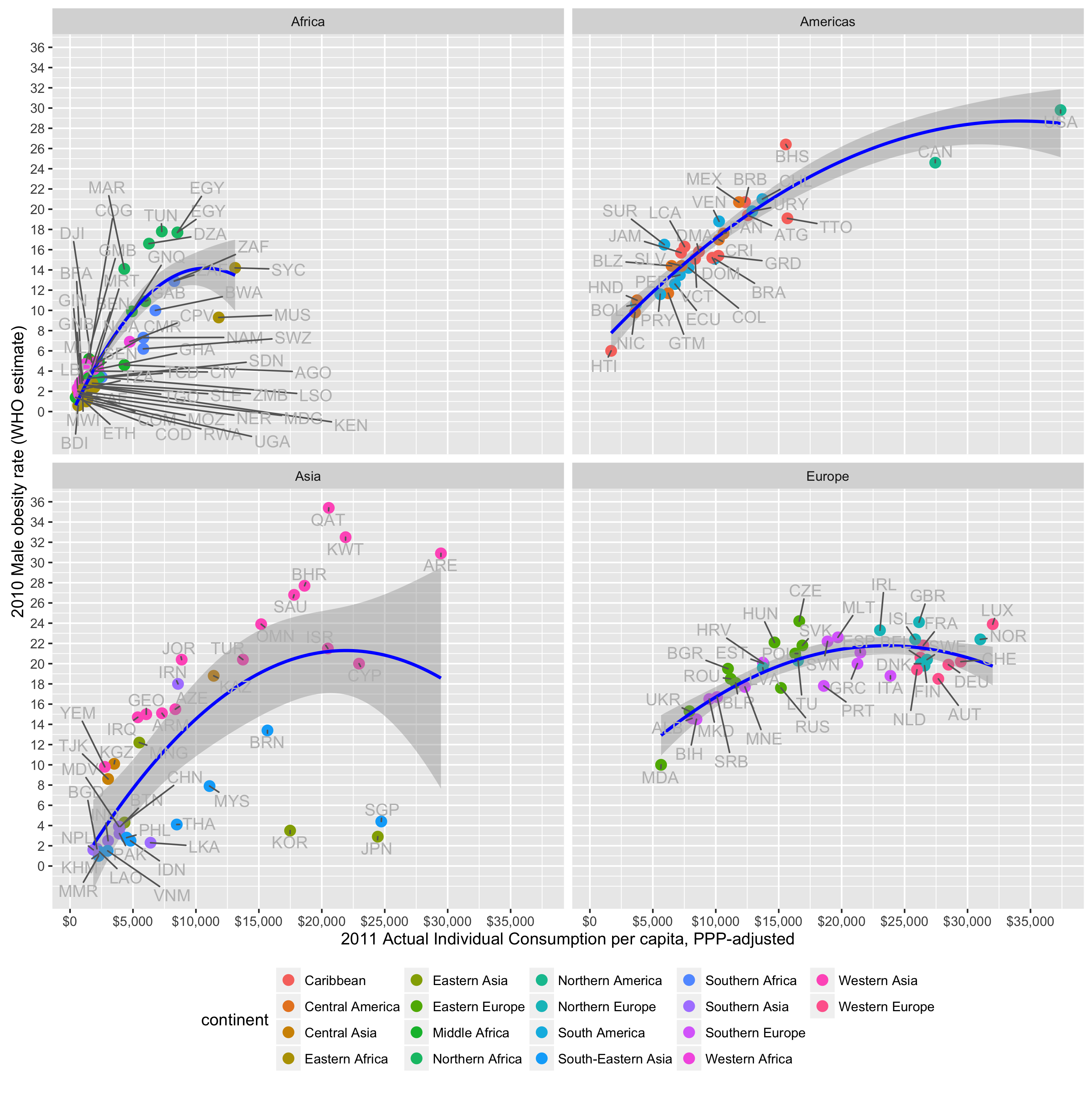
Prices usually decline relative to incomes, and they drop differentially.

A 50% decline in price relative to income implies that the same share of household disposable income would buy twice as much, a 95% decline twenty times as much, and so on. The vast majority of prices declined and declined substantially.

The overall price indices and their changing compositions mask the absolute magnitude of the social change over time (and probably even some within the country). We have become particularly efficient at producing (or at least cheaply acquiring) Goods overall. The ~76% reduction since 1970 implies we could consume four times more real Goods per capita with a similar income share (and it’s likely somewhat under-estimated because this index is re-weighted to reflect changing preferences!). If we consumed proportionally like we did even a few decades ago our “real” incomes or consumption per capita would be much higher because the relevant price indices would reflect this change.
However, because the marginal utility we get from each unit of consumption surely declines across most of these categories and because the prices of most of these same items plummet relative to incomes, we would not do that even if we could. Indeed, we find the consumption shares in many of these categories falls rapidly with incomes even though they don’t actually decline in real terms. This genuine and often under-appreciated economic growth leaves a lot of room in the average households’ consumption budget.

(related)
So the perspective that health is “eating the economy” is the really wrong way to conceptualize this. Rather, it’s probably more correct to say something like “the economy ate the market share of other sectors.” Those sectors are victims of their own success and households choose to spend an increasing share of this surplus in healthcare (amongst other notable sectors) because the perceived marginal value of healthcare (technology) is higher than in most other major categories of consumption. One might argue this is just ignorance, that everyone would get greater utility from relatively more consumption in other sectors and relatively less from ever-more cutting-edge healthcare (if we only we had a benign dictator), but I do not believe this to be self-evidently true, at least not for a large segment of our society (no, not just the “top one percent”).
It seems to me the lack of consensus on what we ought to be spending this surplus on is a major strike against this view; as is the derision for seemingly all actual existing forms of expanded alternative consumption (ugh, McMansions! froufrou restaurants!); as is the (approximately) log-linear relationship between income and happiness found within and between countries; as is the high-and-rising costs of many favored progressive projects (see: infrastructure, education, research); as is the fact that most of the significant economic challenges we still face aren’t apt to be substantially resolved by increased production; as are the rising consumptive aspects of medicine; and so on and so forth. Add to this the uncertainty of what actually works in medicine; the abysmal failure of other countries to contain costs in the long run; the lack of ability of so many otherwise intelligent people to accurately diagnose this situation; and the political/administrative uncertainty associated with any so-called “solution.” It is far from clear that a much better solution exists in practice with human nature being what it is.
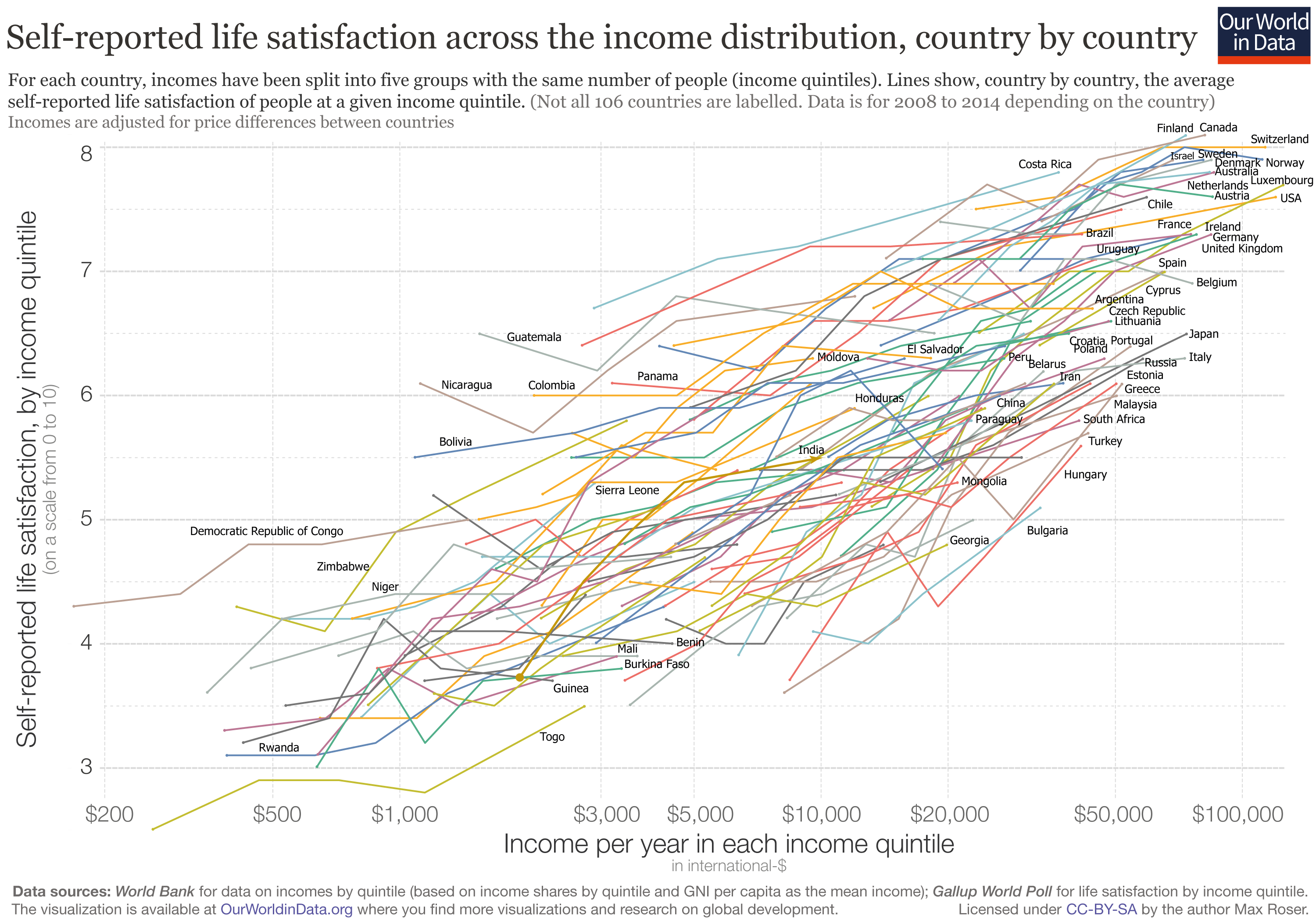
[simple minded non econ]
HC is diff from other goods in that consuming more, at least in US, is not fun or pleasant: it means tedious waiting, tests that are physically painful and getting bad news
so HC is one thing we might deliberately consume less of then we “want ” to
if you think of household budget as pie, adding up to 100%, as food/clothing get cheaper, something has to change
since we have enough clothes, we spend more on HC
also, do we *really* spend more on HC ?
I bet if you include all the soc welfare spending in , say, EU, they spend more on HC, they just don’t overpay MDs and drug companies, they spend it on housing people so they don’t get sick
Economists: productivity is stagnating
Cancer patients: funny new treatments saved my life
Paraplegic: funny, I can walk again thanks to new tech
Blind: funny, self driving cars changed my life
economists: that your life is changed dramatically for the better is irrelevant to GDP, the god which we worship
other people: talk to the hand
Excellent article! Has there any been any country that actually cut healthcare costs (rather than just bending the cost curve) once they implemented national health care systems? It seems that those who are in favor of a Medicare for All scheme are under the impression that if it was implemented, the US would be able to cut healthcare costs to the level of comparable OECD countries, even though as it stands, the US costs are about double. This would require cutting costs by half which is a very formidable goal. If no country that has created a national health care program has ever done this, it is likely that supporters of Medicare for All who think that it will get the US close to the OECD average are suffering from a major delusion…
Absolutely outstanding article that made challenged a number of pre-conceived ideas I had about the world which was based on looking at income as a measure of wealth rather than consumption.
Now I know that:
1 – Inequality isn’t the huge issue that it is made out to be.
2 – America is still king.
3 – Ireland is signficantly poorer than I previously thought although I expect their rate of growth to exceed many EU countries over the next two decades so they will eventually have an AIC above the EU average rather than below.
4 – My country, Britain, is actually doing a lot better than I thought.
5 – The world is drastically improving and will continue to drastically improve at least in terms of economic well-being disregarding potential environmental problems.
How does Singapore end with an AIC of $25k? That’s less than 1/3rd their GDP per capita.
How do I get this good at looking at data without graduate school?
A response to “Hoopyfreud” on SlateStarCodex since it ate my comment twice:
The OECD researchers publish disaggregated statistics for individual procedures, hospital services (weighted average of procedures), and health care (weighted average of all healthcare) and overhead is calculated into all of this [presumably they have price indices aligned with various SHA components to do these calculations for the entire health sector, but I haven’t found it yet]. Their data indicates we are relatively lower in the overall component than in hospital services, so I think that tends to argue against your notion because hospital services should be relatively more loaded towards end-of-life/high intensity care. Also I think you’re likely to see much more need for administrative overhead in the hospital/institutional sector because of the variety and complexity of what they do than in PCP settings outside of hospitals and their subsidiaries. Billing for a single office visit with no additional services (lab work, preventative care, etc) is about as straight forward as it comes and tends not to be particularly well reimbursed.
Perhaps, but then it must be through extra treatment, diagnostics, etc as opposed to higher overhead costs. This is distinct from “price” as people would typically think of it and it’d still look a lot like what I’m arguing, i.e., higher intensity/technology per encounter. While I’m not entirely unsympathetic to the idea that our particularly plaintiff (+attorney) friendly tort system leads to some unnecessary treatment and inefficiency, it seems to me the data are still generally more consistent with changes in material living conditions (e.g., US spending didn’t diverge until recently and US indicators generally following the same trend across a variety of available metrics, little change in concentration and little increase in out-of-pocket spending amongst low spenders ).
I honestly don’t believe that’s the issue it’s made out to be. The cost of the basic healthcare probably hasn’t risen relative to incomes and people that aren’t consuming a lot of healthcare generally don’t pay much out of pocket either. The issue, such as it is, is that we do far more across the board and we as a society have decided that patients should be sheltered from the cost of their health consumption. Our willingness to spend ever more through these arrangements is a consequence of rising material living conditions, but for the small proportion of people that fall through the cracks of our various overlapping system the apparent “price” can seem very high because healthcare providers are conditioned to treat according to the average demands of the entire population under this extensive system of third party payment (and, to lesser degree, the prices that are presumably billed to these individuals can sometimes be much higher than the average prices actually paid for the same treatment…. though little of this actually get paid directly by the uninsured in practice). That is, it’s not just end-of-life care or even necessarily care for very sick or badly injured; the growth rate is broad similar at all points in the distribution, albeit somewhat lumpy due to the nature of changing technology and medical know-how.
I presumed you were using sprained ankle as a stand-in for presumably basic healthcare, but I wouldn’t be so sure that’s true in the long run and we don’t actually have prices to compare with this specifically. Even if said treatment, diagnostics, etc are exactly the same, the environment this care is provided in is clearly not and these higher costs will tend to get reflected in prices in less obvious ways. The technology, the training, staffing levels, etc has changed quite dramatically in hospitals over the past few decades; just because you might get the same treatment in the ER for a given condition doesn’t mean the cost structure to provide this care is the same or could be provided more efficiently by hospitals given demands for other types of care.
Several reasons.
1) We don’t have good internationally comparable statistics for income or consumption at various points in the distribution. The distributional estimates are based on household surveys and they clearly miss a great deal of income and consumption (people lie and the surveys themselves questionably exclude certain things like indirect taxes, implied rent, etc). They have a lot of measurement error and they likely yield systematically biased estimates for the US (under-estimates of income for the bottom ~40% of the country). For instance, these types of surveys have lower income households in the US consuming multiples of their reported income every year on average despite the fact that they have an average net worth of approximately ~0 and little ability to borrow; higher-income households are under-reporting their consumption (when we know they aren’t saving this much either). It’s just not plausible.
2) When I’ve looked into this I have not found measured differences in the distribution or the median to be particularly informative. Quite the contrary, mean household consumption and income are typically substantially stronger predictors and mediate these sorts of measures in multiple regression.
3) This makes sense because there is approximately no relationship between individual income and health spending in the developed world, including the United States. Our spending is determined by how much we are willing to put into the system, which has to do with the mean, and we don’t want or tolerate much inequality in healthcare. The rich subsidize the poor and likely even 50th percentile household. Lower-income households might prefer to consume relatively more of their comprehensive incomes in other forms of consumption but it’s not like any developed country really gives them this choice.
I replied to your SSC comment here since it ate my reply twice!
While I have no complaint about the overall analysis (although the exposition could be clearer in comparing the early plots that appear to show the USA as an AIC/per capita GDP outlier versus the later ones that state the USA is not such an outlier), the role of third-party payment IN-KIND in distorting consumption toward health care seems underplayed (as does the impact of such systems on price competition and cost-reducing innovation; first-party-paid medical services such as LASIK and cosmetic procedures have shown a smart increase in quality and decline in price along the lines of other high-tech services).
The primary economic problem with contemporary medical care is that there is no good feedback loop to assure that the benefits to the patient (and society) exceed the opportunity cost of the employed resources on a short- or long-term basis. Medical insurance benefits are in-kind and if unused by the patient are lost to him or her forever. Hence the marginal value of a new hip versus a vacation, say, is not a calculation routinely “computed” by our economy in the same way that a new streaming-video subscription is routinely traded off against a vacation via the consumer’s opportunity cost. We generally don’t have to worry very much that our economy is producing too many HD pixels on our screens and too low-quality massages, because both are bought first-party by consumers who internalize the tradeoffs on the benefits side from producers and factor markets that internalize the tradeoffs on the cost side.
I believe it may be possible to combine the desired property of insurance–equalizing wealth, consumption, income, or utility (take your pick) across healthy and sick states of the world–with an internalized patient incentive to consider the tradeoff between medical and non-medical expenditures, but the necessary administrative, legal, and managerial developments would not be trivial.
lol
“What should we spend it on if not healthcare?”
1) Extra savings in the event of financial setback
2) Better real estate (McMansion quips aside, decent housing anyplace worth living is quite expensive relative to incomes for most people, I’ve learned this easily spending lots of time on Zillow lately)
3) More leisure, shorter workweek, earlier retirement
4) Infrastructure (public transport and roads in my city suck)
I admit many of these ways of spending have their own issues and cost diseases, but I would certainly have liked to turned some non-useful extra medical expenses into useful real goods/free time/savings.
When you talk about intensity, all I can imagine is being woken up several times a night in my recent hospital stay to check my vitals (unnecessary), check my blood sugar (I have a device that does that automatically, leave me alone), and run what was a total battery of tests (that found nothing, and they were schedule and run very poorly – I had to get the radioactive dye and run through the machine twice in the same day when it could easily have been once). Meanwhile, simple bedrest would have done me much better then all of that “intensity”, and I would have preferred to have kept the money involved to help afford an upcoming home purchase.
Of course I can think of a million useful ways to spend more money. It would be nice to fly rather than drive my family a long distance to see relatives at the holidays. I could afford to do that more if I had more money. It’s not hard to think of useful ways to spend extra 20% more income if you gave me a 20% pay boost in exchange for healthcare I didn’t want or need. Of course nobody is ever presented with that choice, so we don’t really know what anyone would decide. Instead we basically get “the system says X, take it” and that is better then having no healthcare at all so we comply.
Have you read the Gerard Anderson paper that came out in January that’s making the rounds?
You mean the “It’s still the prices” article? I skimmed it a few weeks ago. It seems to be mostly a rehash of their old paper and it’s largely non-responsive to the sorts of criticisms I’ve raised on this blog (I just noticed they cited me in the footnotes!). I’ve been working on another (very long) blog post tangentially related to the healthcare debate (speaks to the causes of the divergence between GDP and material living conditions), but I’ll probably address that article in my next blog post somehow or other (either a short review of the paper itself or a broader critique of the methods these sorts of articles tend to use…. I have a few ideas).
Yep, that’s the one. I’m a bit puzzled by their conclusion. I’m under the impression (you can correct me if I’m wrong, you know more than I do) that in the US, public sector (Medicare) prices influence private sector prices far more than the other way around, since prices paid by private insurers are elevated to offset below-cost reimbursement rates of Medicare (and maybe because the government has more bargaining power than private insurers). If Medicare reimbursement rates have been diverging further from cost, then that would cause hospitals to charge even higher prices to private insurers to offset that growing gap. The cause of even the private sector price increase would be in the public sector. Or perhaps I’m missing something.
Looking forward to your next post, in any case!
Dude, put all your ridiculous graphics at the bottom of the article and link to them within the text when necessary. The only reason I can think of making articles this painstaking to read is to give the impressive of substance where it doesn’t exist.
If people are misrepresenting you, its because you are possibly the worst human being in existence at relaying information. Although I suspect you make your arguments extremely confusing and hard to follow on purpose. I find it difficult to believe any sane human could look back at this complete mess and think “this does an adequate job of getting my point across.” If it isn’t intentional. it certainly gives the impression you are trying to hide a bad argument behind a copious amount of infographics.
I don’t know, because I got a headache and gave up due to the atrocious formatting…. as I suspect most others did. But I also suspect this is what you hoped to achieve so people will just skip to the end and blindly accept the conclusion.
I need a better class of troll.
Im convinced you are a troll. Managed to strip out the all the graphics and it still managed to be incredibly infuriating to read. I don’t understand are you getting paid by the word? You constantly restate things over and over for no reason. It reminds me of when I was trying to hit the page requirements while using the minimum amount of research possible back in college.
I mean just look at this sentence “My position is the average level of real resources available to residents of a country is the ur-cause of the vast majority of health spending everywhere and that AIC and AHDI are plainly superior measures of this, ergo these indicators are vastly superior means to evaluate the efficacy of cost containment regimes everywhere.”
Oh are they a plainly superior measure, ergo a vastly superior means to evaluate? So in other words, you believe they exist as an exceedingly superior gauge for evaluation, proving immensely superior to the alternative thus demonstrating superiority?
Who writes like this?
Speaking of “in other words” that phrase appears constantly, not including alternatives. You shouldn’t constantly have to rephrase things over and over.
This is the most mind-numbingly verbose thing I have ever attempted to read, even after stripping out the 5 billion graphics, most of which probably don’t even need to exist. Like why? Why would anyone intentionally write like this? I just don’t understand.
Im not trolling, im just genuinely bewildered why someone would put in what appears to be an incredible amount of effort in order to make something nobody in their right mind would want to read.
“Dude”, “the worst human being in existence” created the “impressive of substance”, that I “got a headache and gave up due” the “ridiculous graphics”. “I suspect you make your arguments extremely confusing and hard to follow on purpose” “I find it difficult to believe any sane human” “in their right mind would want to read”. “This is the most mind-numbingly verbose thing I have ever attempted to read”.
###
For a self-professed college attendee, you managed to string together an awful lot of semi-coherent words to comment on a blog post which, according to you, no one wants to read and has no redeeming features. What an unusual way for someone that claims to have the attention span of a gnat to spend their time!
10/10. Would troll again
So If took my short and concise criticism and bloated it to 100 pages of bombast and redundancies loaded with pointless graphics, would you prefer to read that instead? Or would you probably get infuriated and stop after realizing you are being waterboarded with pointless drivel?
Nobody likes having their time wasted, its not an attention span thing… its a cost/benefit analysis thing. When you take a lot of time to relay very little information, the value proposition takes a nose dive. In the time it would take to read this, I could get 100 times more information from somebody who is able to write in a clear and concise manner. So unless I have a compelling reason to believe there is some sort of profound information hidden within (and I don’t) it would be completely illogical to continue slogging through.
And that’s ultimately the problem, I would like to read what you have to say, but you have made it virtually impossible to justify doing so. I am giving you a valid criticism, you can take it or leave it. If you take it though, it would probably be to your benefit.
If you wish to be taken seriously, make an argument and don’t act like a troll.
you could have (should have) communicated that more respectfully. i think there is a point underneath your rant, possibly that this article goes into too much detail for an explainer on healthcare spending. and i think the misunderstanding here is that the article was probably meant primarily as a rebuttal or defense against the “healthcare spending is out of control” views — an angle where detail really does matter.
perhaps it’d be beneficial to add a link at the top of this article to summary pieces, if anyone has made such a thing. much as bloggers are known to summarize detailed scientific studies to provide explainers to a more trusting audience. there’s probably a decently sized audience that is more casually interested in understanding the ideas in this article only at a high level, but who are linked directly to this article from a context where a summary was all they needed/wanted.
kudos to author though: this is an impressive amount of research. even if it was more detailed than i needed to be convinced by the arguments, it introduced me to a lot of concepts that i really haven’t seen presented elsewhere.
One example of why GDP is a poor measure is the performance of the state of Delaware’s GDP per capita over the last decade. It’s declined most years in real terms, but almost entirely because of corporate inversions that have been tax events only.
The view that total household expenditures predict healthcare spending seems to have a very optimistic view of the political economy, especially in non-US countries (and even in the US where you point out healthcare spending doesn’t vary much with income). In most countries healthcare comes from the national budget and the national budget comes from the tax base, which is not the same thing as the spending available to households. So the mode of causation must be that raising e.g. corporation tax to pay for more healthcare spending has a downstream effect on household income and that voters/politicians are aware of the tradeoff and accurately asses how much of one leads to a decrease in the other, and that is how policy is decided. From the ground level to me it looks like there are ideological battle grounds of free market vs. healthcare, and the usual interested parties, businesses vs healthcare workers. To see that arrive at a pretty consistent percentage of healthcare vs household income seems unlikely.