
Note: I have already touched on these issues in a much longer, much broader post on education and on twitter at some length, however I thought it’d be useful to zoom in on this issue and marshal the evidence in one place for future reference.
It is still commonly supposed by much of the public that school funding is terribly unequal due to reliance on local funding mechanisms (especially property tax). Although there were once modest inequalities associated with local income levels (several decades earlier), this information is generally wildly out of date today. Within the vast majority of states districts with less advantaged students (read: higher poverty, lower income, fewer parents with college degrees, minority, etc) actually spend at least as much money per pupil (often more), both overall and in the narrower instructional expenditure category, and where there are inequalities these differences are usually quite modest and fleeting.
Though school funding is still significantly a local affair in most states there is substantial progressive redistribution of state and federal funds that effectively offset these potential inequalities (and then some). Some districts may choose to spend more controlling for income/wealth (tax effort) and there is some variance (mostly poorly explained by any SES measure), so that malcontents can always find isolated examples to complain about, but various formulas employed at the state and federal level sets a floor and effectively acts to prevent there being substantial positive correlations between school spending and district median income (or low poverty rates, percent minority, school free lunch percentage, and so on …. this holds across multiple measures).
Before I begin with my own data analysis, here are some helpful summaries from researchers on the center-left (people associated with Brookings, Urban institute, etc):
School funding systems vary by state, but in the typical state, the financing of K-12 education is shared roughly equally by the state and local governments (with the federal government covering less than 10 percent of the cost). Most states have provisions designed to target additional funding to districts attended by low-income students, with the goal of making up for these districts’ limited capacity to raise revenue through property taxes and other local sources.
[snip]The measure is a simple one: we calculate the average per-pupil funding levels of districts attended by poor students (those from families below the federal poverty level), compared to the funding of districts attended by non-poor students. Specifically, we calculate two weighted averages of the funding of all regular school districts in each state: one using the number of poor students in each district as weights, and the other using the number of non-poor students as weights. We adjust funding levels in each district using average wage levels in its local labor market.
[snip]Nationwide, per-student K-12 education funding from all sources (local, state, and federal) is similar, on average, at the districts attended by poor students ($12,961) and non-poor students ($12,640), a difference of 2.5 percent in favor of poor students.

source
This tells us that poor students attend school in districts with measurably greater cost-adjusted revenues per pupil than non-poor students throughout in the nation as a whole (i.e., on average) and that spending has been broadly progressive since at least 1995.
When these researchers evaluate current expenditures they find much the same result, i.e., districts with less advantaged students spend more per pupil.

source
Likewise, when they look within districts, schools with less advantaged students spend at least as much (and often significantly more).

source
Moreover, they find that more segregated districts actually spend significantly more progressively (between schools within the district) even controlling for a bunch of other covariates:
looking within income or income inequality quintiles, there is a consistent pattern showing positive relationships between segregation and relative poor, black and Hispanic resource share. While it is mechanically necessary for there to be a correlation between between school segregation and our measure of spending inequality, the direction of that correlation was not preordained.
At the state level we find similar patterns in total funding ( local + state + federal):

source

source
Doing my own analysis with district median income and instructional expenditures per pupil I reach very similar conclusion for almost all states (save mostly for Illinois).

Note: Although it’s well correlated with student poverty rates (or free/reduced lunch eligibility), district median income speaks more directly to the districts tax base and answers a slightly different question than the one answered by these think-tank researchers using student poverty rates. Using instructional expenditures instead of total expenditures side-steps at least some complaints about inequality in spending due to needing to spend more on lunch programs and the like.
Interestingly the highest income districts in many states spend much less on average than the poorest districts in other (richer) states. Put differently, there is much more inequality in nominal per pupil expenditures between states (regardless of district income level) than there is within states (in those few rare instances we find any in the “wrong” direction)
If I reduce this to deciles of median household income amongst school districts nationally this might make the point a bit more clear:

Likewise, along the racial dimension, minority enrollment is associated with more spending in most states (certainly not much less).

And inversely associated with socioeconomic status as derived by SEDA:

This SES index is “the first principal component factor score of the following measures: median income, percent with a bachelor’s degree or higher, poverty rate, SNAP rate, single mother headed household rate, and unemployment rate”. These measures are quite well correlated with one another so it provides a nice summary measure of “advantage” across multiple dimensions (which also tends to be quite well associated with race in diverse states).
Again using SEDA we can see that in most states there is little-to-no association between district test scores and expenditures (more likely to be inversely correlated than positively).

Keep in mind this is with zero controls, so presumably this should be a pretty good proxy for how rich these districts are.
What you’re not seeing here, regardless of the measure or specification used, is any kind of consistent and substantial relationship between school socioeconomic status and their financial resources.
Even at the oft discussed local revenue level the fiscal differences are fairly modest in most states.

It does not take a great deal of extra revenue per pupil from state and federal coffers to offset these sorts of differences (in most states) and these funds are typically allocated very progressively (towards lower SES schools). Some people might hope for even more progressive spending for yet more programs to try to offset some of these disparate outcomes, but the notion that school resources are significantly responsible for socioeconomic outcome disparities (particularly within states) is at odds with a great deal of evidence.
Spending is clearly quite progressive overall nationally. The 1st and 2nd deciles spend more on average than the vast majority of broadly middle class districts.

The very richest districts may spend a bit more than more modestly affluent districts, but it is still less than the poorest districts overall and these differences are not large or all that quantitively significant if you think about this in terms of overall allocation of spending (mostly they’re small inner-ring type suburban districts near big/prosperous cities). Moreover, these differences are trifling as compared to the differences between states.

These would likely be compressed if we adjusted for cost of living/prevailing wages between states and somewhat explained by more tax effort (higher effective tax rates) than actual income/wealth effects [likewise for “real” expenditures in these affluent inner-ring suburbs], but either way I do not believe it is worth fretting about.
Above and beyond the lack of large systematic differences in inputs like revenues, there is also very little reason to believe that the modest differences in teacher attributes associated with school SES are of much practical significance today.
For instance, see this study on the association between teacher value-added metrics (VAM) and income amongst 26 representative schools (h/t Spotted Toad). They find that the average difference in teacher effectiveness is very small:
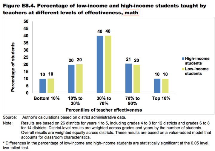

The actual effective difference as it translates to student outcomes is barely even measurable (about 0.005 SD):

Moreover, their statistics suggest that this is unlikely to be explained by ability to attract talented teachers (seemingly identical average effectiveness) or negative transfer patterns (those that transfer out of low-income schools aren’t worse). Rather the slight difference seems to come down to something mundane as having a somewhat higher teacher turn over (which translates into having somewhat more inexperienced teachers on average).

The very modest association between school/district income and teacher VAM is also quite consistent with the conclusions reached by Chetty et al on teacher VAM:


Besides these estimates, the observables, which schools may use for personnel decisions and which we may readily compare across schools/districts, things like teaching credentials, years of experience, awards, test scores, and so on, are at best very weak predictors of teacher VAM (mostly it’s whether the teacher has less than one year of teaching experience) and these simply don’t vary all that much by school/district income level. The implied effect of the sum total of these differences as it translates to student outcomes is exceedingly modest (and may well be biased upwards for higher SES students) and is quite consistent with what we find in these VAM-income association estimates.
These sorts of achievement gaps are unlikely to be a substantially a result of our distributed education system because we also find similarly large socioeconomic gaps throughout Europe and in other developed countries with much more top-down systems of funding, management, etc (see my prior post for more details)


My sense is that the progressive avant-garde has already moved far beyond educational funding and is now looking at the allocation of white students in the same way they previously viewed allocation of school funds: a scarce and educationally vital resources that the white people hog for their own schools. (Of course, there is still a massive zombie army of leftists chanting slogans about school funding, just like they chant slogans about redistricting, but as irritating and harmful as the zombolsheviks are, they aren’t going to read your excellent analysis.)
My further questions (purely out of curiosity, not because I want to increase ed spending under *any* circumstances):
1. Is there any price-point at which you can militarize a ghetto school enough that the students will behave, if you refuse to use any traditional forms of discipline? (i.e. no corporal punishment, no expulsion, no profiling/preemptive punishment of repeat offenders)
2. What *can* you spend money on so that a kid learns more? For example, people who get one-on-one piano lessons, violin lessons, etc. seem to learn to play the instrument, whereas others do not. Does the same principle apply to language tutoring? Athletic training? Or are better facilities/equipment/books desirable? Travel? Where should the marginal dollar go?
3. My interest in #2 is motivated by the theses that (a) a small percentage of retarded/dumb/nasty students absorb most funding (even in good schools), analogous to healthcare spending, and (b) educational spending doesn’t do much. Obviously we could just lower taxes, but keeping the education budget constant: what results *could* we get if we expelled the ineducable and diverted all those resources to normal students? What is the opportunity cost?
4. This points towards the experimental question, how cheaply could you run a school which still produced (highly-?)educated students, and how could you convince wealthy parents to skimp on educational expenses? (For example, could you find some other childrearing-related expense to replace it?) This interests me on an intellectual level, but I also suspect that ostentation virtue-signaling about how spartan one’s child’s school is will be the only way to get this lesson across to the public.
Reblogged this on Davi Lyra-Leite.
My experience is that in New York the difference between spending in lower income areas and higher income areas on school is extraordinary. In NYC if we included all the wealthy children who go to private schools that gap would narrow considerably. In other states is the gap in spending narrowed by very few wealthy children going to public school, that does not seem accounted for here.
As I pointed out on twitter, this doesn’t really fall apart in and around NYC either.
Compare total expenditures per pupil in NYC vs districts in Westchester, Suffolk, and Nassau counties
Or see weighted average expenditures per pupil for the 3 aforementioned counties + NYC.
One can always point to individual districts that spend abnormally more than other individual districts, but these expenditures patterns are largely orthogonal to district income/wealth in the vast majority of states and, where it’s not, it is usually tilted significantly in favor of poorer school districts.
P.S., The larger differences are between states. On average the poorest districts in NY spend much more than the richest districts in AZ, UT, ID, NV, etc (even those that have much higher median household incomes), i.e., merely being in a rich states brings substantial benefits regardless of the actual local tax base.
So, there’s no school funding inequality except between states but that doesn’t count because reasons. No wonder you won’t put your real name on this shit.
You might attach great significance to between state inequality, but clearly what many people object to is the notion of funding disparities resulting from local (as in, school district/city level) funding mechanisms. Though I specifically pointed out the existence of some modest inequality between states this does not change the fact that poor students on average enjoy more spending than non-poor students, i.e., it’s not as if all of the rich students are sorted into rich states and all of the poor students are sorted into poor states (not even close) so that somehow accounting for states disappears what is otherwise a robust positive association between these two variables. For instance, the average instructional expenditures per pupil in districts with median income greater than 100K/yr is roughly 4K/pupil/year in AZ, a relatively poor state, whereas districts with a median income of 25k/yr in NJ spend 2-3x as much (~12k/pupil/year).
If you say so “Cool Guy sexhaver”.
Interesting post! If the revenues (or total expenditures) of two schools are the same, does that mean that their educational expenditures are the same?
E.g. I could imagine that poor districts get more money for subsidizing student lunches, and if this is included in their expenditures then they may spend as much as a richer district in total but less on education per se.
I can see how the data here undermines the story that disparities in funding within states are responsible for bad outcomes for the poor, but it’s a little less clear how this undermines the story that disparities across states might be responsible. I guess it might by undermining the notion that funding is important to outcomes. If that’s not the mechanism you meant, I’d appreciate clarification on this point. It’s possible I just overlooked something, I didn’t read as thoroughly as I could have.