The Congressional Budget Office periodically produces income distribution and effective tax rate data for households by income group.
One interesting, but little known fact, is they produce their “income categories” (quintiles, top 1%, etc) with a weighting according to the household size.
Here is their definition:
“Income categories are defined by ranking all people by their income adjusted for household size—that is, divided by the square root of a household’s size. (A household consists of the people who share a housing unit, regardless of their relationships.) Quintiles, or fifths, contain equal numbers of people, as do percentiles, or hundredths. Households with negative income (business or investment losses larger than other income) are excluded from the lowest income category but are included in totals.“
What this means is that a household with 1 person and 50K of income would be ranked identically to a household with 100K of income and 4 people, as would a household with 150K in income and 9 people, and so on.
Although I think this is, in some respects, a useful and perhaps necessary way of approximating the welfare of each individual household, I suspect they unintentionally mislead a lot of people with respect to both the effective tax rates and the actual distribution of income since few people probably know that they do this in the first place and fewer still understand the implication of this.
Consider, for instance, that if the wealthiest 0.5% of households (unadjusted for size) adopted 1 child each, it would surely produce a more “unequal” distribution since highest reaches of the income distribution would account for that much more of the population (CBO income groups always account for similar shares of the entire population), despite the fact that they have less discretionary income and haven’t (for the sake of argument) increased their incomes by one dime.
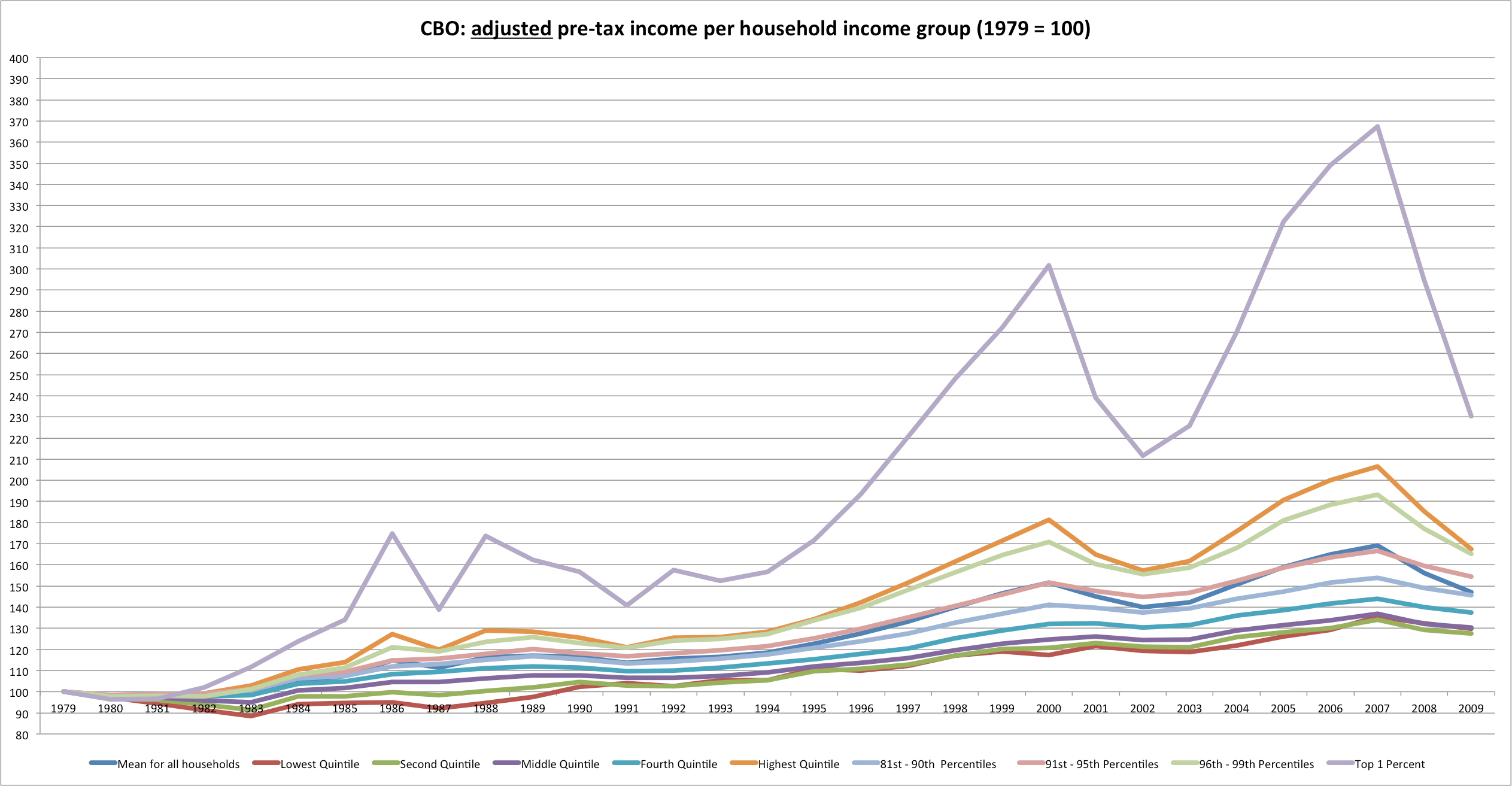
The CBO further confuses this issue by then quoting the average income, pre- and post- tax, across these adjusted-income groups without actually quoting the adjusted-incomes (which seems very strange to me indeed). Thus, say, middle 20% of households may shrink dramatically in size and may include people with very different raw-income levels, but their published results do not give you any hint of this at all.
This is not an academic argument since, in fact, the households have never been identically sized and there has been a significant shift in the distribution of population (and, in fact, earners) amongst the households.
Below I have calculated the approximate size using their household count data (they round the numbers so there is a small amount of error between years).
Average number of people per CBO household income group (scaled to 1979)

Observation: The very richest and very poorest grew or stayed the roughly the same, whereas the middle income groups and the like dropped dramatically in size. (Remember: this is after their weighting method so “middle” can mean very different pre-weighted incomes… the effects are probably even more dramatic w/o this weighting)
Average number of people per household income group – unscaled

Percentage of (unadjusted) households represented by the CBO’s various income groups – scaled to 1979’s values

Clearly these adjusted-income groups look VERY different now than they once did.
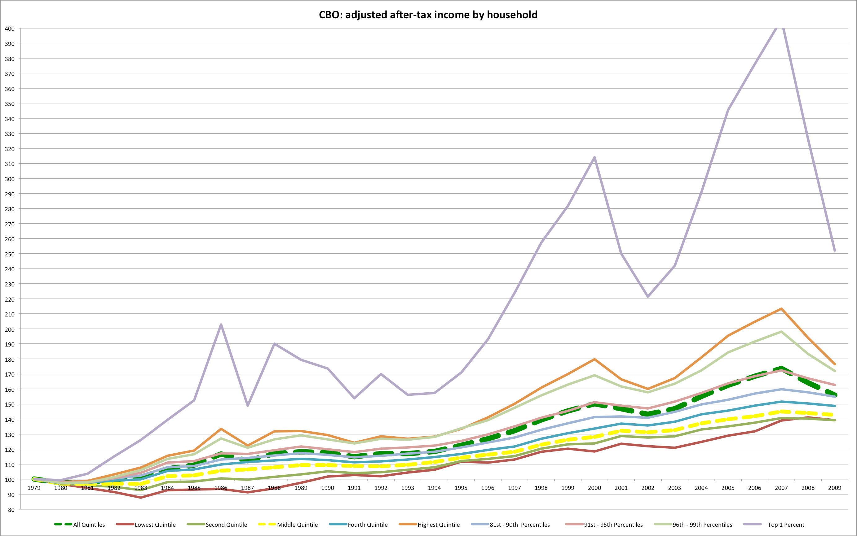
Below is what the results of these UNadjusted incomes look-like according to the adjusted-household income groups:


Now I can sort of correct for this by adjusting each adjusted group’s mean income according to the mean number of people in them…
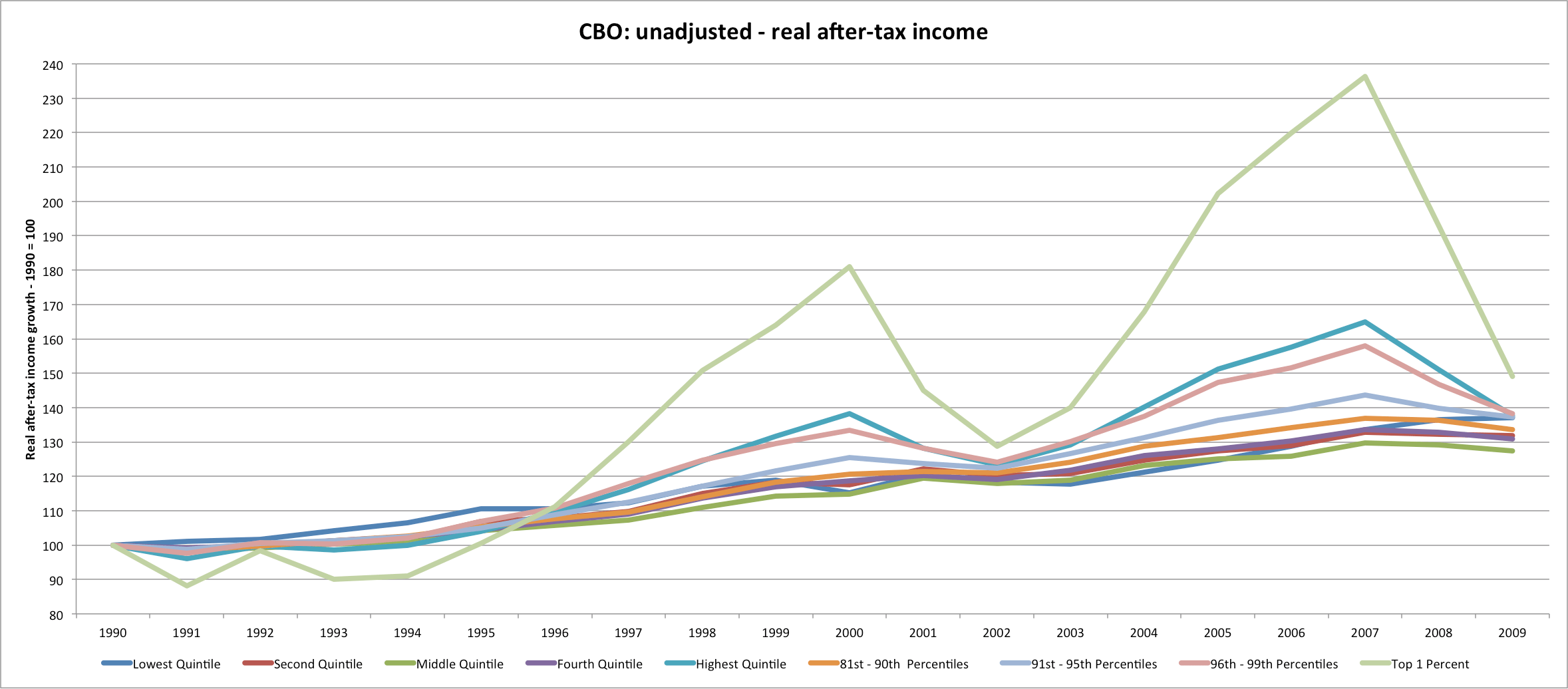
UPDATE: Now let’s look at 1990 – 2009 [post-tax reform]
UNadjusted….
Adjusted….
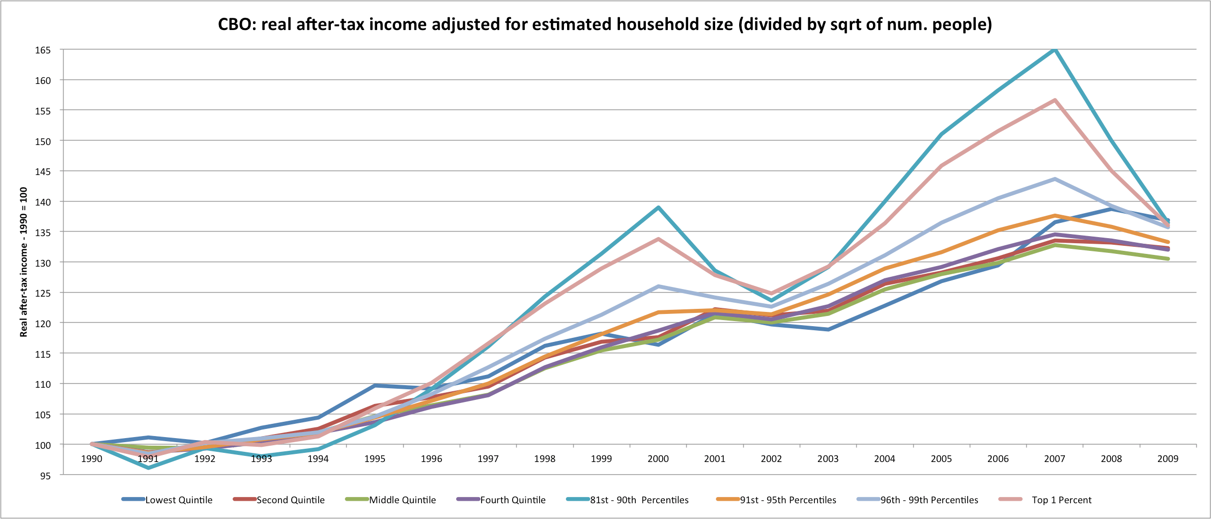
Observation: After 1990, the adjusted incomes (which are probably a decent measure of the individual welfare of the household members) of all of the CBO’s income groups climbed 30 to 36% for ALL of their income groups [only a 5% difference between the top 1% and the middle quintile]. Their unadjusted figure produces a 20% spread between the middle quintile and the top 1% (but notice that the middle quintile drops in size in this same period and, not coincidentally, lags behind everyone else in these unadjusted averages….)
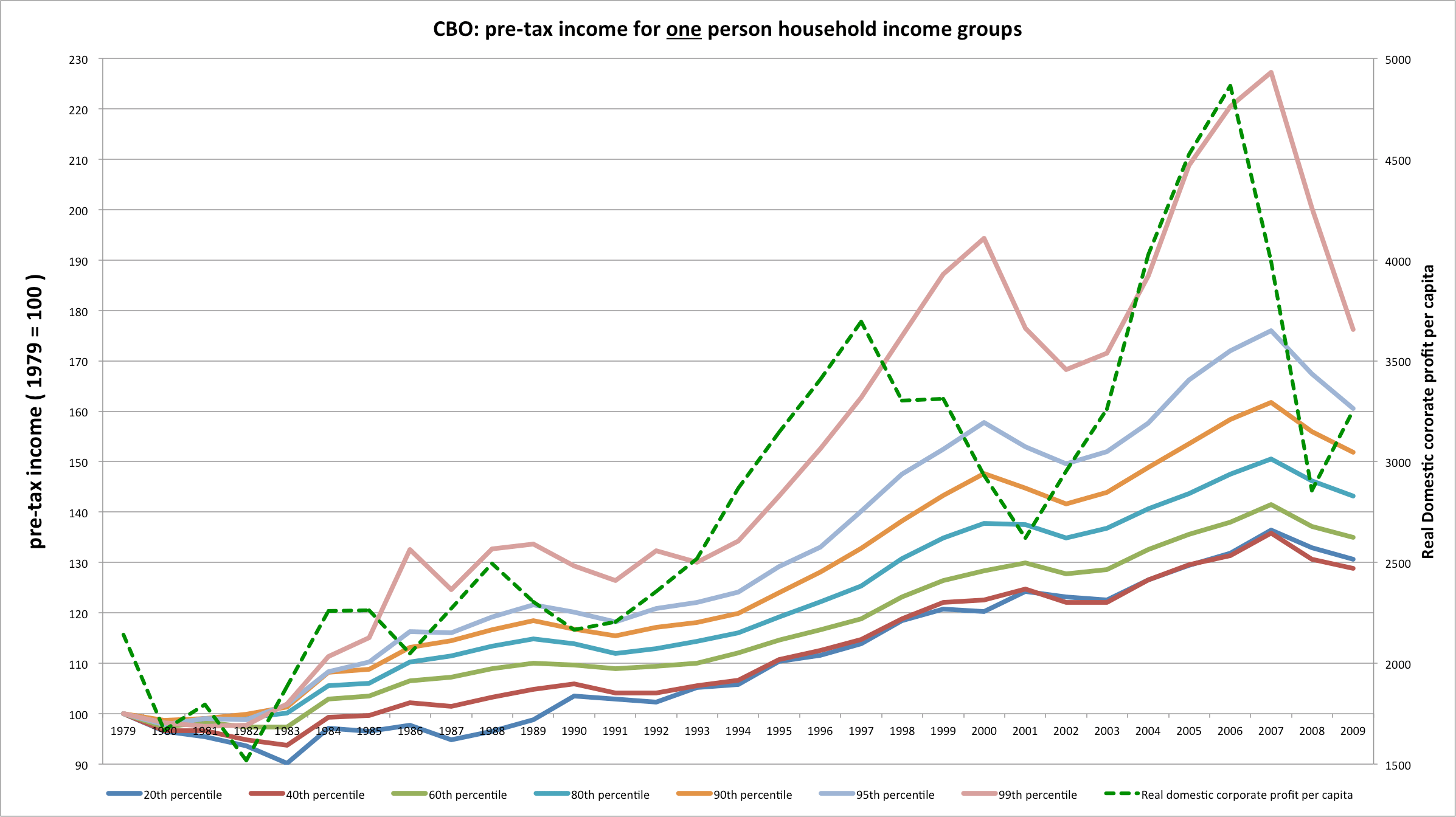
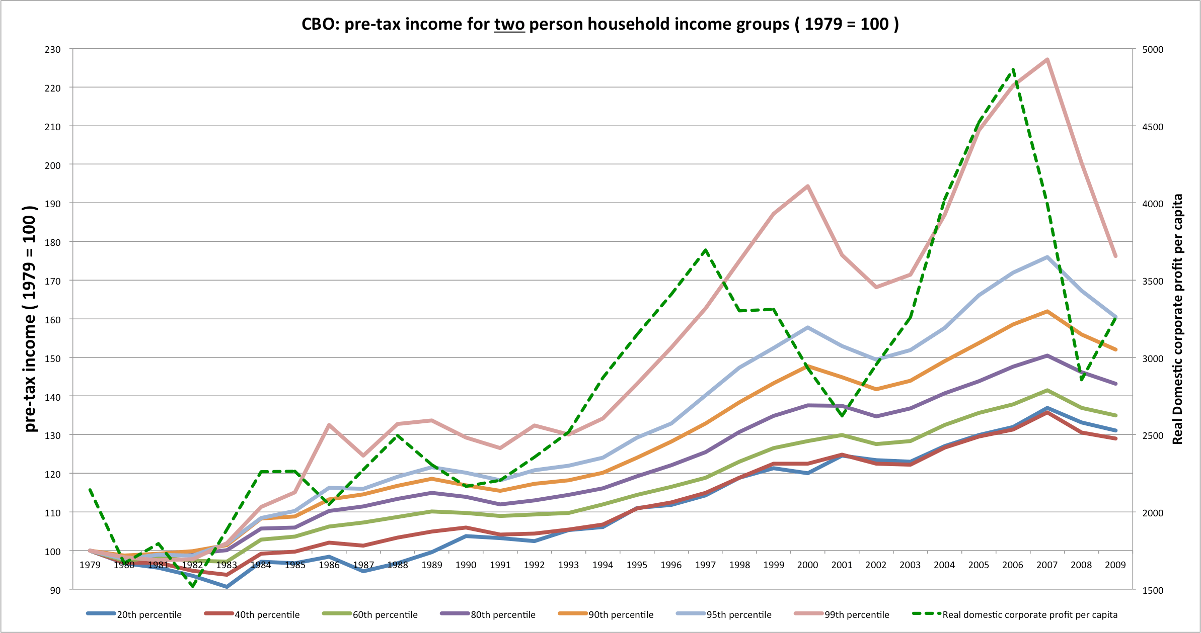
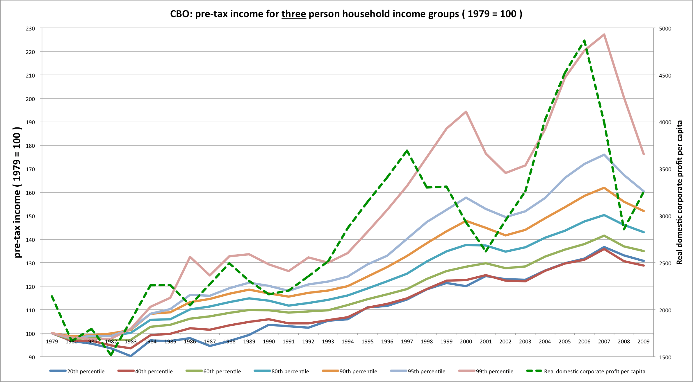
Fortunately, the CBO does publish the minimum income levels for each income group according to household size, so we can remove some of this bias….
1979 – 2009

1987-2009

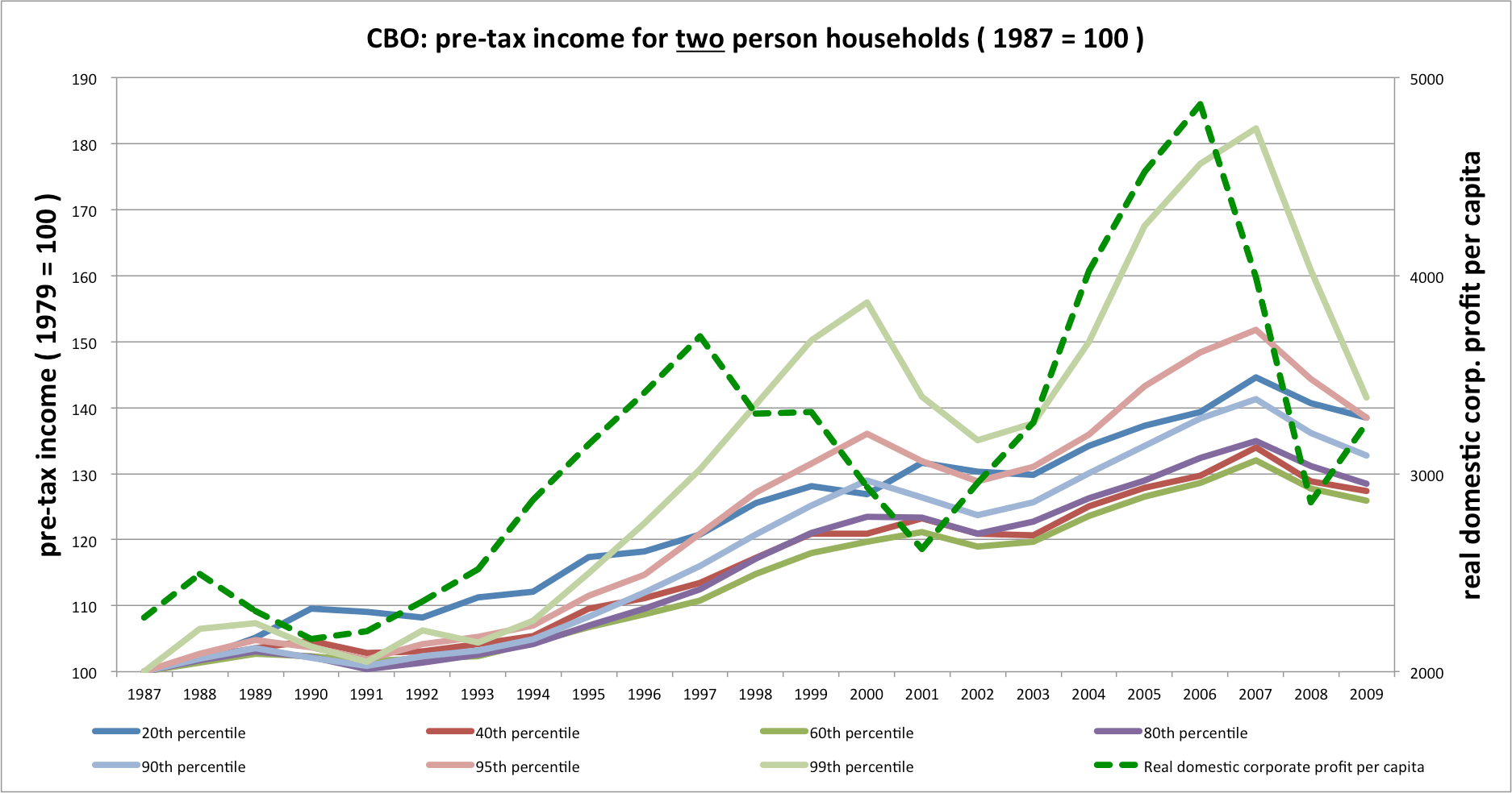
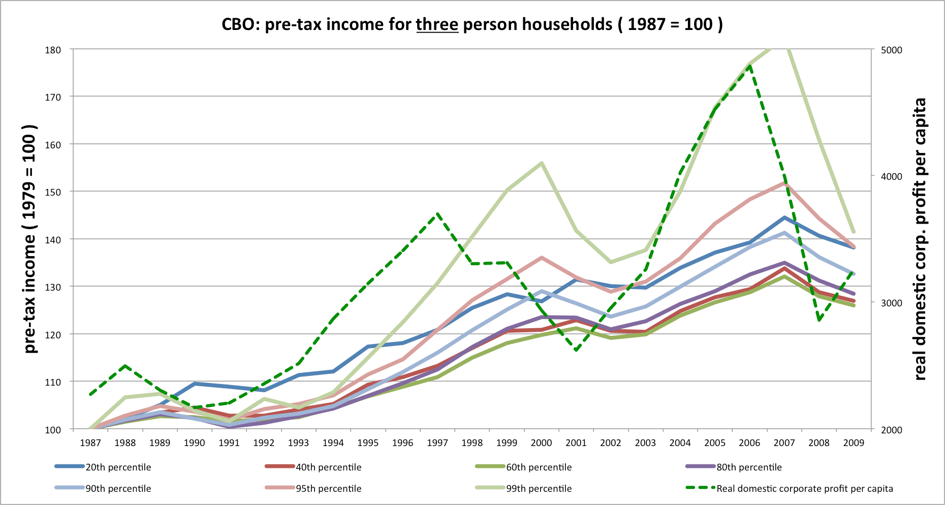
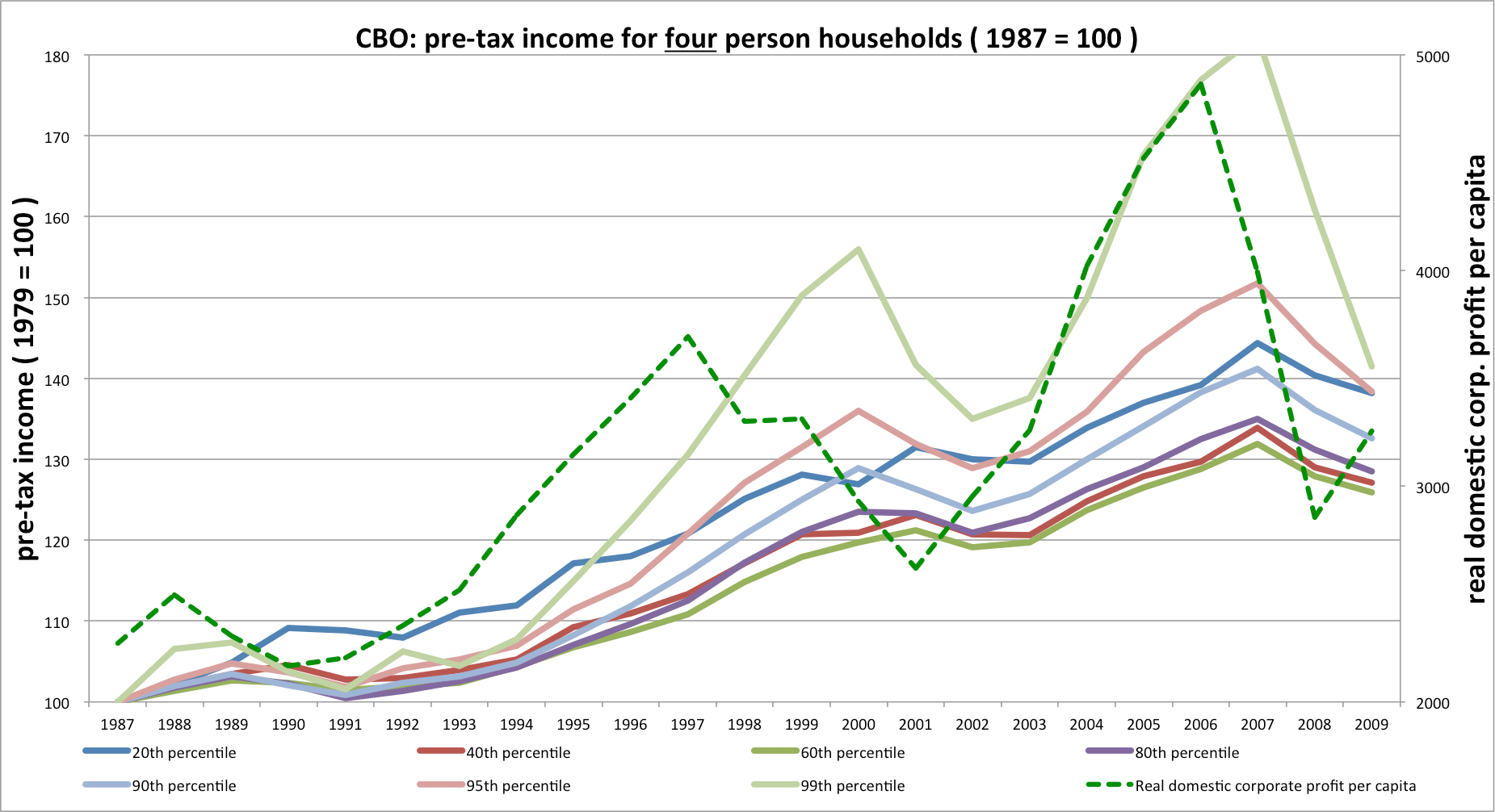
What I see is that similarly sized households in the income distribution saw similar gains. Everyone gained appreciably, but higher income groups at all levels saw their income rise and fall more with the business cycle.
I included domestic corporate profit, the dotted green line on the right axis to make this relationship more apparent. This domestic corporate profit measure is direct from the BEA and includes all private C-corporations as well as S corporations. This, I believe, is important since higher income fates are tied to this profit measure in several respects: market returns, senior management pay, and (crucially) it includes most of the gross income of pass-through entities that’s not normally reported elsewhere [the CBO also imputes corporate taxes to pre-tax income].
I also ran separate charts for 1979 and 1987 since the trend is much different, post 1987, and because I suspect (but cannot yet prove) that part of the trend may have been be linked how AGIs were reported pre-1986 (what or how the CBO corrected for this, I do not know). In any event, tax reform clearly plays a large role (just compare the trends from between 1979 and 86 or 90– VERY different).
Anyways- the highest income groups still saw their incomes grow somewhat more rapidly than the less well off, but this impact is MUCH less dramatic than that reported by the CBO and the like and it seems to be clearly linked to domestic corporate profitability…
P.S., I realize that this does not account for the fat tail past the 99th percentile, but even still it seems pretty clear to me that much of the apparent inequality is a byproduct of their methodology that is highly sensitive to compositional issues.